Apply prebuilt themes, set a primary color, and pull in your brand colors so forms match your practice.
Themes and brand colors let you launch polished, on-brand forms, surveys, and quizzes faster in Aesthetix CRM. Instead of styling every element by hand, you can start from a ready-made theme, set a primary color that carries your brand through every interaction, and pull saved colors straight from your Brand Boards. This article explains how to apply themes, customize them, control the primary color, and use your saved brand palette so every asset looks consistent with your practice.
Themes in the Form and Survey Builder are professionally crafted presets that apply a cohesive design in a single step. With user-friendly controls and real-time previews, you can create visually stunning, responsive forms that match your practice's identity. Themes streamline the design process, save time, and keep a consistent look across every form and survey you build.
Consistency: Creates a cohesive look across the entire asset with one selection.
Speed to launch: Reduces setup time by starting from a polished preset.
Responsive by default: Automatically adapts to mobile, tablet, and desktop for a consistent experience.
Real-time previews: Validate changes instantly before publishing or embedding.
Open your Form or Survey in the builder.
Click Styles & Options (top-right) to open the right sidebar.
Select the Themes tab and choose your preferred theme.
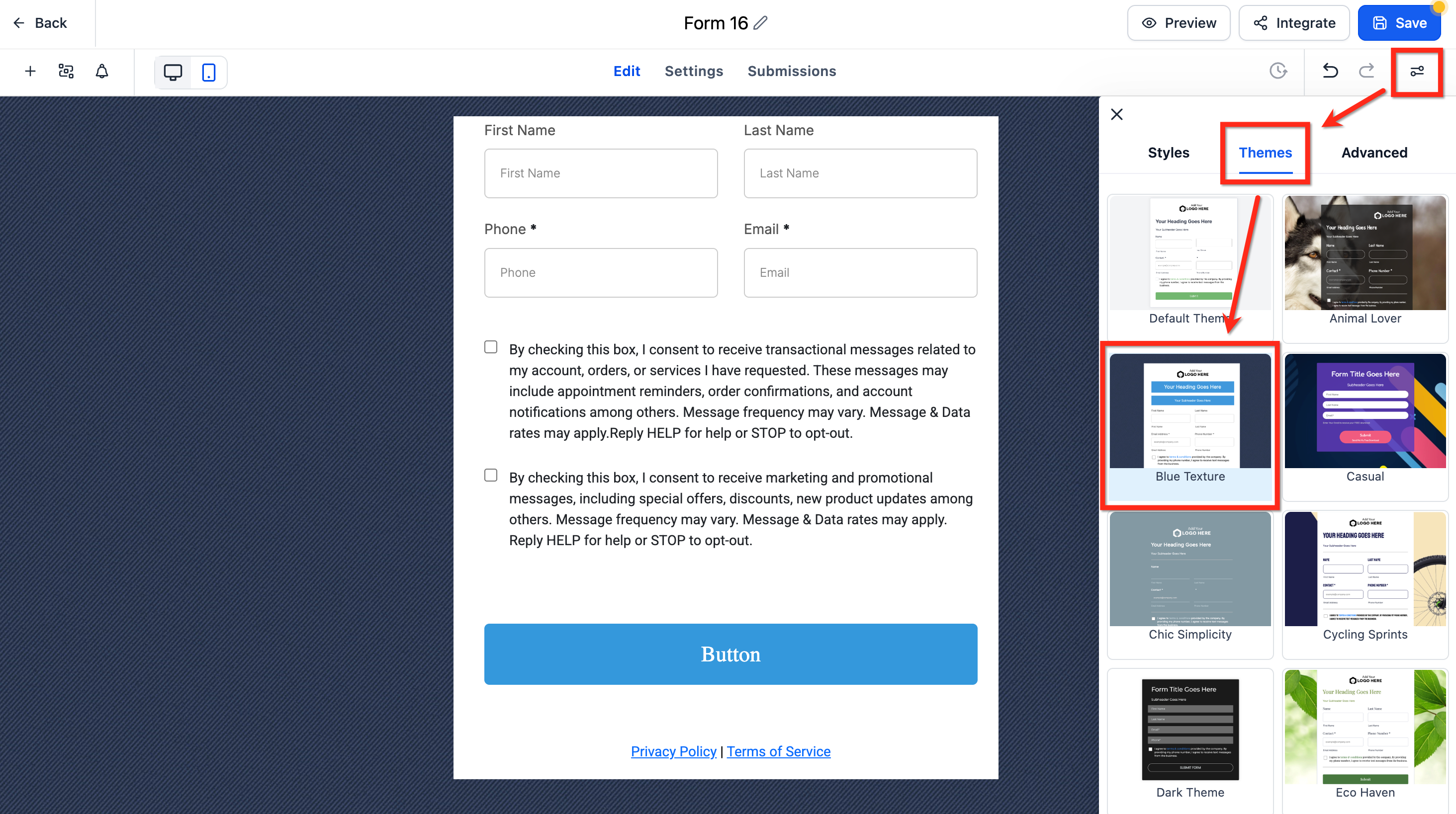
After selecting a theme, refine your brand colors and imagery in Styles & Options → Styles → Colors & Backgrounds.
Button Themes (gallery and live preview)
Button themes provide curated presets (Filled, Border, and Text Only) that apply best-practice color, typography, and spacing. Start with a theme for speed, then refine with the Button Styling Panel to maintain brand consistency.
Customize after applying a theme
Close the gallery to return to the Button Styling Panel.
Use Colors & Background, Typography, Layout & Alignment, Padding, Border & Corner Radius, and Shadow to refine the look.
Toggle Full Width if needed.
Branding and color tokens
Confirm how the Primary Color maps to button fill, border, and text for your chosen theme.
Adjust colors to meet accessibility contrast guidelines.
Consistency across assets
If button themes are reusable across forms and surveys, apply the same theme across assets to standardize your calls to action.
If themes are set per asset, repeat the apply and customize steps on each form or survey.
Revert or try another theme
Open Select Themes to switch presets, or use Reset/Revert in the panel to undo changes.
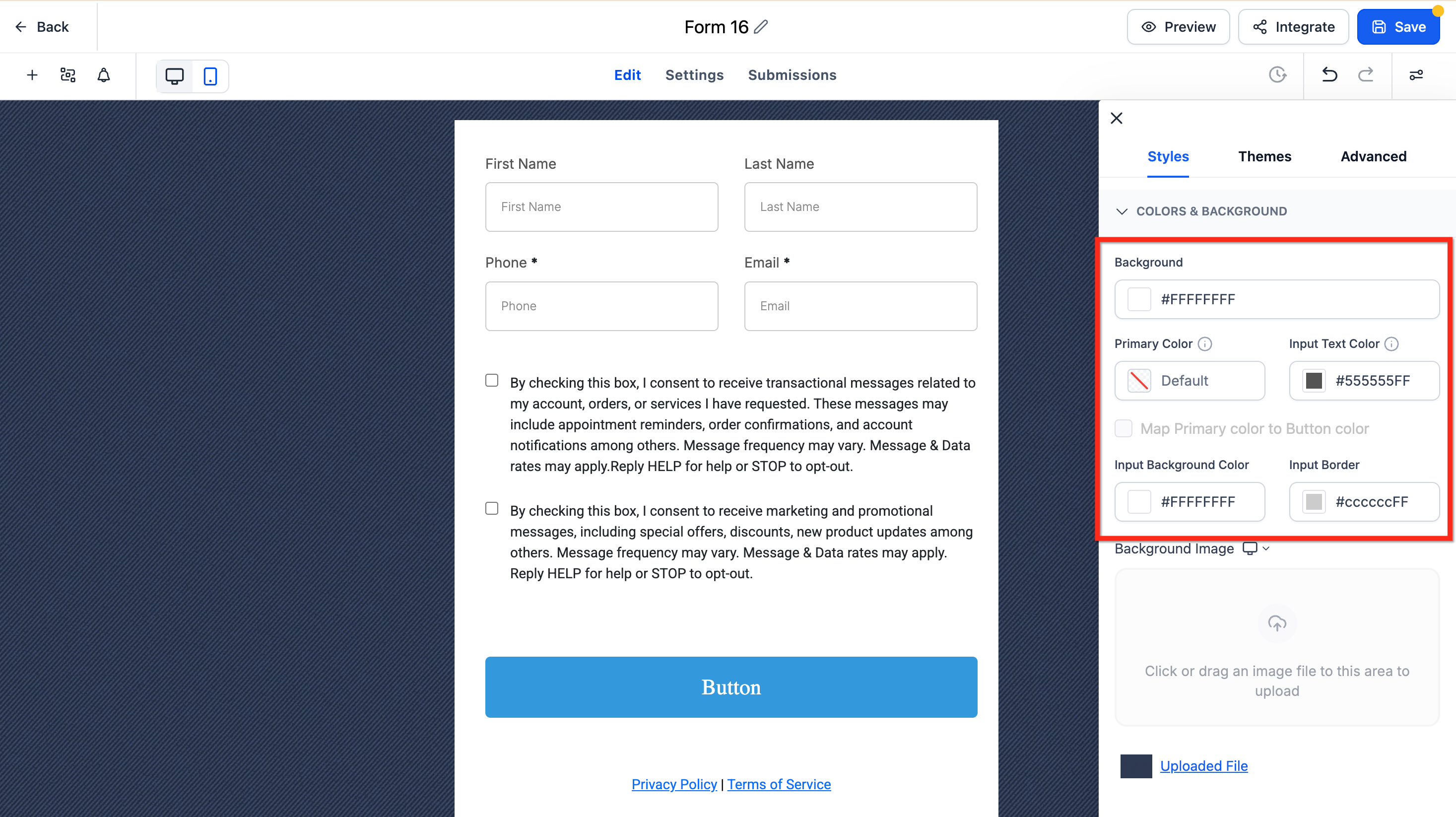
Adjust colors
Use these settings to adjust the background, text input, and input border colors to match your branding.
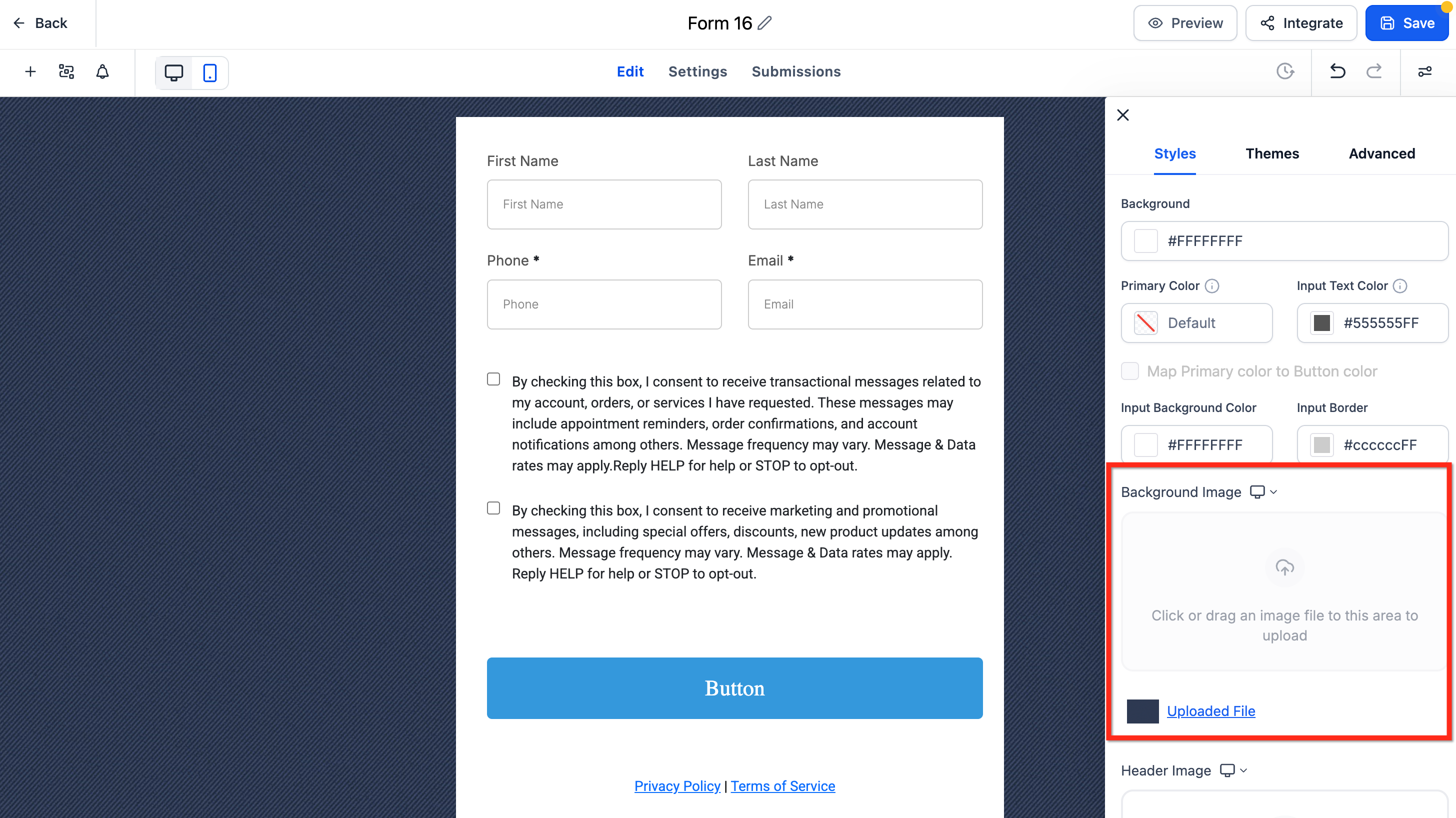
Change the background image
If your selected theme includes a default background image, remove it first. The upload control stays disabled until the default is deleted. Then click below Background Image to upload your file.
The default theme for forms, surveys, and supported quiz components has a refreshed look and feel. This update improves the out-of-the-box appearance with cleaner spacing, more polished inputs, rounded styling, and better visual consistency across supported elements. You will also see clearer empty states and more consistent styling for labels, placeholders, images, footer colors, and chips.
The Primary Color setting controls how your form elements look when patients interact with them. It automatically applies your chosen brand color to input fields, dropdowns, checkboxes, and other elements, keeping everything visually consistent with your branding. The result is forms that look professional, cohesive, and on-brand without needing any design experience. Primary color also improves accessibility by making active and selected elements easier to see.
Brand consistency: Creates a cohesive look and feel across forms, surveys, and quizzes.
Usability and clarity: Highlights hover and active states so patients always know where they are typing or what they selected.
Trust and professionalism: Polished, responsive states can improve perceived quality and completion rates.
Fewer styling steps: Set it once and the color applies to multiple interactive elements automatically.
Flexibility: Optionally map the primary color to your button color for complete visual harmony.
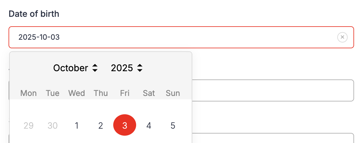
When you set a primary color, it updates the appearance of several form interactions. These visual effects help patients see where they are clicking or typing while keeping your forms aligned with your brand colors. The primary color appears only when a patient interacts with a form, such as:
Hovering over a field
Clicking or typing in a field
Selecting a checkbox or radio button
Choosing a date or option
If no primary color is defined, the form uses the default neutral styling. Here is how the primary color shows in each type of element.
Form fields: The border highlights with your primary color when hovered or clicked.
Dropdowns: Options and borders reflect the primary color when opened or selected.
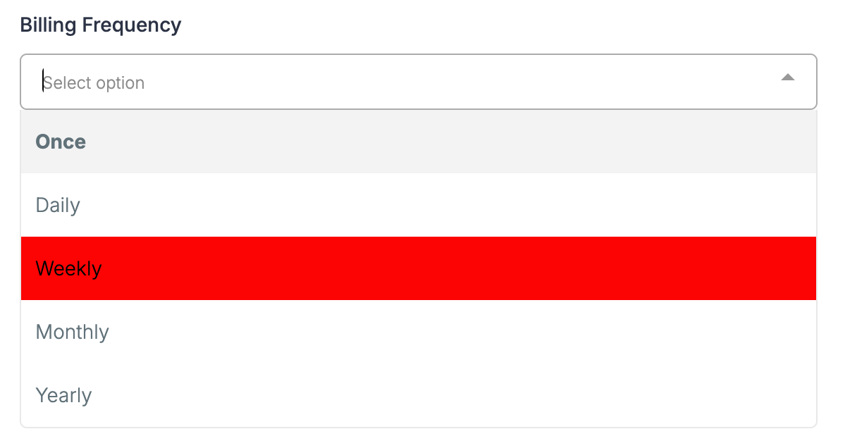
Checkboxes and radio buttons: Selected options fill with your primary color.
Date picker: The active or selected date is highlighted in your primary color.
File uploads and signature fields: Borders and sketch colors use your primary color.
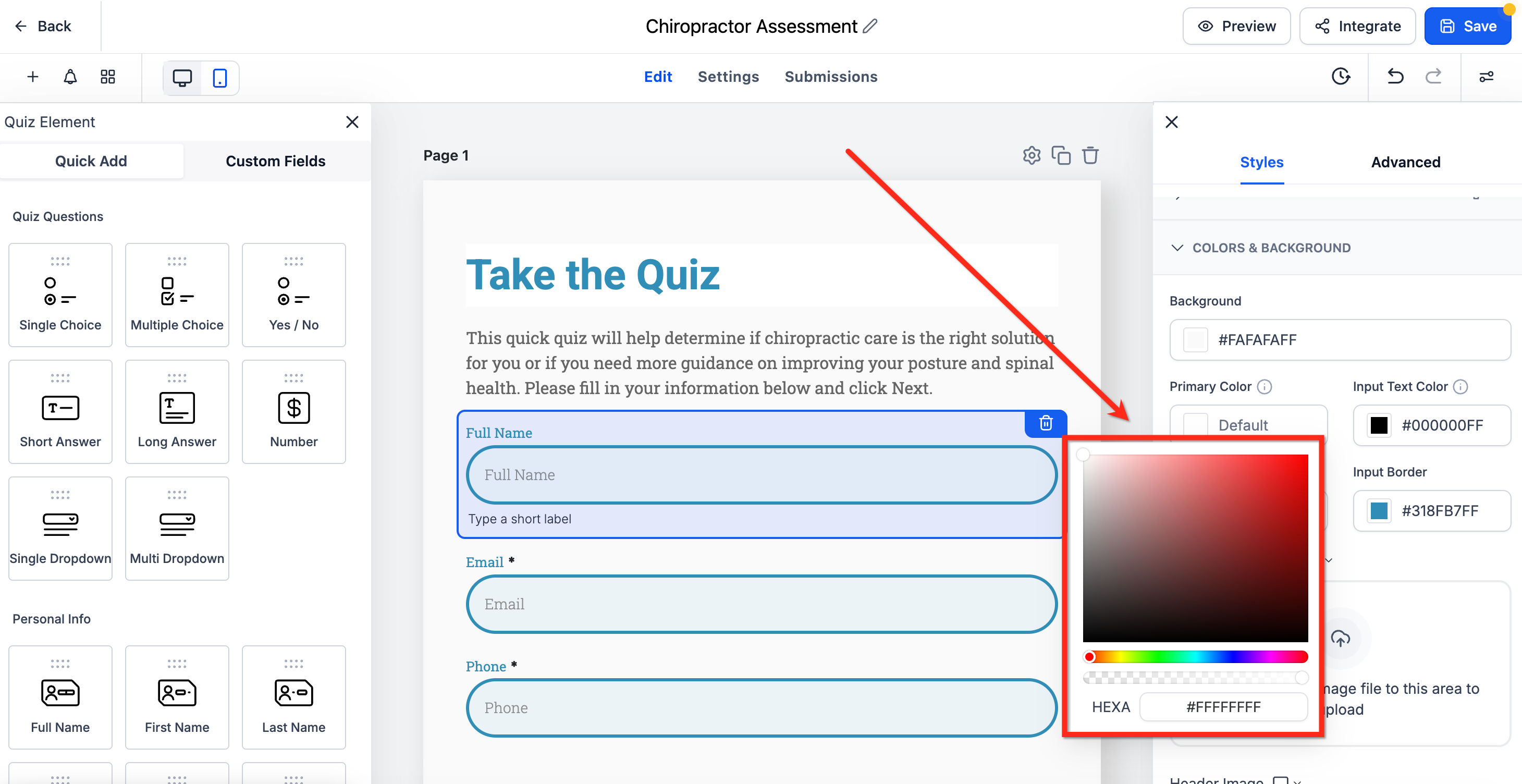
From within the builder, go to Styles & Options → Styles.
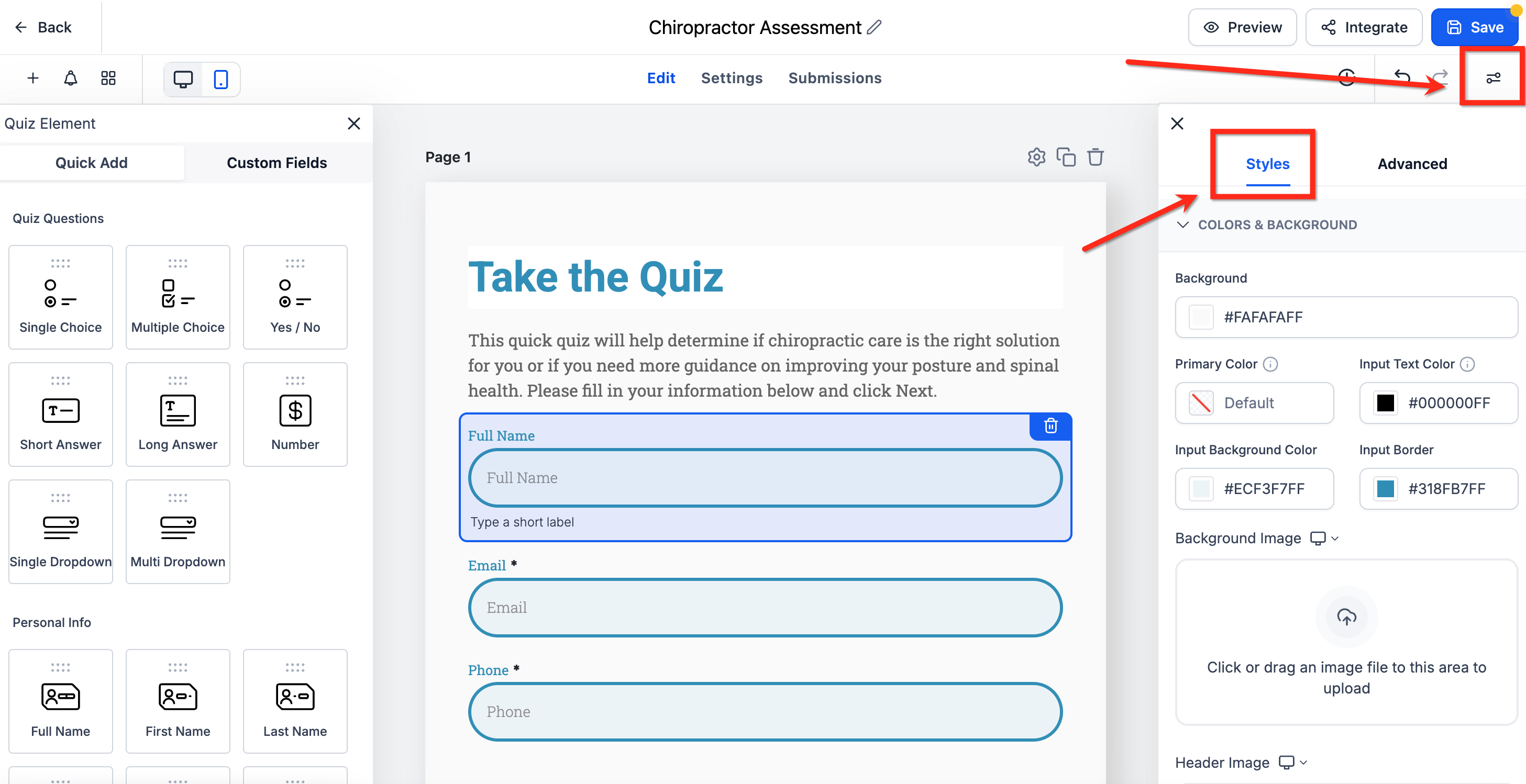
Scroll down to the Primary Color field, which is under Colors and Background.
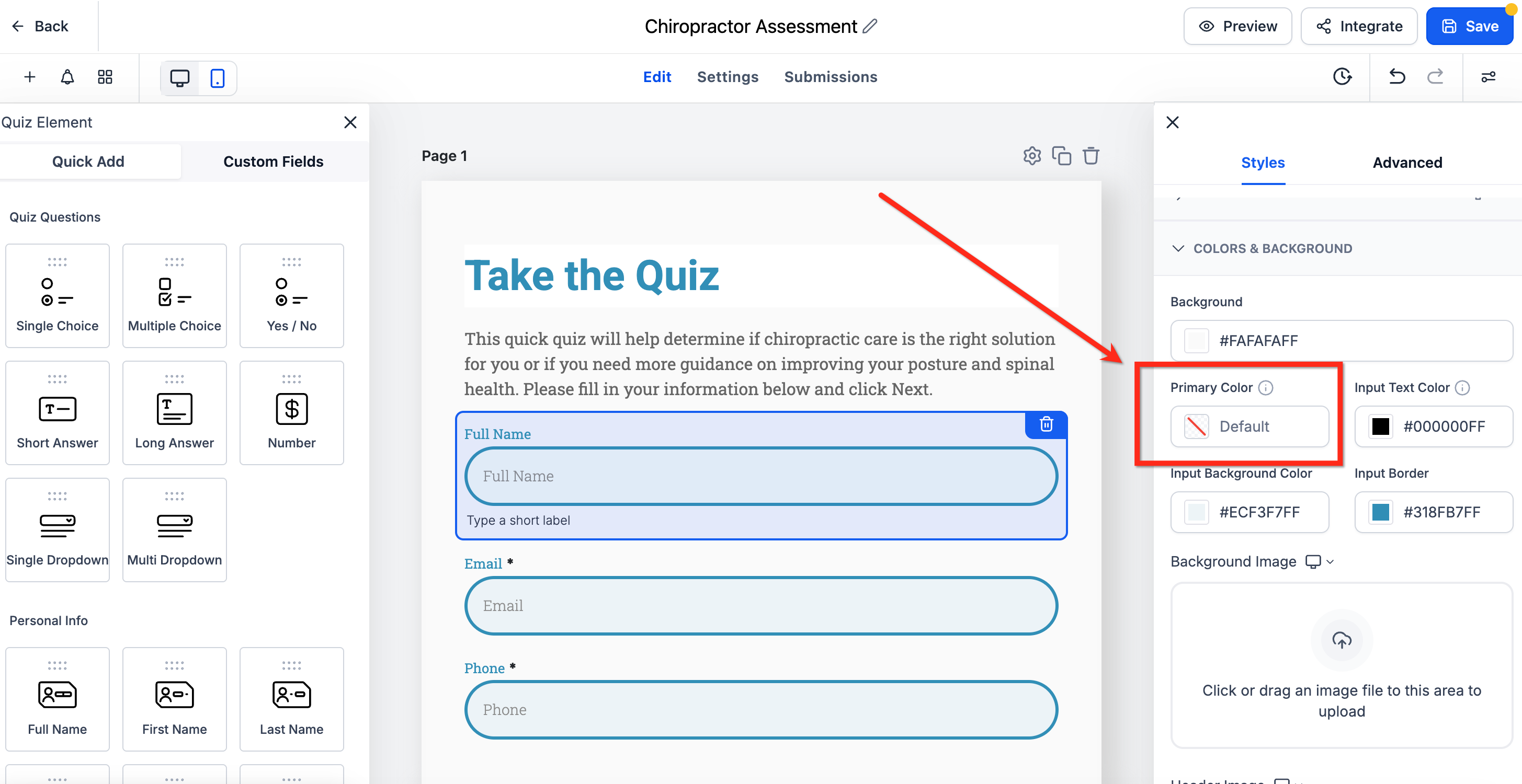
Select a color or enter a custom hex code. Toggle Map Primary color to Button color if you want buttons to follow suit. Click Save to apply the changes. Your forms will automatically update to use the new color for all interactive elements.
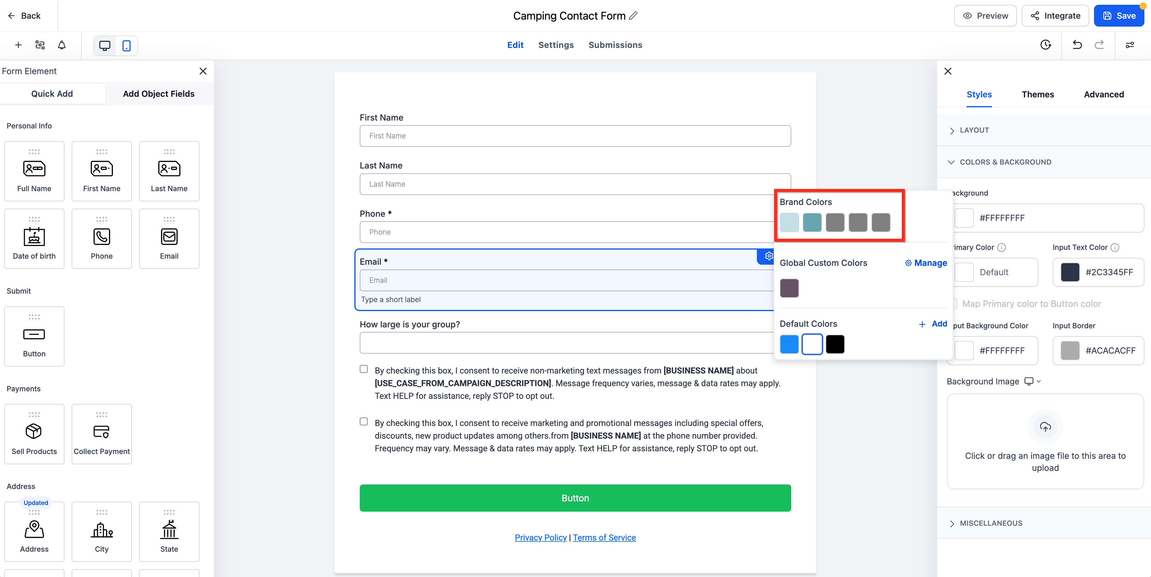
You can use your saved Brand Board colors directly inside the Form, Survey, and Quiz builders. The color picker surfaces your brand colors so you can keep every asset on-brand without manually copying color codes.
Brand colors let you apply saved brand colors directly from the color picker while styling builder elements. This keeps buttons, inputs, labels, and other design elements aligned with your brand without pasting hex codes each time.
Brand colors appear based on your saved Brand Board setup. To manage them, open Brand Boards in Marketing Tools. If you do not see your colors, confirm:
Your Brand Board has colors configured, and
The correct default Brand Board is set.
Faster styling: Apply saved brand colors without manually entering hex codes each time.
Better brand consistency: Keep buttons, fields, labels, and other visual elements aligned with your approved palette.
Simpler collaboration: Share a reusable set of colors across forms, surveys, and quizzes.
Easier color management: Open Brand Settings from the picker to add or manage reusable custom colors.
This feature connects your saved brand palette to the builder so you can apply approved colors without interrupting your workflow. It also reduces the need to manually match colors across forms and other assets.
When you open a color field in the builder:
The color picker displays available color sections, including Brand Colors, Global Custom Colors, and Default Colors.
Selecting a saved Brand Color applies that color to the chosen element, and the builder updates the preview automatically.
To add a new custom brand color, click Manage in the color picker to open Brand Settings.
Note: Changing your default Brand Board does not automatically restyle existing forms, surveys, or quizzes. Existing assets keep their current styling until you update them manually.
Why is the "Upload New Background" button disabled?
Delete the theme's default background image first. The upload option becomes available once the existing image is removed.
Can I reuse the same theme across multiple assets?
Apply the theme per asset. To keep multiple forms and surveys consistent, choose the same theme and mirror your Styles settings.
Why are my brand colors not showing in the color picker?
Confirm that your Brand Board has saved colors and that the correct default Brand Board is configured. You manage brand colors under Brand Boards in Marketing Tools.
What is the difference between Brand Colors and Global Custom Colors?
Brand Colors come from your Brand Board's approved palette. Global Custom Colors are reusable saved colors that can be managed from Brand Settings and used across supported color pickers.
Will changing my default Brand Board automatically update my existing forms?
No. Existing forms, surveys, and quizzes keep their current styling until you update them manually.
Will changing the primary color affect all my forms?
Yes. All forms using the default styling update automatically when you change your primary color. The primary color applies across all forms in your account, so you cannot set a different primary color for just one form right now.
Can I keep a different button color than my primary color?
Yes. Leave the mapping toggle off and style buttons through your theme or custom styles.
Can I turn off the hover or focus effects?
No. These effects are built in to improve clarity and usability for the patients filling out your forms, and they carry over to mobile devices as well.