Use the Styles tab to control form fonts, colors, spacing, borders, and field styling so every form matches your practice brand.
The Styles tab in the Form Builder is where you shape how a form looks. From layout and background color to borders, corner radius, width, and custom CSS, these settings let you match each form to your practice brand and drop it cleanly into any page you embed it on. This article covers the Styles tab options, themes for a faster start, and how to add company branding.
Click Marketing.
Click Forms.
Click Add Form to create a new form, or open an existing one.
Click Styles.
Use the Styles tab to customize the appearance of your form.
In the Layout section, you can access settings to modify your form's structure:
Create inline forms, which position the input fields side by side rather than in a vertical stack.
Turn off the input field labels by toggling the Show Label setting.
The Form Style section controls the overall look of the form container.
Modify the background color of your form to match your practice colors.
Style the border using the Border type option.
Give your form a stronger border by increasing the width of the border walls.
Customize the corners of your form by specifying the Corner radius value.
Adjust the total width of your form using the Width option so it fits seamlessly into the web page you're embedding it in.
With custom CSS, you can completely transform the appearance of your forms. You can alter elements such as the shape of input fields, colors, buttons, and much more.
Note: If you're unfamiliar with CSS, we recommend seeking the guidance of an experienced web developer.
To have your practice logo appear on every form, toggle the option in this section.
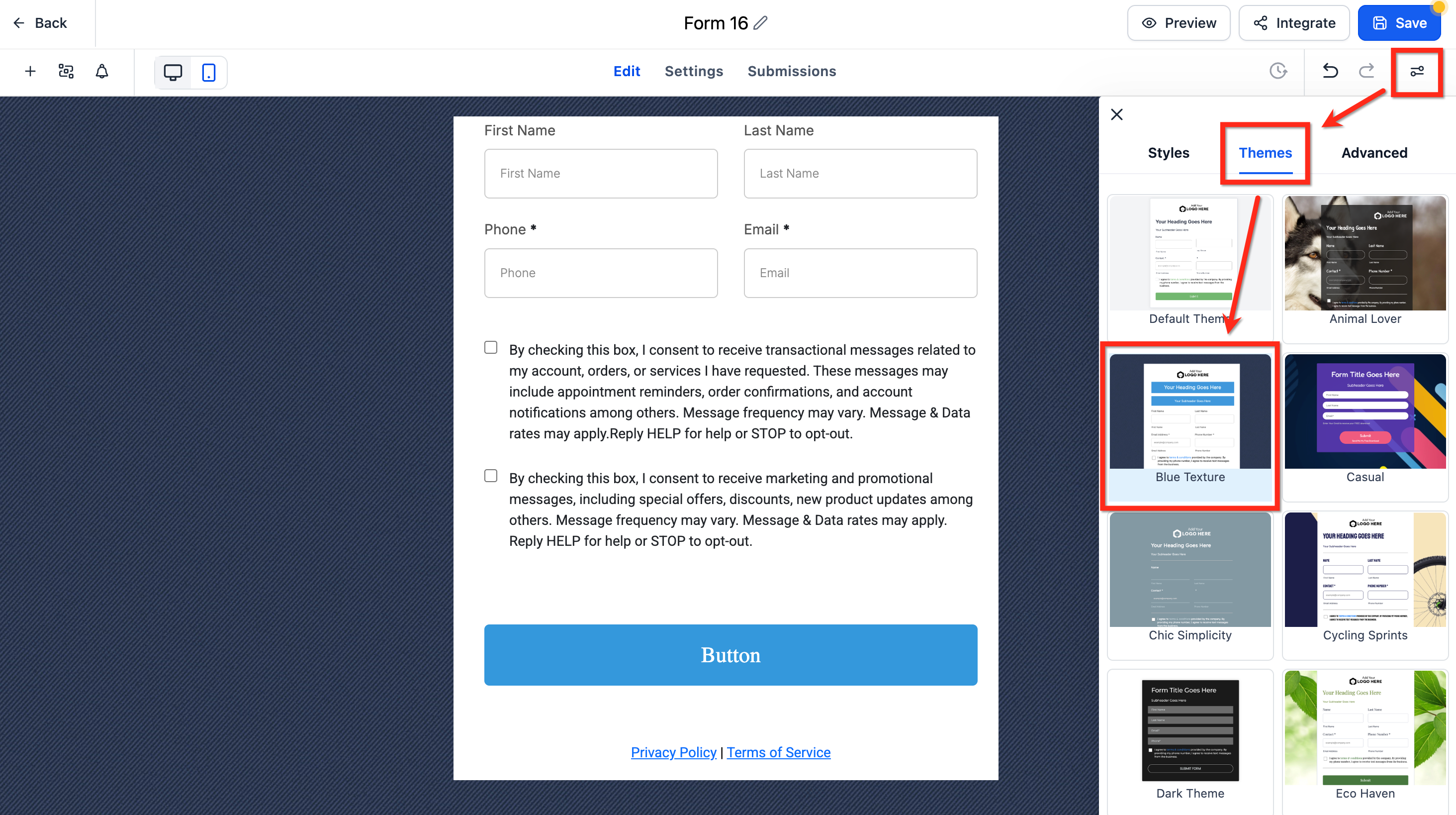
Themes are ready-made presets that apply a cohesive design in a single step. Instead of setting every color, font, and spacing value by hand, you can start from a professionally crafted theme and then refine it to fit your brand. Themes come with real-time previews and are responsive by default, adapting to mobile, tablet, and desktop automatically.
Key benefits:
Consistency: Creates a cohesive look across the entire form with one selection.
Speed to launch: Reduces setup time by starting from a polished preset.
Responsive by default: Automatically adapts to mobile, tablet, and desktop for a consistent experience.
Real-time previews: Validate changes instantly before publishing or embedding.
Open your form in the builder.
Click Styles & Options (top right) to open the right sidebar.
Select the Themes tab and choose your preferred theme.
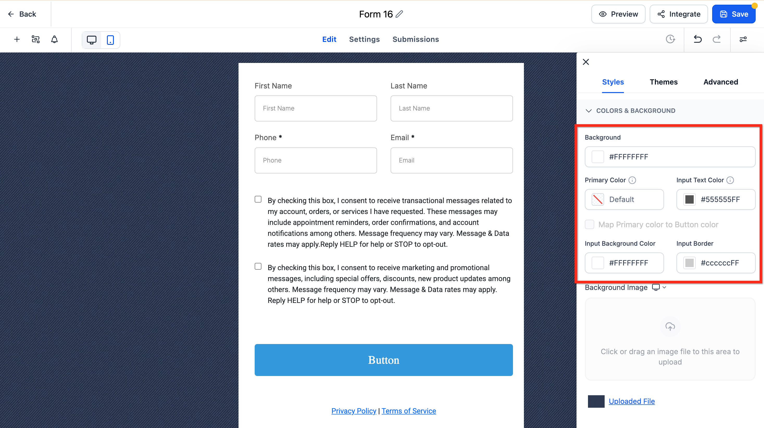
After selecting a theme, refine brand colors and imagery in Styles & Options, then Styles, then Colors & Backgrounds.
Button themes
Button themes provide curated presets (Filled, Border, and Text Only) that apply best-practice color, typography, and spacing. Start with a theme for speed, then refine with the Button Styling Panel to maintain brand consistency. Close the gallery to return to the Button Styling Panel, where you can adjust:
Colors & Background
Typography
Layout & Alignment
Padding
Border & Corner Radius
Shadow
Toggle Full Width if needed. To switch presets, open Select Themes, or use Reset/Revert in the panel to undo changes.
Branding and color tokens
Confirm how your Primary Color maps to button fill, border, and text for your chosen theme.
Adjust colors to meet accessibility contrast guidelines.
Adjust colors
Use these settings to adjust the background, text input, and input border colors to match your branding.
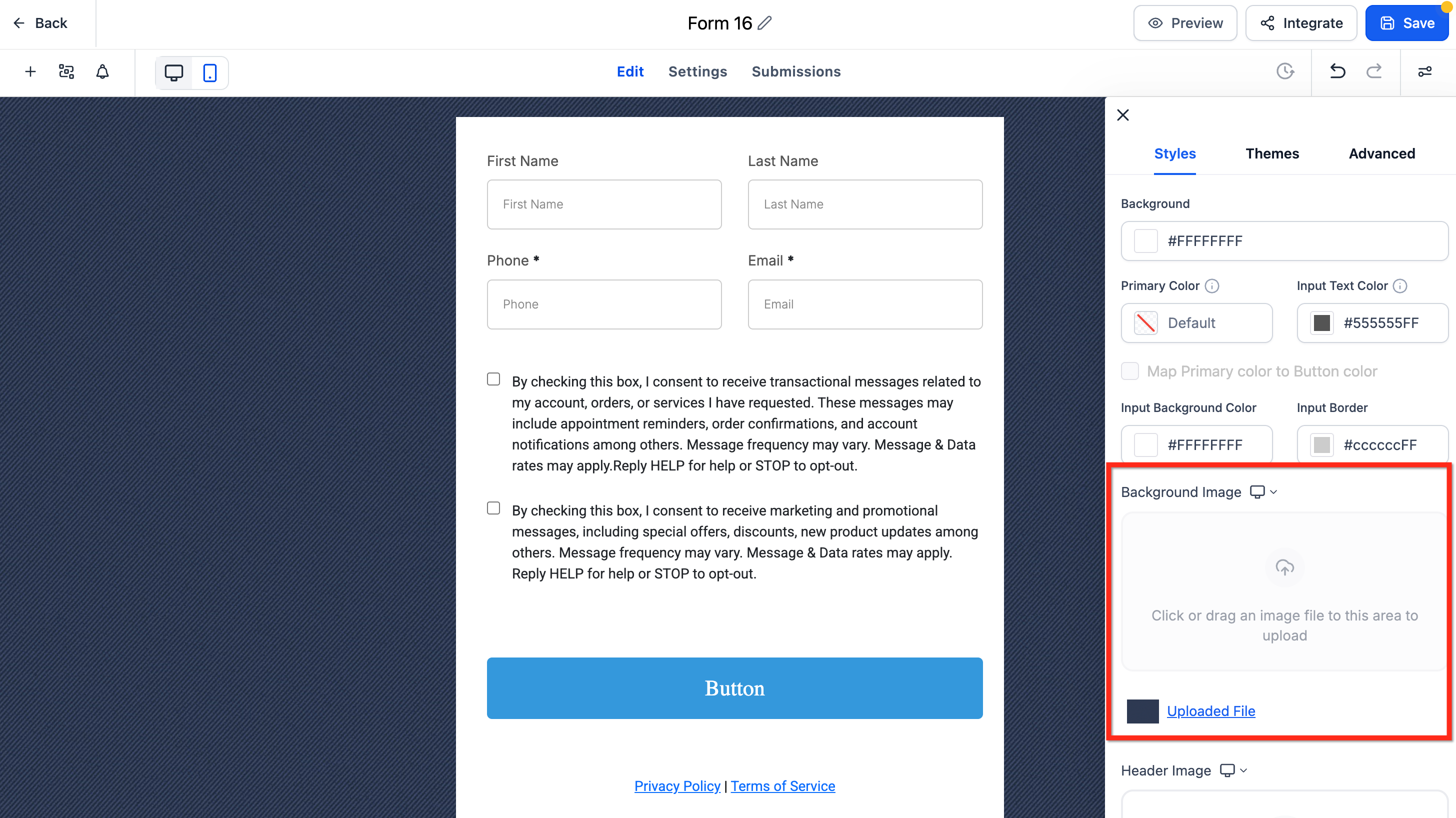
Change the background image
If your selected theme includes a default background image, remove it first. The upload control remains disabled until the default is deleted. Then click below Background Image to upload your file.
The default theme for forms and surveys has a refreshed look and feel. This update improves the out-of-the-box appearance with cleaner spacing, more polished inputs, rounded styling, and better visual consistency across supported elements. You will also see clearer empty states and more consistent styling for labels, placeholders, images, footer colors, and chips.
Where do I find the Styles tab?
Open a form under Marketing, then Forms. Inside the Form Builder, click Styles (or Styles & Options in the top-right sidebar) to access layout, colors, borders, and theme settings.
What is the difference between the Styles settings and a theme?
The individual Styles settings let you adjust each element (background, border, width, and more) one at a time. A theme applies a complete, cohesive design in a single step, which you can then refine using the same Styles settings.
How do I create an inline form with fields side by side?
In the Layout section of the Styles tab, enable the inline form setting. This positions input fields side by side rather than stacking them vertically.
Can I hide the field labels on my form?
Yes. In the Layout section, toggle off the Show Label setting to hide the input field labels.
Why is the "Upload New Background" button disabled?
Delete the theme's default background image first. The upload option becomes available once the existing image is removed.
Can I reuse the same theme across multiple forms?
Apply the theme per form. To keep multiple forms consistent, choose the same theme and mirror your Styles settings on each one.
How do I make my practice logo appear on every form?
In the Company Branding section of the Styles tab, toggle the option on so your logo displays on each form.
I don't know CSS. Can I still customize my form?
Yes. The Styles tab and themes let you customize colors, borders, spacing, and layout without any code. Custom CSS is only needed for advanced changes, and we recommend working with an experienced web developer for those.