Aesthetix CRM's Quiz Builder lets you carry your practice's colors, buttons, and fonts into every quiz you publish, so a skin type quiz or treatment finder feels like a natural extension of your website rather than a generic form. All of the styling tools below live in the quiz builder's right sidebar under Style and Options, and the same controls work identically in the Form Builder and Survey Builder if you want a consistent look across all three.
The Primary Color setting controls how quiz elements look when a prospective patient interacts with them. It automatically applies your chosen brand color to input fields, dropdowns, checkboxes, and other interactive elements, keeping the quiz visually consistent with the rest of your practice's branding without any design work.
Primary color accents appear only when someone is actively using the quiz, such as:
Hovering over a field
Clicking or typing in a field
Selecting a checkbox or radio button
Choosing a date or option
If no primary color is set, the quiz falls back to default neutral styling. Here is how the primary color shows up across quiz elements:
Quiz fields: The border highlights with your primary color when hovered or clicked.

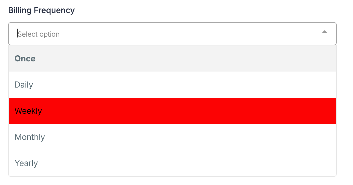
Dropdowns: Options and borders reflect the primary color when opened or selected.
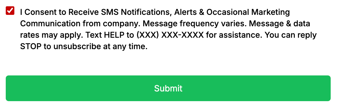
Checkboxes and radio buttons (common on quiz answer options): Selected choices fill with your primary color.
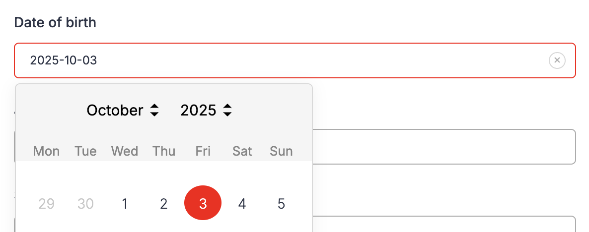
Date picker: The active or selected date is highlighted in your primary color.
File uploads and signature fields: Borders and sketch colors use your primary color.
Beyond the visual polish, this also improves accessibility, since active and selected elements are easier to see against the page.
From within the quiz builder, go to Style and Options → Styles.
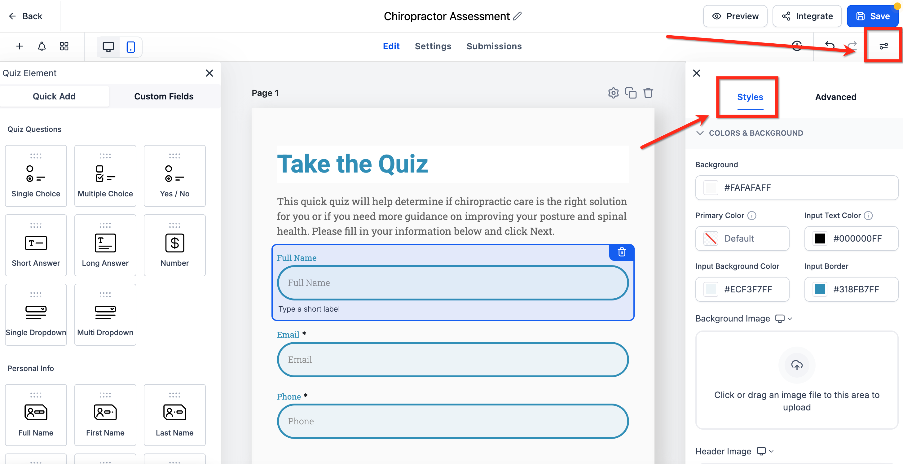
Scroll down to the Primary Color field under Colors and Background.
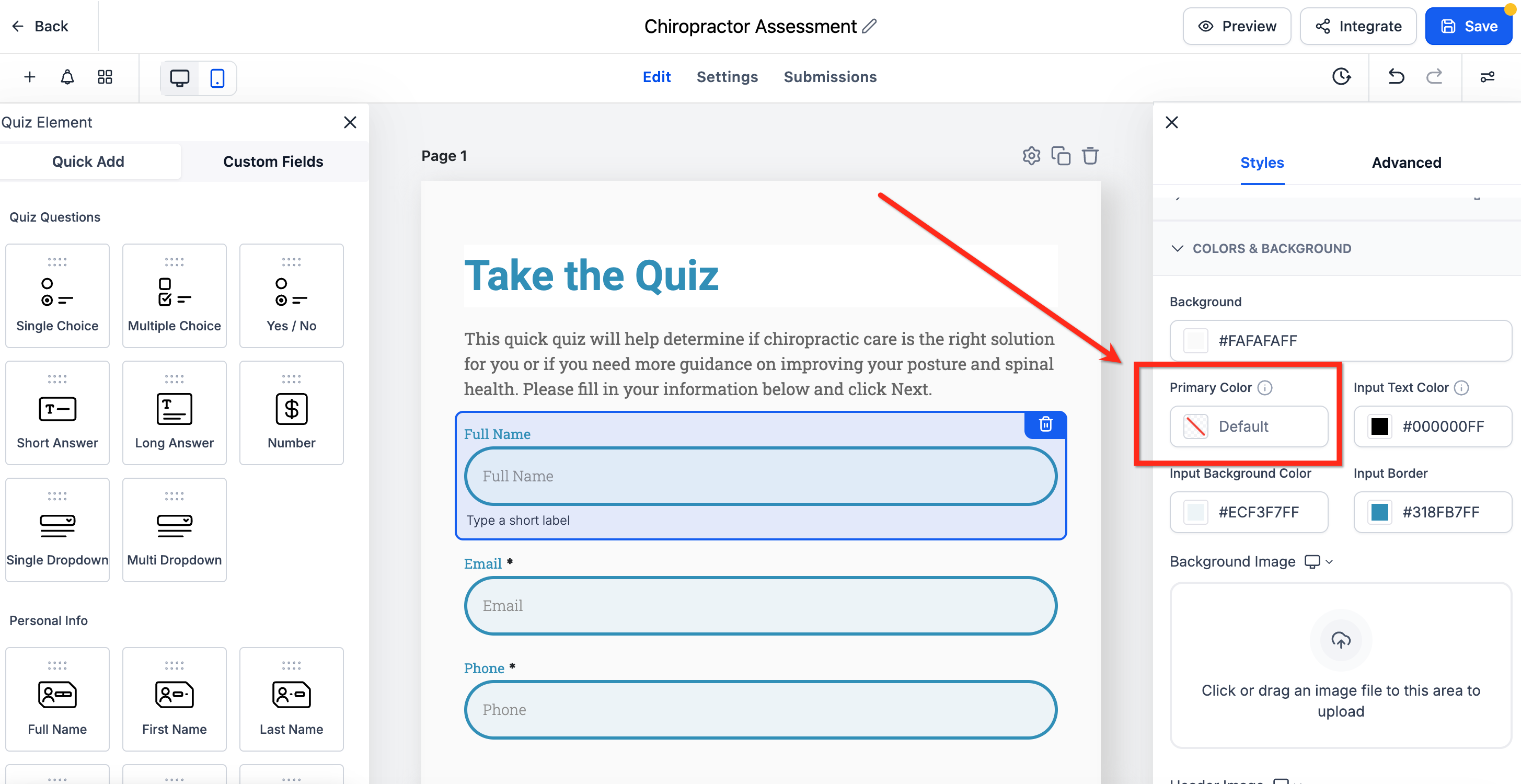
Select a color from the picker or enter a custom hex code. Toggle Map Primary color to Button color if you want quiz buttons to follow the same color. Click Save to apply the change.
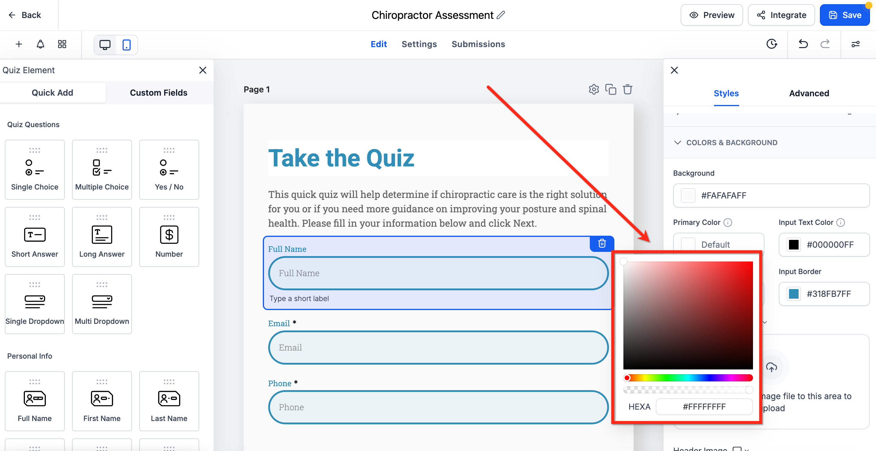
The primary color you set here applies across all your quizzes, forms, and surveys under your account, not just the one you're currently editing.
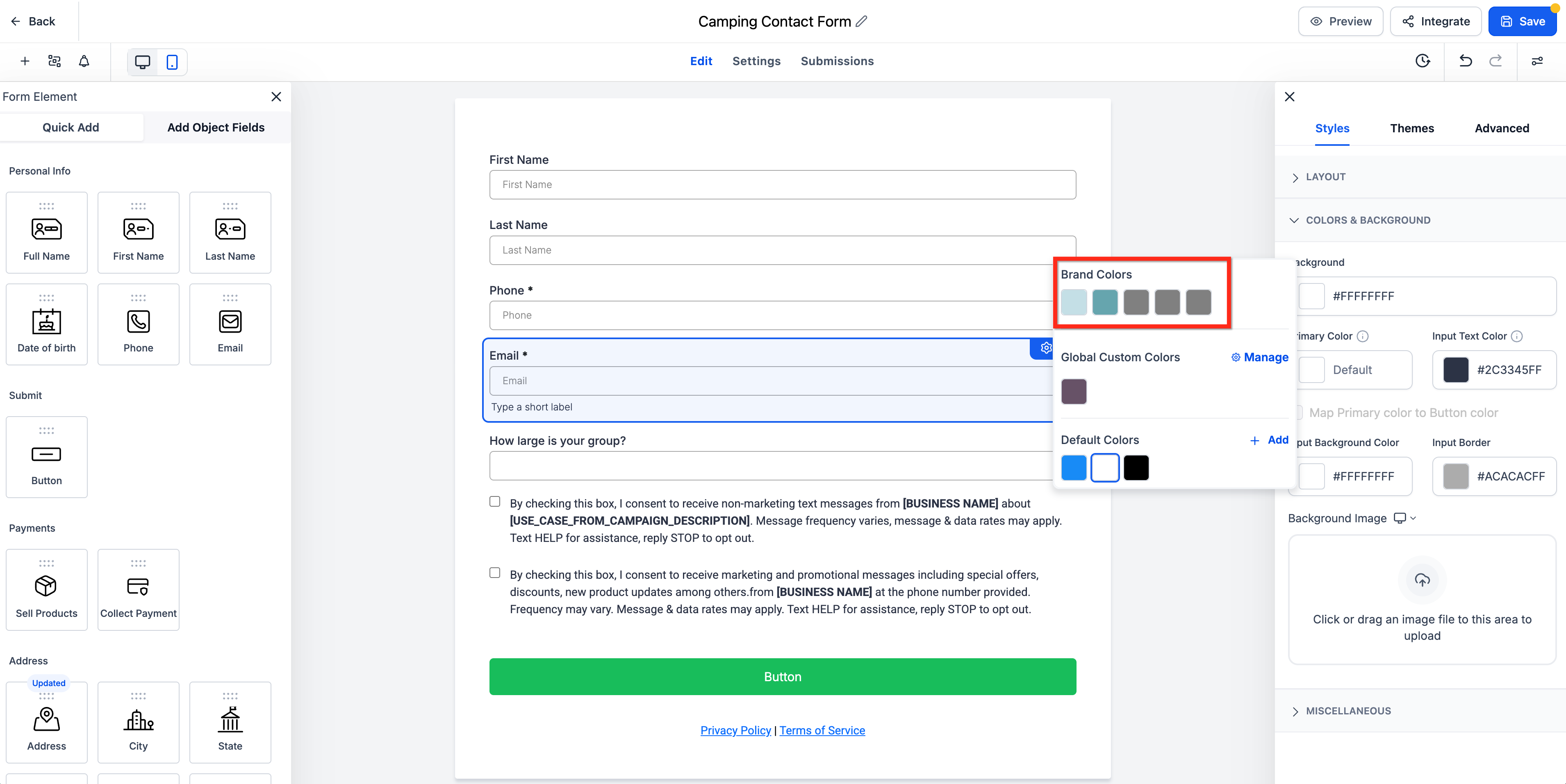
Instead of hunting down hex codes every time you style a quiz, you can pull colors directly from your saved Brand Board right inside the color picker. This keeps buttons, fields, labels, and other design elements aligned with your practice's approved palette without copying and pasting.
Brand Colors appear in the picker based on your saved Brand Board setup. If you don't see them, confirm that your Brand Board has colors configured and that the correct default Brand Board is set for your account.
When you open any color field in the quiz builder:
The color picker displays available sections, including Brand Colors, Global Custom Colors, and Default Colors.
Selecting a saved Brand Color applies it to the chosen element, and the builder updates the preview automatically.
To add a new custom brand color, click Manage in the color picker to open Brand Settings.
Changing your default Brand Board does not automatically restyle existing quizzes. Any quiz you've already built keeps its current styling until you go back in and manually update it.
Gradient button backgrounds let you build more modern, branded calls to action, like a "See My Results" or "Book My Consult" button, without relying on a single flat color. You can blend two or more brand colors together directly from the button style settings, with no custom code required.
Button Background Options
Solid Color: Uses one background color for the button. Best for a clean, simple button style.
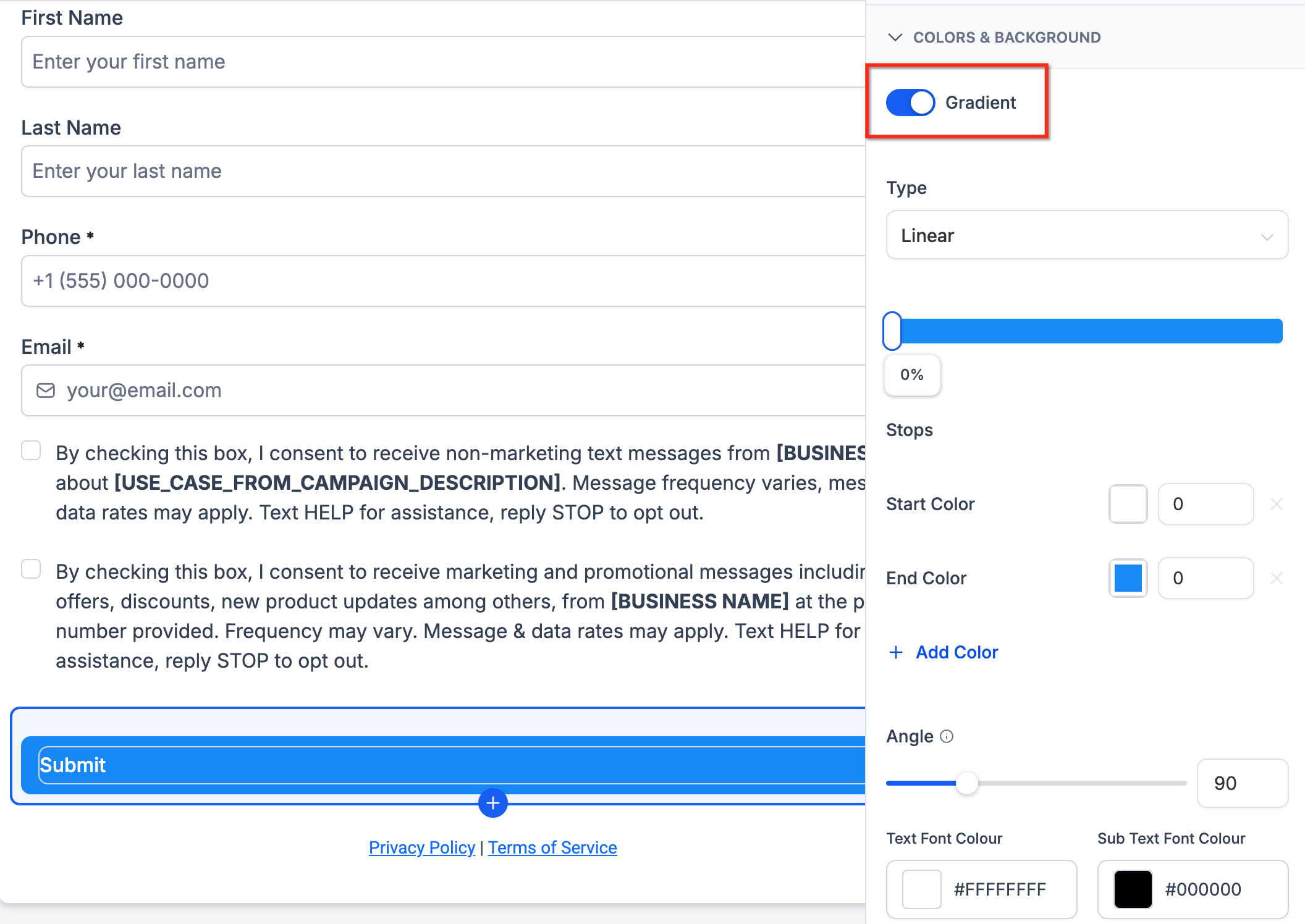
Gradient: Blends multiple colors together across the button. Best when you want the button to feel more visually prominent or match a more dynamic page design.
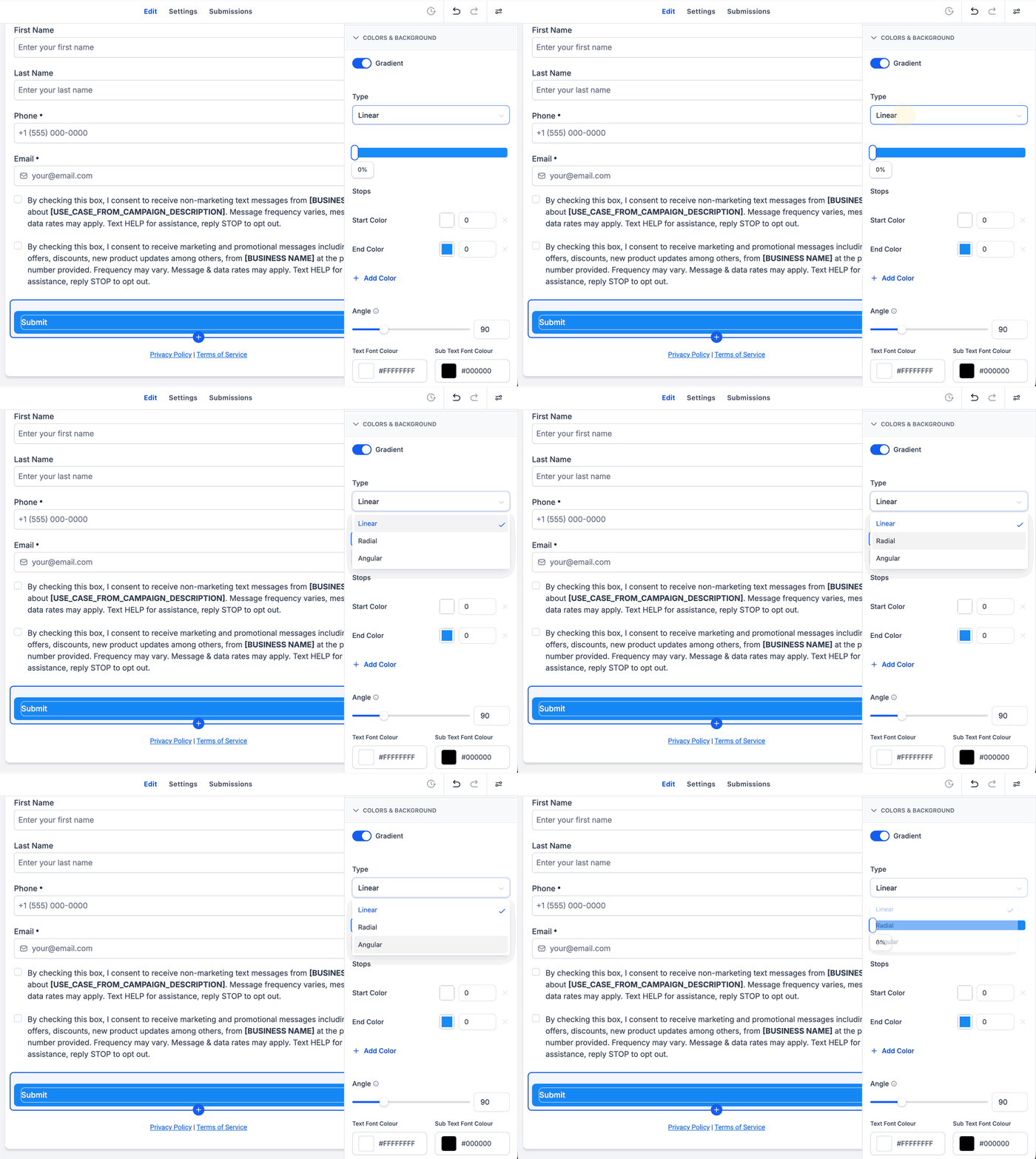
Gradient Types
Linear Gradient: Blends colors in a straight direction.
Radial Gradient: Blends colors outward from a central point.
Angular Gradient: Blends colors around an angle-based pattern.
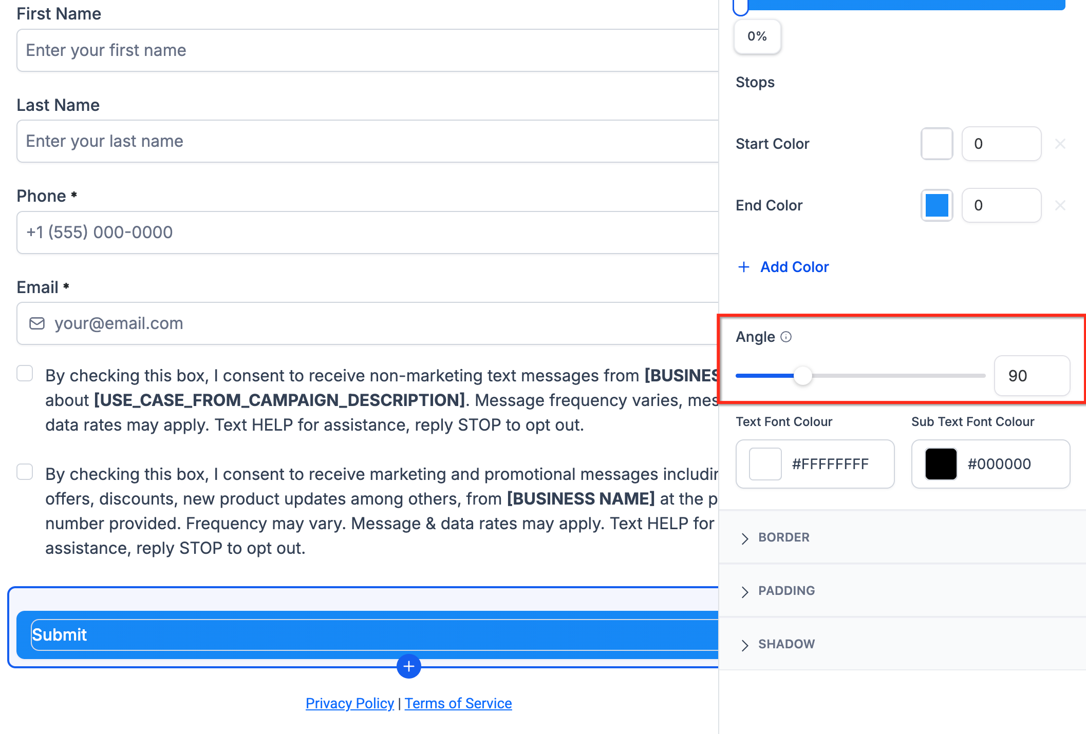
Some gradient types support an adjustable angle, which controls the direction the colors flow across the button (left to right, top to bottom, or diagonally).
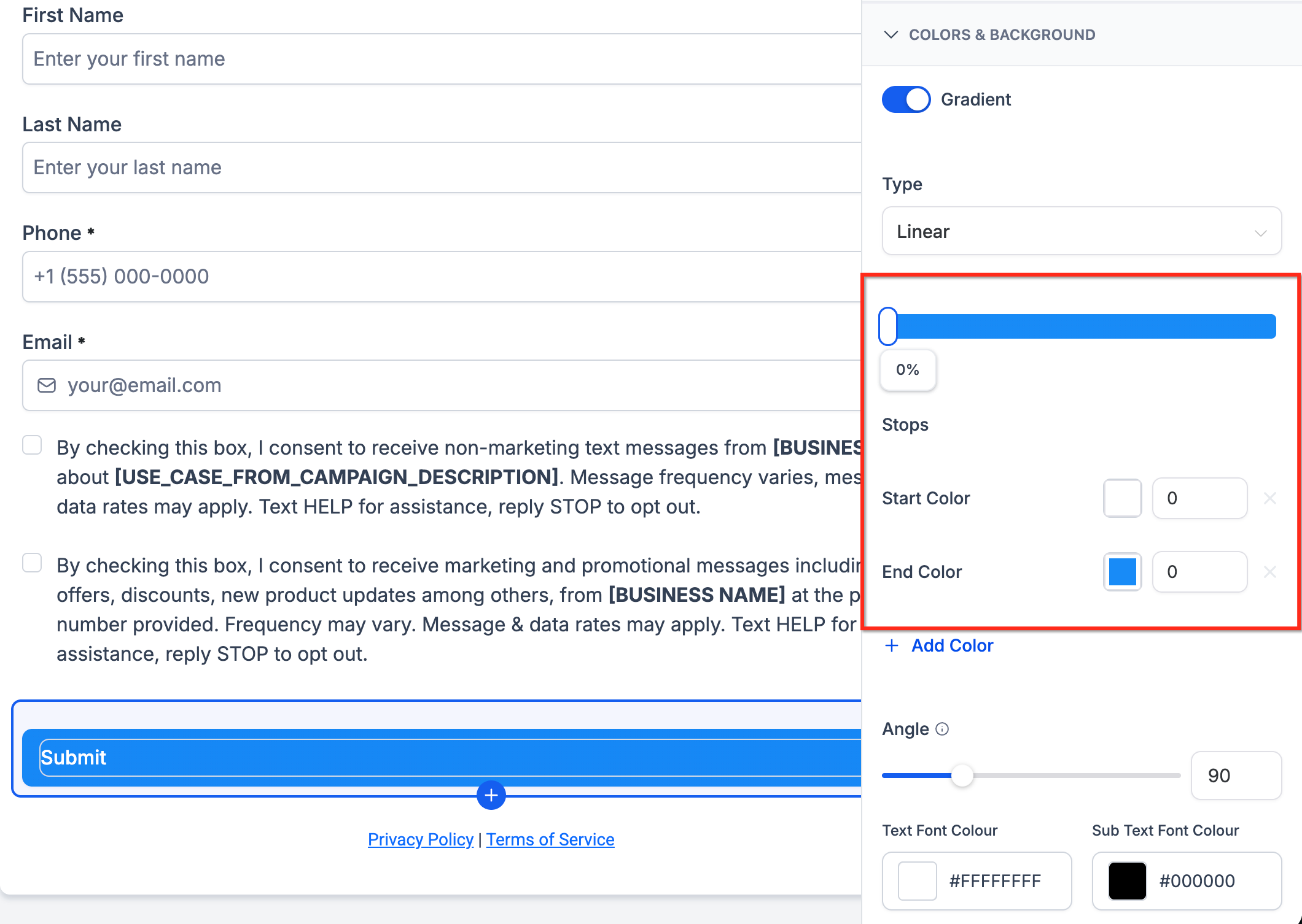
Color Stops define the colors used in the gradient and where each one appears in the blend. Adding multiple color stops lets you:
Add two or more colors to the button background
Adjust how strongly each color appears
Create smoother or more customized transitions
Match your practice's brand colors more precisely
Open the quiz in the Quiz Builder and select the button element you want to customize.
Open the button style settings.
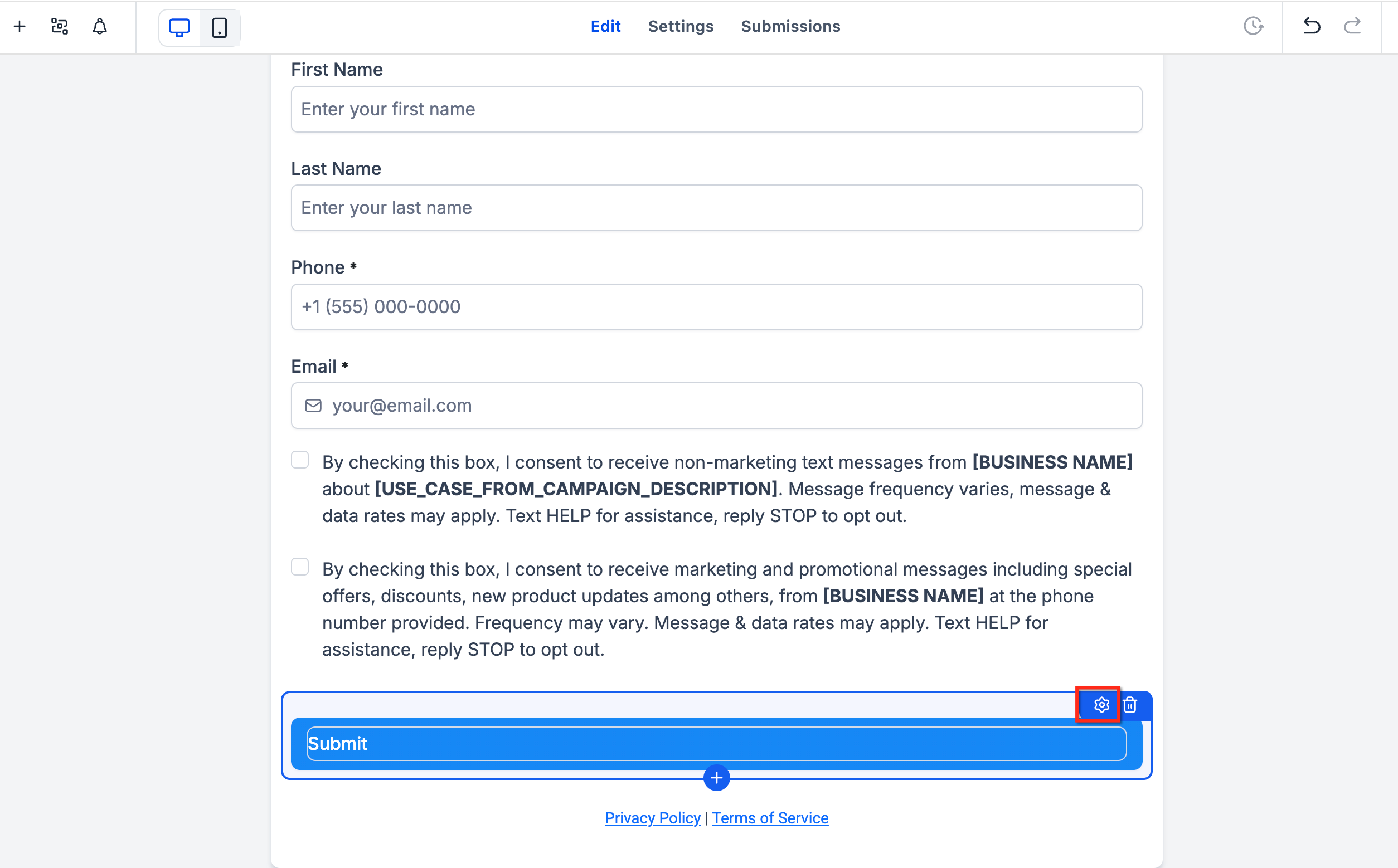
Locate the Button Background section.
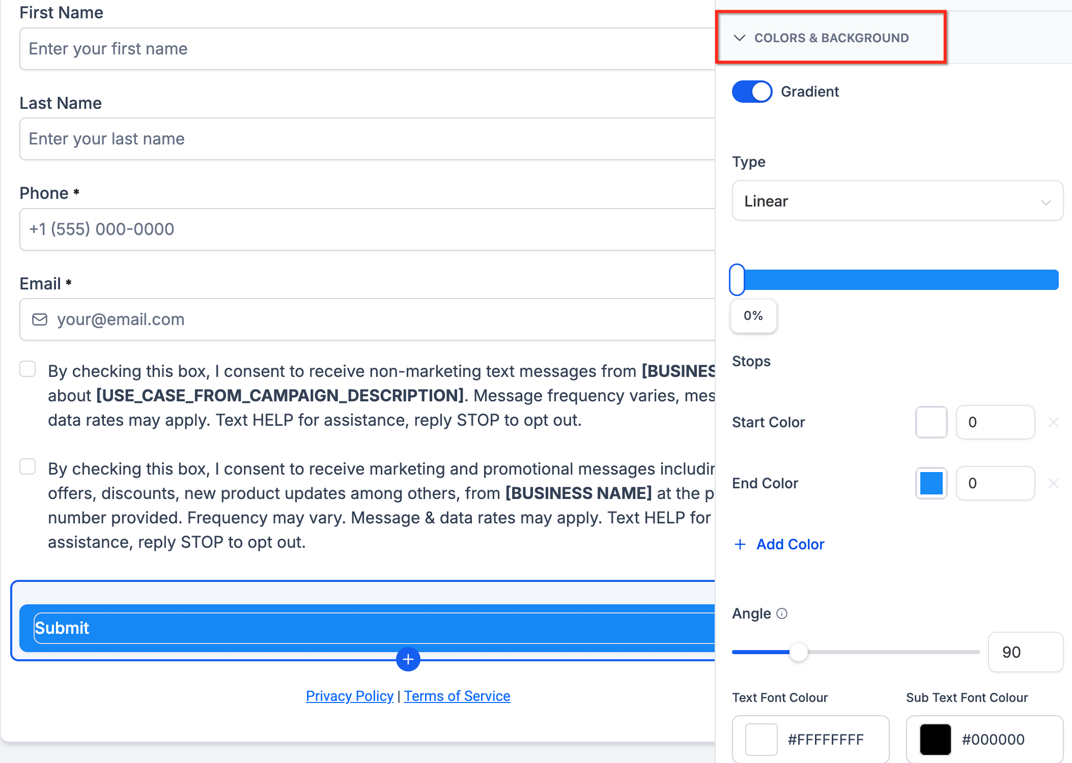
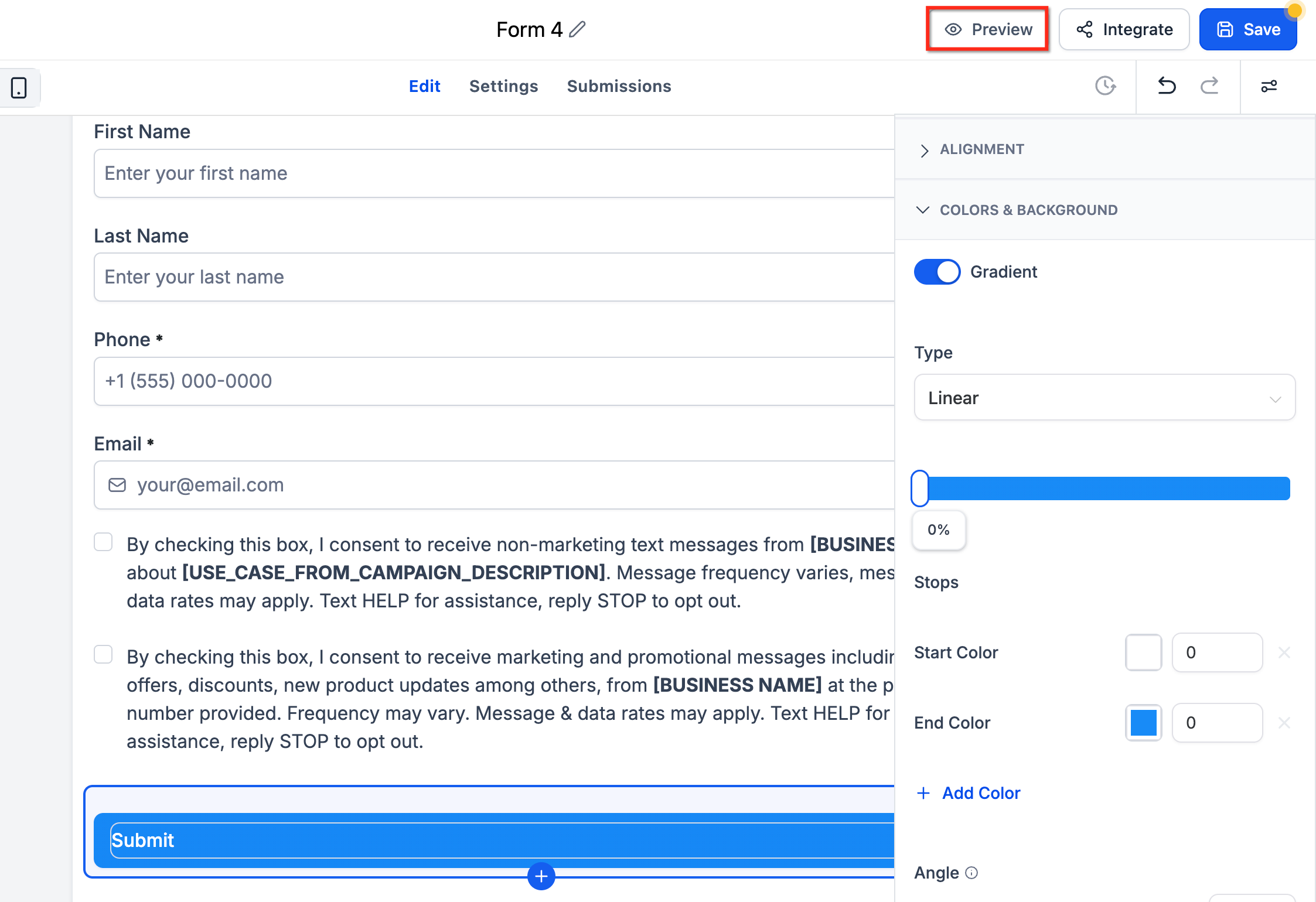
Choose Gradient instead of Solid Color.
Select the gradient type (linear, radial, or angular).
Add or edit the gradient color stops.
Adjust the gradient angle, if the selected gradient type supports angle customization.
Preview the quiz to confirm the button appears as expected.
Save or publish your changes.
Switching a button to a gradient background does not affect any other buttons in the quiz. Existing solid-color buttons keep working exactly as they did before, so you can mix and match as needed.
For styling that goes beyond the built-in color and gradient controls, such as custom border radii, shadows, or font tweaks, you can add your own CSS.
Option 1: Inside the quiz (recommended). This is the method to use if you want to style fields, labels, or buttons inside the quiz itself.
Open the quiz in the Quiz Builder.
Click the Styles tab, then Advanced Section → Custom CSS.
Paste your CSS code.
Click Save, then Publish.
For basic spacing above your quiz, use the built-in top-margin control in Styles → Layout before reaching for custom CSS. Save CSS for advanced visual tweaks that aren't available in the Layout panel.
Option 2: On the Funnel or Website page. If your quiz is embedded on a page, open the Funnel or Website in the builder and go to Settings → Custom CSS. This lets you style the container around the quiz (margins, padding, background color), but not the fields or buttons inside it, because the quiz loads inside an iframe.
Option 3: On an external site (like WordPress). Same limitation: you can style the iframe container, but not the quiz fields or buttons inside it.
Input fields
input, textarea, select {
  border: 1px solid #ccc;
  border-radius: 8px;
  padding: 10px;
  font-size: 16px;
}
input:focus, textarea:focus {
  border-color: #7C3AED;
  box-shadow: 0 0 4px rgba(124, 58, 237, 0.3);
}
Submit button
button[type="submit"] {
  background-color: #7C3AED;
  color: white;
  padding: 12px 20px;
  border: none;
  border-radius: 8px;
  font-size: 16px;
  cursor: pointer;
}
button[type="submit"]:hover {
  background-color: #6931d4;
}
Labels and errors
label {
  font-weight: 600;
  color: #111827;
}
.error-message {
  color: #DC2626;
  font-size: 14px;
}
Quiz progress bar
.progress-bar .fill {
  background-color: #7C3AED;
  transition: width 0.3s ease;
}
Mobile-friendly styling
@media (max-width: 480px) {
  form {
    padding: 0 10px;
  }
  button[type="submit"] {
    width: 100%;
  }
}You can also style the Previous, Next, and Submit buttons that step patients through a multi-question quiz:
.footer-preview .submit-btn {
  background-color: #28A745;
  color: #FFFFFF;
}
.footer-preview .next-btn {
  background-color: #28A745;
  color: #FFFFFF;
}
.footer-preview .back-btn {
  background-color: #28A745;
  color: #FFFFFF;
}
Swap #28A745 for your own brand color to match your theme.
If your CSS doesn't seem to be working:
Make sure it's added in the Custom CSS area inside the quiz itself, not the page it's embedded on.
Click Publish, then refresh your browser or open the quiz in an incognito window.
Remember that page-level CSS on a Funnel or Website page won't reach the fields or buttons inside the quiz, because the quiz loads in an iframe.
Always Save and Publish after editing CSS.
Right-click and choose Inspect in your browser to find the exact class names you need to target.
Avoid overusing !important.
Check how the quiz looks on both desktop and mobile before publishing.
Paste this into your quiz's Custom CSS box as a starting point, then adjust the colors to match your practice's brand:
input, textarea, select {
  width: 100%;
  border: 1px solid #D0D5DD;
  border-radius: 8px;
  padding: 10px;
}
label {
  font-weight: 600;
  color: #111827;
}
button[type="submit"] {
  background: #7C3AED;
  color: #fff;
  padding: 12px 18px;
  border: none;
  border-radius: 8px;
  cursor: pointer;
}
button[type="submit"]:hover {
  background: #6931d4;
}
Once applied, your quiz will use your custom styles, clean, branded, and responsive across devices.
Will changing my primary color affect all my quizzes, forms, and surveys? Yes. Any quiz, form, or survey using default styling updates automatically when you change your account's primary color.
Can I set a different primary color for just one quiz? Not currently. The primary color applies across all quizzes, forms, and surveys under your account.
Can I turn off the hover or focus color effects? No. These effects are built in to improve clarity and usability for patients filling out the quiz, and they carry over to mobile devices as well.
Can my buttons use a different color than my primary color? Yes. Leave the "Map Primary color to Button color" toggle off and style buttons separately through your theme or custom CSS.
Why aren't my Brand Board colors showing up in the color picker? Confirm that your Brand Board has saved colors and that the correct default Brand Board is set as your account default.
What's the difference between Brand Colors and Global Custom Colors? Brand Colors come from your Brand Board's approved palette. Global Custom Colors are separate reusable colors you manage from Brand Settings and can use across any supported color picker.
Will switching my default Brand Board automatically restyle my existing quizzes? No. Existing quizzes keep their current styling until you open them and update the colors manually.
Do I need custom CSS to create a gradient button? No. Standard gradient backgrounds are fully configurable from the button settings. Custom CSS is only needed for advanced styling that isn't available through the built-in controls.
Can I use more than two colors in a gradient? Yes. You can add and edit multiple color stops to build a more customized blend.
Will switching a button to a gradient background break my other buttons? No. Existing solid-color buttons keep working exactly as before. You choose the background type per button.
