Dashboard widgets are the building blocks of your Aesthetix CRM Dashboard. Each widget pulls live data from your account (leads, booked consults, revenue, pipeline value, conversion rates, channel attribution) and displays it as a card, chart, or table so you can see how your practice is performing at a glance.
Widgets are customizable tools that simplify data visualization and reporting. Rather than digging through Contacts, Opportunities, or Payments to find a number, you add the metric you care about straight to your Dashboard.
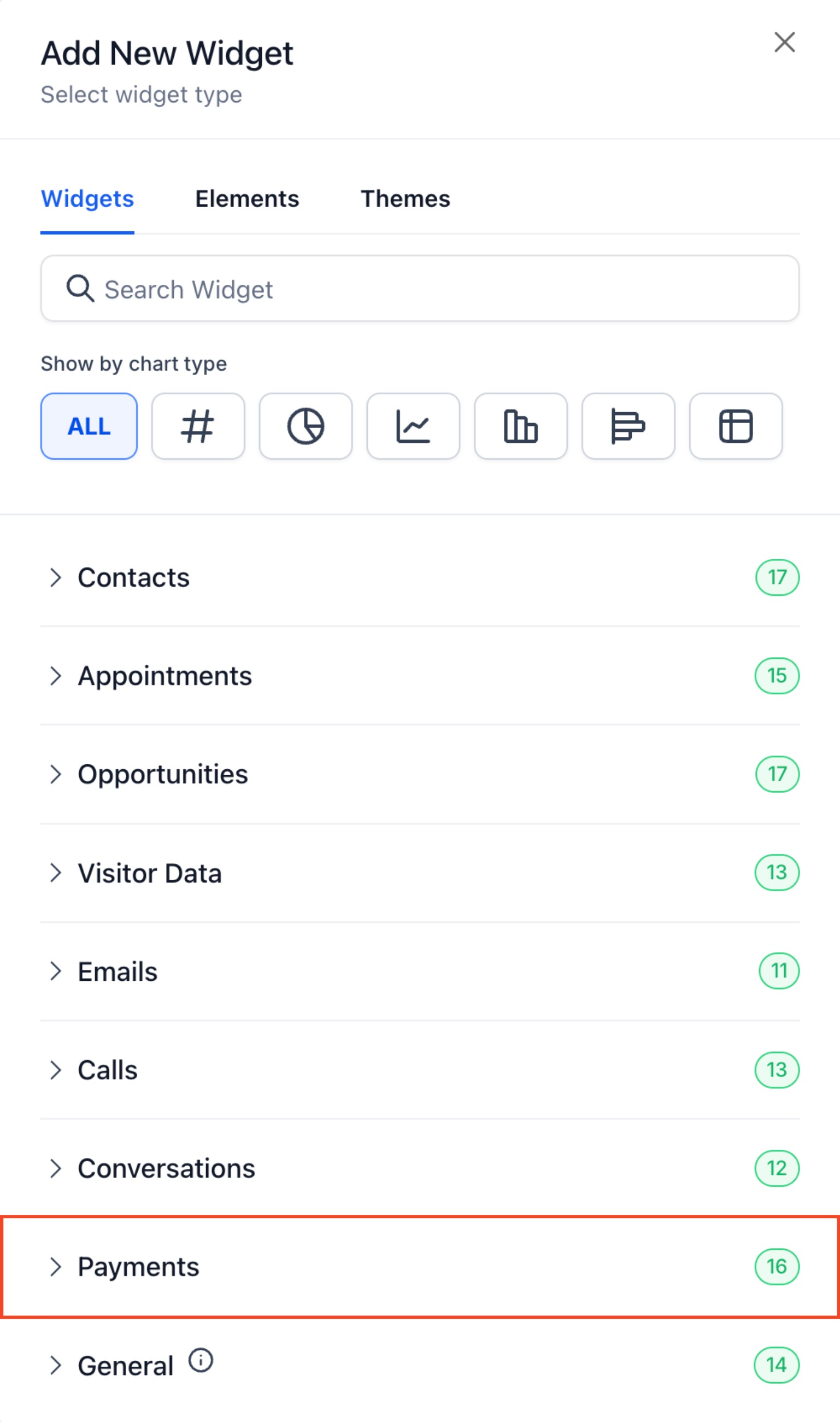
To add one, open your Dashboard and click Add Widget in the top right corner. You can use predefined widgets or build custom ones tailored to your practice, and edit mode lets you rearrange, resize, or remove widgets at any time.
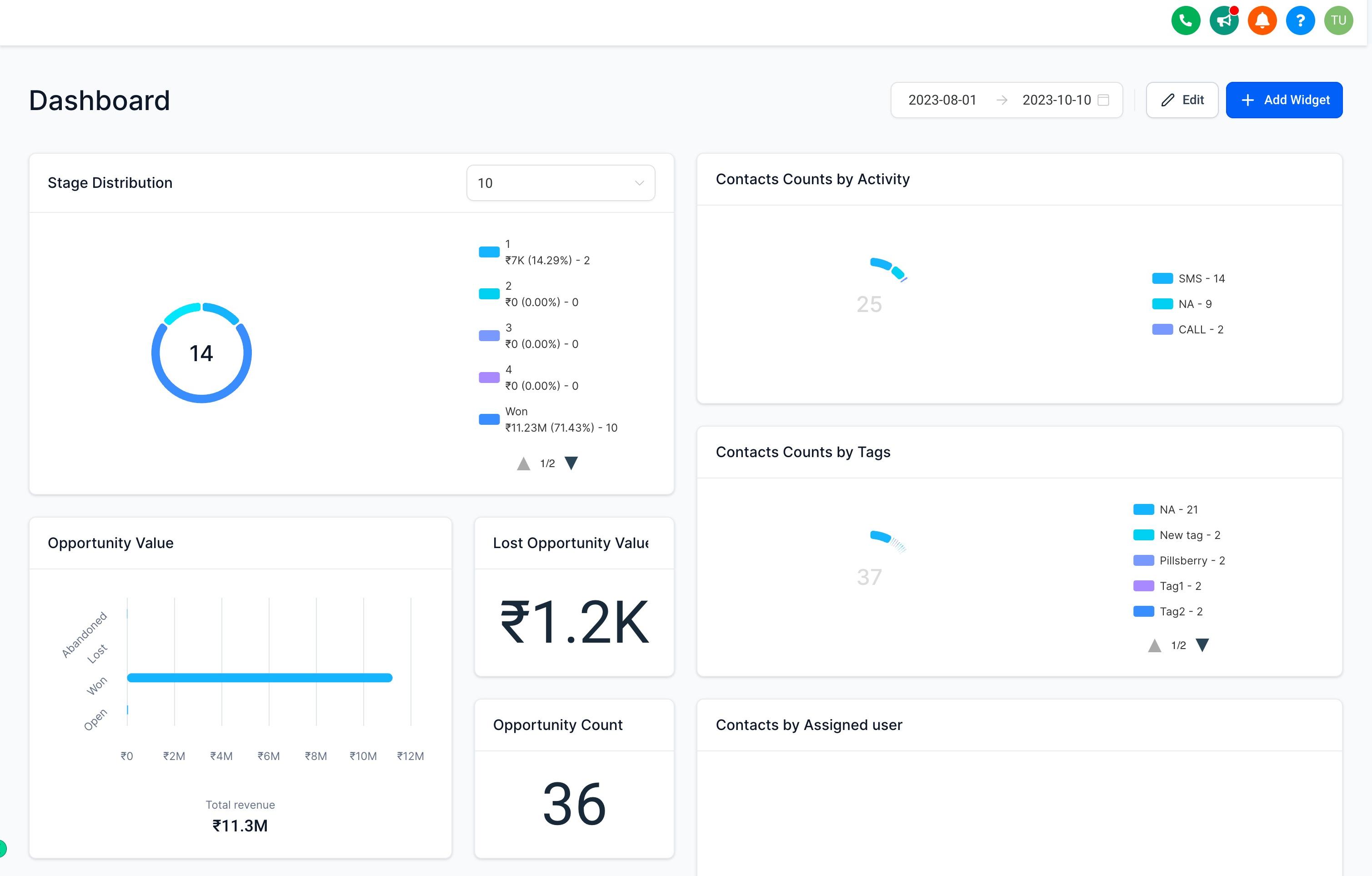
Widgets are organized into categories so you can find the right one quickly instead of scrolling through a long list.
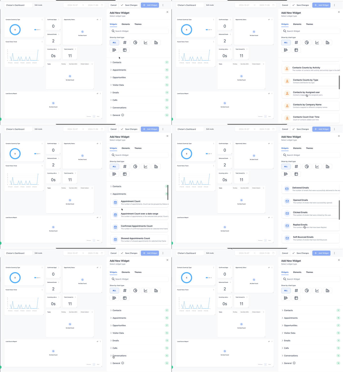
Category | What It Covers |
|---|---|
Contacts | Manage and analyze new leads and existing patient contacts. |
Appointments | Track and optimize consults and appointments with your team and patients. |
Opportunity | See deal status and monetary value across your pipelines. |
Visitor Data | Overview of funnel and website visitor activity. |
Emails | View email campaign activity. |
Calls | Detailed insight into call activity. |
Conversations | Track conversation volume and response data. |
General | Predefined data and performance reports pulled from various platforms, including ad networks and analytics tools. |
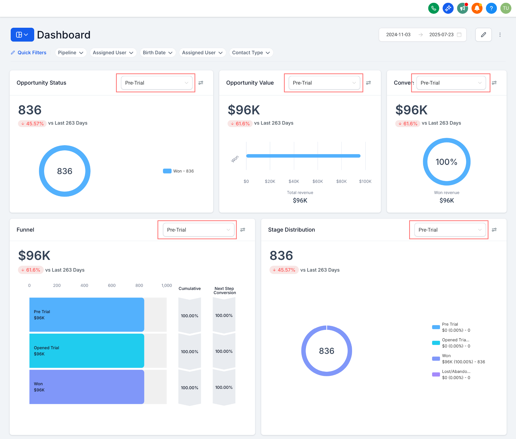
A set of General widgets include a Pipeline dropdown built into the widget itself, so you can view metrics for a single pipeline instead of combined results across every pipeline you run. This applies to:
Opportunity Status
Opportunity Value
Conversion Rate
Lead Source Report
Sales Efficiency
Each widget can display its data as one of the following chart types:
Numeric/Count: a simple number, useful for a single headline figure.
Donut chart: the number inside the donut changes based on the metric you select, such as average or maximum.
Line chart: shows a series of points connected over time, good for tracking trends.
Bar chart: compares numerical values using the length of vertical bars.
Horizontal bar chart: compares values across categories using horizontal bars.
Table: shows organized, detailed data in rows and columns.
For chart types that summarize a number, you can choose how that number is calculated:
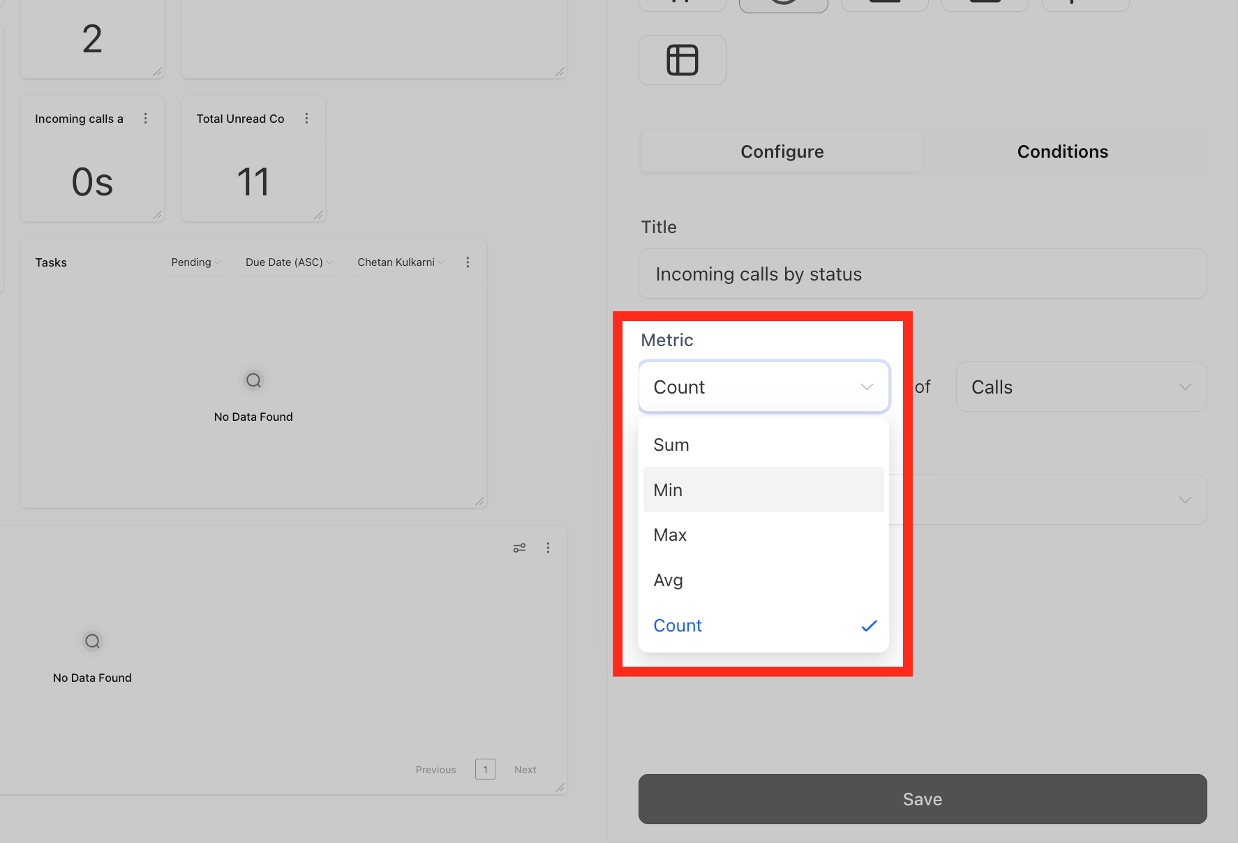
Sum
Min
Max
Avg
Count
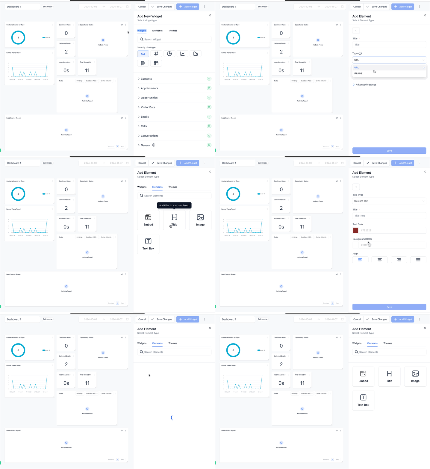
Elements let you add extra context to your Dashboard beyond the widgets themselves. Use titles or headings to organize sections and group related widgets, add textboxes for notes or reminders to your team, and embed images like your practice logo or an infographic for context.
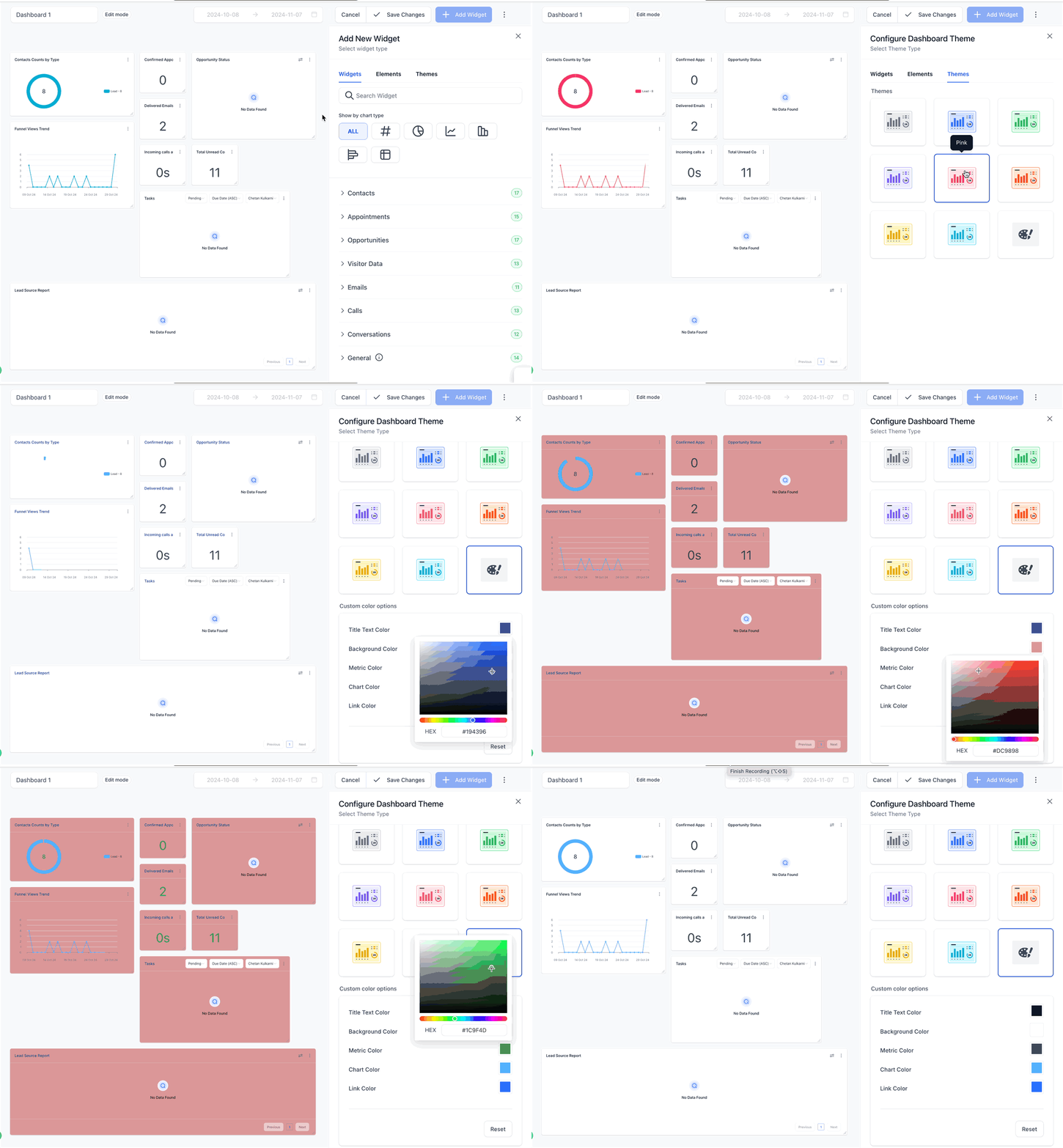
Themes control the appearance of your entire Dashboard or of individual widgets. Choose from a set of predefined themes, or build a custom theme with your own colors to match your practice's branding.
The tables below list every predefined widget available in each category and what it measures. Use this as a reference when deciding which widgets to add to your Dashboard.
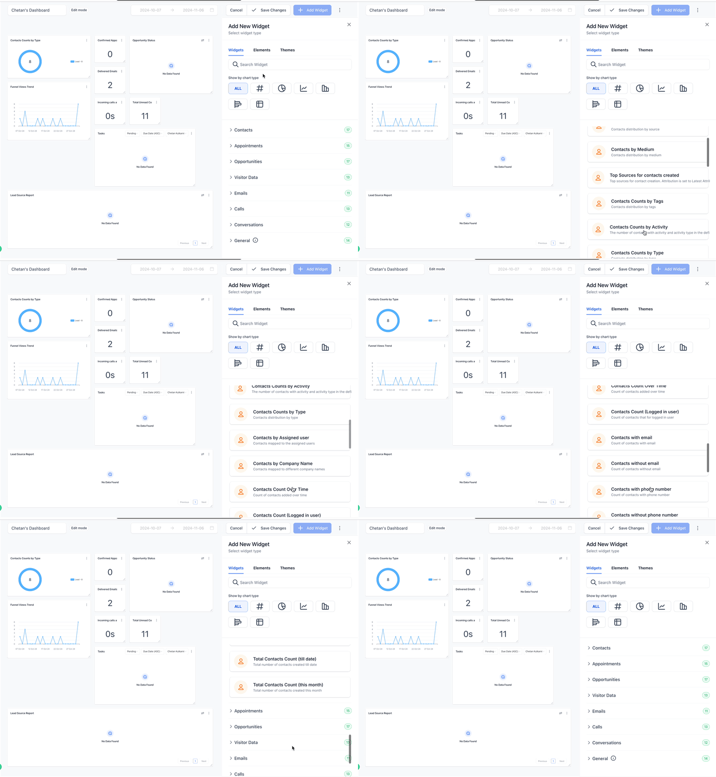
Widget | What It Shows |
|---|---|
Contact Count | Total number of contacts for the team. |
Contact Count (Logged in User) | Contacts assigned to the logged-in user. |
Contacts by Tags | Distribution of contacts by tag. |
Contacts by Activity | Contacts with specific activity over a chosen time period. |
Contacts by Type | Distribution of contacts by contact type. |
Contacts by Assigned User | How contacts are mapped to team members. |
Contacts by Company Name | Distribution of contacts by company name. |
Contacts with Email | Count of contacts with an email address on file. |
Contacts without Emails | Count of contacts missing an email address. |
Contacts with Phone Numbers | Count of contacts with a phone number on file. |
Contacts without Phone Numbers | Count of contacts missing a phone number. |
Total Contacts Count (Till Date) | Snapshot of total contacts created to date. |
Total Contacts Count (This Month) | Total contacts created this month. |
Contacts Count (Logged in User) | Contacts associated with the logged-in user. |
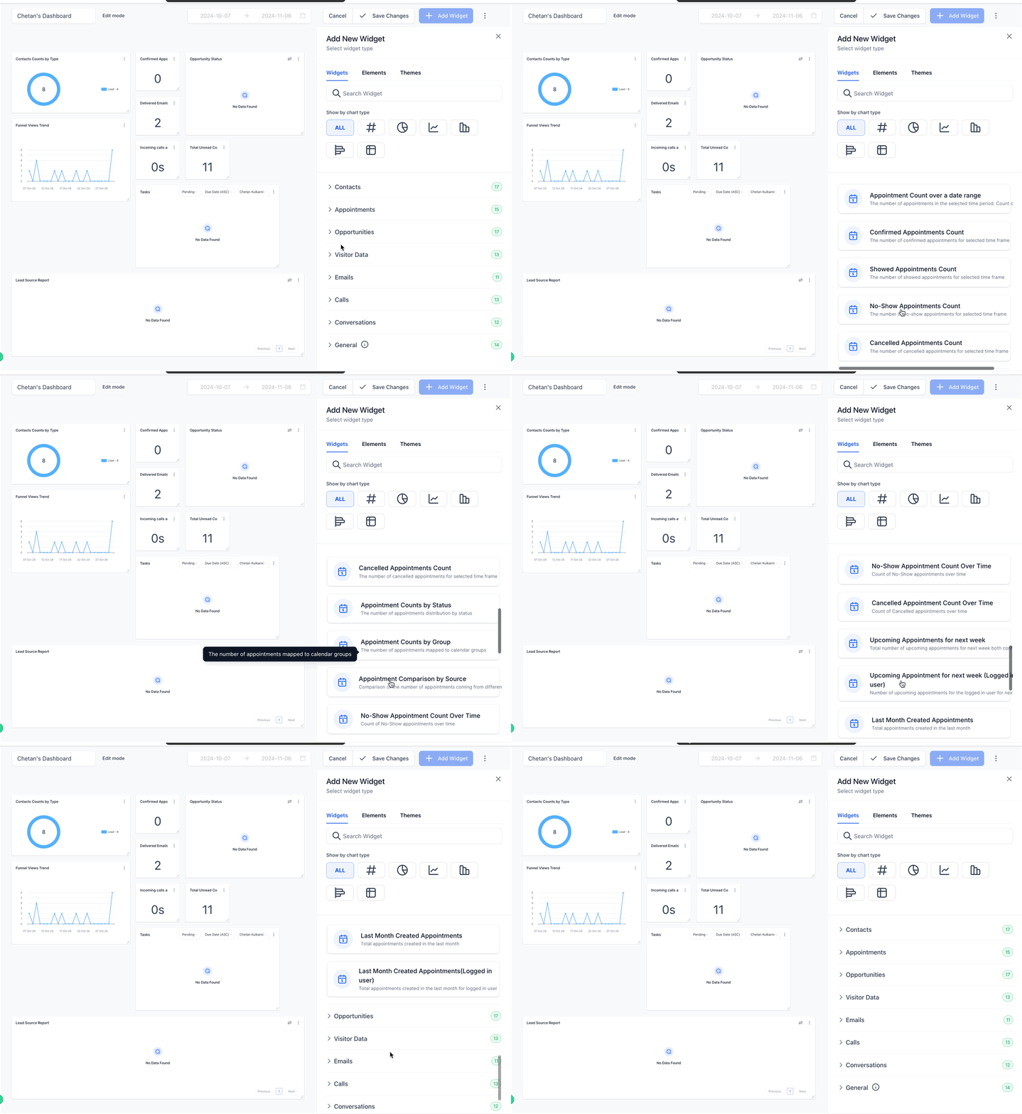
Widget | What It Shows |
|---|---|
Appointment Count | Total appointments, grouped by status or assignee. |
Appointment Count over a Date Range | Appointments in a selected time period. |
Appointment Counts by Status | Distribution of appointments by status. |
Booked Appointments | Number booked in a selected date range. |
Confirmed Appointments | Number confirmed in a selected time frame. |
Showed Appointments | Number of appointments where the patient showed up. |
No Show Appointments | Number marked as no show. |
Cancelled Appointments | Cancelled and invalid appointments. |
No Show Rate Over Time | No show trend over time. |
Upcoming Appointments (Week) | Total scheduled for the week ahead. |
Upcoming Appointment (Logged in User) | Upcoming appointments for the logged-in user. |
Past Month Created Appointments | Total appointments created in the past month. |
Past Month Created Appointments (Logged in User) | Past month appointments created by the logged-in user. |
Upcoming Appointments (Logged in User) | Upcoming appointments tailored to the logged-in user. |
Upcoming Appointments for Next Week | Appointments for next week, including confirmed and unconfirmed bookings. |
These widgets pull directly from your Calendars, so they're a fast way to keep an eye on booked consults without leaving your Dashboard.
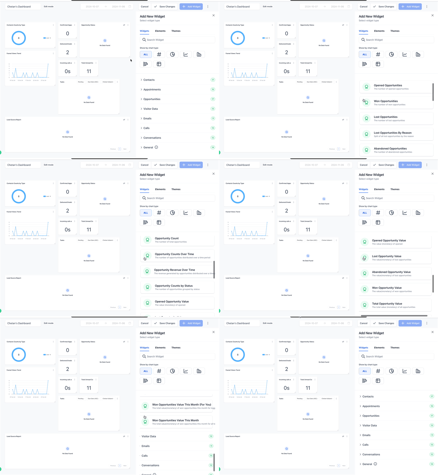
Widget | What It Shows |
|---|---|
Opened Opportunities | Currently open opportunities. |
Won Opportunities | Opportunities successfully closed as deals. |
Lost Opportunities | Opportunities that did not convert. |
Abandoned Opportunities | Opportunities left without action. |
Opportunity Count | Total opportunities overview. |
Opportunity Counts Over Time | Opportunity distribution over time. |
Opportunity Revenue Over Time | Revenue generated by opportunities over time. |
Opportunity Counts by Status | Opportunities categorized by status. |
Opened Opportunity Value | Monetary value of opportunities in progress. |
Lost Opportunity Value | Value of lost opportunities. |
Abandoned Opportunity Value | Value of abandoned opportunities. |
Won Opportunity Value | Value of converted opportunities. |
Total Opportunity Value | Cumulative value of all opportunities. |
Lost Opportunities By Reason | Split of lost opportunities by reason. |
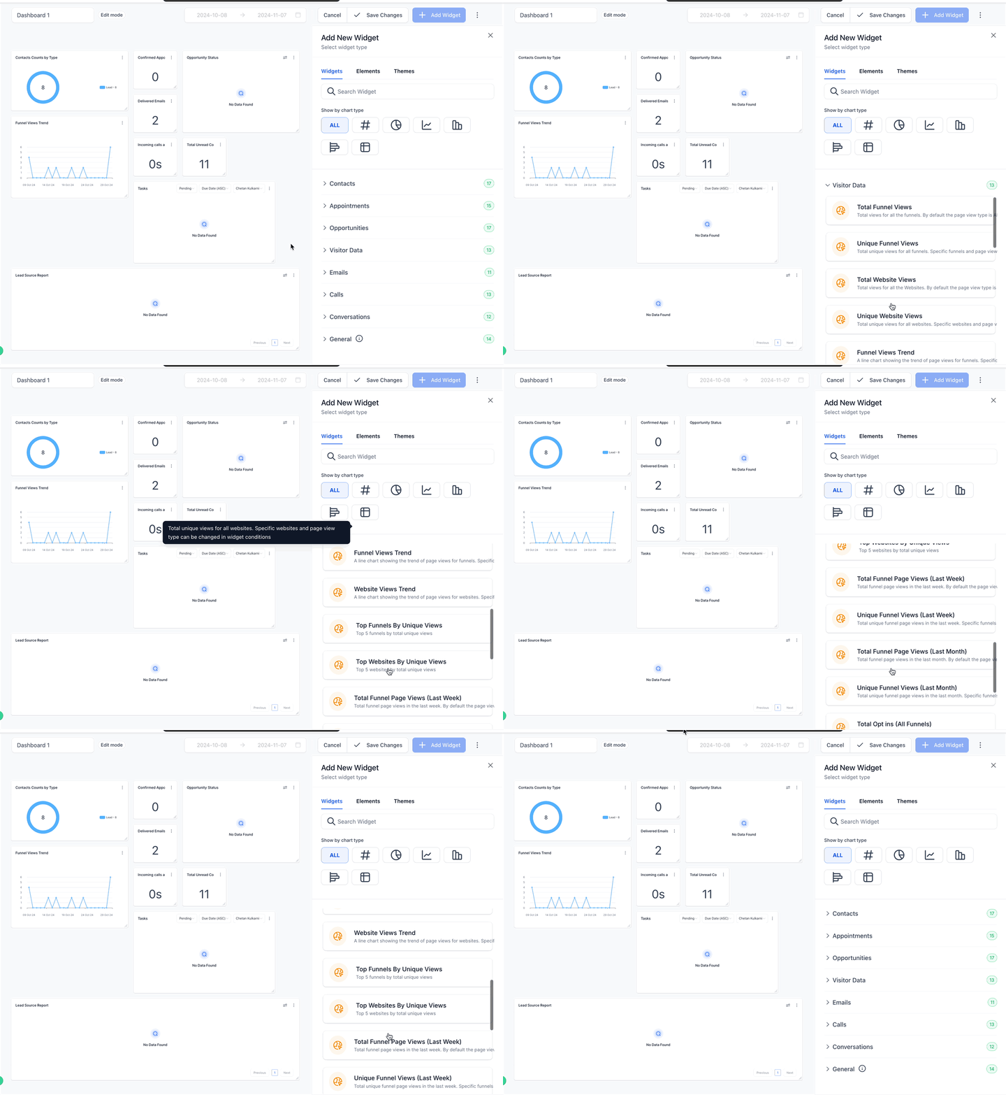
Widget | What It Shows |
|---|---|
Total Funnel Views | All funnel views, customizable by funnel and page type. |
Unique Funnel Views | Unique funnel visitors. |
Total Website Views | Total views across all websites. |
Unique Website Views | Unique website visitors. |
Funnel Views Trend | Line chart of funnel views over time. |
Website Views Trend | Line chart of website views over time. |
Top Funnels by Unique Views | Top 5 funnels by unique views. |
Top Websites by Unique Views | Top 5 websites by unique visitors. |
Total Funnel Page Views (Last Week) | Funnel views from the last week. |
Unique Funnel Views (Last Week) | Unique funnel visitors from the last week. |
Total Funnel Page Views (Last Month) | Funnel views from the last month. |
Unique Funnel Views (Last Month) | Unique funnel visitors from the last month. |
Total Opt-ins (All Funnels) | Total opt-ins across all funnels. |
These widgets reflect the same traffic data covered in Funnels and Websites, so use them for a quick top-line view rather than a replacement for that reporting.
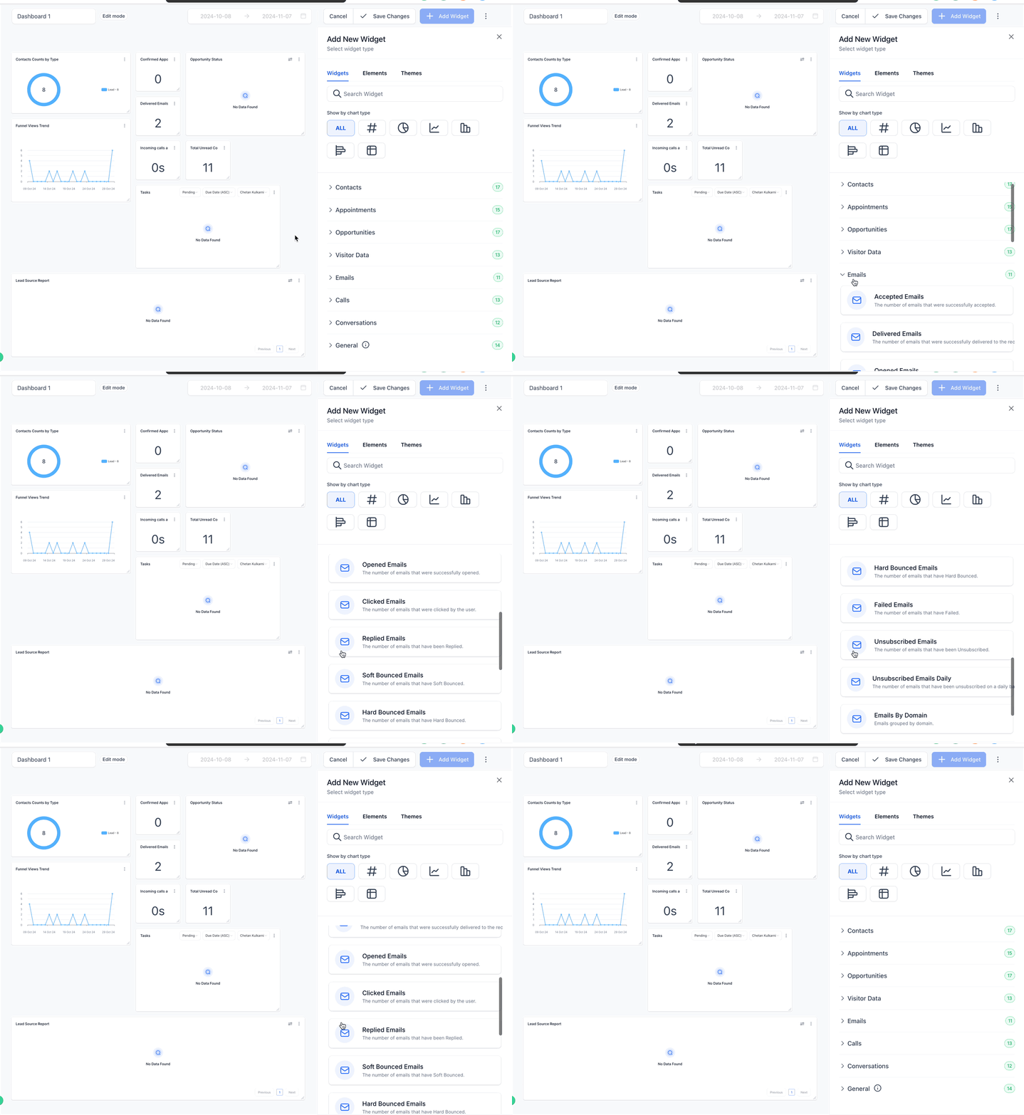
Widget | What It Shows |
|---|---|
Accepted Emails | Emails successfully accepted. |
Delivered Emails | Emails delivered to recipients. |
Opened Emails | Emails opened by recipients. |
Clicked Emails | Emails where links were clicked. |
Replied Emails | Emails that received replies. |
Soft Bounced Emails | Emails with soft bounces. |
Hard Bounced Emails | Emails with hard bounces. |
Failed Emails | Failed email deliveries. |
Unsubscribed Emails | Recipients who unsubscribed. |
Unsubscribed Emails Daily | Daily count of unsubscribes. |
Emails By Domain | Emails grouped by recipient domain. |
If you use a table chart for Email Widgets, the Source Action Name column helps trace an email back to where it came from. For emails sent from a workflow, Source Action Name shows the workflow step name, making it easy to connect an email record back to the workflow that sent it.
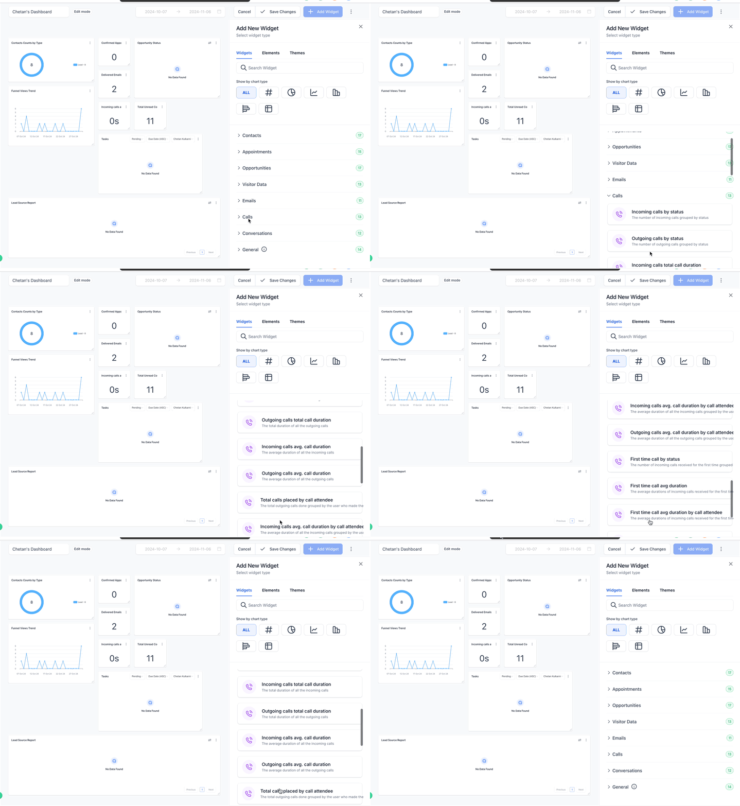
Widget | What It Shows |
|---|---|
Incoming Calls by Status | Incoming calls grouped by status. |
Outgoing Calls by Status | Outgoing calls grouped by status. |
Incoming Calls Total Call Duration | Total duration of all incoming calls. |
Outgoing Calls Total Call Duration | Total duration of all outgoing calls. |
Incoming Calls Avg. Call Duration | Average duration of incoming calls. |
Outgoing Calls Avg. Call Duration | Average duration of outgoing calls. |
Total Calls Placed by Call Attendee | Total outgoing calls grouped by the team member who placed them. |
Incoming Calls Avg. Call Duration by Call Attendee | Average incoming call duration by attending team member. |
Outgoing Calls Avg. Call Duration by Call Attendee | Average outgoing call duration by calling team member. |
First Time Call by Status | First-time incoming calls, grouped by status. |
First Time Call Avg Duration | Average duration of first-time incoming calls. |
First Time Call Avg Duration by Call Attendee | Average duration of first-time incoming calls by attending team member. |
First Time Call Total Duration | Total duration of first-time incoming calls. |
A "call attendee" is the team member who participated in the call, whether they made it or received it from a patient.
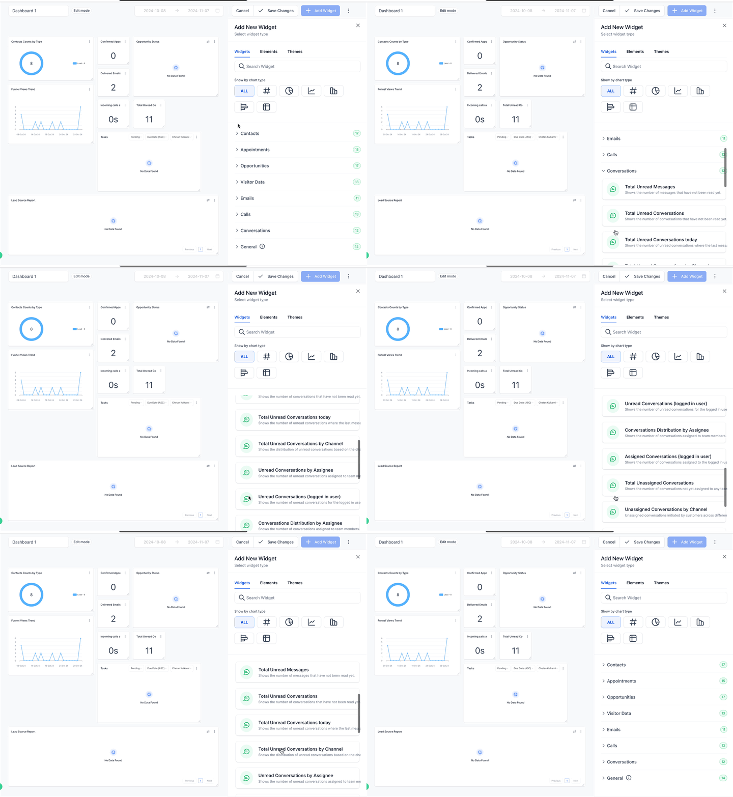
Widget | What It Shows |
|---|---|
Total Unread Conversations | Number of unread conversations. |
Total Unread Conversations Today | Unread conversations where the last message came in today. |
Total Unread Conversations by Channel | Unread conversations by the patient's last-message channel. |
Unread Conversations by Assignee | Unread conversations assigned to team members. |
Unread Conversations (Logged in User) | Unread conversations for the logged-in user. |
Conversations Distribution by Assignee | Conversations assigned to team members. |
Assigned Conversations (Logged in User) | Conversations assigned to the logged-in user. |
Total Unassigned Conversations | Conversations not assigned to any team member. |
Unassigned Conversations by Channel | Unassigned conversations broken out by channel. |
New Conversations Started (This Week) | Conversations started this week. |
Payment widgets group into a few themes: revenue and trends, customer and payment performance, revenue breakdown, discounts and invoices, and refund insights.
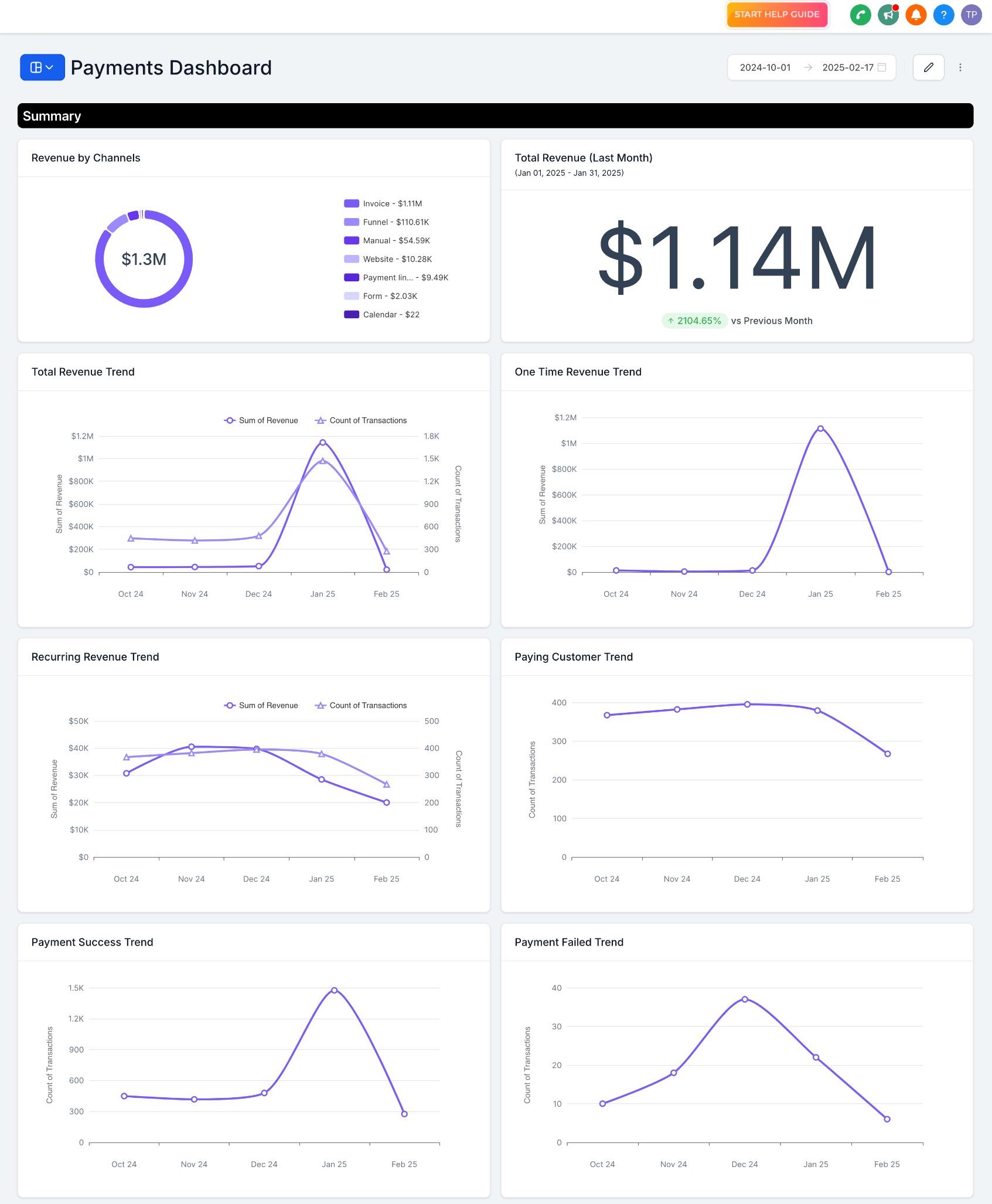
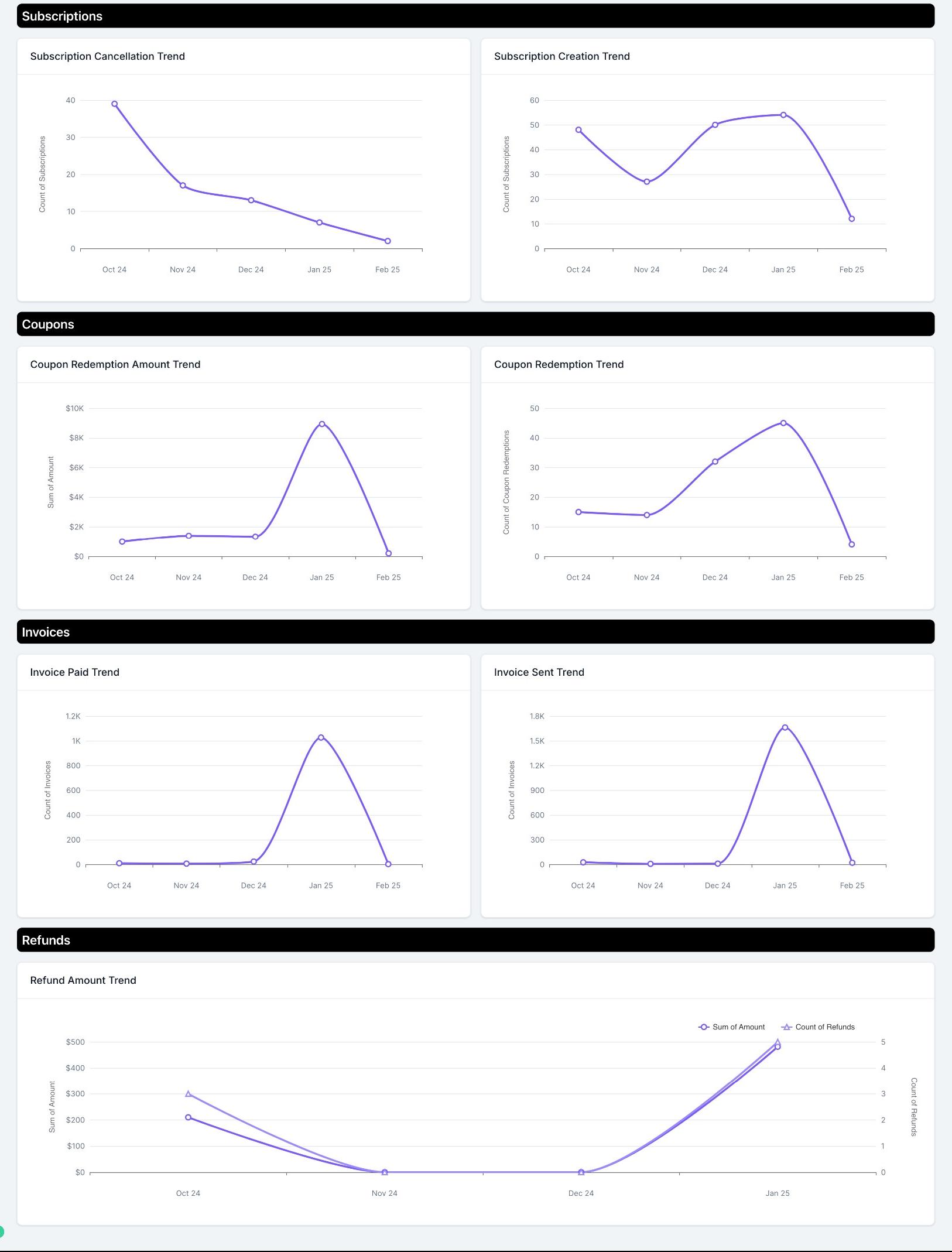
Widget | What It Shows |
|---|---|
Total Revenue (Last Month) | Total revenue generated in the last month. |
Total Revenue Trend | Monthly total revenue trend. |
One-Time Revenue Trend | Monthly trend for one-time payments. |
Recurring Revenue Trend | Monthly trend for recurring payments. |
Paying Customer Trend | Monthly trend of paying patients. |
Payment Success Trend | Monthly trend of successful payments. |
Payment Failed Trend | Monthly trend of failed payments. |
Revenue by Channels | Revenue breakdown by payment channel. |
Subscription Creation Trend | Monthly trend of new subscriptions. |
Subscription Cancellation Trend | Monthly trend of canceled subscriptions. |
Coupon Redemption Trend | Monthly trend of coupon redemptions. |
Coupon Redemption Amount Trend | Monthly trend of discount amounts applied. |
Invoice Sent Trend | Monthly trend of invoices sent. |
Invoice Paid Trend | Monthly trend of invoices paid. |
Refund Trend | Monthly trend of refunds issued. |
Refund Amount Trend | Monthly trend of total refund amounts. |
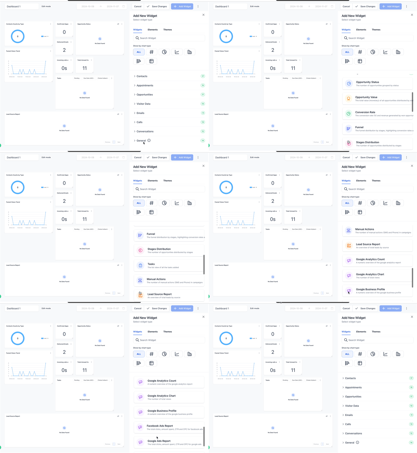
Widget | What It Shows |
|---|---|
Opportunity Status | Visualizes opportunity status. |
Opportunity Value | Total opportunity value by status. |
Conversion Rate | Conversion rate and revenue from won opportunities. |
Funnel | Detailed view of your sales funnel and conversion rates by stage. |
Stages Distribution | How opportunities are distributed among pipeline stages. |
Tasks | Tasks added and which team member they're assigned to. |
Manual Actions | Manual actions such as SMS and phone calls logged in campaigns. |
Lead Source Report | Total leads broken out by source. |
Google Analytics Count | Total views tracked in Google Analytics. |
Google Analytics Chart | Total views and interactions on your website. |
Google Business Profile | Google Business Profile metrics. |
Facebook Ads Report | Clicks, spend, CTR, and CPC for Facebook ads. |
Google Ads Report | Clicks, spend, CTR, and CPC for Google ads. |
Sales Efficiency | Sales efficiency across your opportunities. |
Custom dashboards, widgets, and custom reports are available on higher-tier Aesthetix CRM plans. If you don't see the Add Widget option, check with your account team about your current plan.
Which plans include dashboard widgets? Custom dashboards, widgets, and custom reports are available on higher-tier Aesthetix CRM plans. Reach out to your account team if you're not sure what your current plan includes.
Why do widget dates and times look different from the rest of Aesthetix CRM? Dashboard widgets currently use a system timezone and date format for consistency across your account. We're working on the ability to switch time and date formats within widgets, so this may change in a future update.
Who can edit or view dashboard widgets? Admins have full edit and view access to the Dashboard. Standard users have view access, and what they can see depends on the permissions set on their user profile.
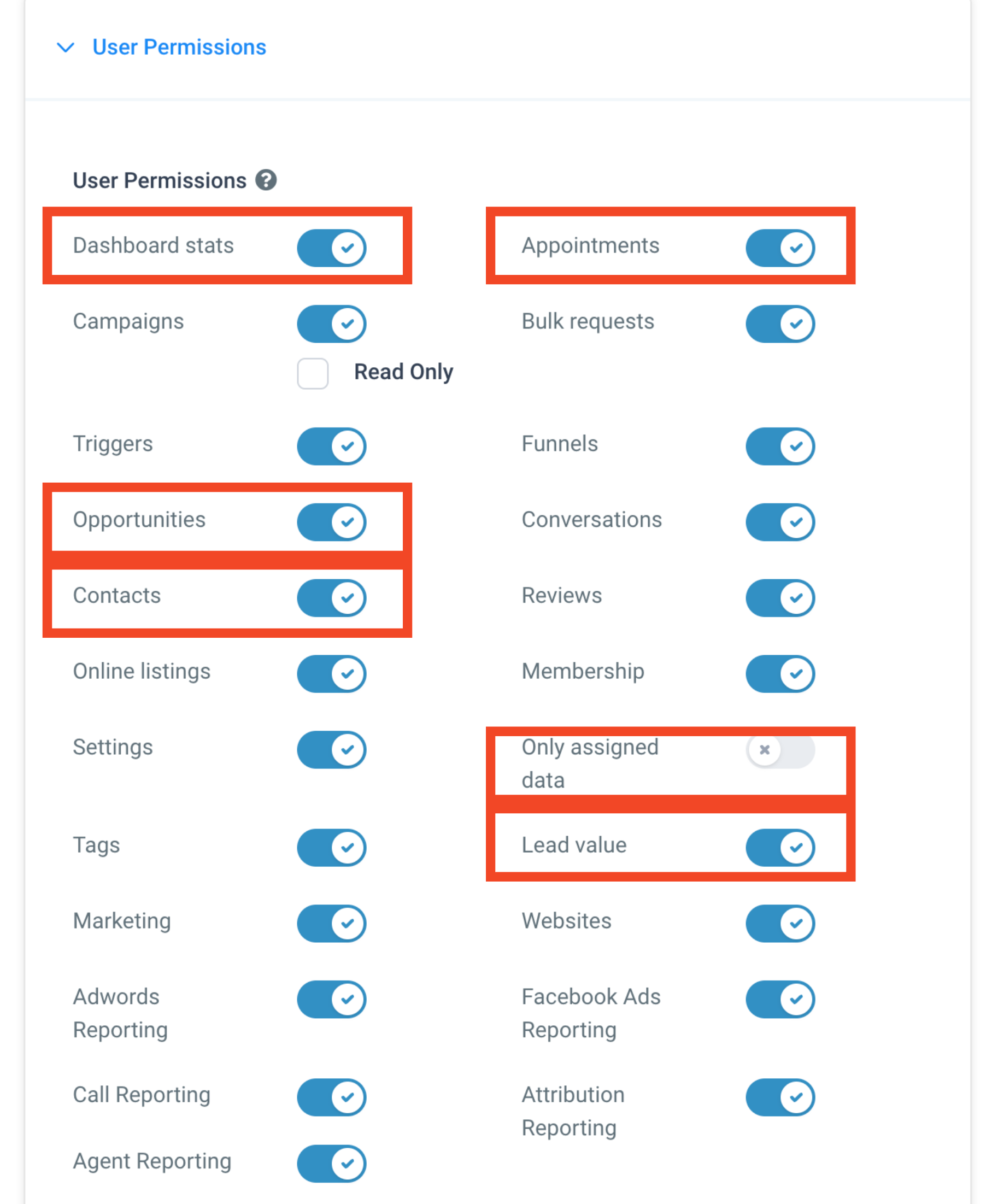
How do I control which team members can see which widgets? Go to Settings > My Staff, click Edit next to the user you want to adjust, and update the User Permissions section. The relevant permissions are:
Permission | What It Controls |
|---|---|
Dashboard Stats | Access to the entire Dashboard (view only for Admins and standard Users). |
Contacts | Access to all contacts and contact-related widgets. |
Opportunity | Access to all opportunities and opportunity-related widgets. |
Appointment | Access to all appointments and appointment-related widgets. |
Lead Value | Access to value (monetary) related widgets on the Dashboard. |
Only Assigned Data | When enabled, custom widgets show no data unless it's assigned to that user. |
Because revenue and patient-volume figures can be sensitive, it's worth reviewing these permissions any time you bring on a new team member.
Can I make a widget show only the logged-in user's own data? Yes. Set a condition on the widget using USER, then LOGGED IN USER, under the widget's conditions tab. This ensures each team member sees only their own data on that widget.
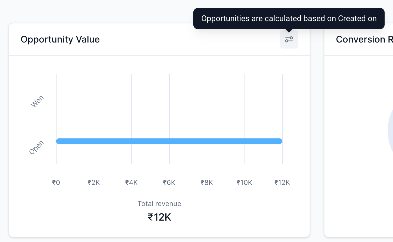
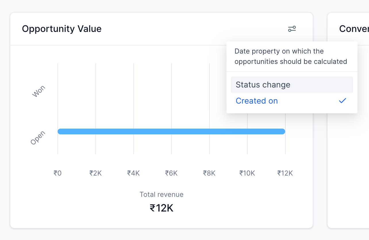
Why do opportunity counts look different than I expect on some widgets? Opportunity widgets use the "Last Status Change" date rather than the "Created" date. If an older opportunity gets updated, it can shift the count shown on a widget, which is why numbers sometimes don't match what you'd expect from creation date alone. To fix this, you can change the date property a widget uses:
For General widgets, click the filter icon on the widget and switch the date property. Changing it on one filter updates it across the other General widget filters automatically.
For higher-tier plans, custom widgets let you set the date property directly in the widget's settings for more control.
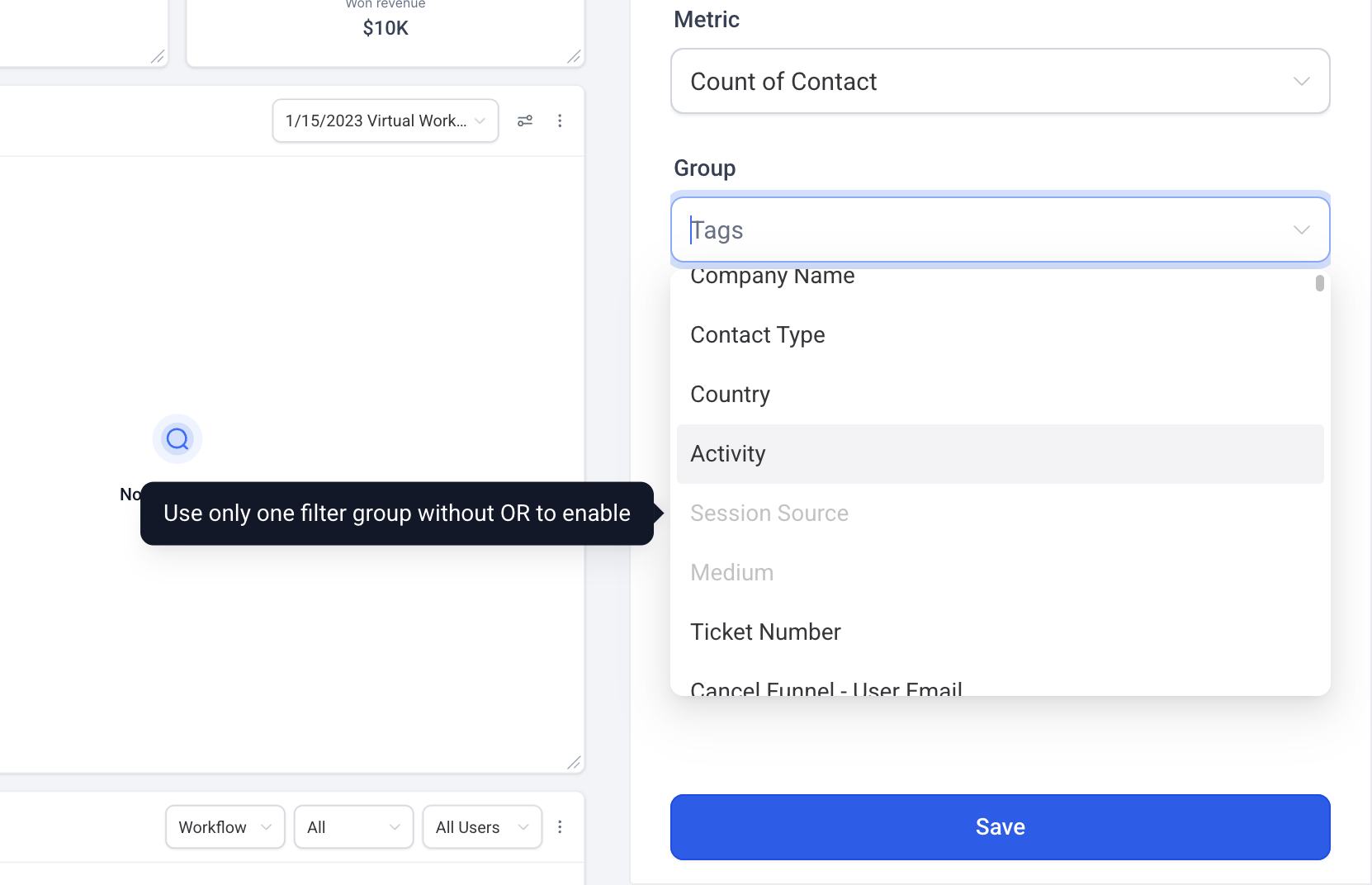
Why can't I select Session Source or Session Medium in the Group By or View By options? This happens when a widget has more than one filter group applied. Session Source and Session Medium grouping requires a single filter group that includes the Attribution Type filter (First Touch or Last Touch). Adding a second filter group disables attribution-based grouping to keep the numbers accurate and consistent.
What's the difference between a widget category and a chart type? A category (like Contacts, Appointments, or Payments) is the area of your practice the widget pulls data from. A chart type (like a bar chart, line chart, or table) is simply how that data gets visualized. You pick the category first, then choose the chart type that best fits the metric.
