Customizing the Product Details Page
The Product Details Page (PDP) is what a prospective patient sees when they click into a specific product in your online store, whether that's a skincare line, a retail add-on, or a gift card. Aesthetix CRM lets you design a default PDP for your store and, when a product needs its own spotlight, build a fully custom page for it. You'll find all of these settings inside Sites > Stores, in the builder for the store you're editing.
This guide covers four related PDP tools: Custom Product Details Pages, product media layouts, product selector styles, and image zoom. Product catalog setup, pricing, taxes, and checkout configuration live in Payments, and connecting an external Shopify or WooCommerce store lives in Integrations, so this guide sticks to how the product page itself looks and behaves.
By default, every product in your store uses one shared PDP layout. A Custom Product Details Page lets you build a dedicated, on-brand page for a single product instead, which is useful for a hero treatment or product line that deserves richer storytelling: before/after style imagery, testimonials, an FAQ block, or a different call-to-action layout.
When a product is mapped to a Custom PDP, any click that would normally land on the default page (from the Product Listing Page, a Featured Product element, or a direct link) automatically routes to the custom page instead. If you ever delete the Custom PDP, the product falls back to the default PDP automatically, so nothing breaks.
Key things to know:
A product can be linked to only one Custom PDP at a time. Assigning it to a new Custom PDP removes the old association automatically.
A new Custom PDP starts as a one-time copy of your current default PDP, including section structure, elements (media, title, price, variants, call-to-action), styling, and desktop/mobile visibility rules. You're editing a full layout, not starting from a blank canvas.
That copy is a snapshot. If you later change your default PDP, existing Custom PDPs do not update to match. Each Custom PDP lives on its own after creation.
Creating a Custom PDP never changes your default PDP, and your other existing Custom PDPs are unaffected.
The Custom PDP has its own page URL. Navigation from the Product Listing Page, Featured Product elements, and product links respects the mapping and takes shoppers to the right page automatically.
Prerequisites: at least one product created and added to your online store, and access to the store's Site Builder.
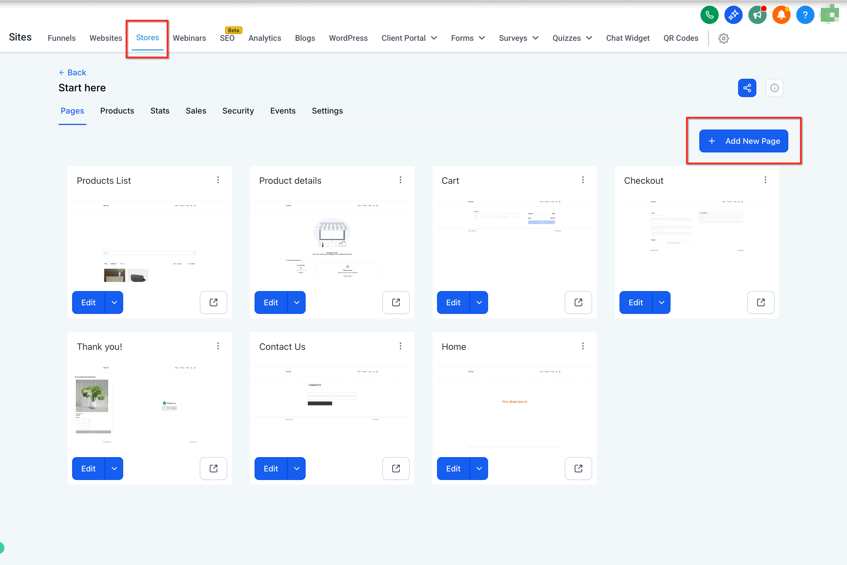
Go to Sites > Stores, select the store, and choose Add New Page.
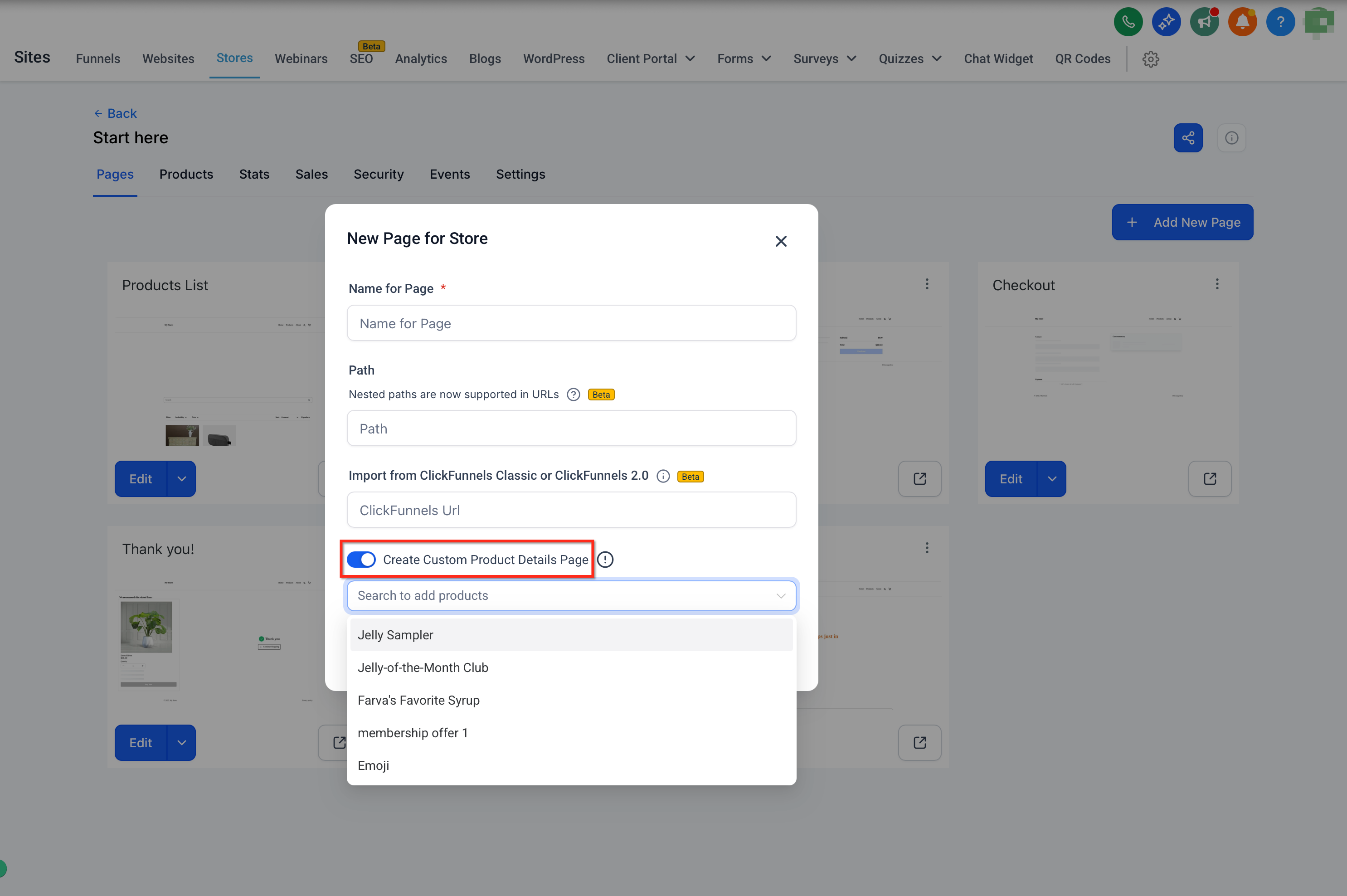
Turn on Custom Product Details Page. In the modal, search for and select the product(s) you want to map to this page.
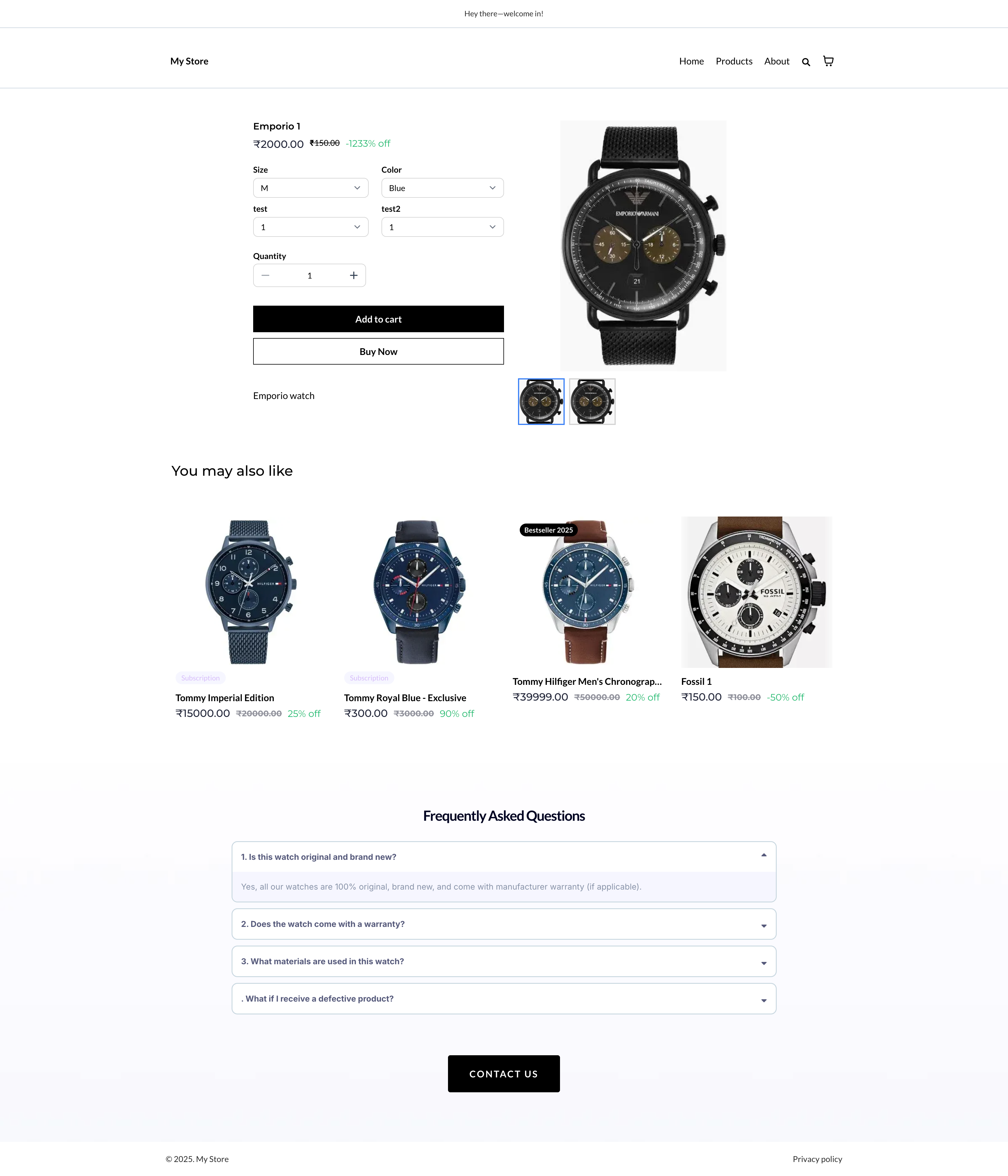
Build the layout using PDP elements such as images, product details, calls-to-action, and Related Products. Since the page starts as a copy of your default PDP, you're customizing an existing layout rather than assembling one from scratch.
Design tips:
Drag in PDP-friendly elements: images, video, features, reviews, and Related Products.
Use Text Customization to adjust labels and messaging across PDP elements.
Keep Add to Cart / Buy Now above the fold, and repeat the call-to-action further down on longer pages.
Reuse blocks and components across product pages so your storefront stays visually consistent.
Click Save and Publish.
During page creation: use the assignment modal shown above to map one or more products to the new Custom PDP.
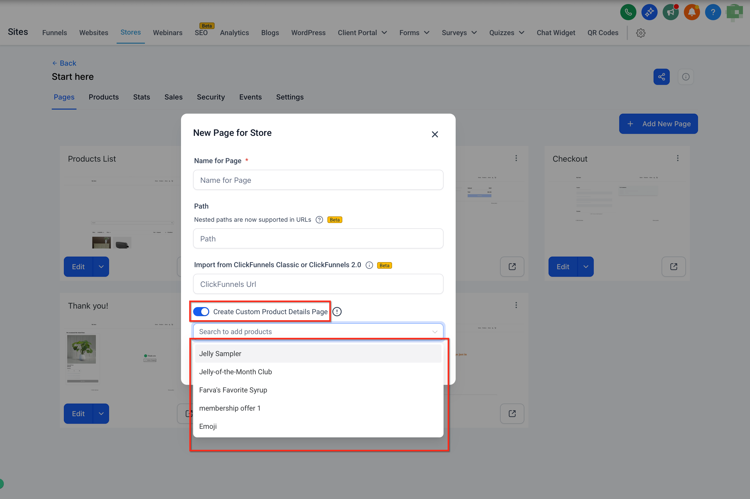
After creation: open the Custom PDP in the builder, select the product element or the page settings, and update the product assignment in the Settings panel.
Assigning a product to a new Custom PDP automatically removes it from whichever page it was previously linked to. A product only ever belongs to one Custom PDP at a time.
Navigation from the Product Listing Page and Featured Product elements always respects the current mapping, whether that points to a Custom PDP or the default PDP.
If you're building inside a marketing funnel flow rather than a store page, you won't see the option to create a Custom Product Details Page there. It's only available on store pages, which keeps funnel building simple and product page building focused.
You don't need to open the Store Builder just to check or share a product's page. From Stores > Products, on the Included tab, each listed product offers two quick actions: Preview and Copy link.
Preview: opens the live Product Details Page in a new browser tab so you can check it before sharing.
Copy link: copies the resolved product URL to your clipboard and shows a confirmation message so you know it's ready to paste.
How the link is resolved:
Custom PDP mapping: if the product is mapped to a Custom Product Details Page, the resolved link points to that Custom PDP instead of the default page, matching the same mapping described above.
SEO handle: the product's SEO handle is used as the URL slug, so the link is clean and matches your product naming.
Domain priority: the link uses your store's custom domain first. If no custom domain is connected, it falls back to the store's preview domain.
Connect a custom domain to your store before sharing product links with patients or in marketing campaigns, so the links you send out carry your own branded domain instead of the preview domain.
Go to Stores > Products. This opens on the Included tab by default, listing every product currently included in your store.
Find the product you want to preview or share. Only products on the Included tab show the Preview and Copy link actions.
Choose Preview to open the live Product Details Page in a new tab, or Copy link to copy the resolved URL to your clipboard.
Once copied, paste the link into an email, text message, or wherever else you're sharing the product with patients.
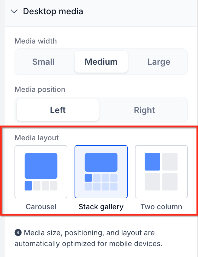
Product media layout controls how a product's images are arranged and browsed on its PDP. Choosing the right layout gives shoppers an easier, more visual way to compare product photos, especially for products with several images.
Three layout styles are available:
Layout | What it does | Desktop | Mobile |
|---|---|---|---|
Gallery | Thumbnails alongside a larger main image | Yes | Not used (Carousel applies instead) |
Carousel | Swipeable/scrollable image strip with navigation arrows | Yes | Always used on mobile |
Two Column | Images stacked in a second column beside product details | Yes only | Not available |
Mobile behavior: Aesthetix CRM automatically applies the Carousel layout on mobile for both the Product Details Page and Featured Product elements, regardless of which desktop layout you picked. Two Column never appears on mobile. This is intentional, it keeps product photos touch-friendly and easy to browse on small screens.
Other notes:
Existing stores keep using Gallery (the original default) until you manually change the layout. Nothing switches automatically.
Featured Product elements only support Gallery and Carousel, not Two Column.
Navigation arrows work in Gallery and Carousel; Two Column doesn't support them.
The layout is set once on the Product element, it isn't something you configure per individual product.
Open your Store Builder.
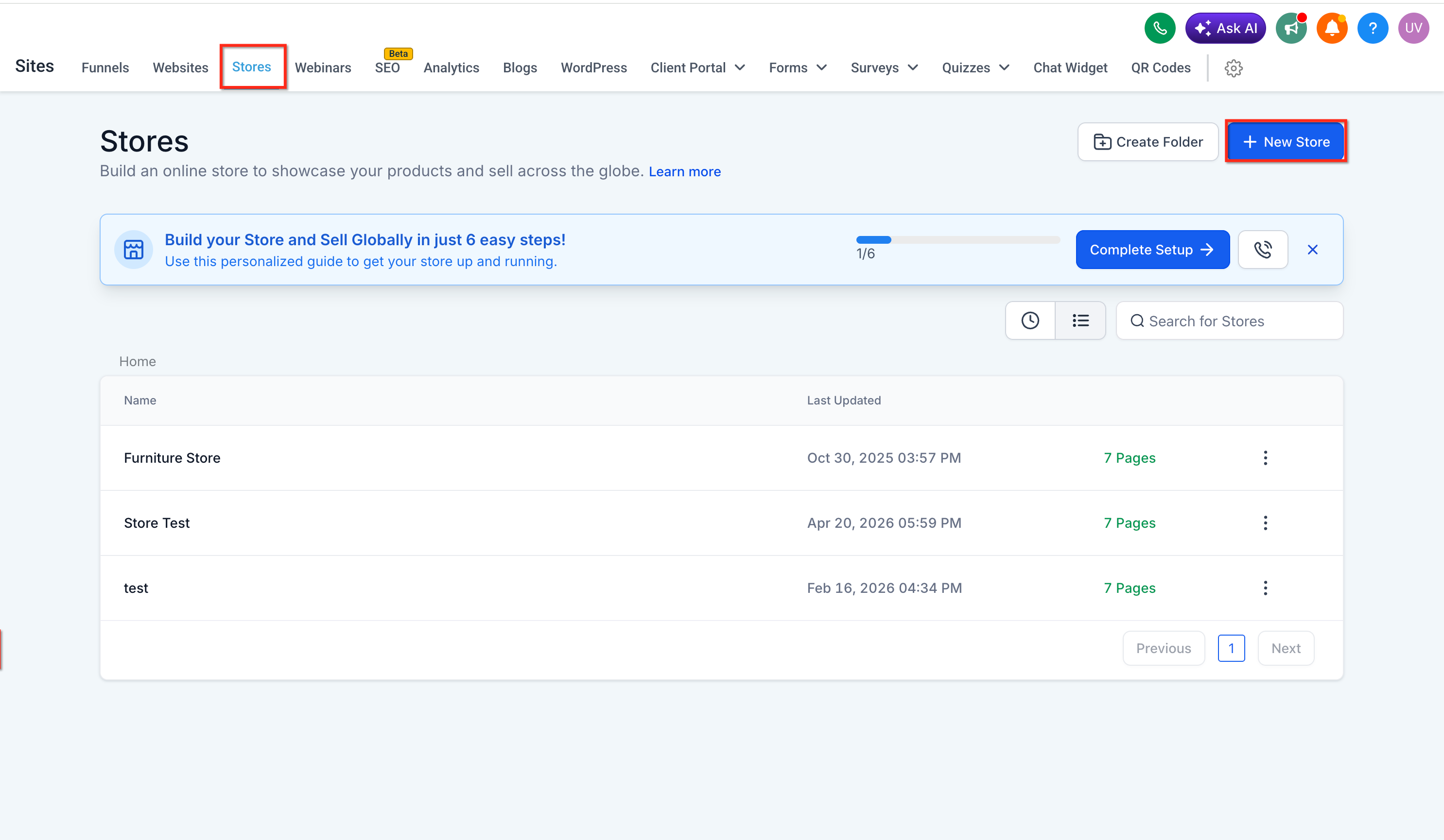
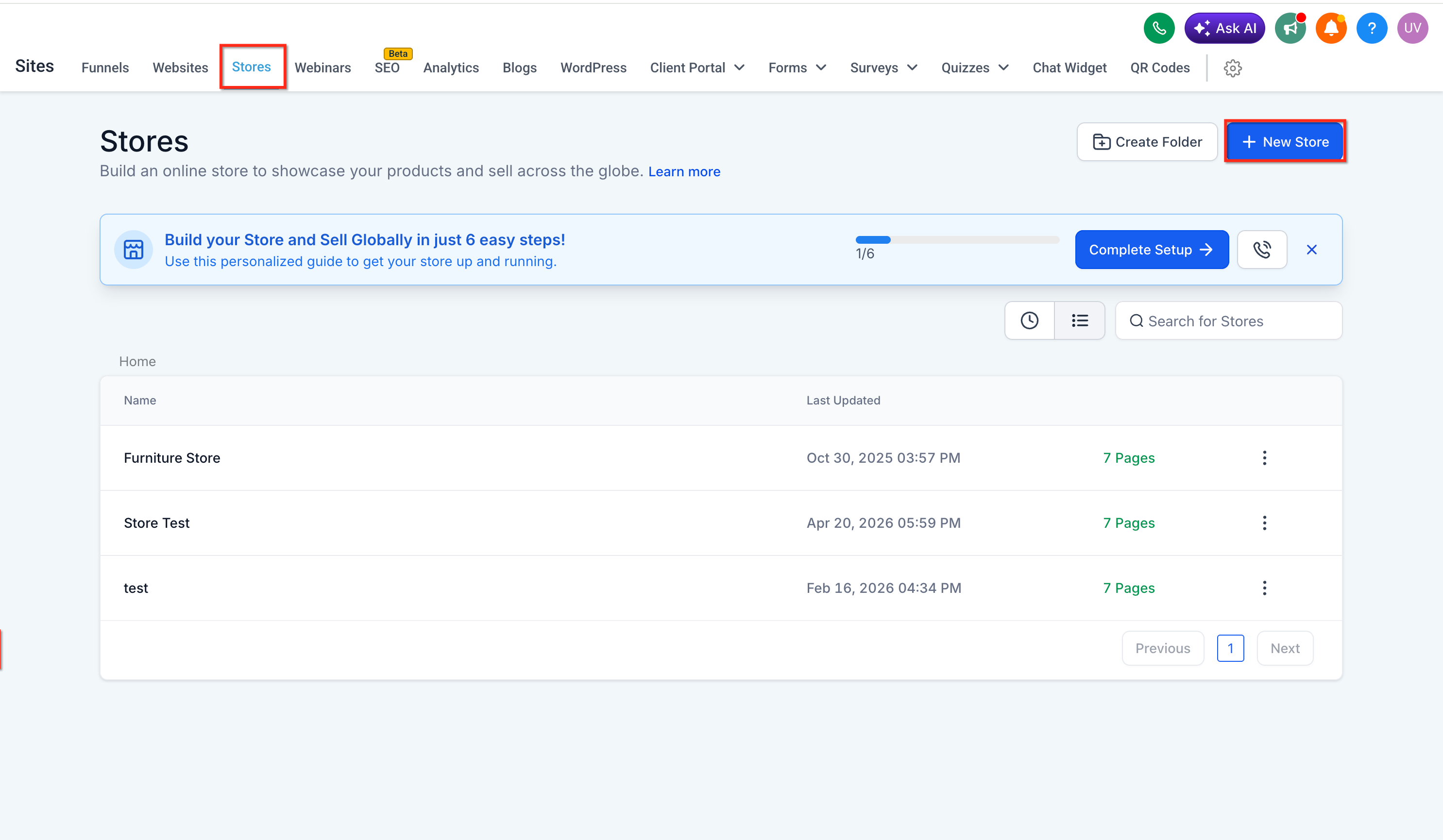
Edit the Product Details Page.
Select the Product element on the page.
In the right-side settings panel, go to Desktop Media settings.
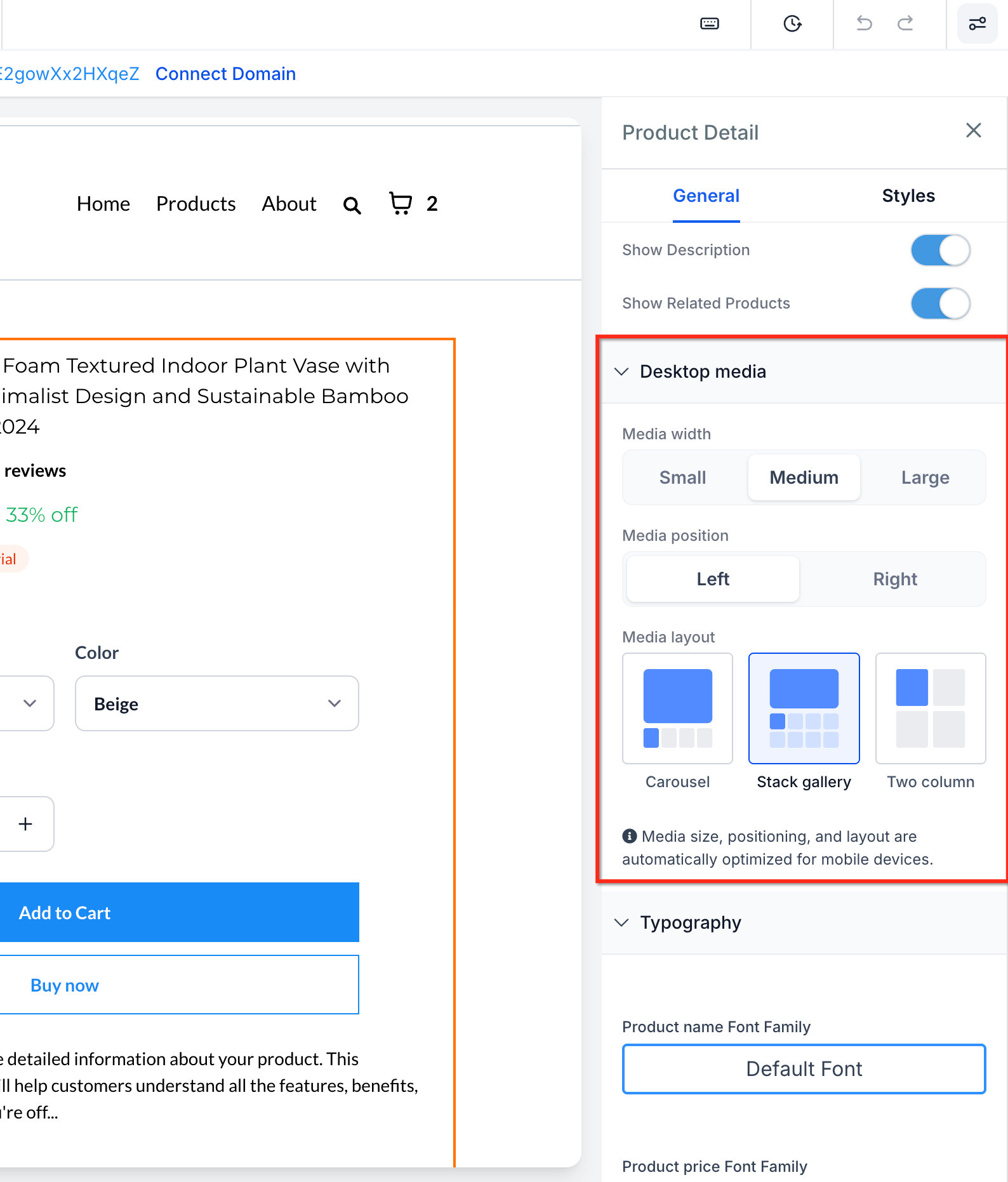
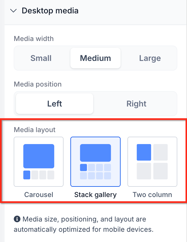
Choose your preferred media layout: Gallery, Carousel, or Two Column.
Save your changes.
Publish the page so the new layout goes live on your storefront.
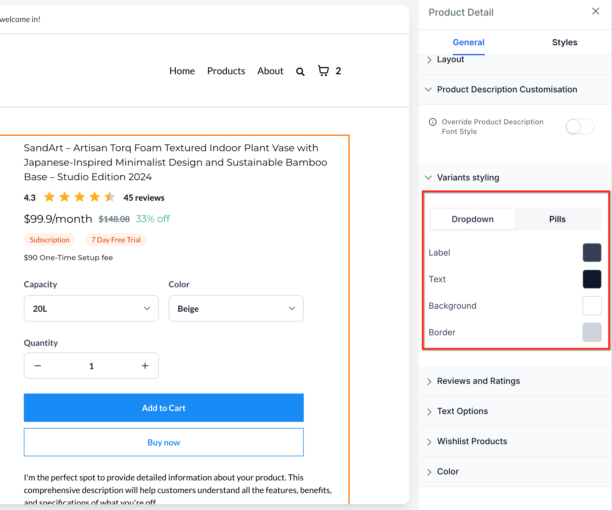
Selector styling controls how shoppers choose product variants, pricing tiers, quantities, and upsells on a PDP. Two display styles are available:
Dropdown: options sit inside a compact menu. This is the existing default, and it stays the default unless you switch it.
Pills: options appear as selectable buttons directly on the page, visible all at once.
When to use Dropdown: products with many variant options, a compact page layout, or if you simply want to keep the current selector behavior.
When to use Pills: products with fewer variant options, when you want option discoverability front and center, or when you want to customize the selected/unselected color states of the buttons. Pills support single selection per variant group (for example, one size and one color at a time), and quantity color customization is only available when Pills is selected.
Multi-price selectors follow the same Dropdown/Pills styling as variant selectors, so your whole PDP stays visually consistent. Both styles are reflected accurately in Page Builder and Builder Preview, so you can check the shopper experience before publishing.
Open your Store Builder.
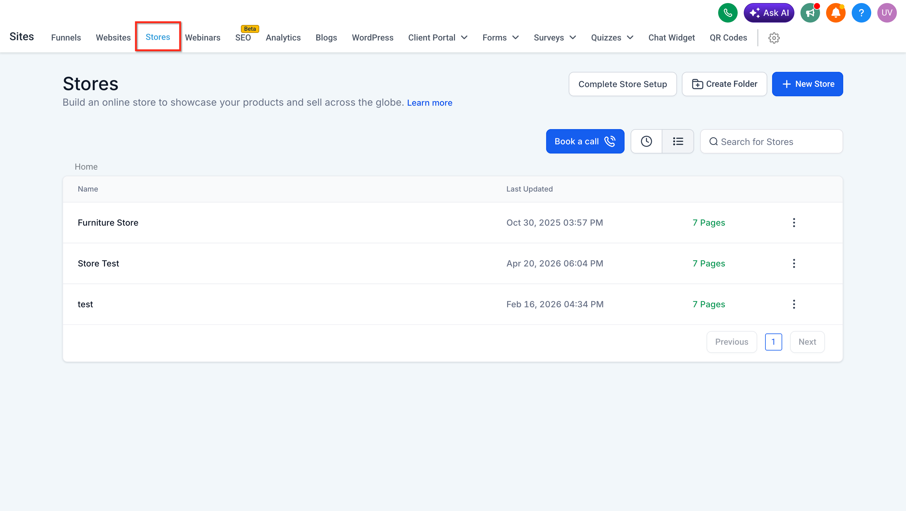
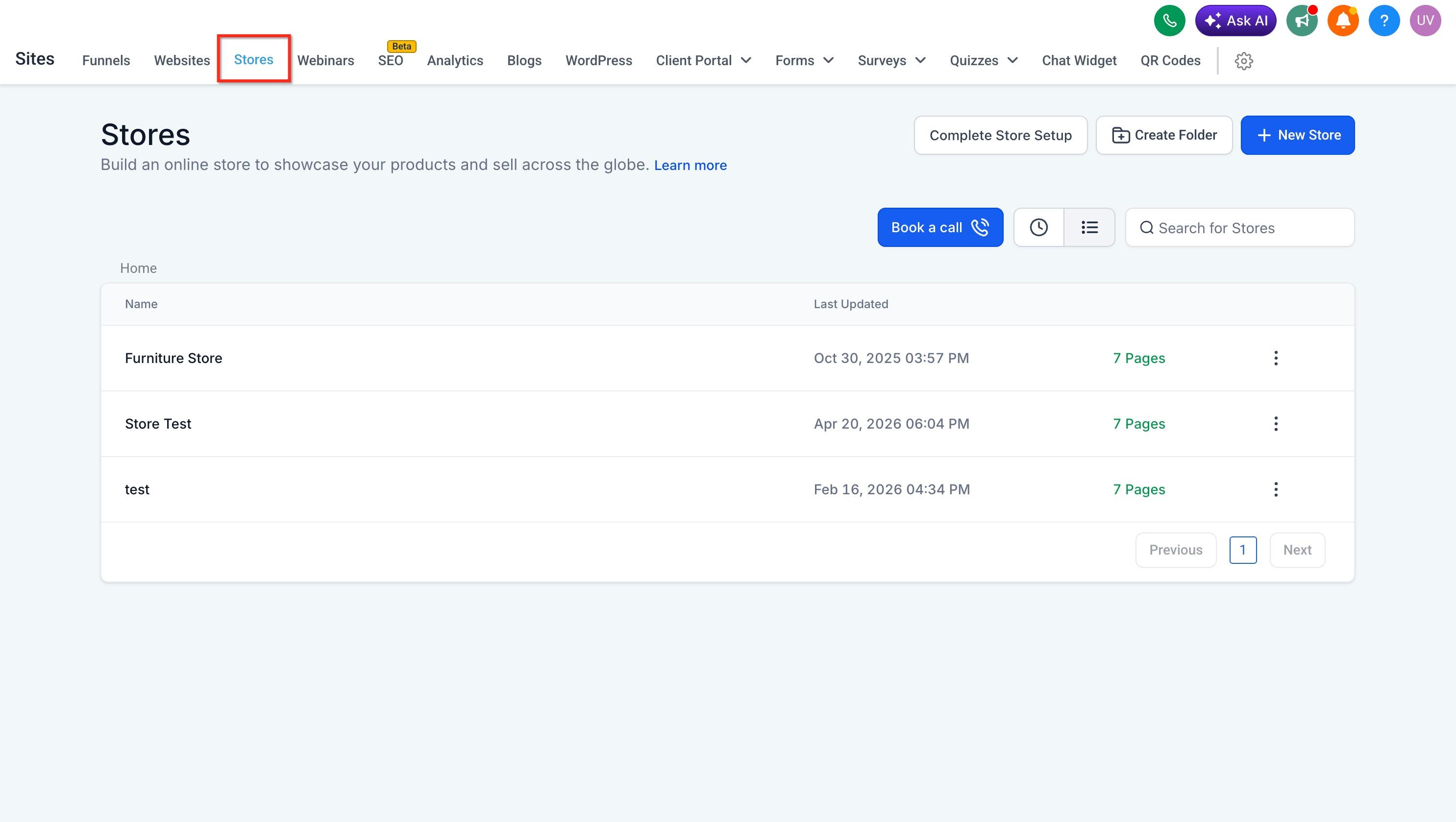
Edit the Product Details Page and select the Product element.
In the general settings panel, find Variants styling.
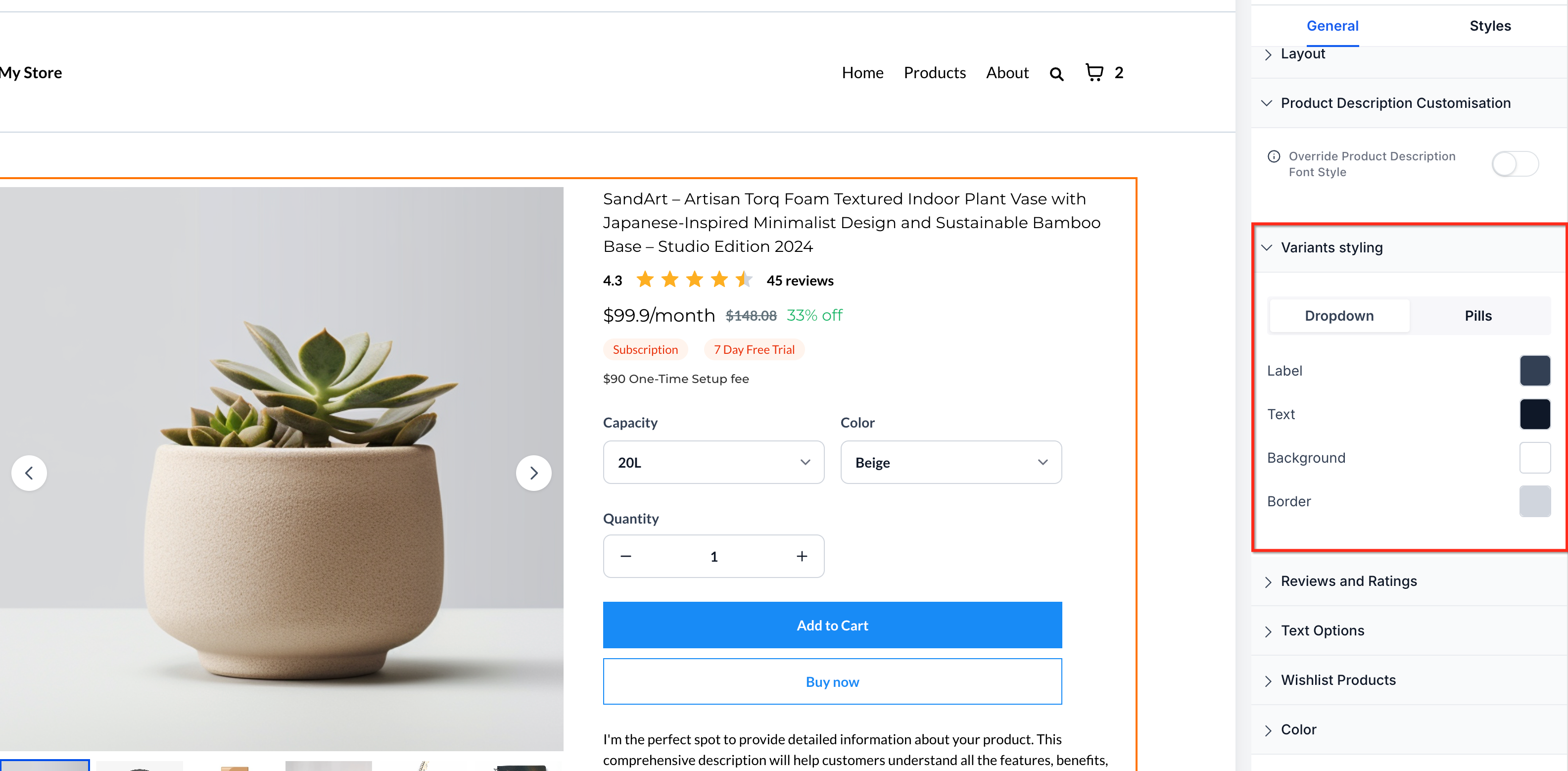
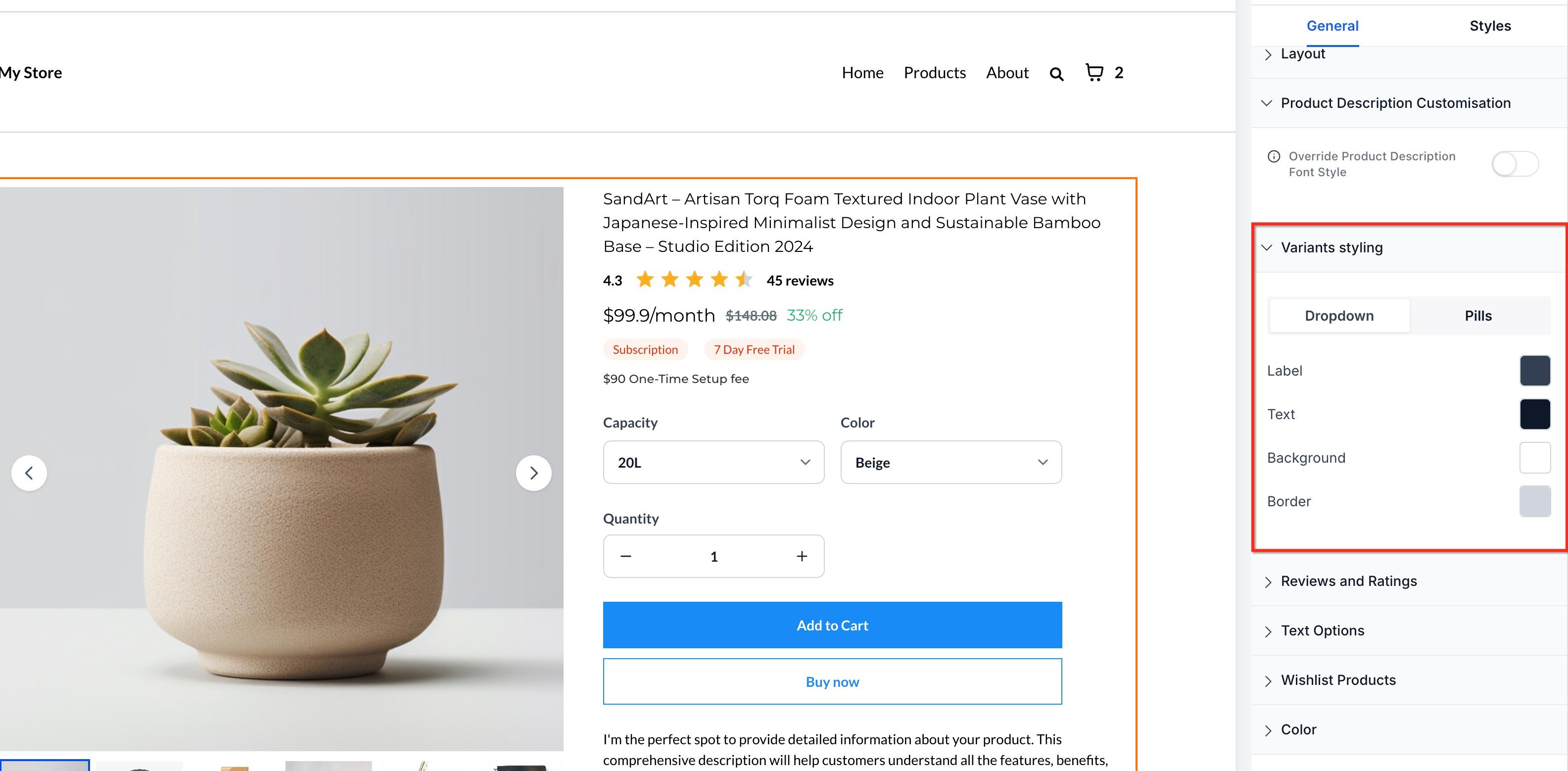
Choose Dropdown:
or Pills:
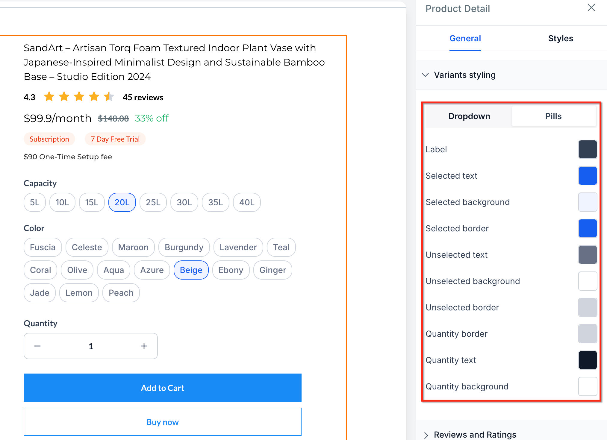
Review the page in Builder Preview to confirm variants, pricing, and quantity controls look right on desktop and mobile.
Save and publish your changes.
Image zoom gives shoppers a closer look at a product photo, useful for anything with fine detail like packaging, texture, or ingredient labels. You'll set this from the same Product Details element, under Layout Settings. Three behaviors are available:
No Zoom: images display normally with no zoom interaction. Good for products that don't need close inspection or if you'd rather keep the PDP simple.
Click & Hover Zoom: clicking or hovering over a section of the image zooms into that area. This works best on desktop with a mouse or trackpad.
Open Lightbox Zoom: clicking the image opens a fullscreen popup where shoppers can zoom in and out, move between images with previous/next controls, and browse a thumbnail strip. Shoppers can also navigate the lightbox with keyboard shortcuts, using the arrow keys to move between images and the Escape key to close the popup, so the fullscreen viewer is fully browsable by mouse, touch, or keyboard. This is the most guided viewing experience and works well when a product has several photos.
Image zoom works across Gallery, Carousel, and Two Column media layouts, so you can set the media layout and the zoom behavior independently. It applies to product images only; product videos in the media area are excluded from zoom.
Open your store in the Site Builder.
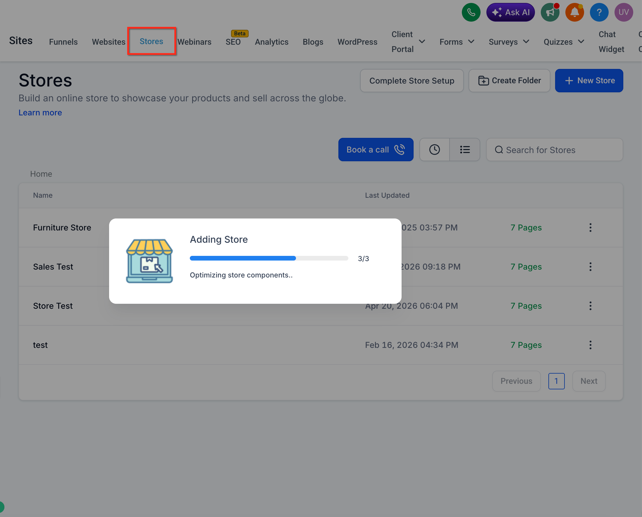
Edit the Product Details Page and select the Product Details element.
In Layout Settings, find the Image Zoom option.
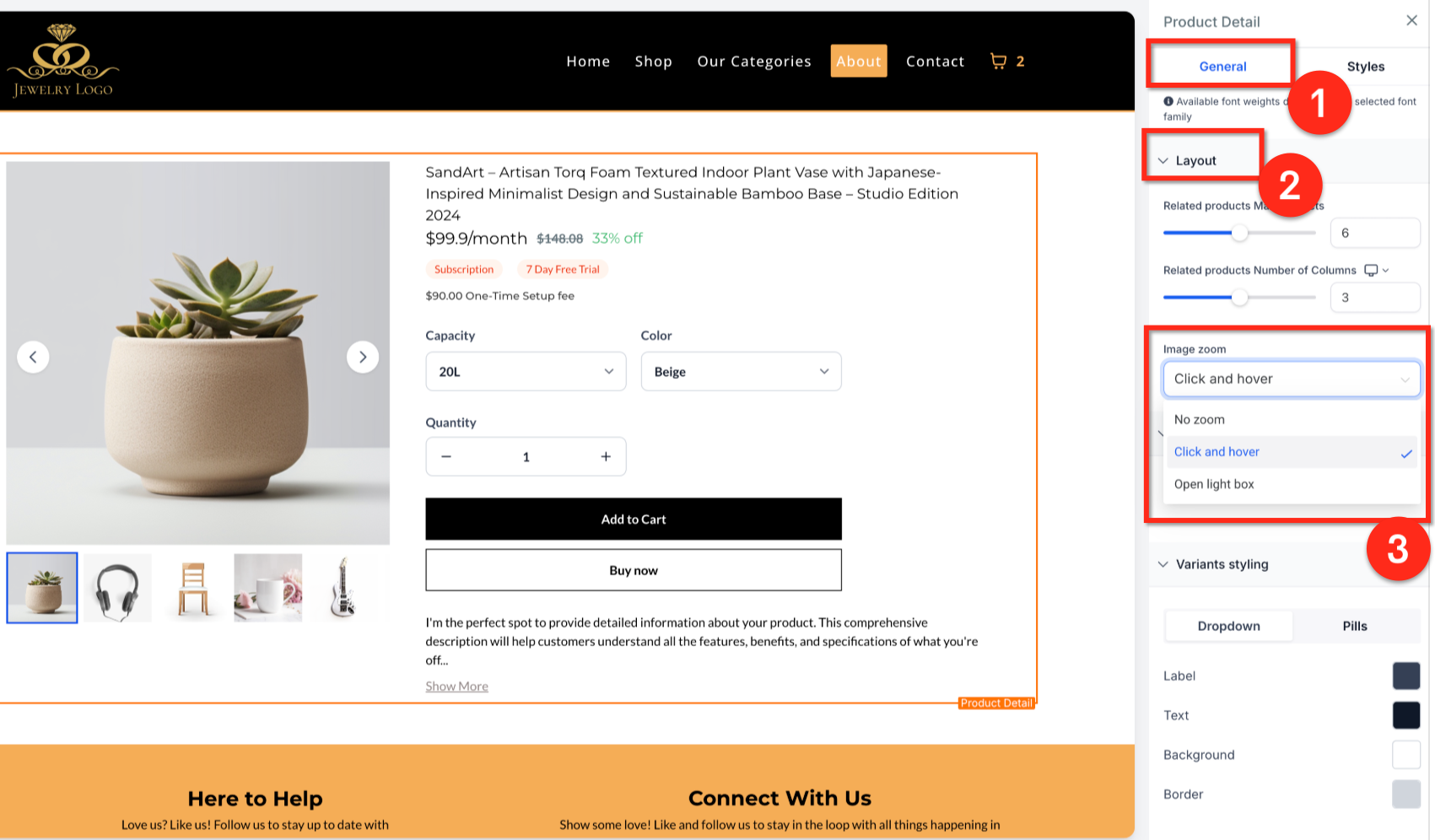
Choose No Zoom, Click & Hover Zoom, or Open Lightbox Zoom.
Save your changes, then publish the page so the updated zoom behavior goes live for shoppers.
Can a product be assigned to more than one Custom PDP? No. Each product links to only one Custom PDP at a time. Assigning it to a new Custom PDP removes the previous association automatically.
What happens if I delete a Custom PDP? All products that were mapped to it revert to the default Product Details Page.
If I update my default PDP later, will my existing Custom PDPs update too? No. A Custom PDP only inherits the default layout once, at creation. After that, the two pages are independent and there's no ongoing sync.
Will my store automatically switch to a new media layout or selector style? No. Existing stores keep their current media layout (Gallery) and selector style (Dropdown) until you manually change the Product element settings. Nothing changes on its own.
Why does my product page use Carousel on mobile even though I chose Two Column on desktop? Two Column is desktop-only. Aesthetix CRM automatically applies Carousel on mobile for every product, regardless of the desktop layout selected, to keep the mobile browsing experience smooth.
Can shoppers select more than one option per variant group with Pills? No. Pills support a single selection per variant group, for example one size and one color at a time, not multiple sizes at once.
Does image zoom work with videos in the product gallery? No. Zoom applies to product images only. Videos display in the media area but are excluded from zoom behavior.
Can shoppers use the keyboard to browse images in Open Lightbox Zoom? Yes. When Open Lightbox Zoom is enabled, shoppers can move between images with the arrow keys and close the fullscreen popup with the Escape key, in addition to using the on-screen previous/next controls and thumbnail strip.
Do I need to update each product individually to change a layout or selector style? No. Media layout and selector style are set on the Product element in the Product Details Page itself, so the setting applies wherever that element is used, not per product.
Can I preview my media layout and selector changes before publishing? Yes. Both are reflected accurately in Page Builder and Builder Preview, so you can check desktop and mobile behavior before making changes live.
Do Featured Product elements support every media layout? No. Featured Product elements support Gallery and Carousel only, not Two Column.
Can I preview or copy a product's page link without opening the Store Builder? Yes. From Stores > Products, use the Preview action to open the live page in a new tab, or Copy link to copy the resolved URL to your clipboard.
Does a copied product link respect a Custom PDP mapping? Yes. If the product is mapped to a Custom Product Details Page, the copied link points to that Custom PDP instead of the default page.
Which domain does a copied product link use? Your store's custom domain, if one is connected. If not, the link falls back to the store's preview domain.
