A well-designed survey feels like part of your practice, not a generic form. The Styles tab in the Aesthetix CRM survey builder lets you match every intake, consult, and satisfaction survey to your brand: colors, fonts, borders, background images, progress footers, and advanced custom CSS. This guide walks through each option.
Surveys live under Web Tools → Surveys, the same place as Forms. If you have styled a form before, most of these controls will feel familiar.
Go to Web Tools → Surveys.
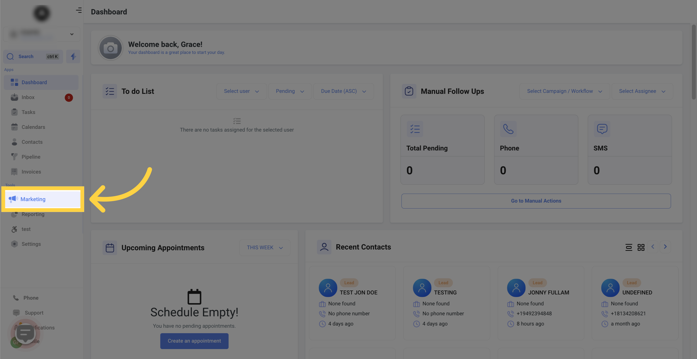
Open the Surveys list.
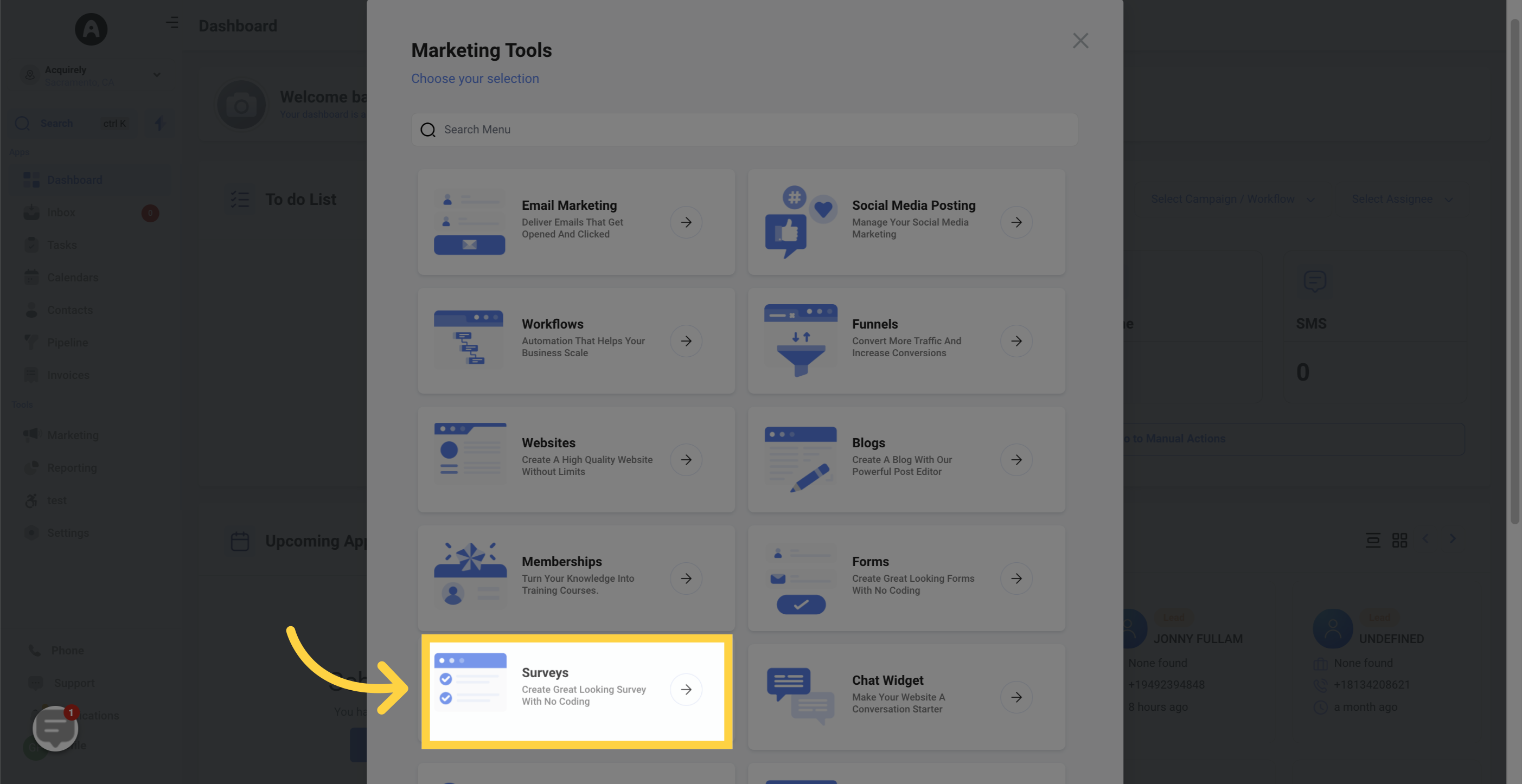
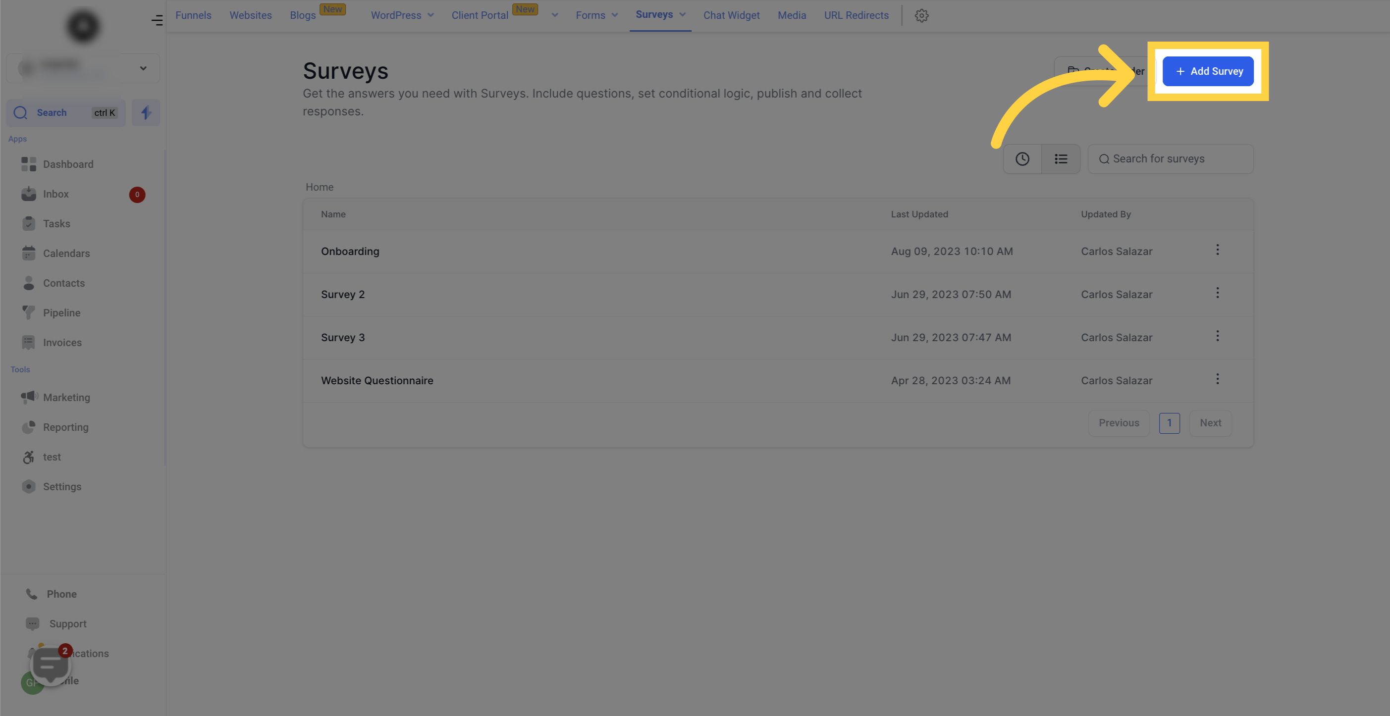
Click Add Survey to build a new one, or open an existing survey to restyle it.
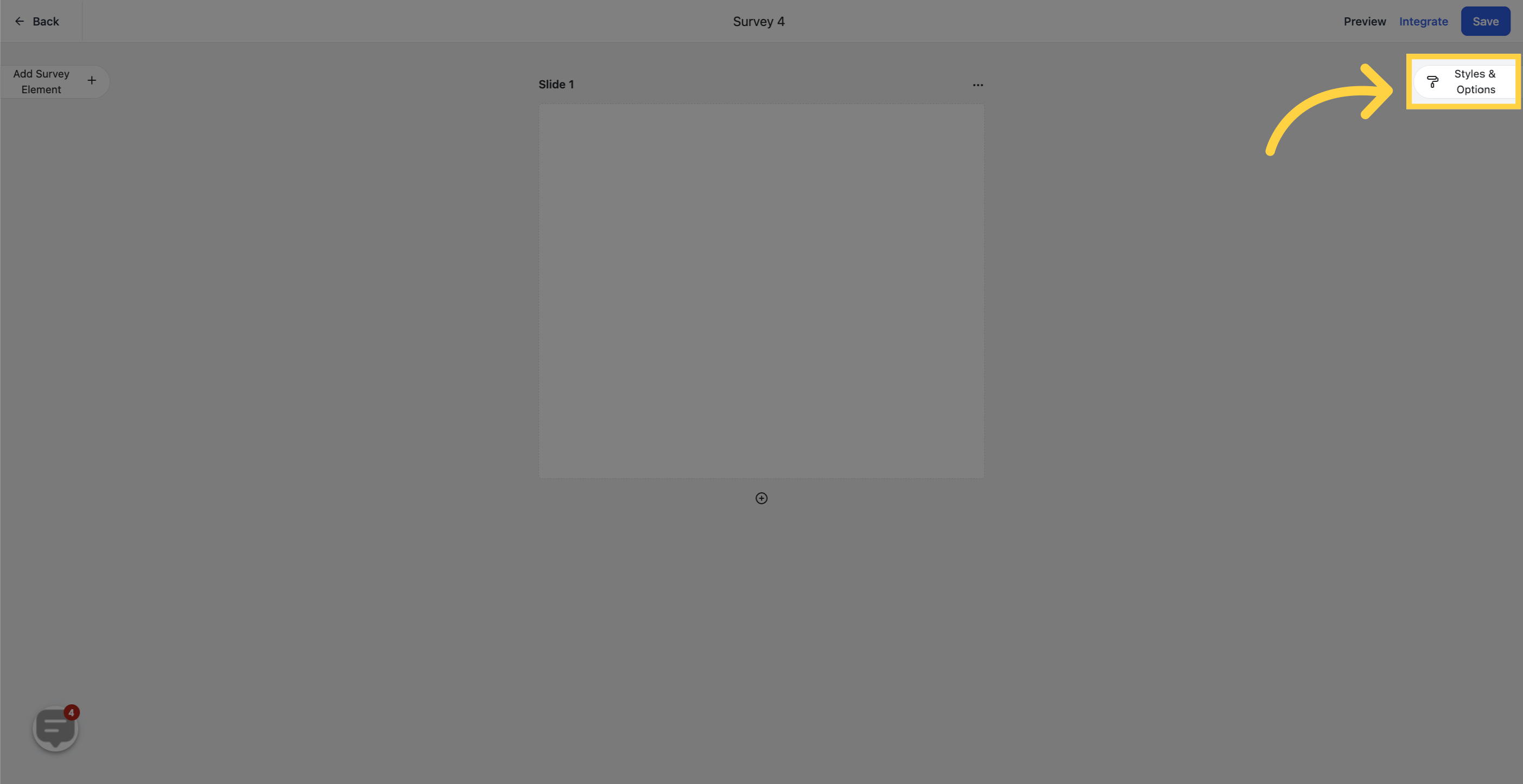
In the builder, click the Styles & Options tab. The Styles panel controls the survey's appearance.
Show Label: Toggle this on or off to display or hide the labels above each input field. Hiding labels can give a cleaner, more compact look on short surveys.
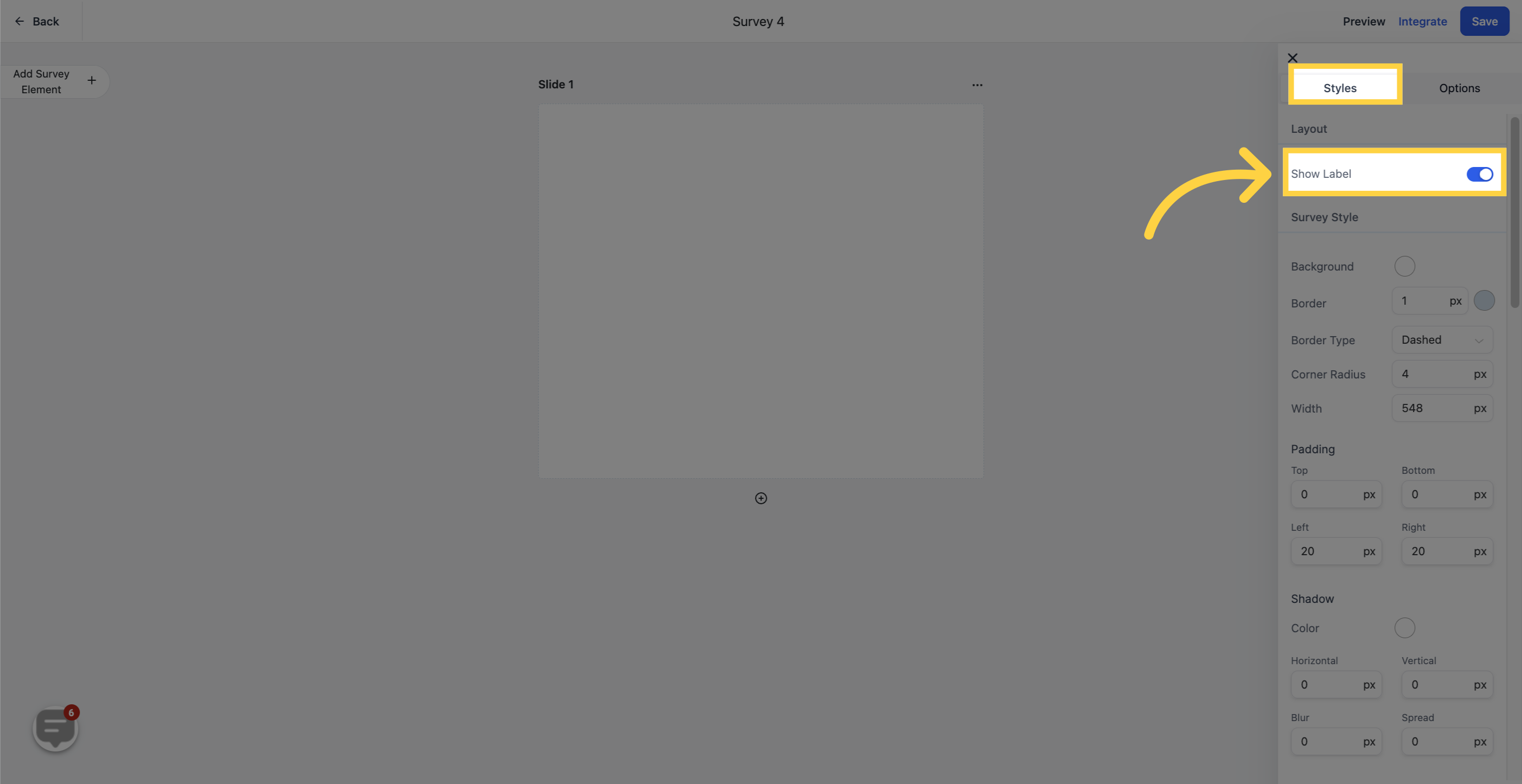
Background Color: Set the survey background to match your practice branding or the page it will sit on.

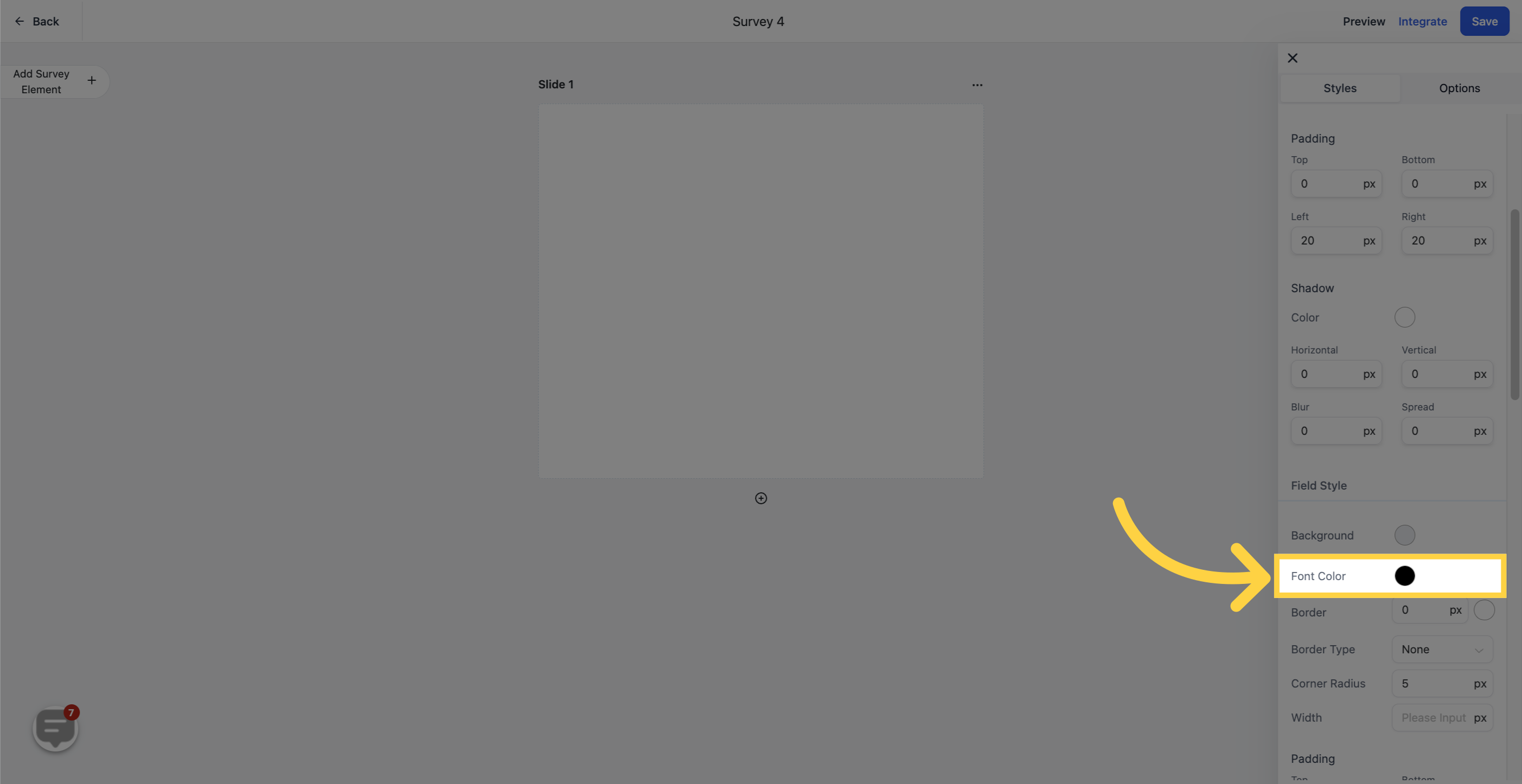
Font Color: Change the text color so questions stay easy to read against your background.
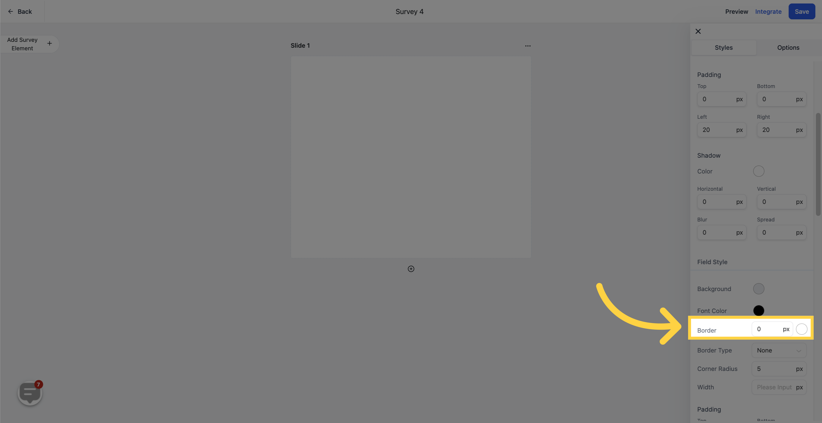
Border: Add a border around your survey and adjust the width of the border walls for the look you want.
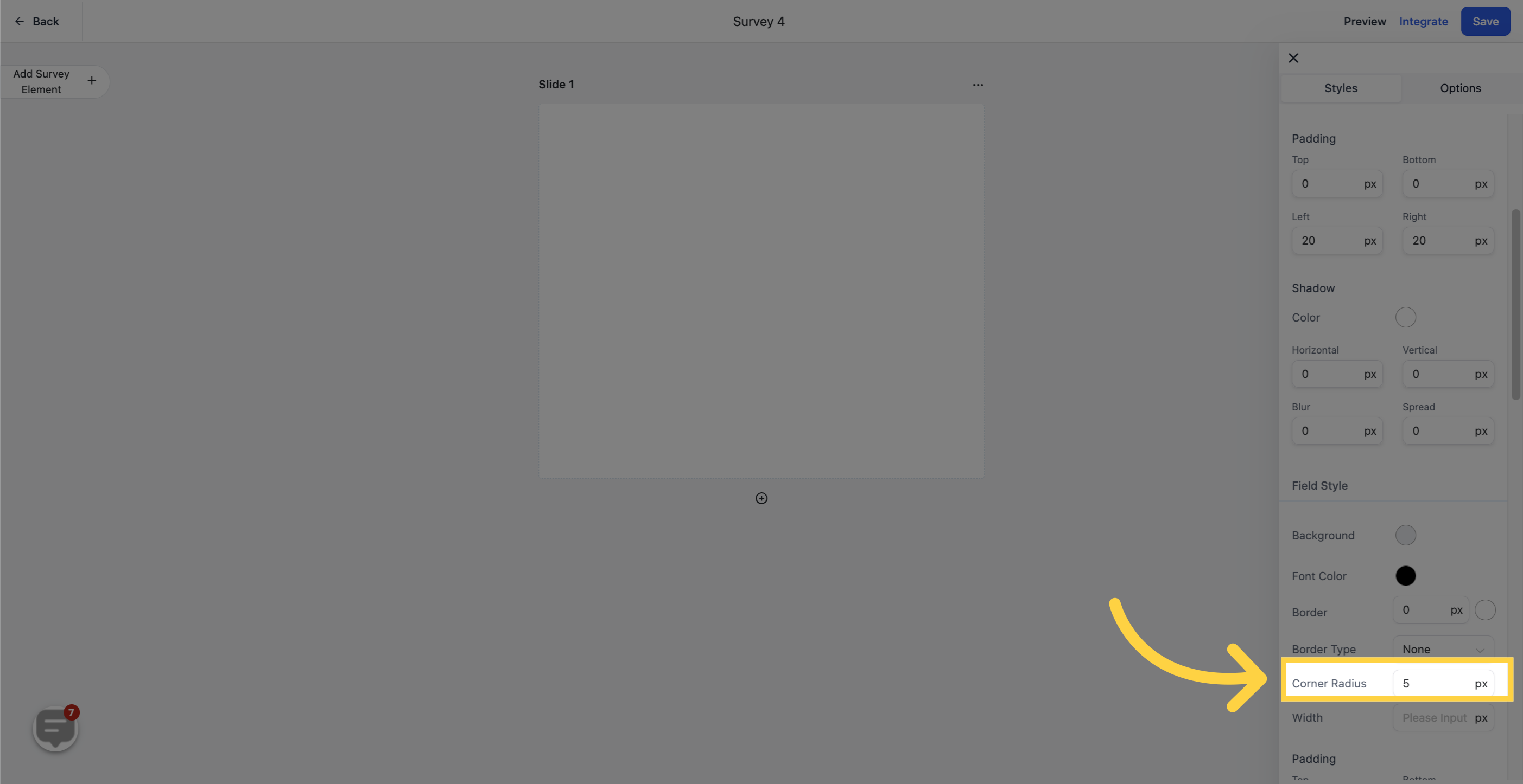
Corner Radius: Round off the corners of the survey for a softer, more modern feel, or keep them squared.
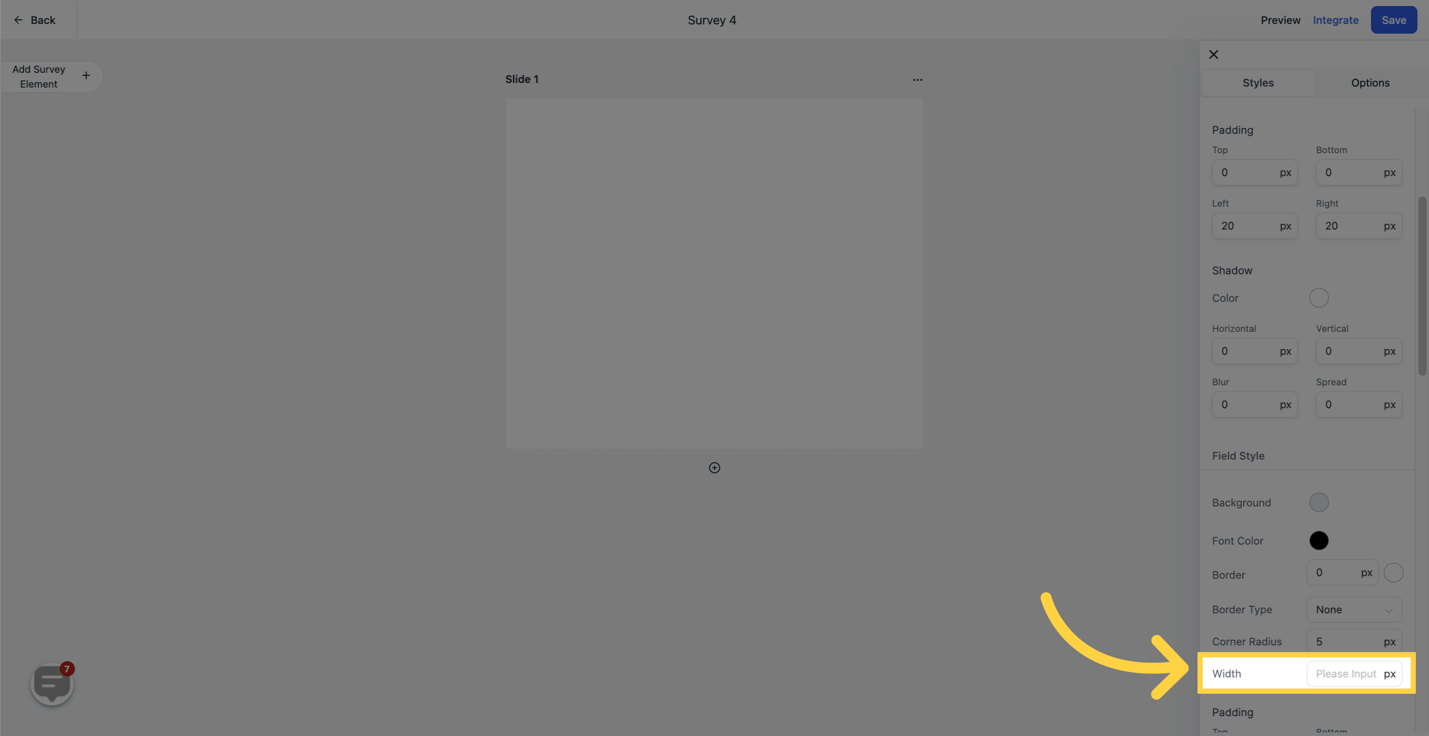
Width: Adjust the total width of the survey so it fits neatly into the page where you will embed it.
The Primary Color setting controls how your survey elements look when a patient interacts with them. It automatically applies your chosen brand color to input fields, dropdowns, checkboxes, and other elements, keeping everything consistent with your branding while making active and selected fields easier to see.
The primary color appears only when someone interacts with the survey, such as:
Hovering over a field
Clicking or typing in a field
Selecting a checkbox or radio button
Choosing a date or option
If no primary color is set, the survey uses default neutral styling. Here is how the primary color shows up in each element type:
Form Fields: The border highlights with your primary color when hovered or clicked.

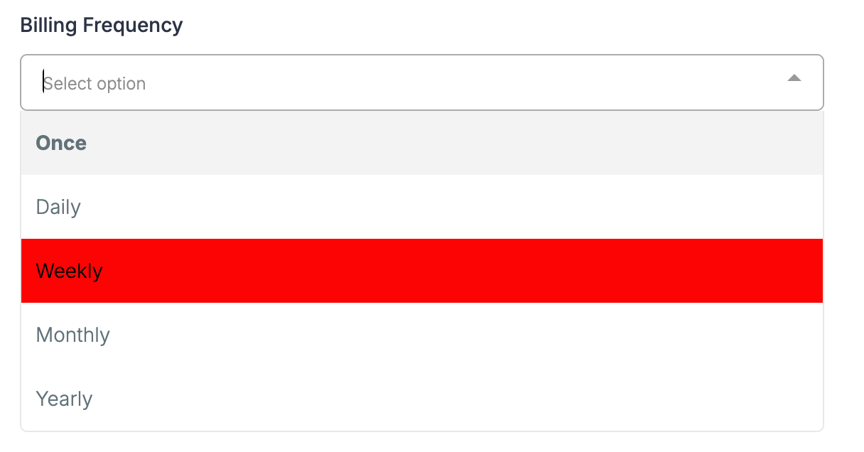
Dropdowns: Options and borders reflect the primary color when opened or selected.
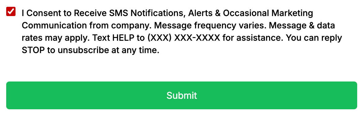
Checkboxes and Radio Buttons: Selected options fill with your primary color.
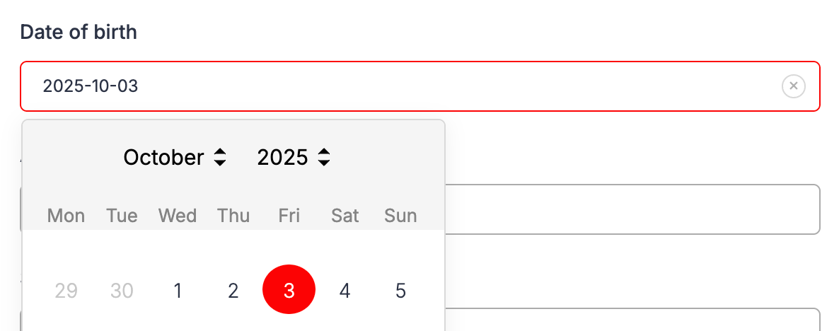
Date Picker: The active or selected date is highlighted in your primary color.
File Uploads and Signature Fields: Borders and sketch colors use your primary color.
To set it:
In the builder, go to Styles & Options → Styles.
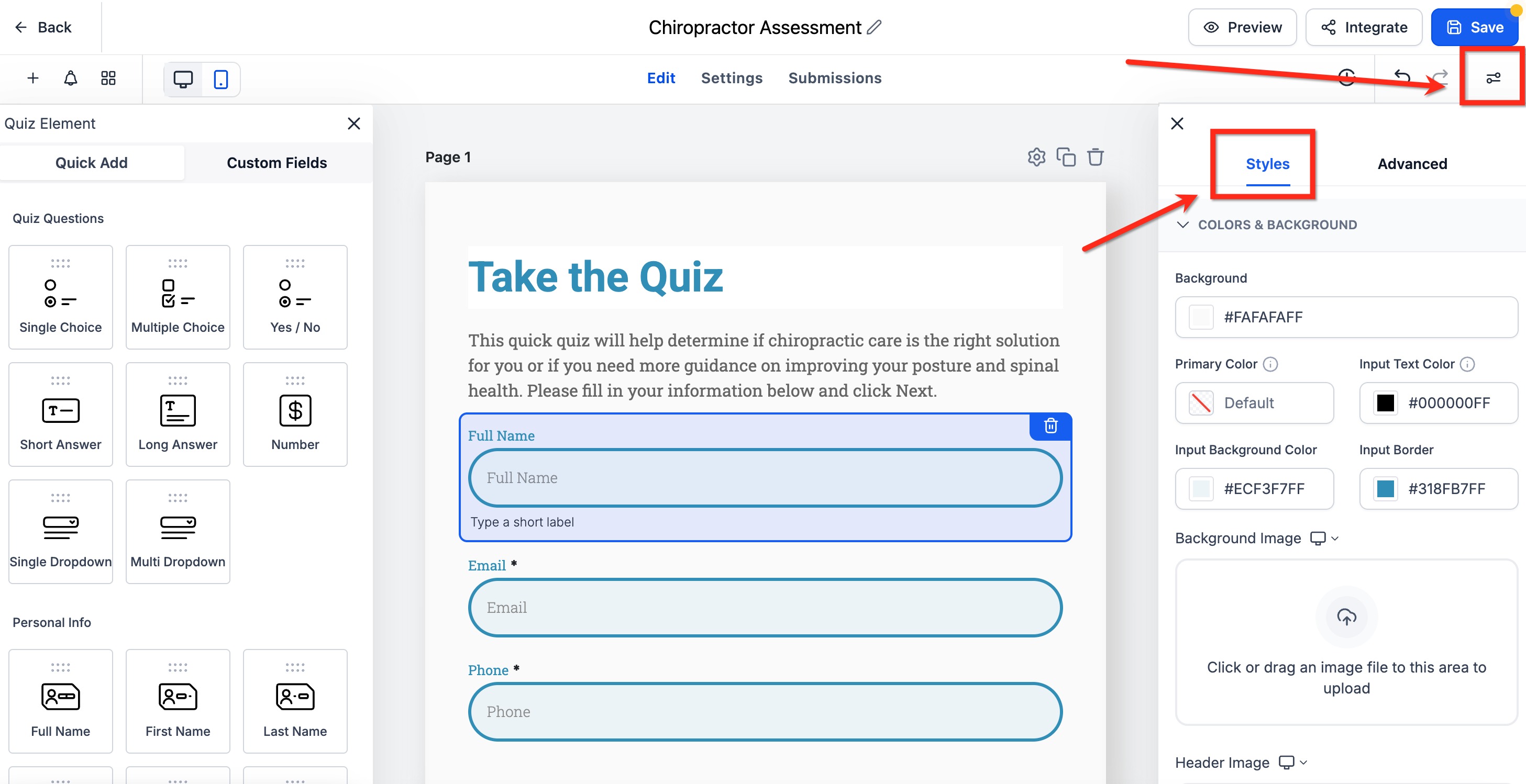
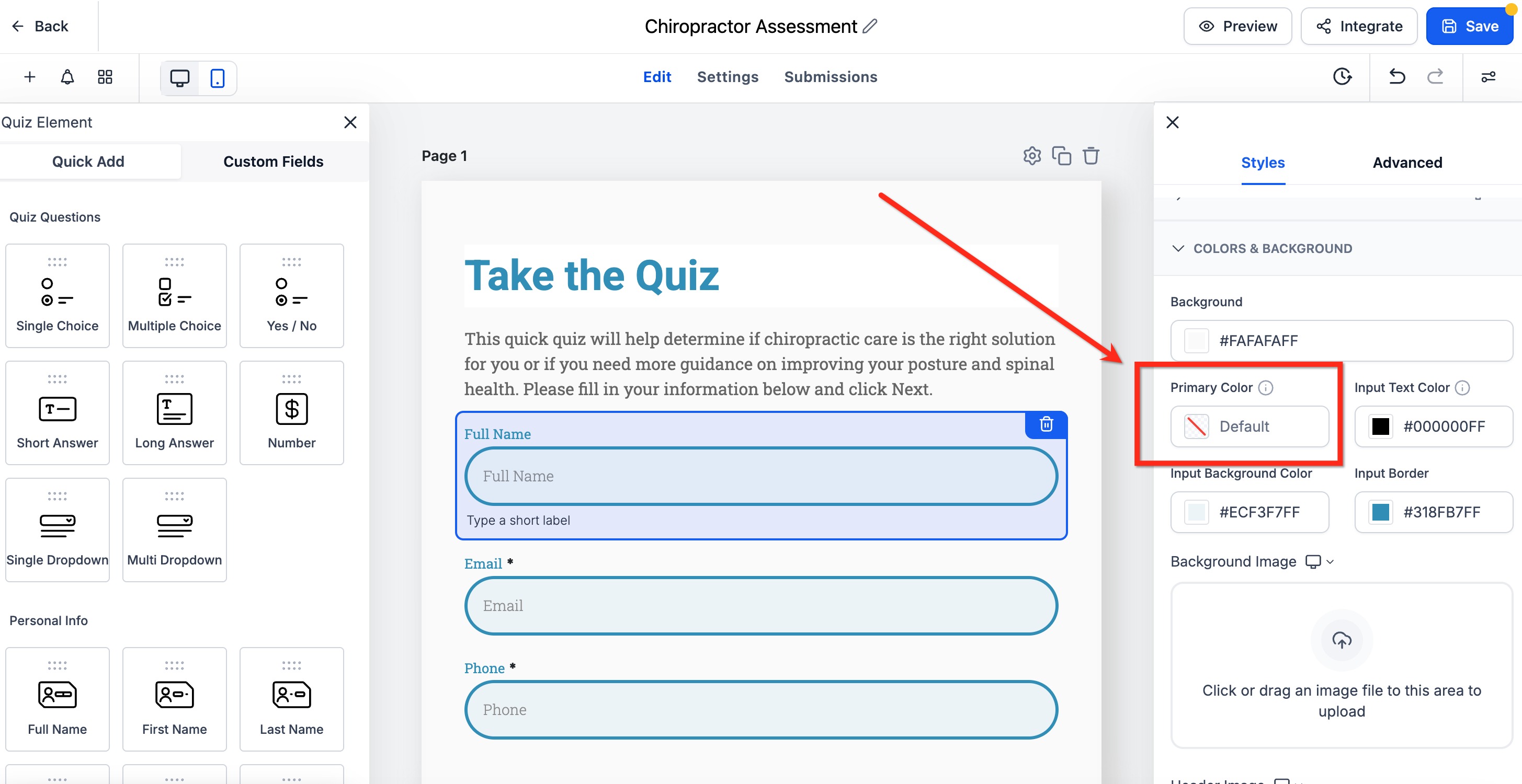
Scroll down to the Primary Color field under Colors and Background.
**
**
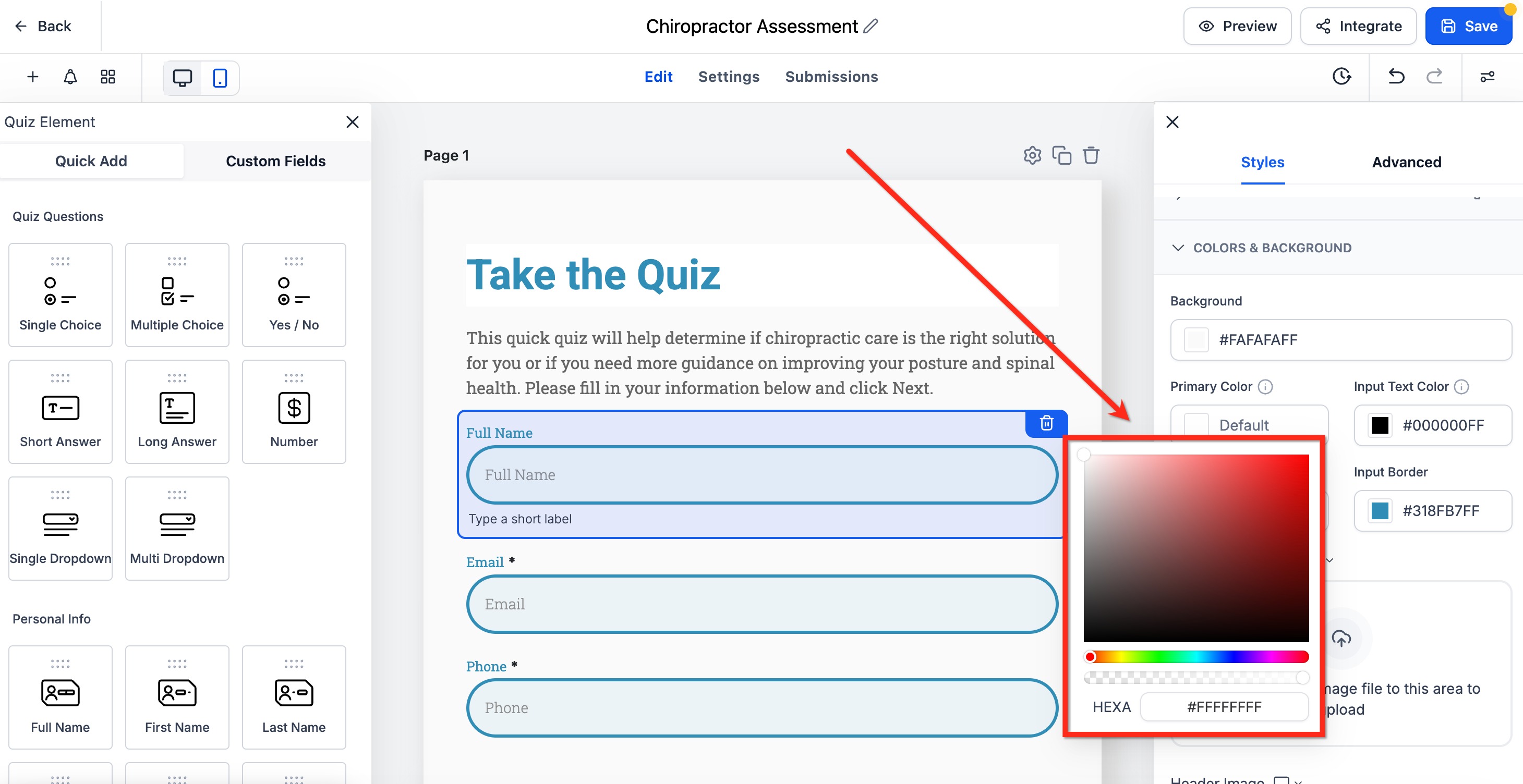
Select a color or enter a custom hex code. Toggle Map Primary color to Button color if you want buttons to follow the same color. Click Save to apply. Your survey updates automatically to use the new color for all interactive elements.
If your practice keeps a Brand Board, its saved colors appear directly in the color picker so you can style buttons, inputs, and labels without copying hex codes by hand. This keeps every survey aligned with your approved palette.
When you open any color field in the builder:
The color picker displays available color sections, including Brand Colors, Global Custom Colors, and Default Colors.
Selecting a saved Brand Color applies it to the chosen element, and the preview updates automatically.
To add a new custom brand color, click Manage in the color picker to open Brand Settings.
Note: Changing your default Brand Board does not automatically restyle existing surveys. Existing surveys keep their current styling until you update them manually.
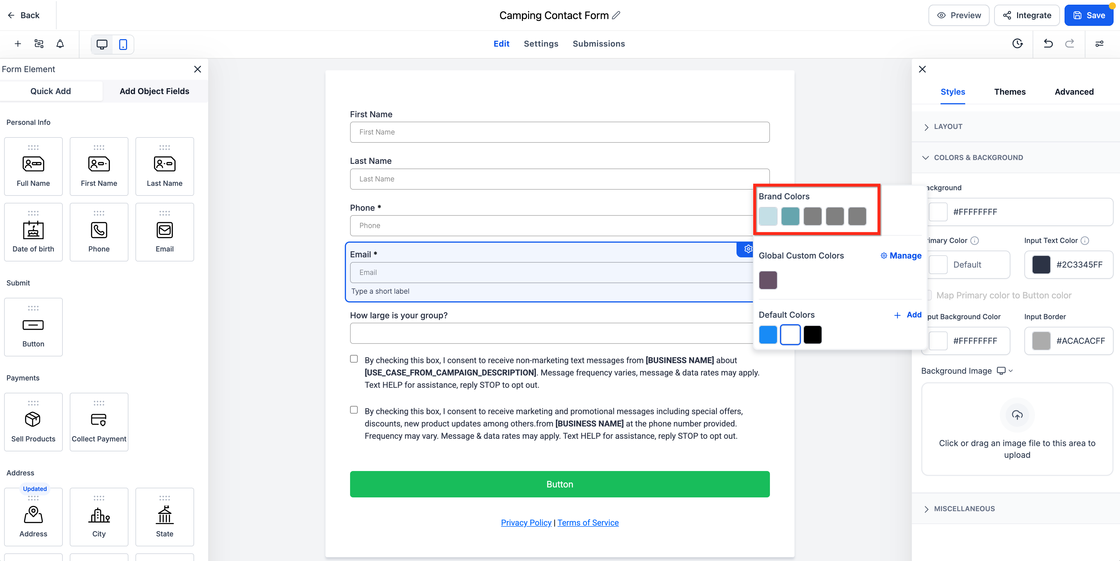
If Brand Colors do not appear, confirm your Brand Board has colors configured and that the correct default Brand Board is set.
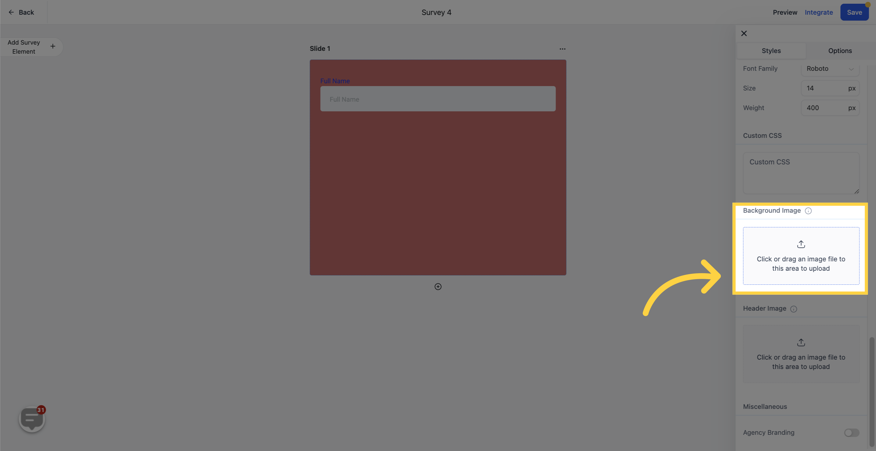
To use a custom image as the survey background, upload it here. A branded or on-theme image (for example, a seasonal special or a treatment-room photo) adds a professional, personalized feel.
For longer intake or consult surveys, a progress footer helps patients see how far along they are, which reduces drop-off. In the Styles panel, enable the footer to unlock these options:
Progress Tracking: Show one of four progress indicators so patients can see their position in the survey.
Page Count or Progress Percentage: Choose whether the footer shows the page count or a completion percentage, and color it to match your brand.
Footer Position: Keep the footer stuck to the survey or detach it and place it at the bottom of the page. You can align it left, right, or both.
Button Customization: Adjust the previous and next buttons, including button height, font size, weight, and type. Buttons can display text, arrows, or both.
Text and Button Colors: Match the footer text and button colors to your survey theme for a cohesive look.
After making changes, preview the survey. As patients enter data and move through the pages, they will see the progress indicator update in real time.
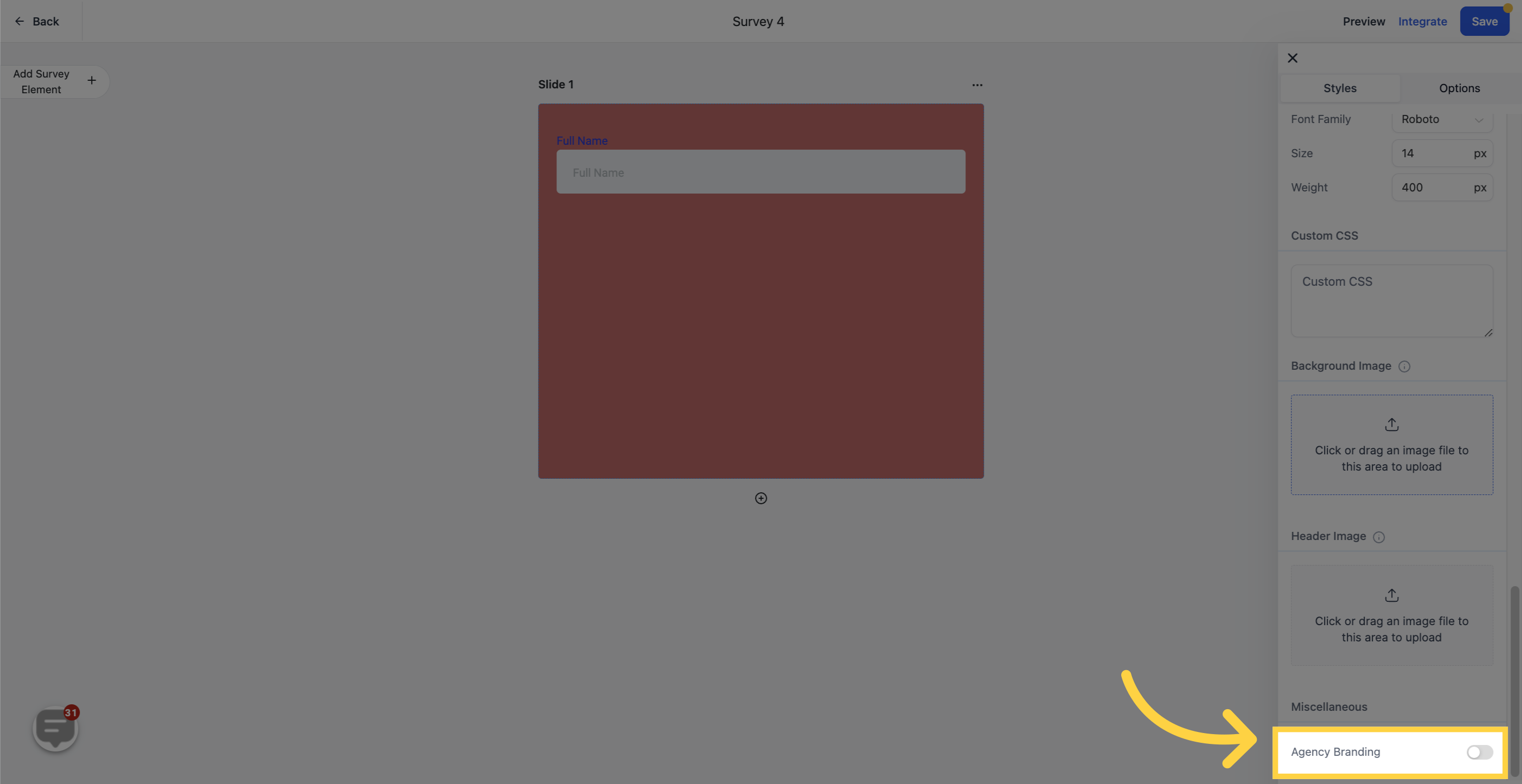
Toggle Company Branding to choose whether your logo appears in the corner of every survey. This keeps your practice branding consistent across all of your surveys.
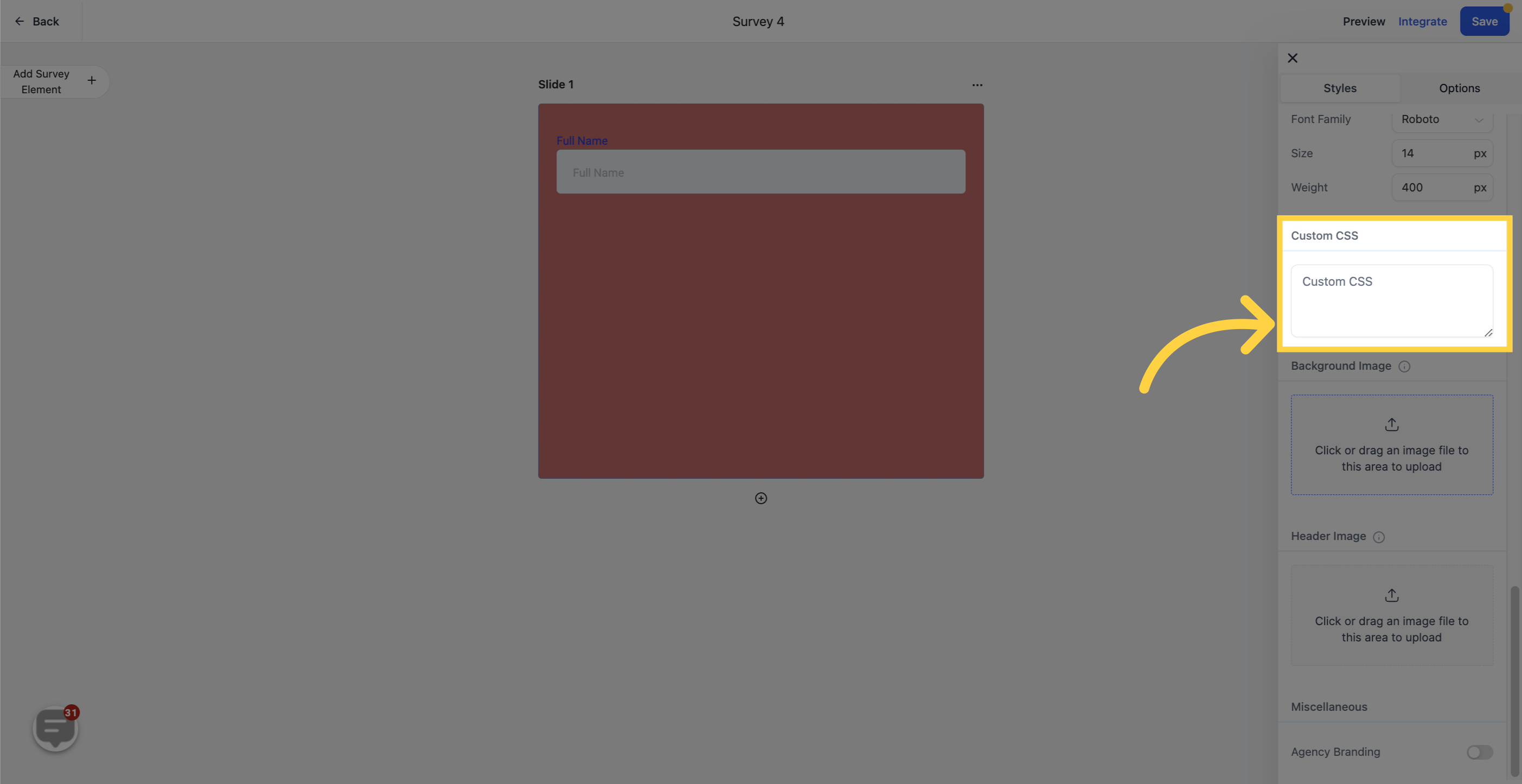
For advanced customization, use custom CSS to fully tailor the survey's appearance, including input field shapes, colors, buttons, and more. If you are not comfortable writing CSS, we recommend working with a web developer who has CSS experience.
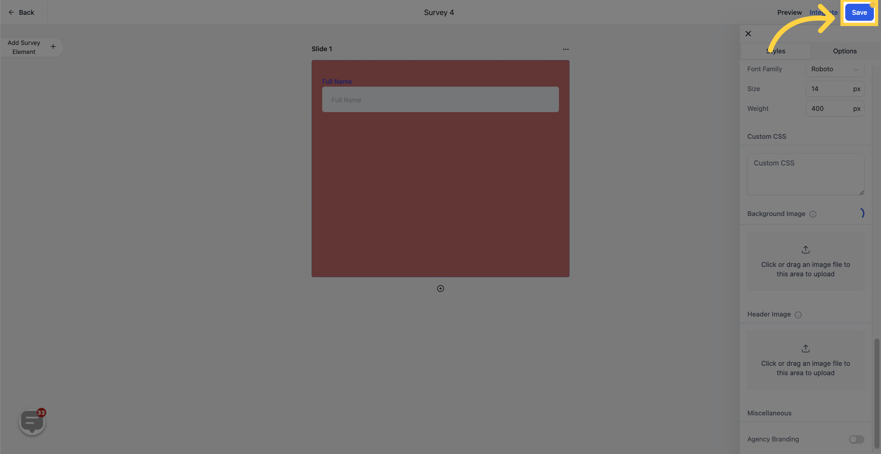
When you are happy with the design, click Save to store your styling.
Where do I find the styling controls for a survey? Open the survey under Web Tools → Surveys, then click the Styles & Options tab in the builder and select Styles.
Why are my Brand Colors not showing in the color picker? Confirm that your Brand Board has saved colors and that the correct default Brand Board is set as the default. If both are correct, the colors will appear in the picker under Brand Colors.
What is the difference between Brand Colors and Global Custom Colors? Brand Colors come from your Brand Board's approved palette. Global Custom Colors are reusable saved colors you manage from Brand Settings and can use across supported color pickers.
Will changing my default Brand Board update my existing surveys? No. Existing surveys keep their current styling until you open and update them manually.
Will the Primary Color affect all of my surveys and forms? The Primary Color applies across all surveys and forms using the default styling under your account. There is currently no way to set a different primary color for just one survey.
Can I keep a different button color than my Primary Color? Yes. Leave the Map Primary color to Button color toggle off and style your buttons through your theme or custom CSS.
Can I turn off the hover and focus effects? No. These interactive effects are built in to improve clarity and usability for the people filling out your survey, and they carry over to mobile devices as well.
Do I need to know CSS to style a survey? No. The Styles panel covers colors, borders, fonts, background images, and the progress footer without any code. Custom CSS is only for advanced changes beyond those controls.
Can I add a custom footer with my own HTML? Yes. The footer options and custom HTML/CSS footer are configured in the Options tab. See the Survey Options and Settings guide for details.
