The Form Builder in Aesthetix CRM lets you create custom forms to collect patient information, intake details, and consult requests. You can design a form, style it to match your practice, and then embed it on your website or share it as a direct link.
Note: Forms often collect patient information (PHI) such as names, contact details, and health history. Handle every submission according to your practice's HIPAA policies, and collect only the information you actually need.
To start building forms:
Click Marketing in the left sidebar to navigate to the Marketing section.
Click Forms.
Click Add Form to create a new form and open the builder.
You can also work with forms directly inside the Funnel and Website builders, so you can stay in your design flow while building a page. Forms created or added from those builders are automatically collected in your central forms list.
Note: Forms and surveys created from the Funnel or Website Builder also appear under Web Tools, Forms, Builder, and can be selected through the Form Picker, so you have a single source of truth across your account.
When creating and editing forms, you work across three tabs and a live canvas that shows your form as you build it.
Use the Fields tab to add new fields and components to your form. From dropdown menus and text boxes to checkboxes and radio buttons, this tab offers a wide range of options to choose from. You can add, remove, and reorder fields, and map them to custom fields where needed.
The Styles tab lets you tweak the visual appearance of your form to make it look more professional and polished. You can customize the background color, form width, font style, and other design elements to match your practice's brand and website.
The Settings tab lets you manage everything related to your form's performance and functionality, from notifications and confirmation messages to tracking data and field settings.
You do not have to build every form from scratch. Templates give you a ready-made structure, while Themes give you a ready-made look.
Templates (structure): Start from curated options such as Application, Contact, Donation, Order, Registration, Request, and Subscribe, then customize the fields and settings. For a med spa, a Contact or Request template is a natural starting point for consult requests and new-patient inquiries.
Themes (visual styles): Apply a polished look in one step.
Note: Switching Themes replaces your current style changes, so choose your theme before doing detailed styling.
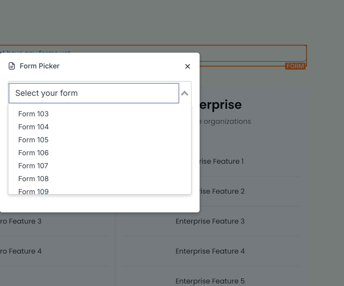
The Form Picker lets you reuse existing forms across multiple funnels and websites, keeping the experience consistent and measurable across your practice.
Search, preview, and select any existing form.
Once selected, drag it onto the canvas and open Edit for one-click customization.
The right sidebar of the Form Builder centralizes design and behavior controls, so you can quickly adjust how your form looks and works. Open it by clicking the Styles & Options button in the upper right corner of the builder, and click it again to collapse it.
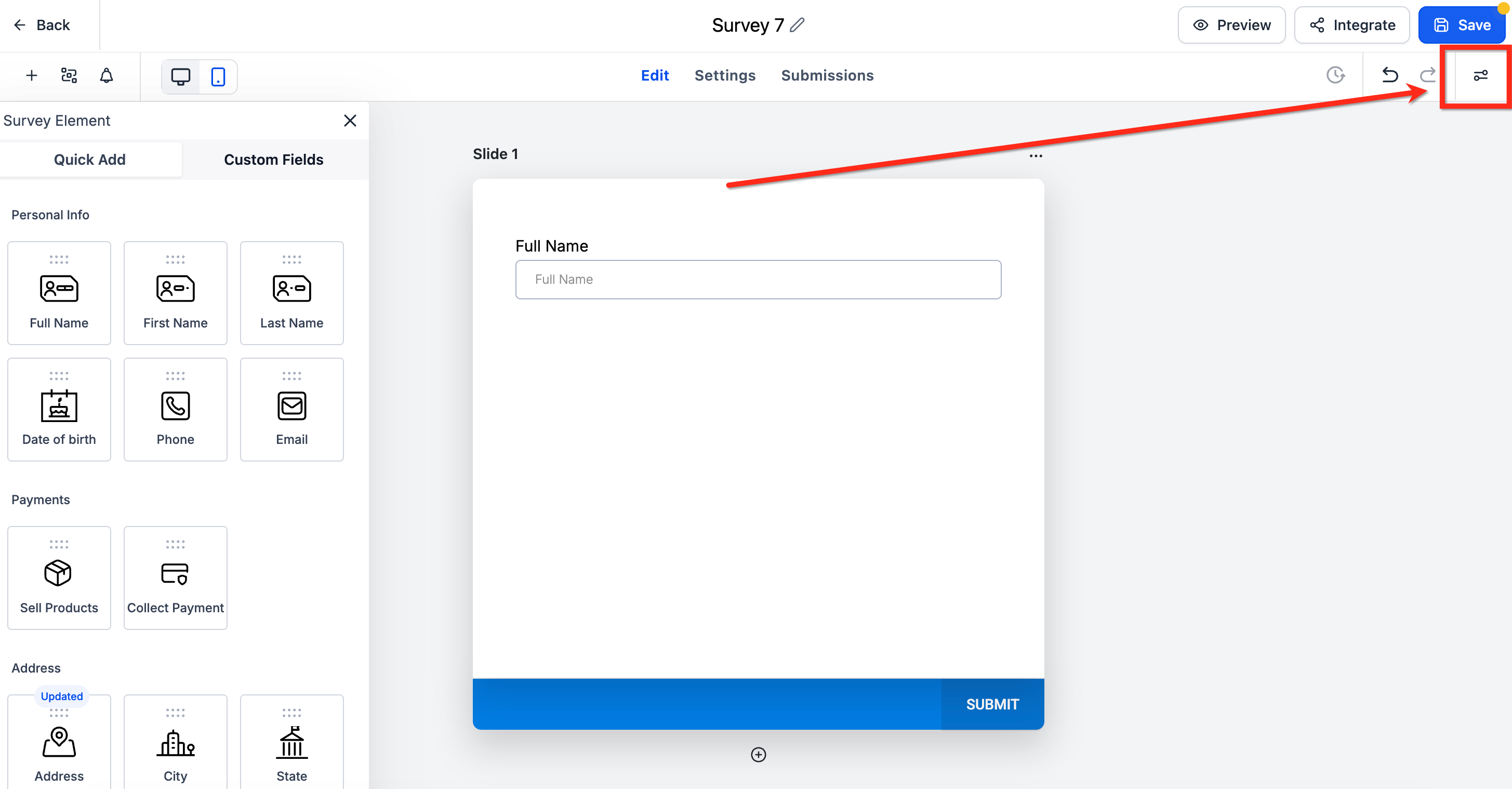
The right sidebar has three tabs:
Styles: Fine-tune the layout and look of your form.
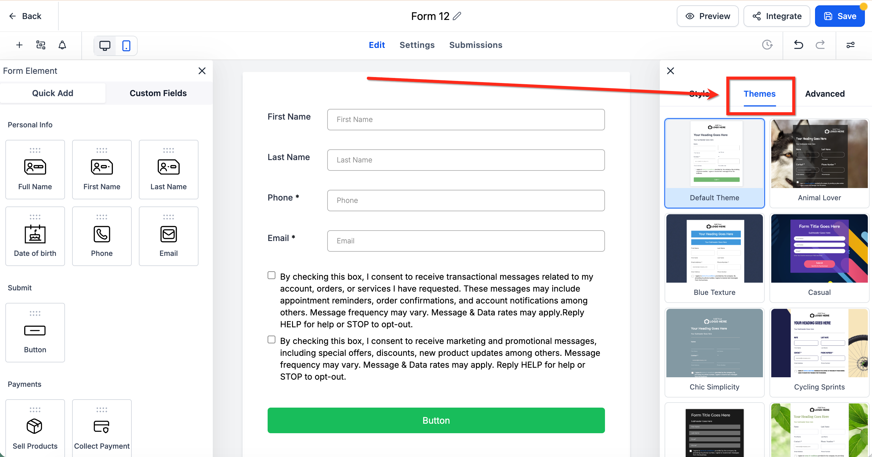
Themes: Apply ready-made presets for consistent branding.
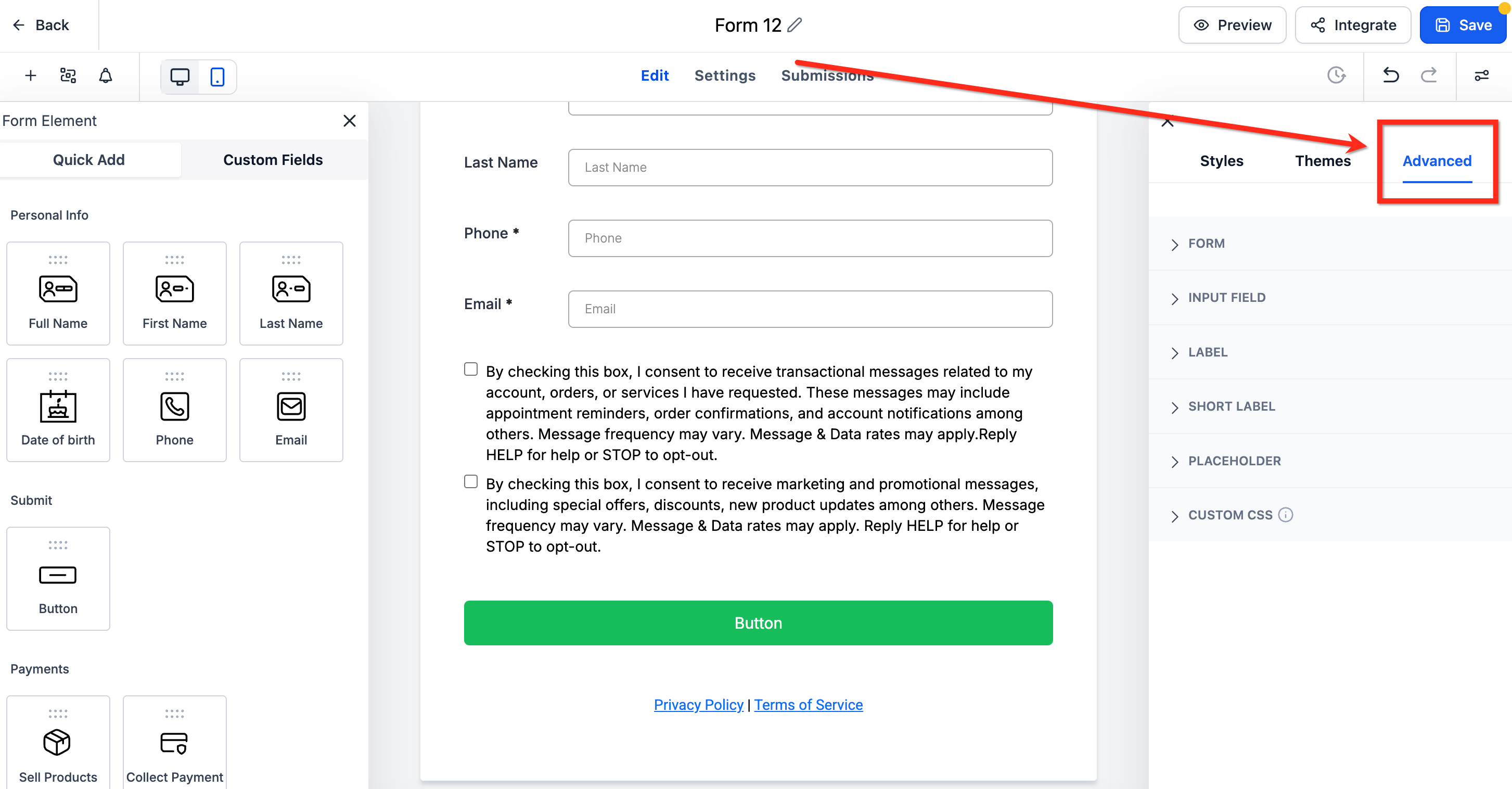
Advanced: Access extra options for specialized needs.
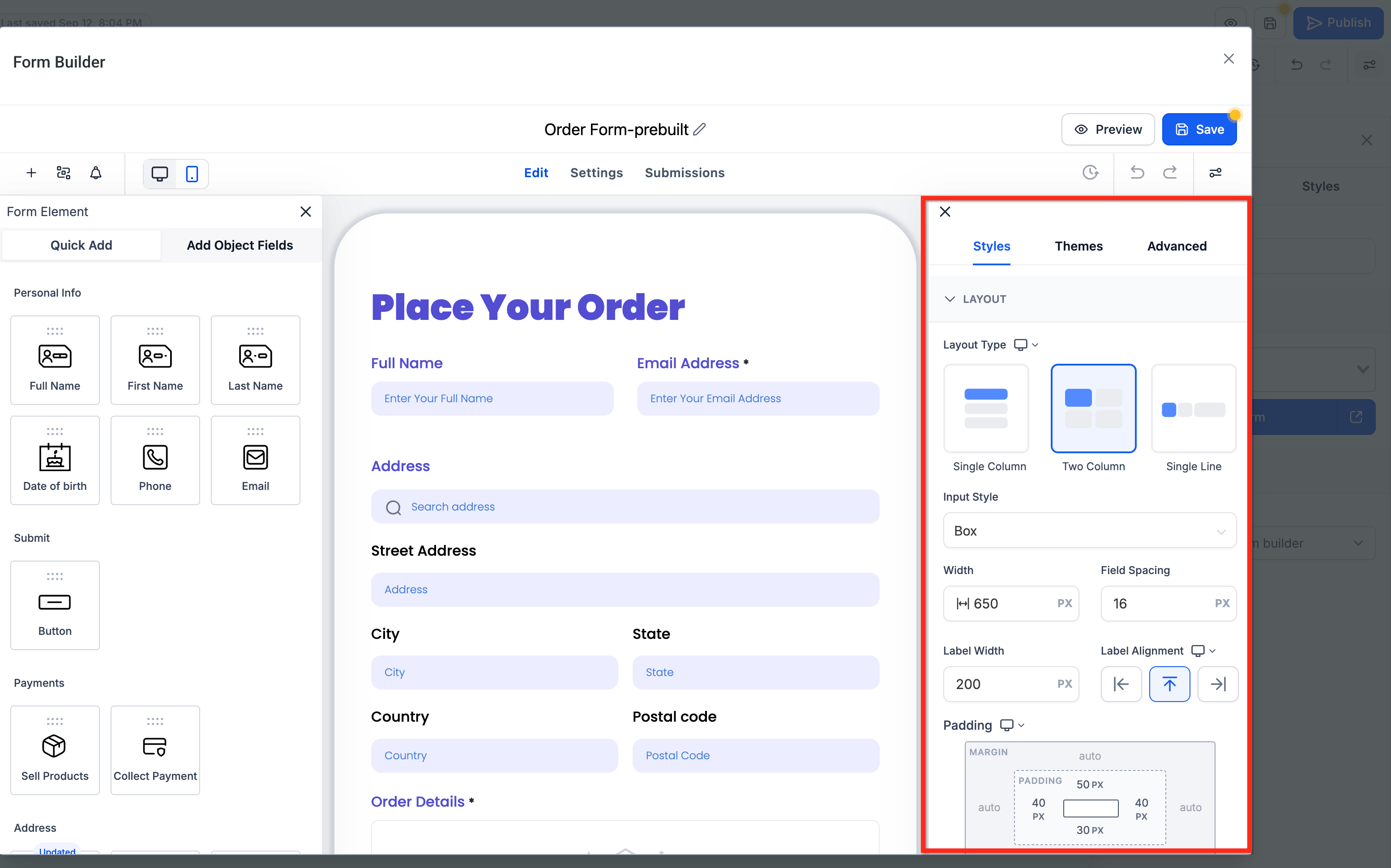
The Styles tab is where you set the core layout, color scheme, and branding for your form. Controls include:
Layout: Define the overall arrangement and field presentation, including how inputs and labels appear, along with widths, spacing, padding, and the top margin above your form. Changes update live in the preview, and leaving margin fields blank keeps the default spacing. You can now set top and bottom padding to 0 px for a true edge-to-edge layout.
Colors & Background: Set font options, choose background colors, and where supported, apply background or header imagery to match your brand.
The Themes tab lets you quickly create professional-looking forms using presets. Use Themes to accelerate setup, then use Styles to fine-tune spacing and widths afterward. To apply a theme, hover over the desired theme and select Use Theme, then confirm by clicking Proceed.
Note: Switching themes results in the loss of your current style modifications.
The Advanced tab provides deeper fine-tuning while keeping the form maintainable. Control types include:
Form: Adjust the form container's borders, corners, and shadow.
Input Field: Style the input elements themselves, including text and focus colors, borders, corners, width, padding, and shadows.
Label: Control label typography and color.
Short Label: Configure short-label typography and color.
Placeholder: Customize placeholder text appearance.
Custom CSS: Add custom CSS for precise control.
Note: Custom CSS takes precedence over Styles and Themes and may impact theme styling.
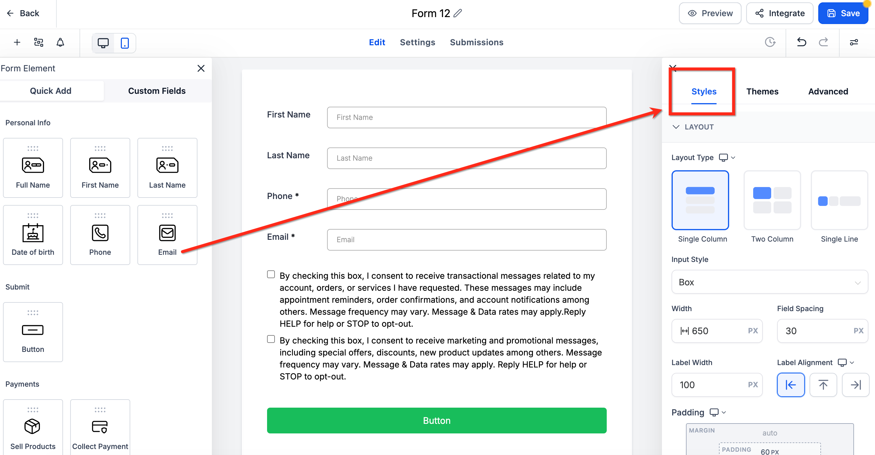
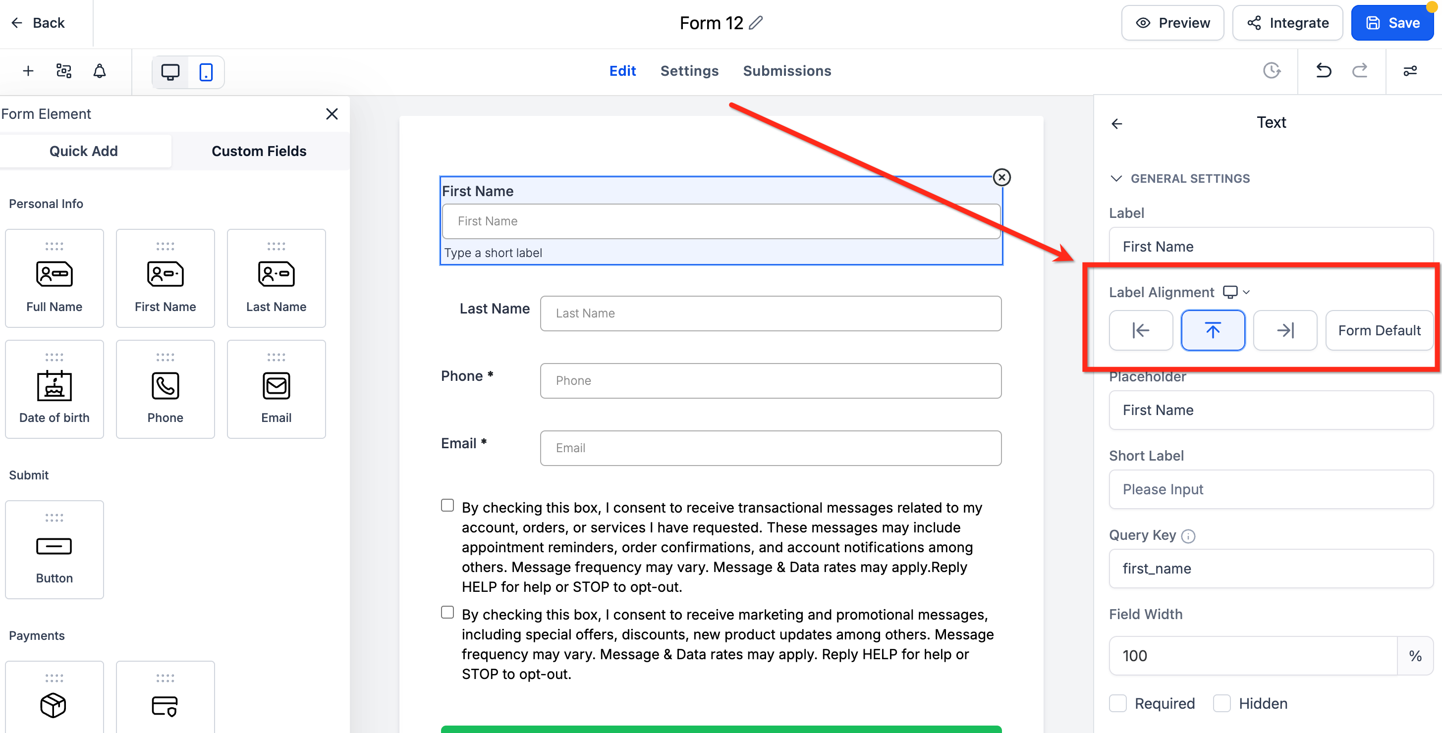
Element-level label alignment lets you set a different label position for each field, instead of applying one global alignment to the whole form. Use it to fine-tune visual rhythm and spacing, especially in compact layouts.
Available for forms using the Single Column layout.
Existing forms keep their global alignment unless you update a field explicitly.
Applies to standard fields such as text inputs, dropdowns, and radios.
On mobile, alignment automatically defaults to Top for a clear, user-friendly layout regardless of desktop settings.
To set it, select a single field in the builder, locate Label Alignment in the right sidebar, and choose the desired alignment (Top, Left, Right, or Form Default).
There are two ways to make your form available to visitors: integrate it into your webpage, or provide a custom form link they can use to access the form.
The Integrate Form tab offers four layout options, giving you flexibility in how the form appears on your website:
Sticky Sidebar: A form that always sticks to the side of the screen, on the right or left. You can choose to minimize the sidebar and set a specific title that appears when it is minimized (enter it in the Sidebar Title field).
Polite Slide-In: A form that appears at the bottom of the screen, on the left or right. It stays visible for a short time and disappears when the visitor is done, giving them more room to browse. Like the Sticky Sidebar, it can be minimized after use.
Popup: An overlay on the current page, often triggered by a button, link, or a set amount of time. Unlike the Sticky Sidebar and Polite Slide-In, a popup form cannot be minimized.
Inline: All form elements are left-aligned with labels displayed alongside each field, and the form appears within the page's content instead of as an overlay. Inline forms cannot be closed or minimized.
Trigger types control when and how the form appears on the external webpage:
Show on Scrolling: The form appears based on how far the visitor has scrolled down the page.
Show after _ seconds: A time-based trigger shows the form after the visitor spends a set amount of time on the page.
Always show: The form appears as soon as a visitor lands on the page.
You can control how the form activates for visitors:
Activate on _ visit: The form appears starting from a chosen visit number, such as a visitor's second or third time on your page.
Always Activated: The form stays activated for every visitor, whether it is their first visit or a repeat visit.
Once a form has served its purpose, you can set it to deactivate:
Deactivate after showing _ times: The form deactivates automatically after a set number of displays. This uses a cookie to track visits and form views.
Deactivate once lead is collected: The form deactivates immediately after a submission is captured, ideal when the main goal is capturing new patients.
Never deactivate: The form stays active once activated.
Copy embed code: Copy the embed code from the builder and paste it onto an external website or landing page.
Copy form link: Copy the unique link for the form to share directly.
Open form link: View the form in a new tab to see how it appears to visitors.
It is important to save your progress as you go. When you click Save Form in the builder, everything you have done so far is saved and you remain in the builder. Saving often is good practice and helps ensure your work is not lost.
These steps apply whether you build from the Form Builder or from within the Funnel and Website builders.
Open the builder. From the Funnel Builder, open your funnel, select a step, and enter the editor. From the Website Builder, open your website, choose a page, and enter the editor.
Open your forms and surveys. From the left sidebar, choose Create New to build from scratch, pick a prebuilt category, or choose Add Existing to launch the Form Picker. Drag and drop a new or existing form onto your page.
Create or modify the form. Choosing Create New opens a large pop-up Form Builder where you can add fields, customize the design, and save.
Choosing Add/Edit Existing launches the Form Picker to search and select a previously created form.
Save and test. Save your page, then preview it and submit a test entry. Confirm the submission appears where you expect it.
Can I customize the prebuilt templates? Yes. Start from any template, then modify the fields, styles, and behaviors in the builder.
What is the difference between Templates and Themes? Templates are starting structures (such as Contact or Request). Themes are visual presets. Switching Themes replaces your existing style changes.
Do changes in the right sidebar save automatically? No. Click Save in the builder to commit your changes.
Will changing Themes later overwrite my detailed styling? A new Theme can reset parts of the visual style, so re-check your Styles after switching. Custom CSS still overrides Themes and Styles, so review your CSS for conflicts.
How can I test different theme presets without losing my current look? After applying a new theme, you can revert to the previous look by clicking the Back button in the upper-right corner of the builder.
What happens to per-field label alignment if I switch to a different layout? Element-level label alignment is only available in Single Column. Switching layouts removes per-field control and labels return to the default setting.
How do I make my form available to visitors? You can either embed it on your website using the embed code or share the custom form link so patients can open it directly.
Where do form submissions go? After saving and previewing, submit a test entry and confirm it appears where you expect. Submissions feed into your account so you can follow up with each patient.