Your website is your practice's digital home: the place where prospective patients find you, learn about your treatments, and take the next step toward booking. In Aesthetix CRM, you can build a full, multi-page website using the same visual page builder you already know, then connect it to your own domain and publish it live. This guide walks you through what a website is, how it compares to a funnel, and how to build, customize, and launch one for your practice.
A website lets you create a patient-facing site directly inside Aesthetix CRM. You can build the perfect home page for your practice, add treatment and service pages, capture new leads, and much more.
Aesthetix CRM offers two types of site builders. They are similar and share the same editing tools, but they serve different purposes:
Websites: A place to build web pages for any use case, such as a home page for your practice. There is generally no set path visitors are led through, so websites do not offer split testing.
Funnels: A direct, step-by-step sequence of pages, usually built for a single purpose like capturing leads or booking a consultation. Because funnels move visitors through an ordered path, split testing is available on funnels only.
Both a website and a funnel are built with the same page builder. If you want a full site with many independent pages, choose a website. If you want a focused, sequential path, choose a funnel.
Note: Both websites and funnels are edited with the same visual builder. To learn the editing tools in depth, see "The Page Builder."
In most respects, funnels and websites are the same: both house a group of web pages, and both can be used for many purposes. What matters is whether you need split testing and how you want to view page traffic.
The main differences are:
Split testing is available on funnels only. Split testing lets you create a variation of a page to see which one performs better.
eCommerce (online store) can only be created and used on websites.
Page-view interface differs slightly depending on whether you are viewing a funnel or a website.
When you create a new site, you can choose from hundreds of ready-made templates. Once you select a template, you can edit any or all of its parts. We encourage you to browse them all to find the best starting point for your practice.
After you select a template, it loads. To begin editing a specific page, click Edit on that page to open the page builder.
Launching your own website can feel daunting, but it does not have to be. Think of it as your digital home: the spot on the internet where patients can easily find you. With ready-to-go templates, you are only moments away from a professional-looking site.
Navigate to Web Tools → Websites. Head to the Websites section to get started.
Click New Website.
Choose your starting point:
From Blank: Total creative freedom to build from scratch.
From Templates: A polished, quick start.
Select from Templates and click Create. Browse the templates, click Preview to see one live, then hit Continue.
Next, customize your site:
In the Website Editor, configure your website. Tweak colors, add images, and make it your own.
Click Save. Don't forget to save your work.
Click Publish. Make it live for the world to see.
Click Back to exit the Website Editor.
Now connect your domain:
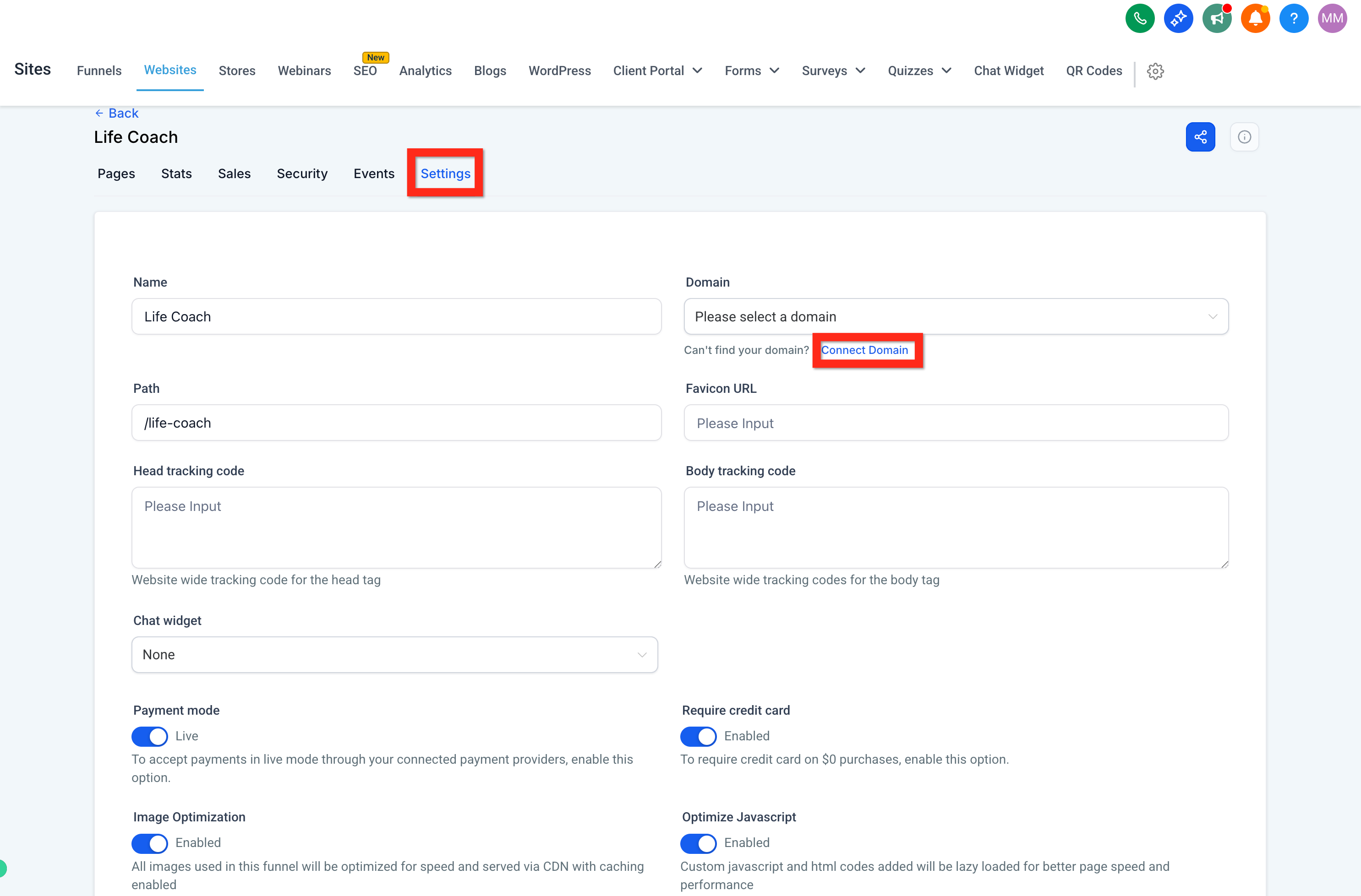
Click the Settings tab to connect your web address.
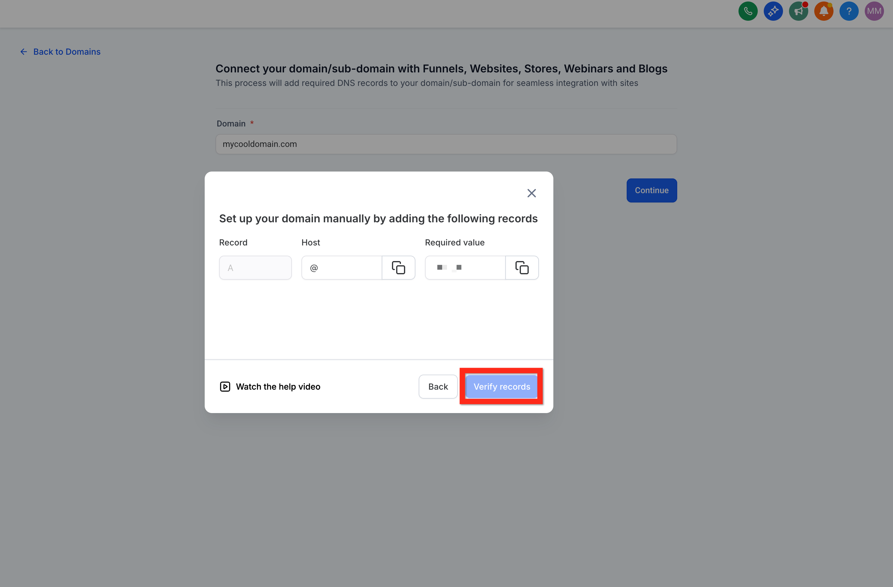
Under Domain, click Connect Domain. Find the domain dropdown and click the Connect Domain link underneath.
After clicking Connect Domain, you may go straight to this page, where you can enter your domain and click Continue, or click Back to Domains to open your Settings > Domains list.
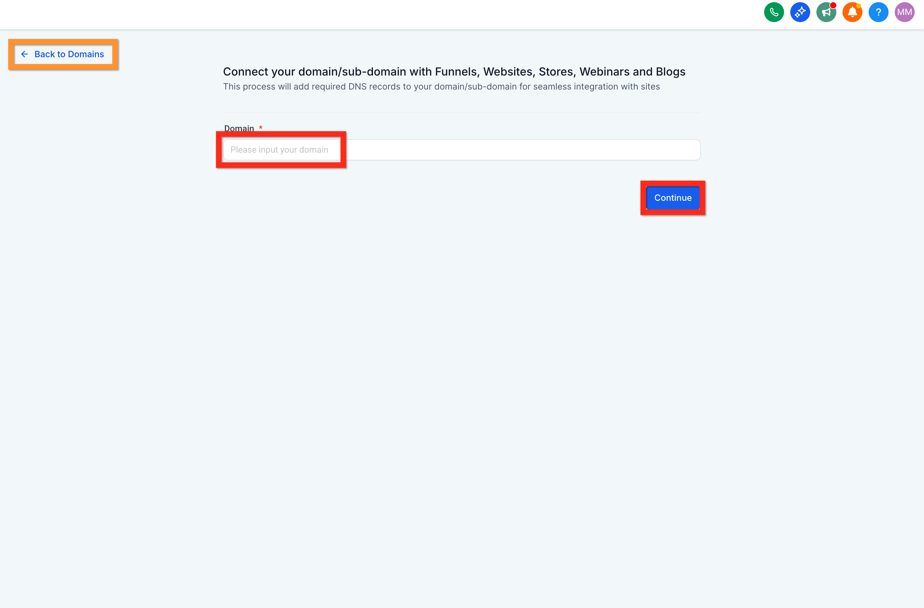
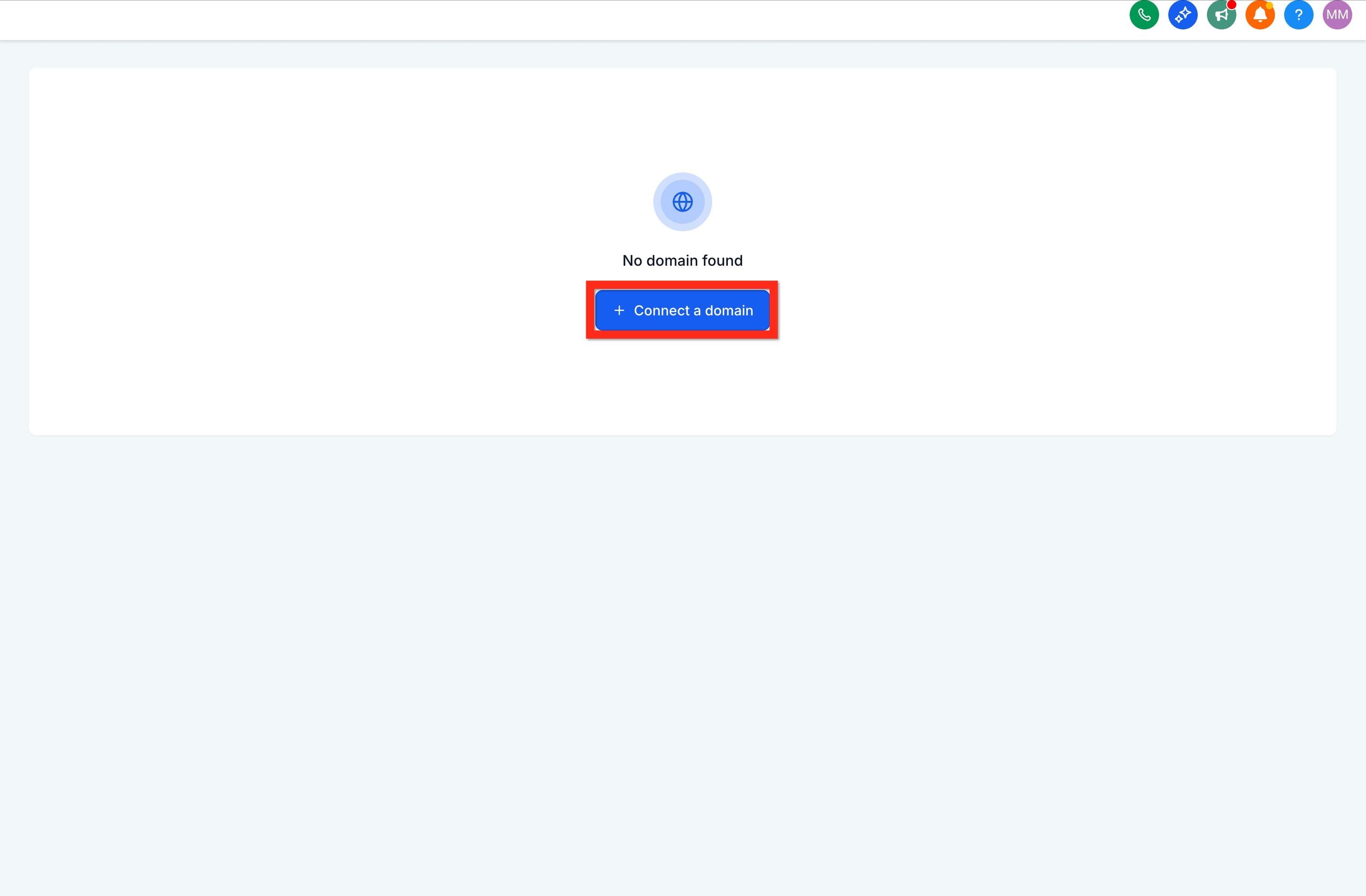
Click Connect a Domain. Enter your domain name and click Continue.
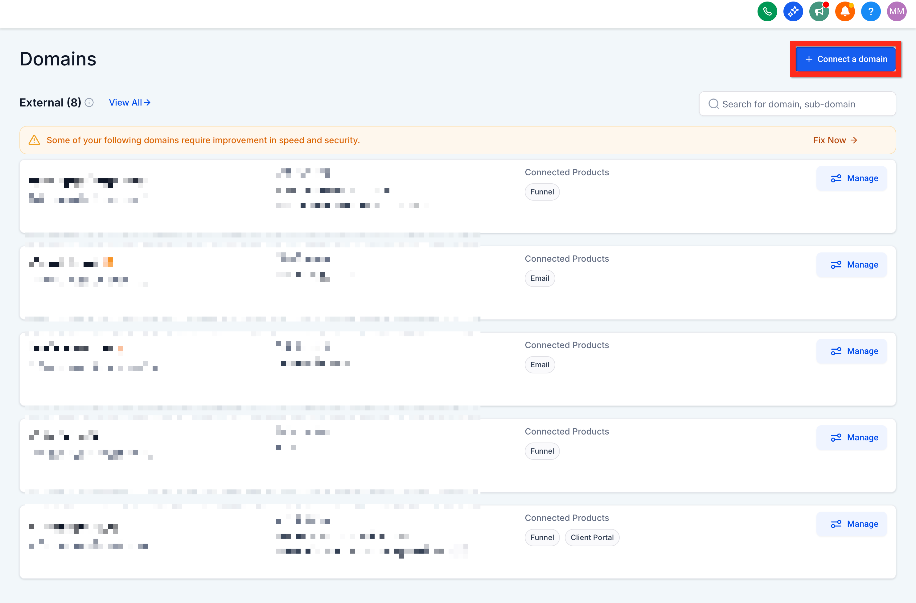
If you don't have any domains yet, this is the page you will see. Just click Connect a Domain.
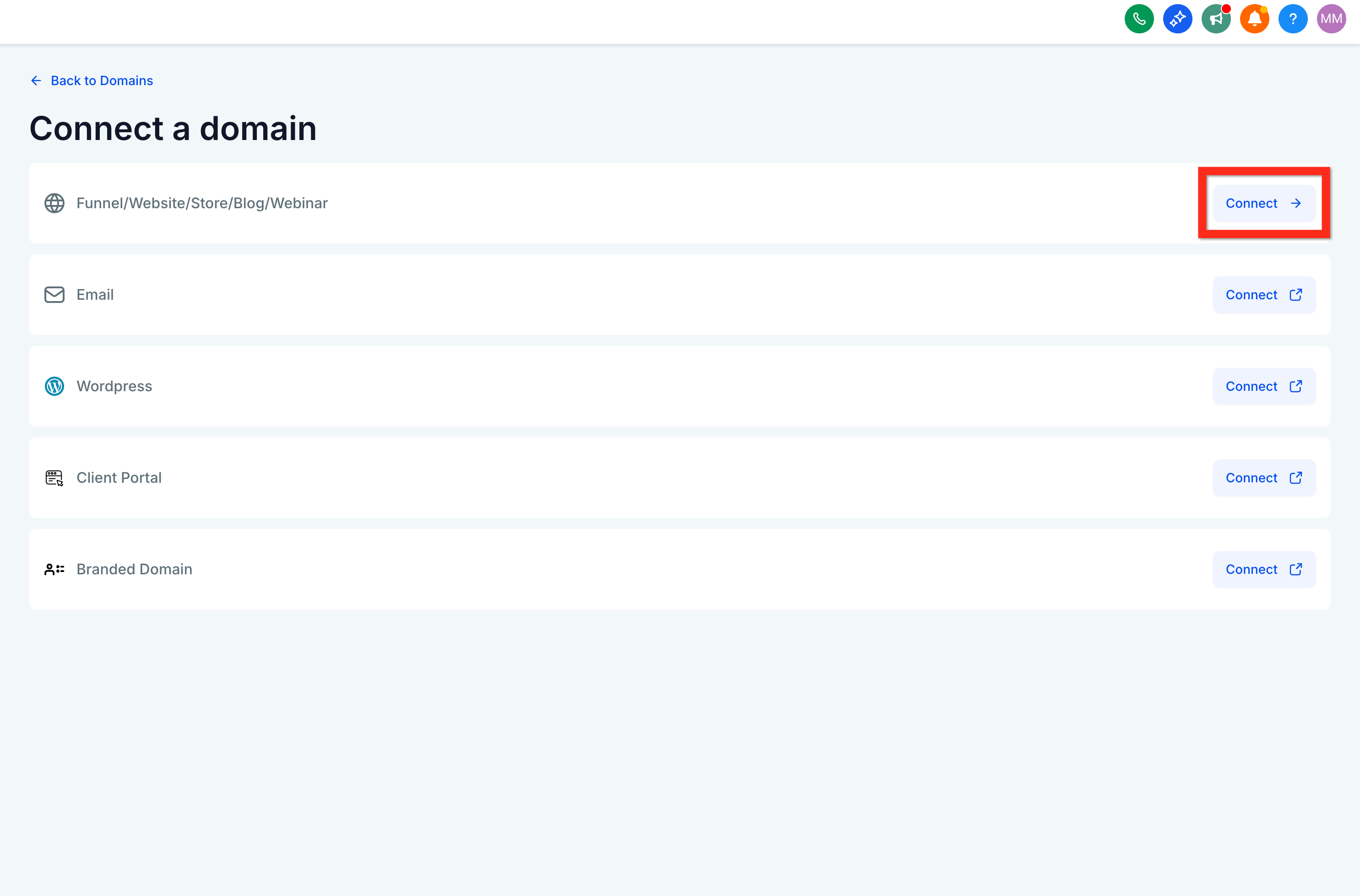
Choose to connect a website. Use the option for blog, funnel, website, and so on.
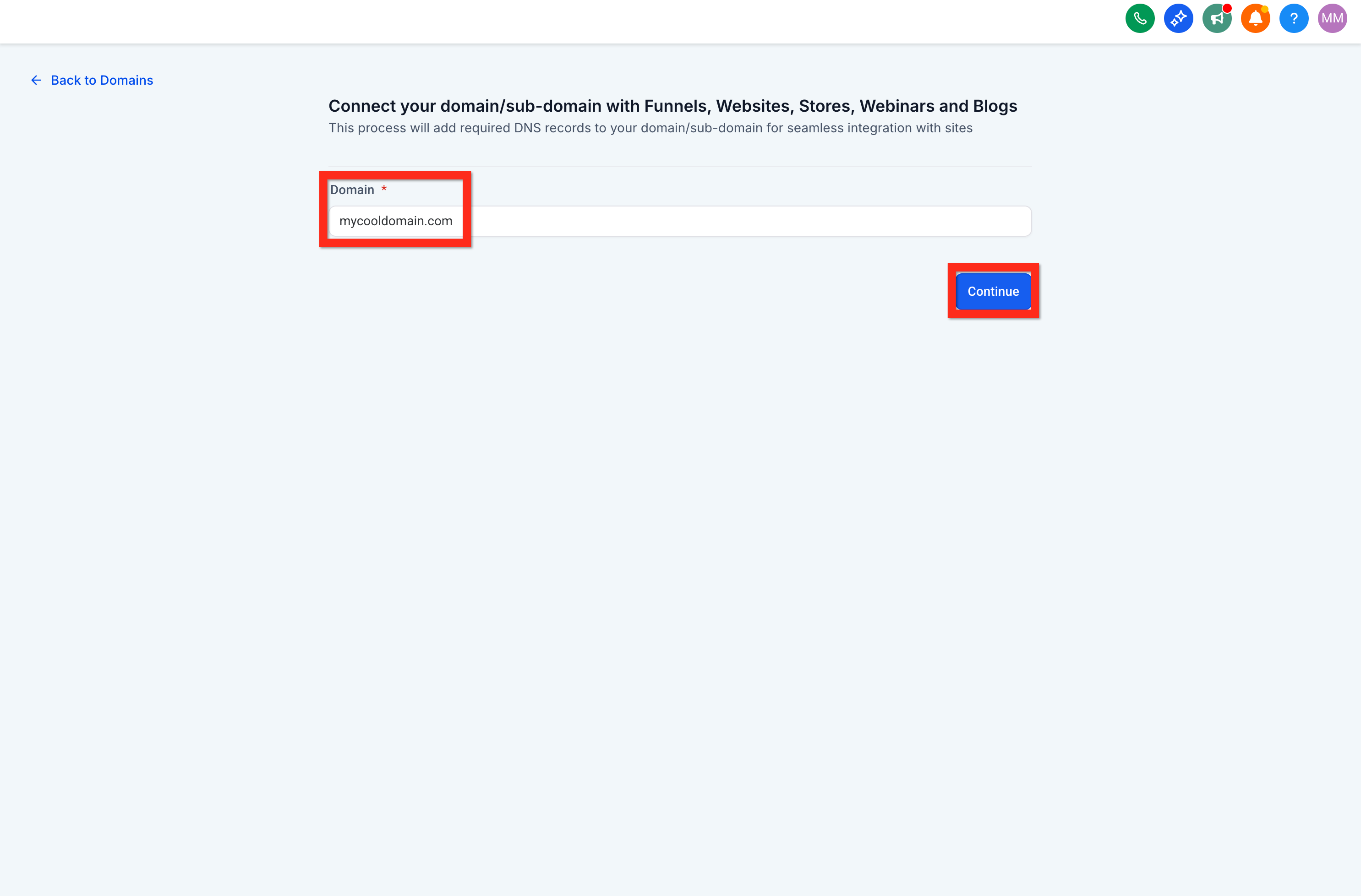
Enter the domain and click Continue. This is where you specify the domain your website will launch on.
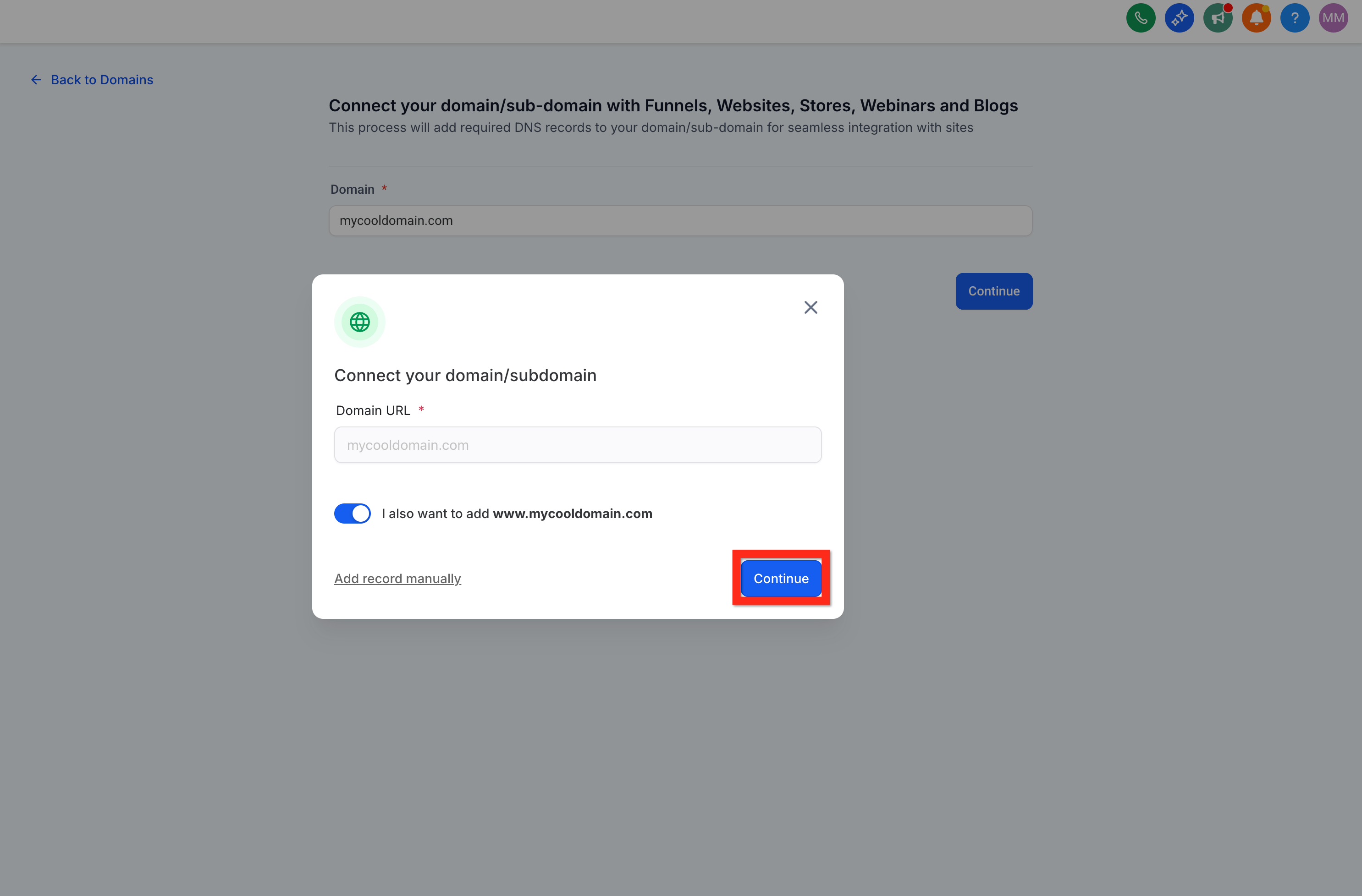
Configure DNS (varies by registrar). Follow the provided instructions; it is simpler than it sounds.
Click Verify Records to confirm everything checks out.
Navigate back to the Website Settings tab.
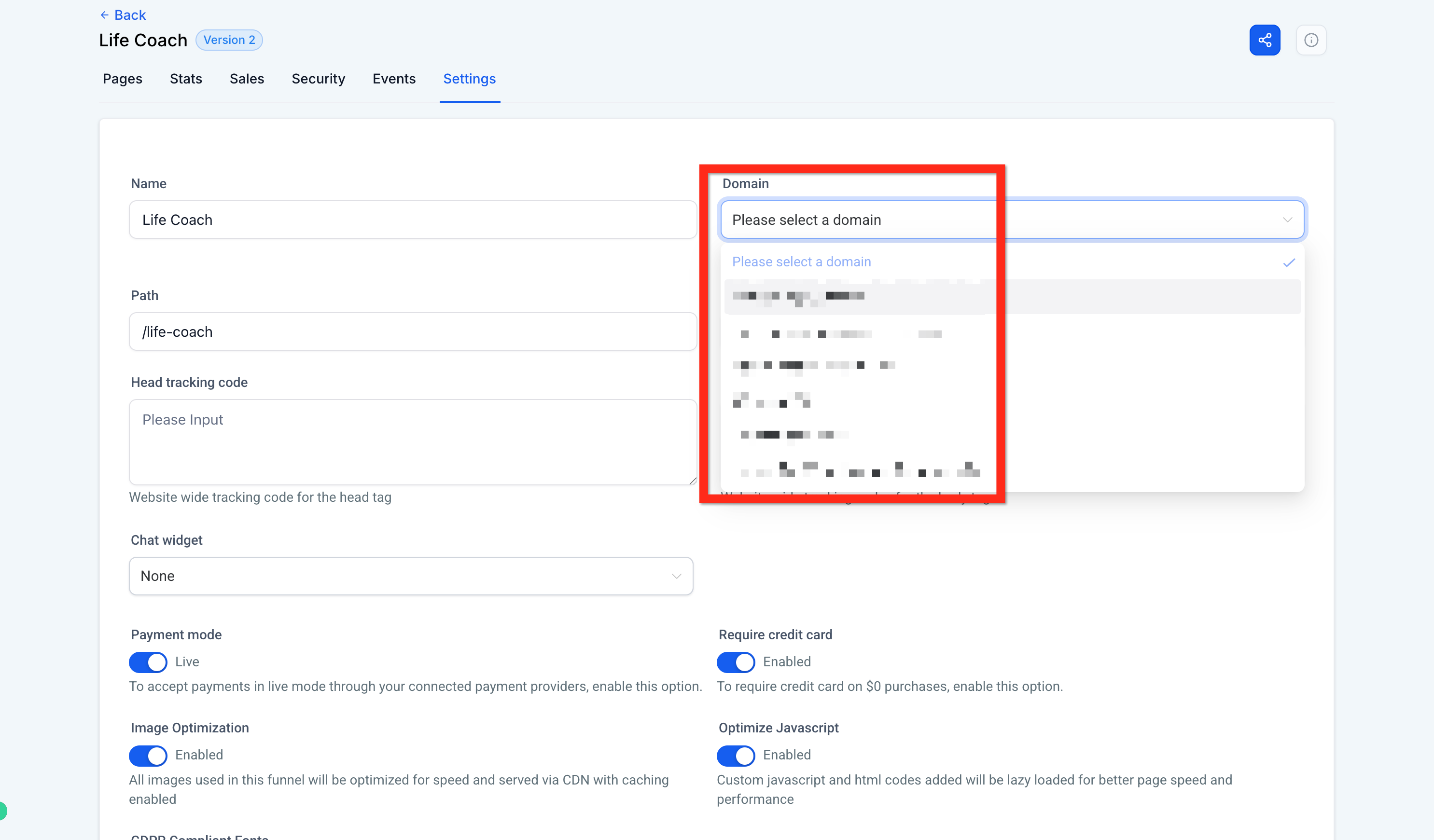
Select your domain and click Save. Choose your new domain and save your changes. Your website is now live.
From here, share your new website link with your audience, explore your analytics, or add more content to enhance your online presence.
Websites and funnels share the same builder, so the tools and hierarchy of elements are identical. Let's look at how you use the builder to create your site.
Site builder navigation bar
The navigation bar lives at the top of the builder and lets you toggle between the various features. Each tab is covered below.
Rows and columns are the building blocks of your site, and they house your elements. To add an element like an image, you need at least one section, one row, and one column. From there you can add an element, and there are many unique elements to choose from.
Note: Page builder elements use refreshed default styling (updated typography, placeholder images and content, and default colors) so new pages look modern right out of the box. You can still override styles using the right sidebar settings, the color picker, or your brand board.
To add an element, click Add Element in the top right of your editor to see what you can add.
To find elements faster, use the Quick Add search. You can search with common or related keywords even if you do not know the exact element name. For example, search "headline" or "title" to find Heading, "booking" or "schedule" to find Calendar, or "slider" to find Image Slider.
Once you find the element you want, click and drag it to the area you prefer.
Note: When you choose images or files while editing, the media picker opens in a window and supports on-the-fly uploads via drag and drop.
Every element on a web page requires a section. Within that section you need at least one row, and within that row at least one column. Once you have all three (Section > Row > Column), you can add an element from the + Add Element bar.
From largest to smallest, the hierarchy is:
Sections > Rows > Columns > Elements
Note: The hierarchy still applies (Sections → Rows → Columns → Elements), but with Enhanced Drag & Drop the builder can auto-create this structure when you drop elements onto the canvas.
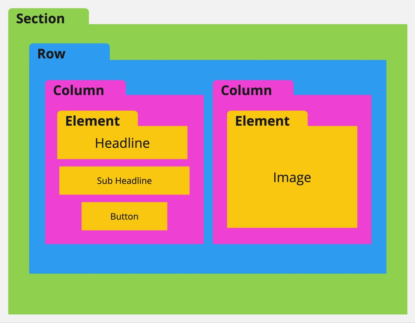
A few rules about sections, rows, and columns:
You cannot add a section within a section, a row within a row, a column within a column, or an element within an element.
You can add multiple rows into a section, multiple columns into a row, and multiple elements into a column.
You must have at least one section, one row, and one column to add an element.
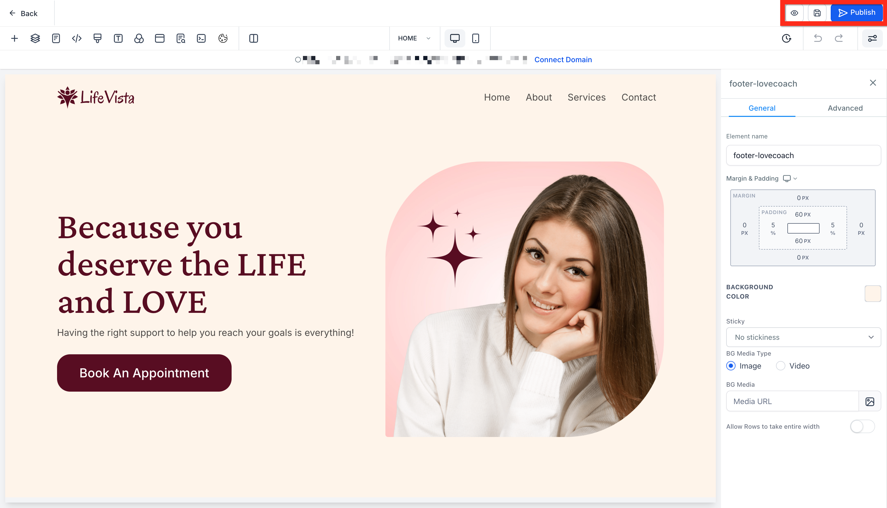
To edit a specific section, row, column, or element, hover over it and click the gear settings icon that appears. Clicking any part of an element also opens the settings menu on the right.
Within these settings you can add padding and margin, change visibility, and much more. Note the General and Advanced tabs, which offer additional settings.
When you want to move an element or add space around it, you will adjust its padding or margin from the object settings. Click the object to open its settings menu on the right.
Padding adds space within a section, row, column, or element. It adds space from the outside of the object inward.
Margin adds distance outside a section, row, column, or element, giving space between it and other objects.
You can move an object in two ways:
Up/down arrows (when available) shift the object up or down based on the elements around it.
Drag and drop: Hover over the object, click and hold the move icon, then release to drop it into its new place.
When Enhanced Drag & Drop is enabled, you can also move elements by dragging from anywhere on the element.
Hover over the row to reveal the column boundaries and drop zones.
Drag the column left or right within the same row.
Drop it when the placement indicator shows the new position.
Review the tablet and mobile views to confirm the responsive order still looks correct.
Note: Reordering is currently scoped to the same row.
Hover over any object to clone it and everything within it. All settings and objects inside the clone are duplicated and added below. This is great when you have a format or object you want to reuse elsewhere on the page.
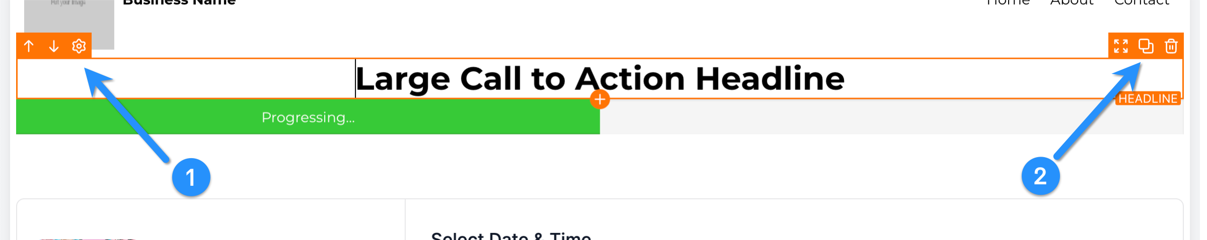
To delete an object, hover over it and select the trash can icon. You can use Undo/Redo to bring it back if needed.
Layers let you view all of your objects and how they are nested within the page hierarchy. This is helpful when you have misplaced an object or hidden it from both mobile and desktop view.
View and navigate to other pages within your website from the Pages tab, so you can quickly move between pages when editing several at once. You can access this tab from both the right and the middle of the builder navigation bar.
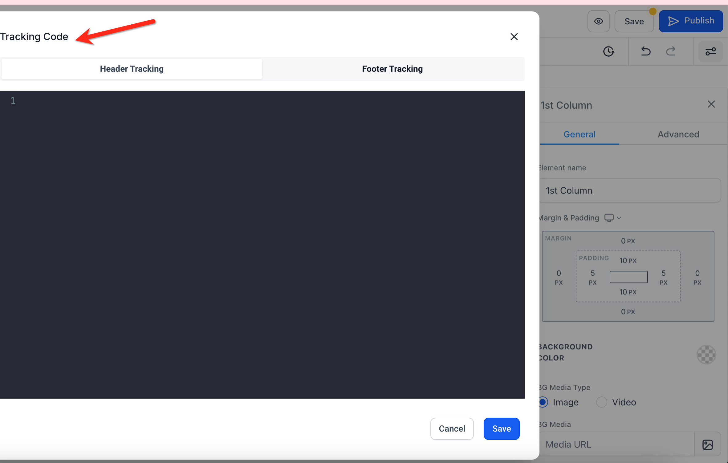
If you would like to add a tracking code to the header or footer of your page, you can do so from the Tracking Code tab.
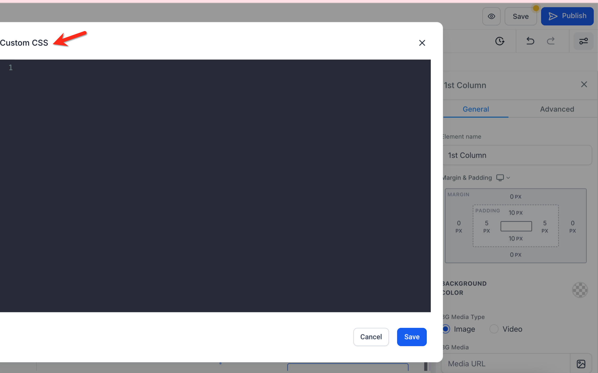
When you want to add custom CSS to your website, use the Custom CSS tab. Consult a developer for code tailored to your unique needs.
Change the default font for your headlines and content, as well as your text and link colors, within Typography.
To change the default background image or background color of your page, select the Background tab. This adds a background behind your sections. If you have a background set on a specific section, row, column, or element, it will appear in front of this page background.
Pop-ups still convert well despite their reputation. To add one, use the Pop-Up option, then edit its properties in the settings menu on the right.
You can trigger a pop-up by adding a button and setting its action to show the pop-up. You can also use the pop-up settings to show it on exit or after a time delay: select the pop-up, then adjust the settings on the right.
Here you can edit your SEO metadata, which appears in search engine results, in your browser tab, and when you share your site link. It may seem small, but proper SEO settings help search engines find your site and help visitors trust your links.
If you have custom code on your site and it installed successfully, this button loads that code so you can see it within the builder. You can also preview the page. If your custom code is not working as planned, consult a developer.
While building, you can have the right-hand settings panel overlay the page, or you can set it to two-column mode, which splits the view: the first column is your page and the second is the settings panel.
While editing, you may need to undo a change. You can undo or redo your actions from the top right of the builder navigation bar.
Undo/Redo captures changes made not only on the main page but also within pop-ups and global settings such as typography and tracking codes.
When you undo or redo a change that affects a pop-up, the builder automatically opens the relevant pop-up so you can see the change in context.
For text-based elements, changes are intelligently batched together, preventing an undo step for every keystroke and keeping your history clean.
Note: Undo/Redo is session-based. If you reload or leave the builder, you may not be able to undo or redo earlier changes. Versions, outlined below, are great for restoring earlier states of your site.
In the top right of the builder you will find the Versions, Preview, Save, and Publish buttons.
Versions takes you to previously saved versions of your site. Helpful when you want to view or revert to an earlier version.
Preview creates a preview of your page so you can see it as a live visitor would. Great for testing recent edits.
Save stores an unpublished version of your site. This version is overwritten with every save and is separate from the published, live version. Your visitors will not see any changes until they are published.
Publish activates the current saved version and posts it live to the internet. Visitors will then see your most recent published version.
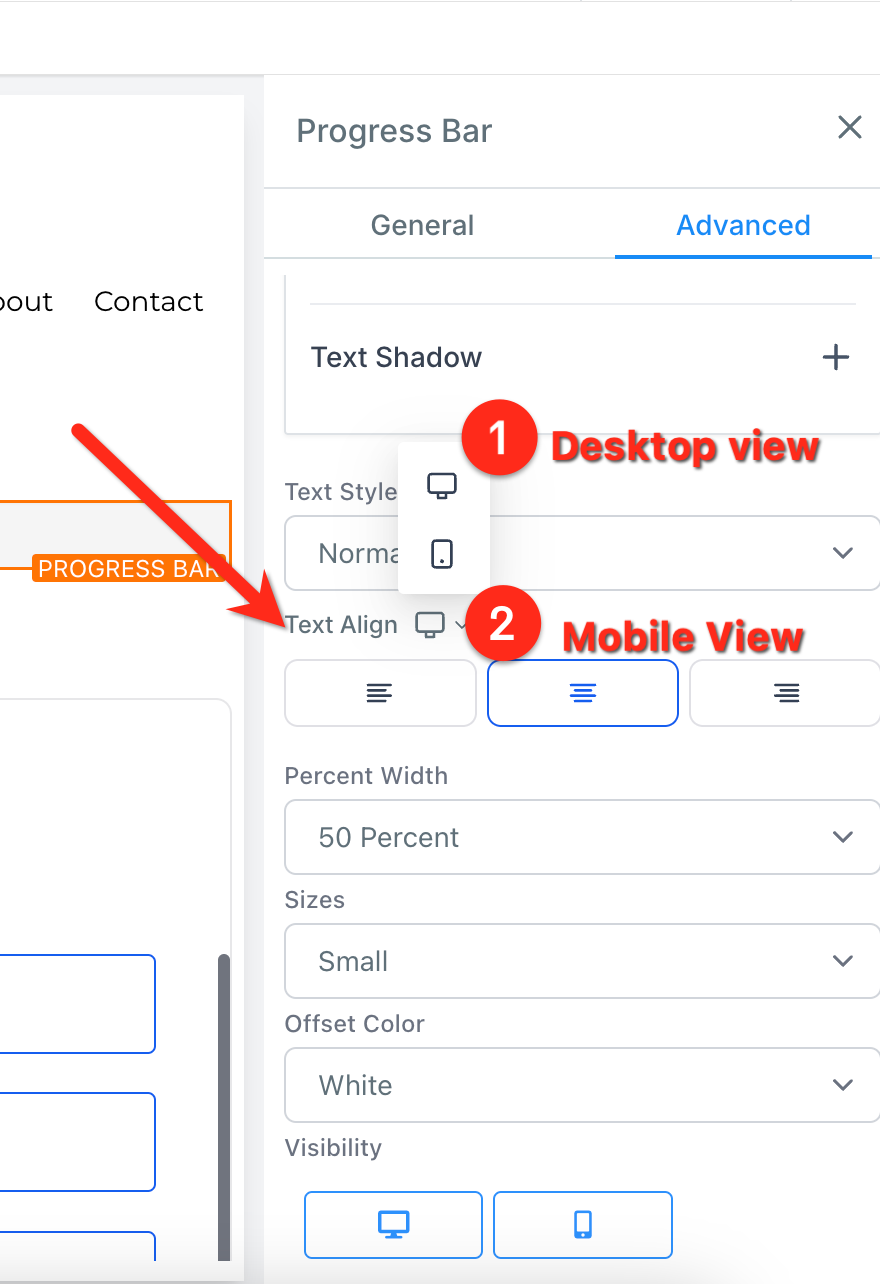
Every site builder has both a mobile and a desktop view. Unless you edit an object specifically, the two views are identical. When you review your mobile view, you will likely find aspects you want to adjust for mobile visitors, which makes sense because mobile and desktop screens are different sizes.
At the top of your editor you will see buttons for Desktop Mode and Mobile Mode. Selecting Mobile Mode toggles to the mobile view editor.
By default, all objects are visible on both mobile and desktop. You can change this, which helps greatly in some situations.
Often you will want a section, row, column, or element to appear only on mobile or only on desktop. Select any object, go to its settings, then open the Advanced settings to change its visibility. This is very helpful for optimizing the look and feel of each view.
After toggling, the object appears only where you have allowed it. For example, if you remove Desktop, the element shows only in the mobile editor and on the live mobile view.
Within an object's settings, you will see mobile-responsive toggles that let you edit settings unique to mobile or desktop. For example, you can set an image element's alignment on desktop, then toggle to mobile and give it a different alignment there.
You will find mobile-responsive settings like this on several object settings, and we are always adding more.
Finish desktop mode first. Completing a full desktop version of your site usually makes it easier to edit the mobile view. Get the desktop view looking great, then work on mobile.
Mobile navigation menus. If you have a navigation menu, create a global section with mobile-only visibility. You can add it to the mobile version of each page for a clean, consistent look. Do the same for your desktop navigation menu.
Duplicate an object and change visibility. If you cannot get a section to look good on mobile without changing the desktop version, create a mobile-specific section. Use the duplicate function to copy the object, set one copy to desktop-only and the new one to mobile-only, then edit the mobile copy freely. This is especially useful for images.
Now that your site is built, let's review its backend settings.
Site pages
This is where all of the pages of your site live. You can edit or preview a page from here. You land here before entering the site builder, and again when you exit it.
To use order forms on your site, you must attach a product you have created in Aesthetix CRM to the specific page where visitors will check out and purchase.
On websites, click the three dots at the top right of the page, then select Products. After arriving on the Products tab, add your product. If you don't have one created in your account yet, you will need to create it first.
Stats give you insights into your page views and opt-ins, along with the number of sales and earnings on your site.
The Sales area reveals each transaction that has occurred on your sites. For current sites, this has moved to the Payments tab: select the Orders and Transactions tabs there.
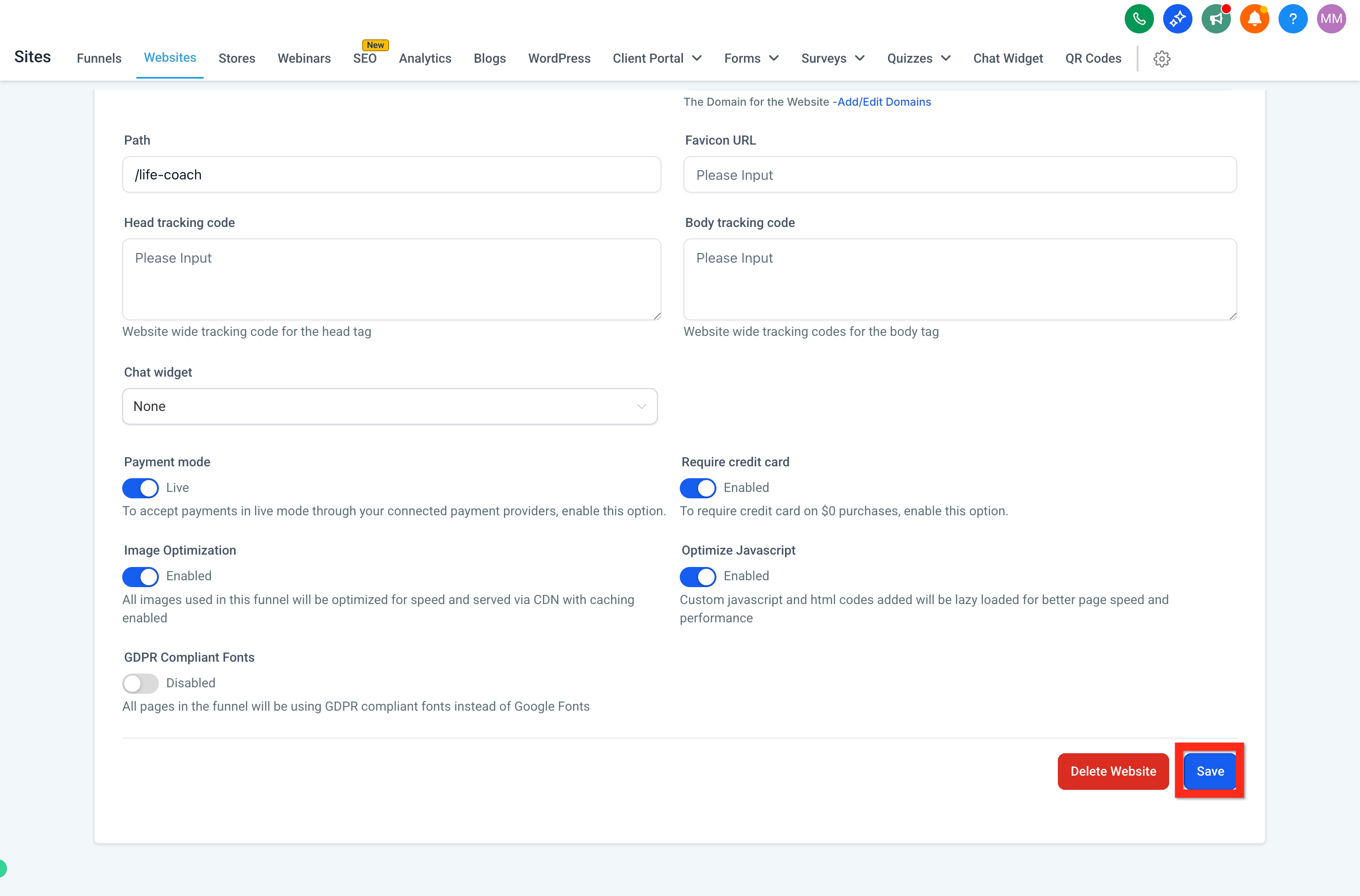
Site settings let you attach your domain, update the default path, add a favicon, and more. Let's unpack each one.
Name is the name you give your site. It does not appear to your patients; it is for internal use only.
Domain is the domain you assign to your website. Without a domain, people cannot visit your site (aside from an uncustomizable preview link, which is not recommended).
Path is the default path or extension for your site. In yourpractice.com/about, the /about is the path. Each page has its own path, and no two pages can share the same one.
Favicon is the small icon that appears in the browser tab when someone opens your site. Add a shareable image URL here, and it will load the favicon across all of your pages.
Head tracking code installs a site-wide tracking code into the header.
Body tracking code installs a site-wide tracking code into the body.
Payment mode lets you switch between test and live modes if you have products attached to your site. Test mode lets you use testing cards to complete a form and run a test, which is great before launch. As you get closer to going live, a live purchase is encouraged (you can always refund yourself).
Image optimization automatically adjusts your images to load faster. It is on by default and generally should stay on, since faster loading creates a better experience for visitors.
Optimize JavaScript helps your pages load faster when you have custom JavaScript installed, since JavaScript can otherwise slow load times. External JavaScript is loaded efficiently for better performance.
GDPR-compliant fonts can be enabled depending on your legal needs. This removes non-compliant fonts to help your site meet applicable laws and regulations. Always consult a lawyer to ensure full compliance.
Chat widget can be customized and set up under Web Tools → Chat Widget. Enabling this deploys your chat widget to all of your websites. To deploy it on specific pages only, keep this disabled and copy the code to the pages you want.
To change the name of a page or site, or its path or extension, open the site builder, click the three dots, then select Settings.
From here you can edit the page or site name and the path. The path goes at the end of a URL: in yourpractice.com/about, the /about is the path. You can set these yourself; otherwise a random one is assigned. If a path already exists on your domain, numbers are added, since paths cannot repeat.
What are global sections?
Global sections are saved sections you can reuse across multiple pages. Any change you make to a global section, after saving, automatically updates it on every page it appears on. A great example is a header or footer: using a global section keeps it identical across all of your pages.
To create one, build a section you like (such as a header), hover over it, click the Save icon, name it, select Global Section, then click Save. You can now add this same global section to all of your pages.
Remember that any change to a global section, after saving, updates it everywhere it is used. Global sections are not placed automatically; you must add them. To add one, click the + Add Element icon in the top right of your builder, then select Global Section and choose your saved section.
What are template sections?
Similar to a global section, a template section can be saved and added later within the same page or another page. Unlike a global section, changes made to a placed template section do not update the saved template or other places it was added.
What is a funnel?
A funnel is a series of pages used to move a visitor toward a single goal, such as capturing a lead or booking an appointment. Funnels have "steps" that let you visualize the pages a prospective patient will visit. For example, a booking funnel might have three steps:
Landing page where you offer something for contacts to download in exchange for their contact information.
Booking page where, after a contact fills out a form, you present your booking calendar to schedule a consultation.
Thank-you page where, after booking, the contact sees next steps and a thank-you message.
Funnels usually serve a specific purpose, while websites are better for a full, multi-page presence.
How do I see the mobile view of a website on my desktop?
Right-click on the loaded web page, click Inspect, then toggle the view from desktop to mobile.
How do I upload and get a shareable image link?
To load an image, you must either upload it to Aesthetix CRM or provide a shareable link. To upload, go to Settings > Media within your account, then select Upload File in the top right of the media library.
After the image uploads, right-click it to copy the link. Use this link wherever a shareable media URL is required. For example, the Favicon field in Site Settings requires a shareable media URL; paste your uploaded image URL there so your favicon loads.