The Page Builder gives you a full set of visual styling controls so you can design polished, on-brand pages without leaving Aesthetix CRM. This guide covers the color picker, gradients and background blur, shadows, and border control.
Note: Visual styling controls, color picker, gradients and background blur, shadows, and borders.
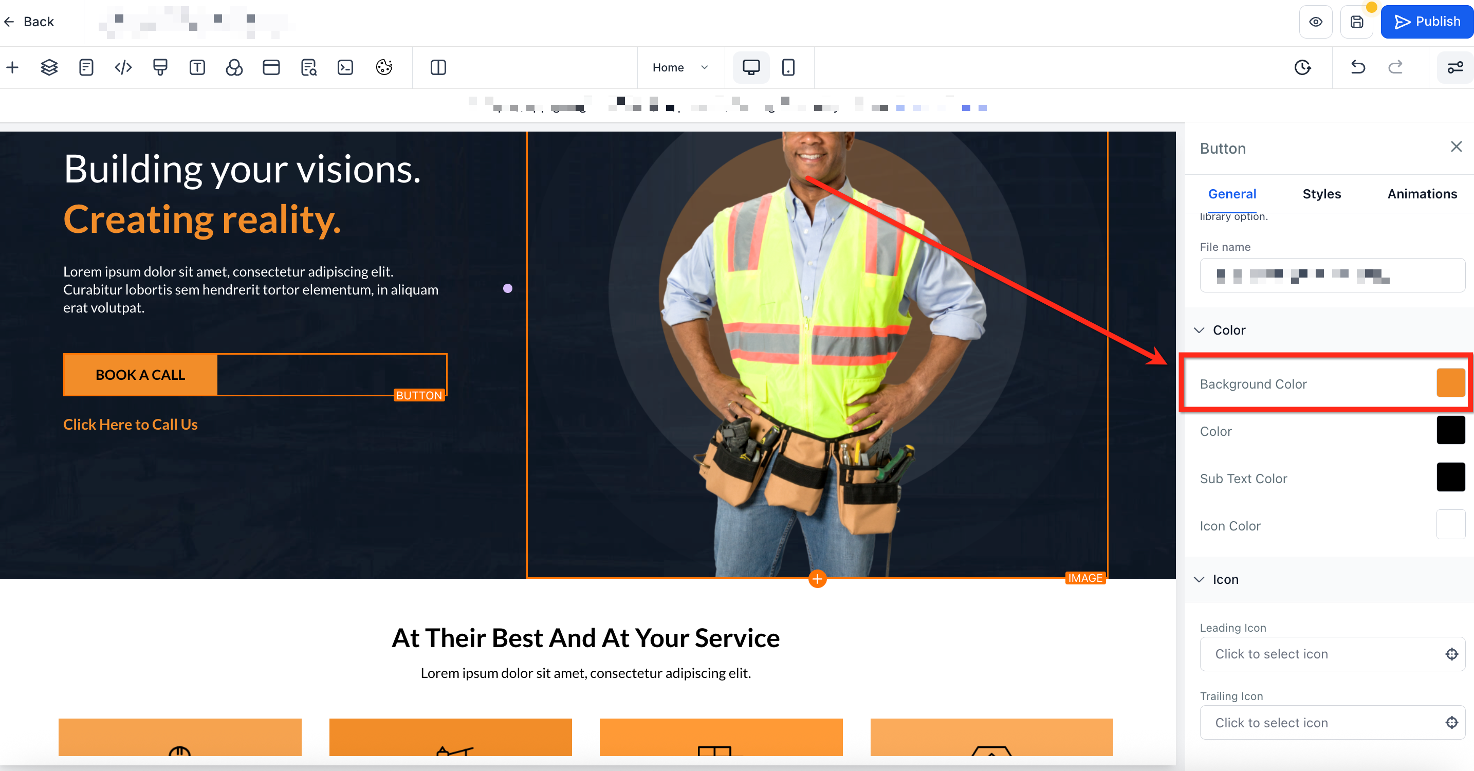
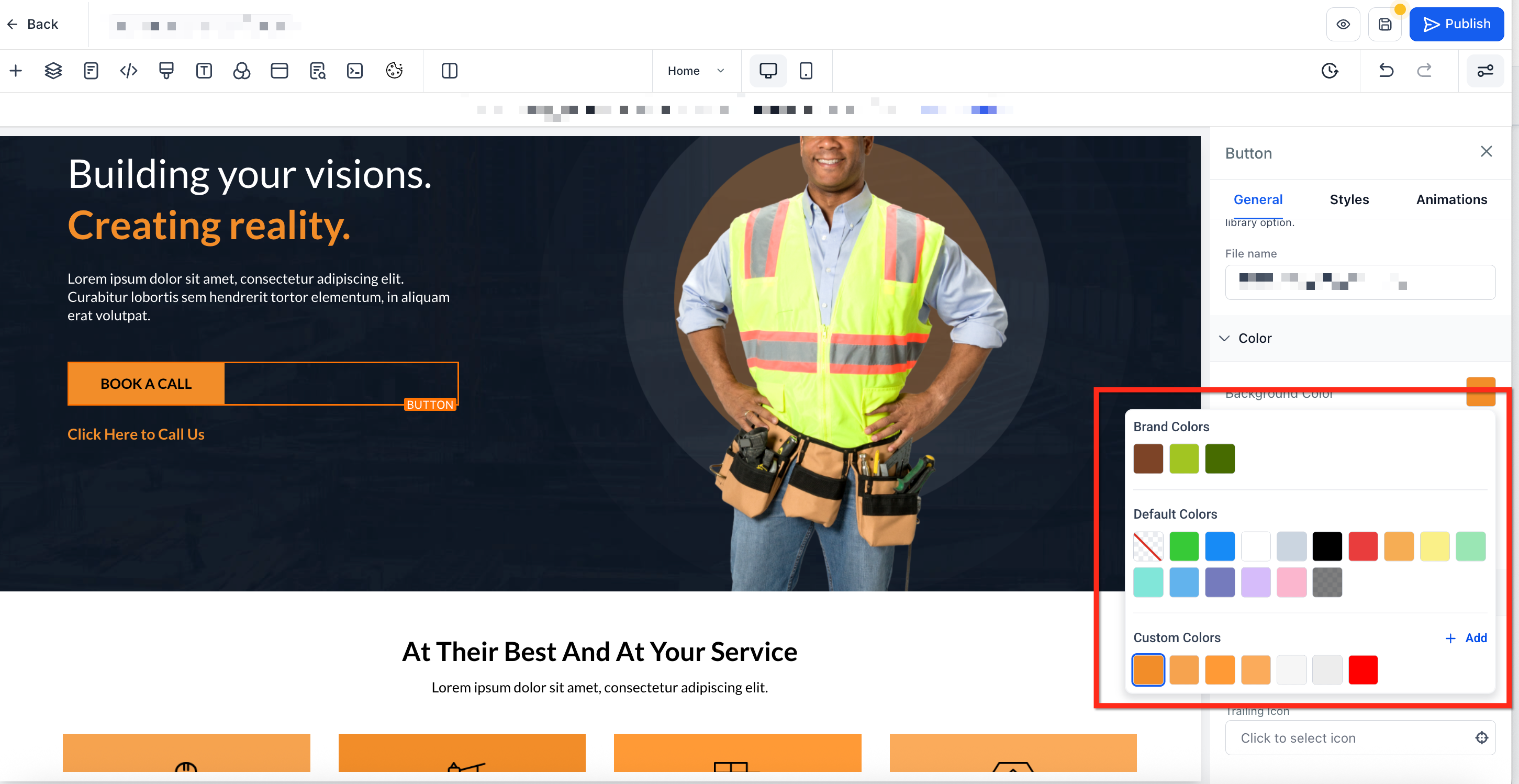
The color picker is the design component inside the Page Builder that controls every color you use, from section backgrounds to hyper-specific text highlights. It displays brand, default, and custom colors together, supports HEX, RGB, and custom values, and offers precise, per-character styling directly from the inline text toolbar.
Note: Default colors in the picker may change over time as the Page Builder's out-of-the-box styling is refreshed, and new default palette options can appear to support modern starter designs. If you need strict brand consistency, set your Brand Board colors or global custom colors and select those instead.
A unified interface and smart controls help you style pages faster and more consistently.
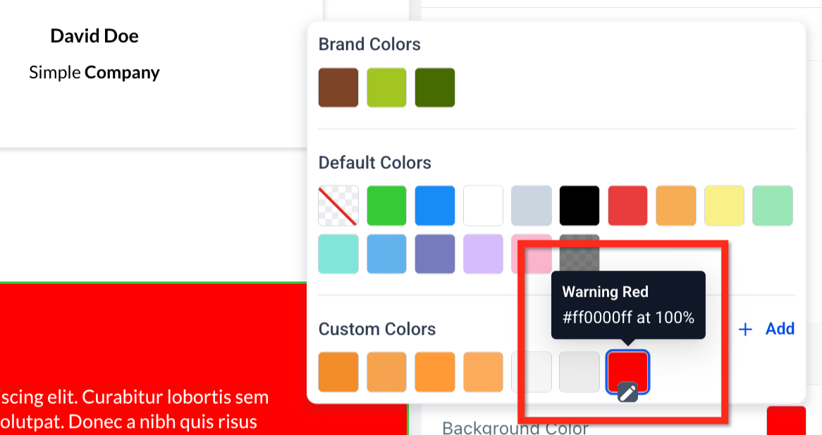
Unified palette: View brand, default, and custom colors in a single panel, so there is no need to switch tabs.
Per-character control: Color a single word or letter for precise emphasis.
Custom labels: Name colors (for example, "CTA Blue") for quick reuse.
Format flexibility: Enter and display colors in HEX, RGB, or custom values.
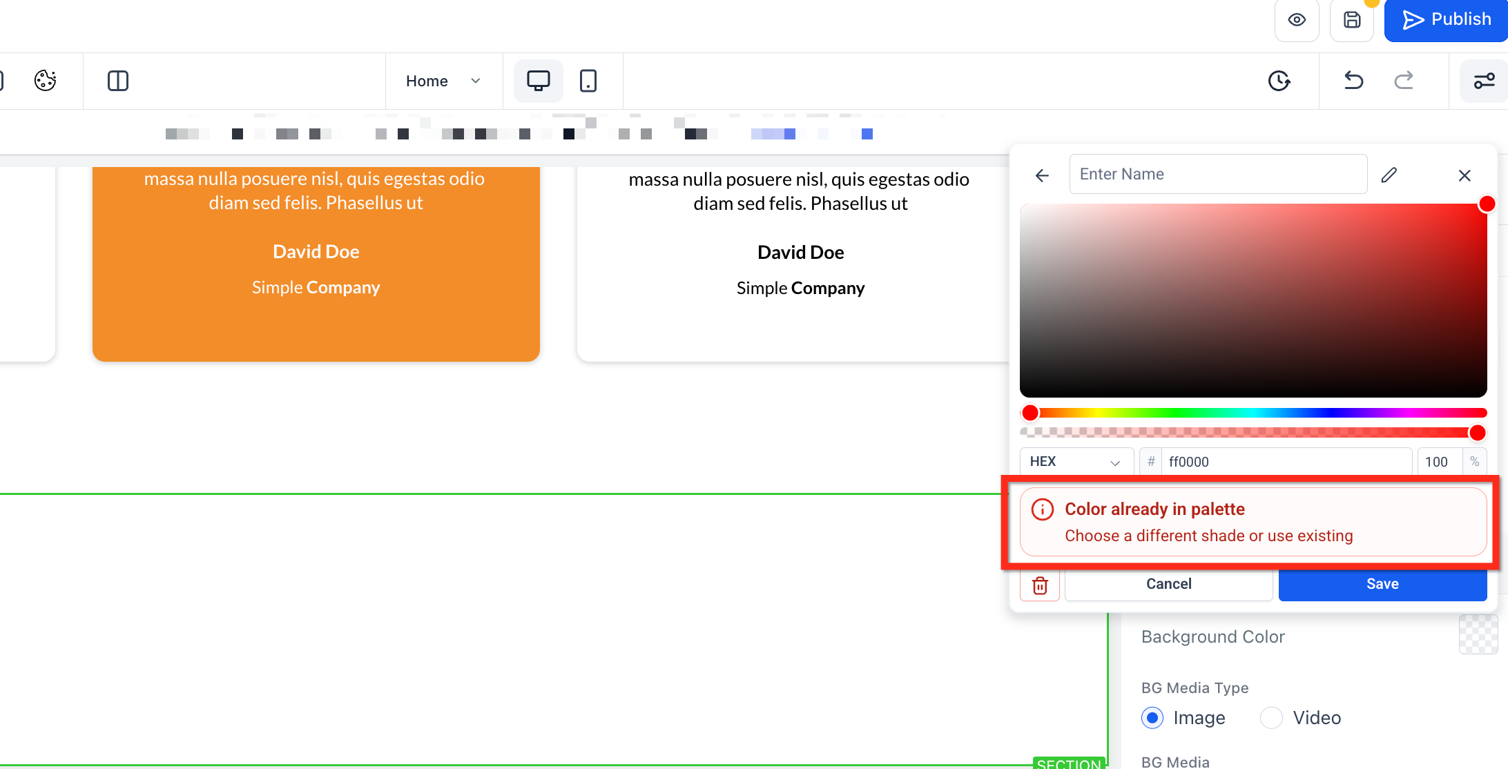
Duplicate protection: Validation prevents accidental shade duplicates.
Compact layout: A modern, space-efficient design loads quickly and stays out of your way.
With the inline text editor, you can apply color to individual words or even individual characters in your text. This means you can highlight specific words or change the color of just part of the text, giving you full control over your design's look and feel.
Keep palettes organized, even when shades are similar, by giving your custom colors names.
Naming colors
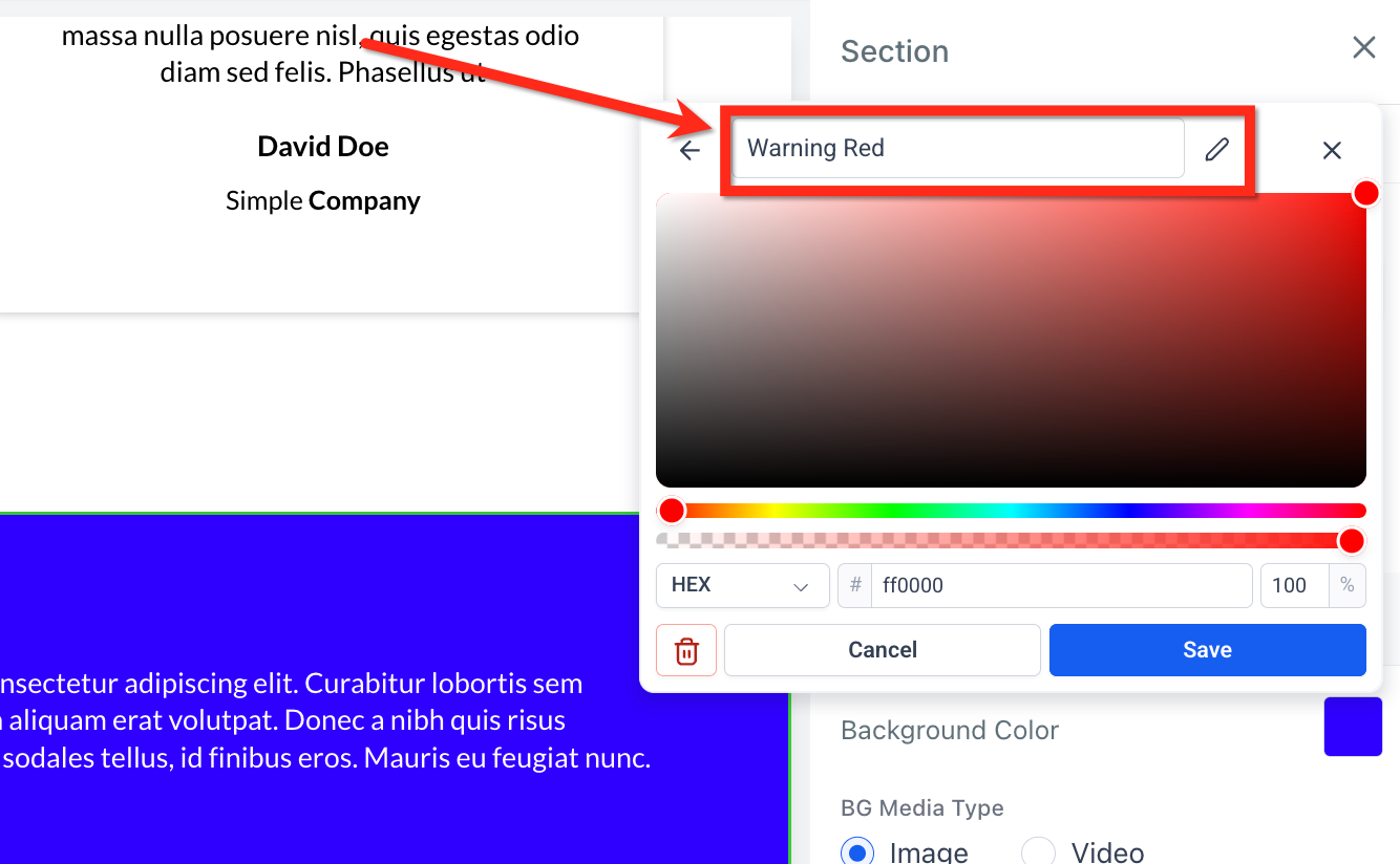
After picking a color, you can name and edit labels for custom colors (for example, "Warning Red"). Labels can be edited or removed at any time.
Custom label tooltips
Hovering over a custom color displays its label as a tooltip. This makes it easier to distinguish similar shades, so your team can pick the right tint without memorizing HEX codes.
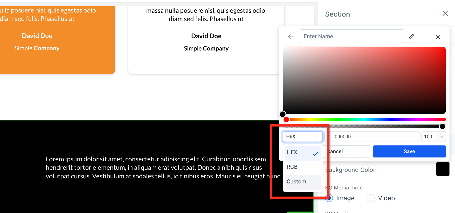
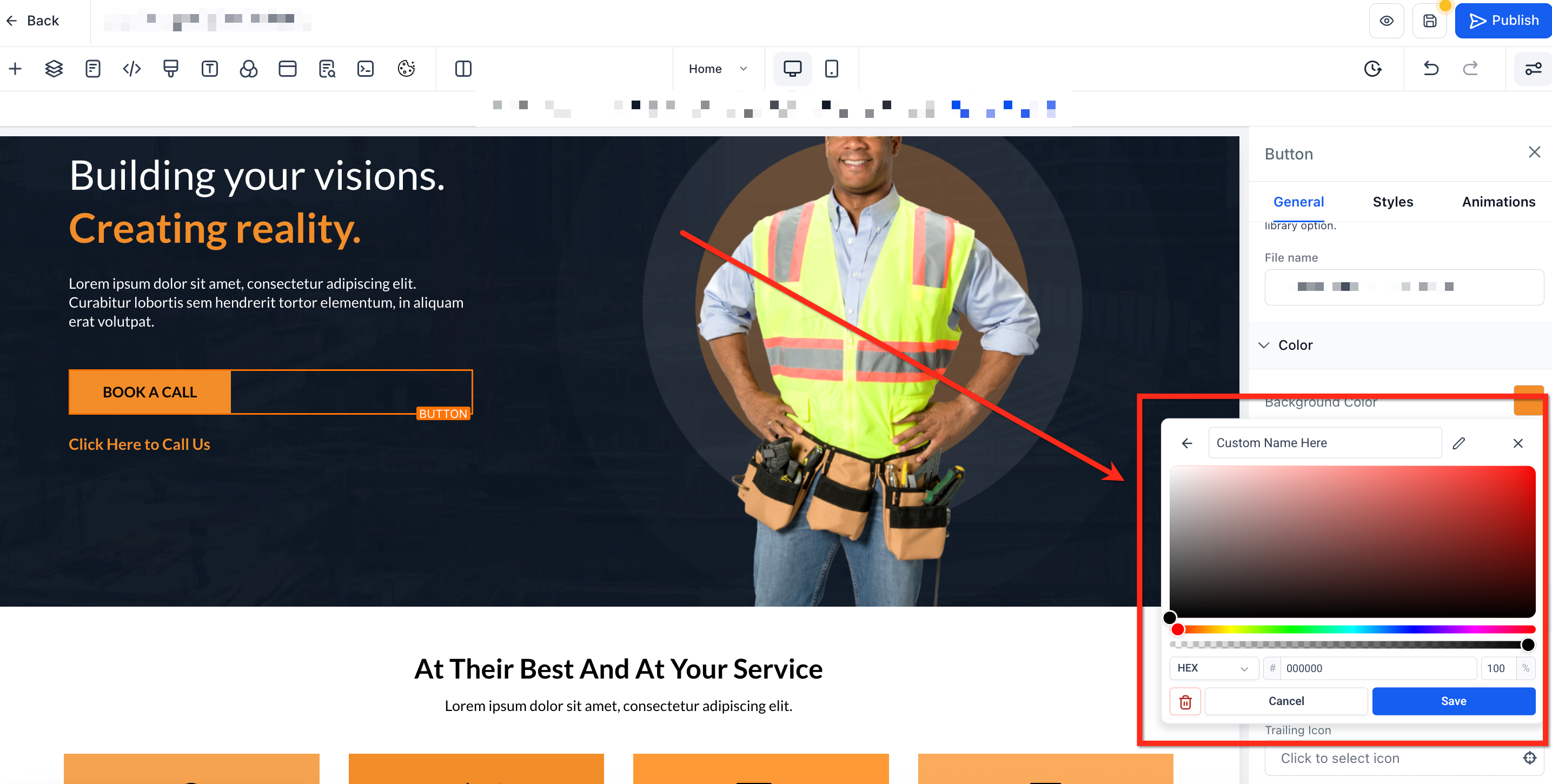
The color picker lets you choose and save colors in multiple formats so you can work with the values that best suit your needs. Use the dropdown to switch between color formats.
HEX: A six-character code that defines color (for example, #1E90FF). This is the most common format for web design.
RGB: A set of three numbers that define color based on red, green, and blue values (for example, rgb(30,144,255)). This is useful for precise control over color blending and opacity.
Custom values: Accepts dynamic tokens such as {{ custom_values.primary_color }}. These let the color be pulled from your custom values, making it easy to change in one place and have it update everywhere it is used.
Custom color validation
Custom token values must exist in your current configuration before they can be stored, which prevents broken references.
Duplicate color prevention
Stay consistent and error-free. If you try to save a shade already in the palette, the picker flags it instantly and prompts you to adjust the value.
Step 1: Open the color picker
Open an existing funnel or website page.
Select a section, element, or text block.
Click the Color square in the style panel, or click the A icon in the inline toolbar for text.
Step 2: Choose a color
Pick a shade from the default colors, brand colors, or already-created custom colors.
To create a new custom color, press + Add.
Step 3: Create a custom color
Once the custom color panel is open, select the desired color.
Use the dropdown to select between RGB, HEX, and custom color formats.
Type a descriptive name for the color.
Click Save. The new color tile will appear in your palette.
Button icons can be colored independently, giving you precise control over icon visibility and brand alignment without affecting button text or subtext.
Independent control: Icon color is separate from text and subtext colors.
Color sources: Uses the color picker, including Brand Board colors and custom colors.
Design flexibility: Adjust the icon to match brand accents while keeping text highly readable.
Gradients let you blend two or more colors smoothly to create visual depth, while background blur softens the content beneath an element to boost contrast and readability. Together, these tools reduce the need for external design apps and help you build polished layouts directly in the Page Builder.
Multi-color control: Build gradients with up to 10 color stops for subtle or vibrant blends.
Style variety: Choose Linear, Radial, or Angular gradient types to match your layout.
Precision editing: Drag color stops on a visual slider and set angles for exact results.
Instant depth: Toggle background blur and adjust intensity to create soft, professional "glass" effects.
Clean workflow: Switch quickly between Color, Image, and Video background tabs to pick the best background source.
Backgrounds live at the container level. Use them at the section, row, or column level to control how effects cascade and how content sits above them.
Apply gradients or blur on sections for full-width hero areas.
Use rows to create banded backgrounds across multiple columns.
Apply blur or a subtle gradient on columns to improve text readability for a specific content block.
Follow these steps to add a gradient to your background. You can even add multi-color gradients.
Step 1: Navigate to the Page Builder
Go to Marketing → Landing Page Builder / Websites**.
Open the funnel or website, then select the page that you would like to edit.
Step 2: Go to color settings
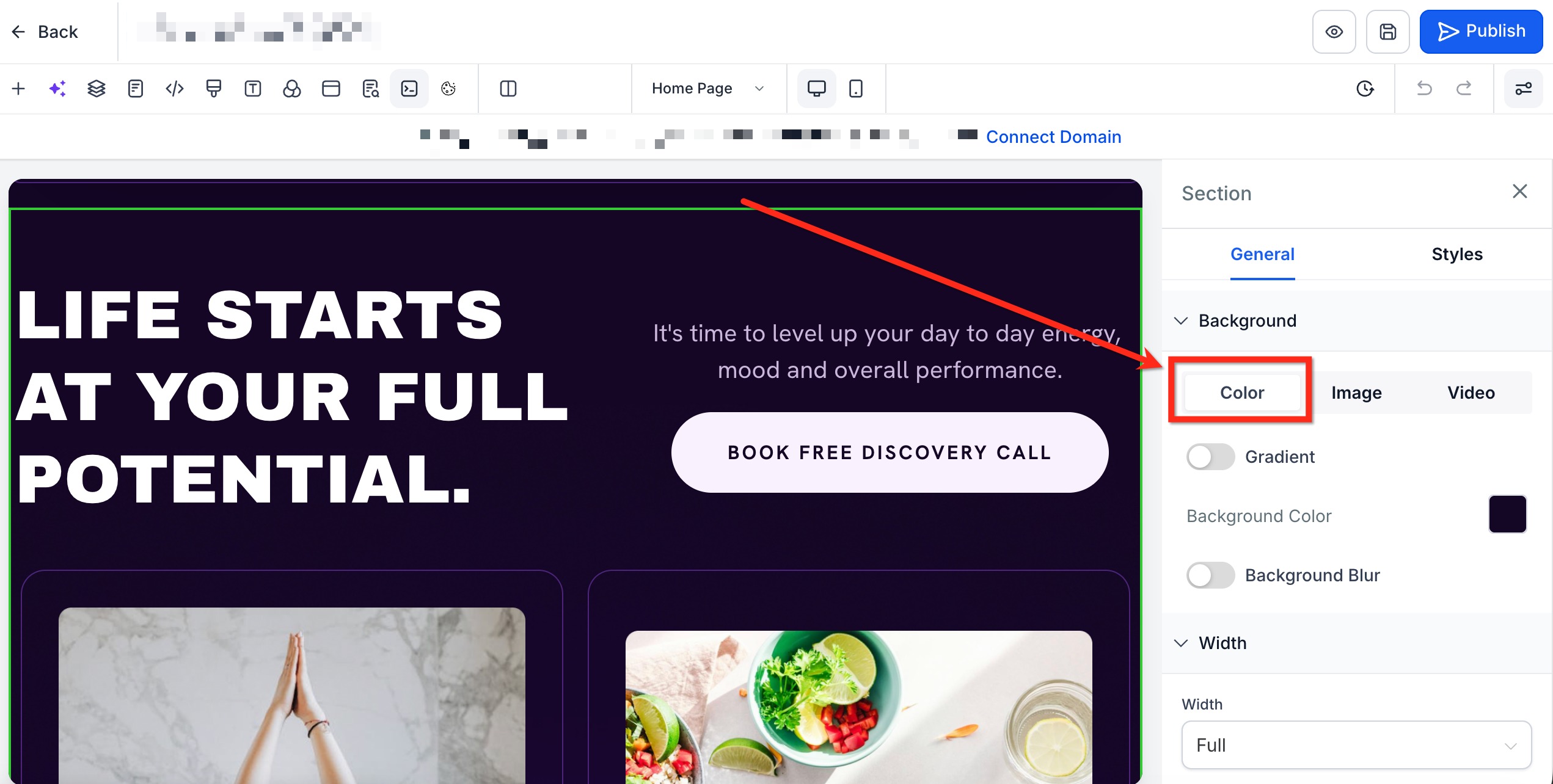
Click on the section, row, or column, then scroll to Background in the right-hand sidebar.
Under Background, select the Color tab to open color settings.
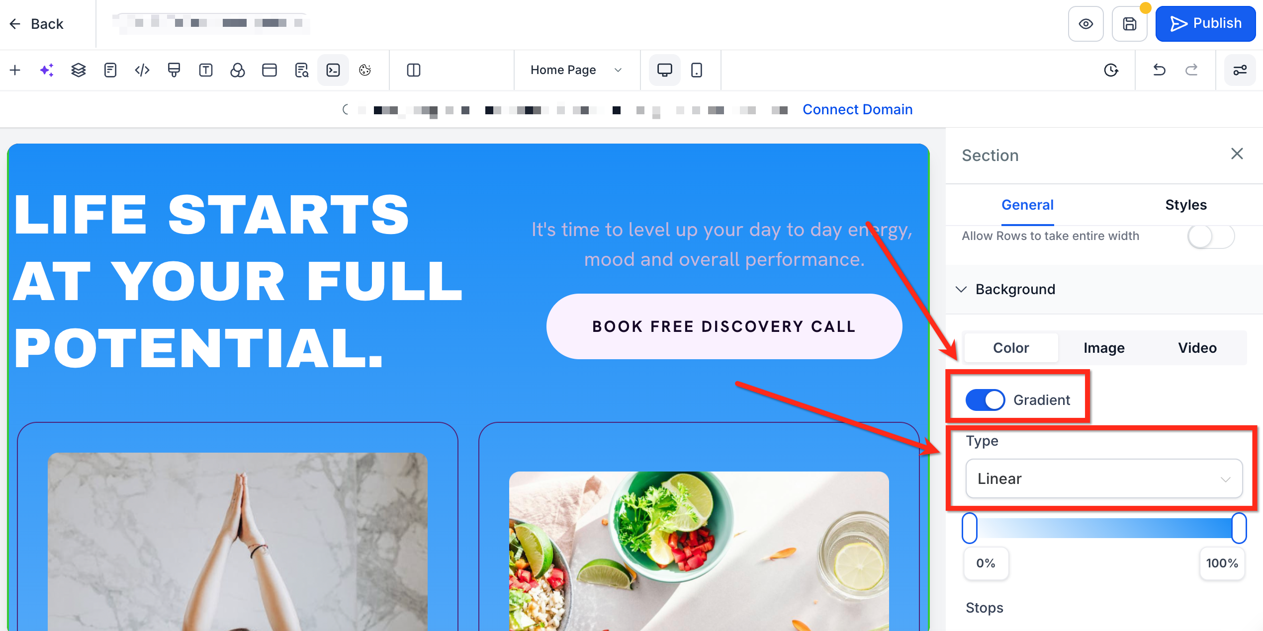
Step 3: Enable and select a gradient
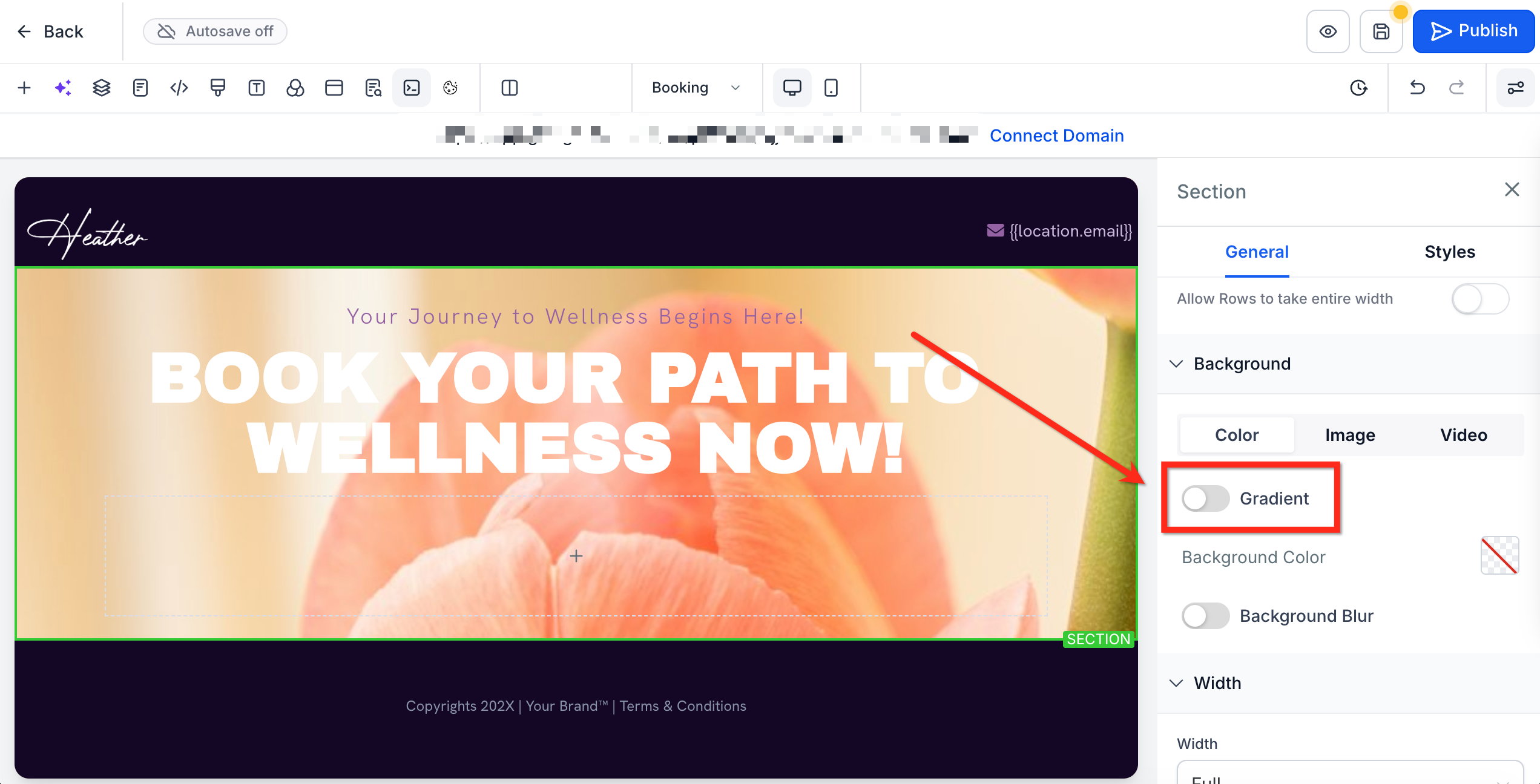
Under Color, turn on the Gradient toggle.
Use the Type dropdown to select your gradient type (Linear, Angular, Radial).
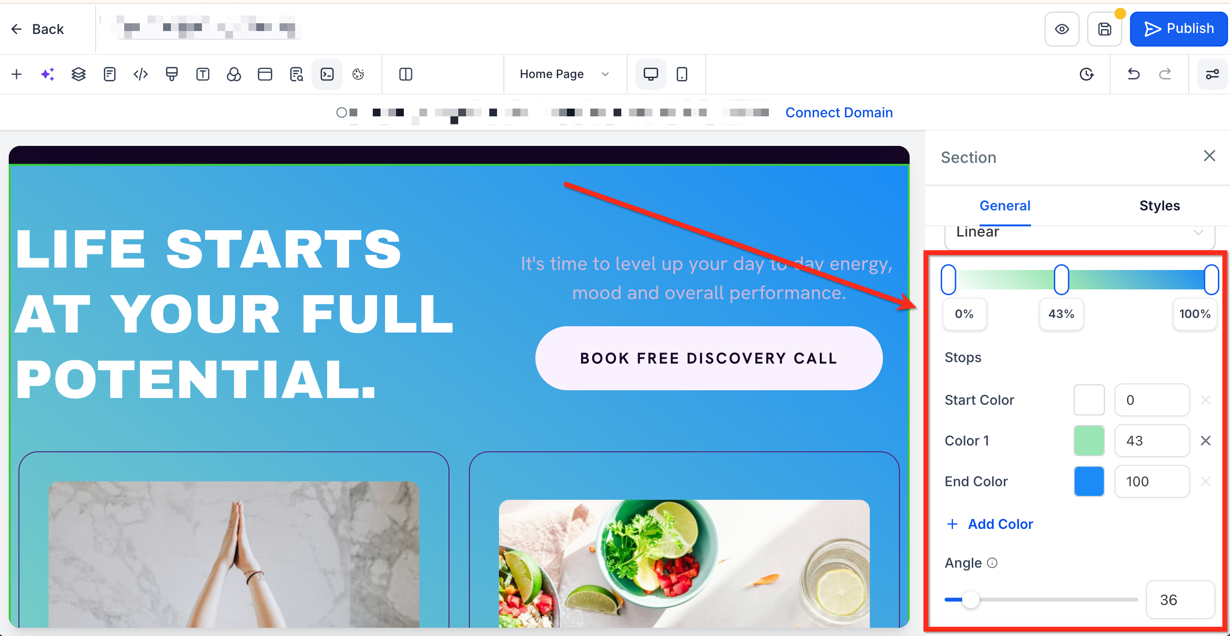
Step 4: Set up the gradient
Select colors for your gradient by clicking + Add Color or by clicking directly on the gradient slider.
Adjust colors using the color selector.
Customize the gradient using the gradient slider.
Use the Angle slider to adjust the gradient angle (only available for Linear and Angular gradient types).
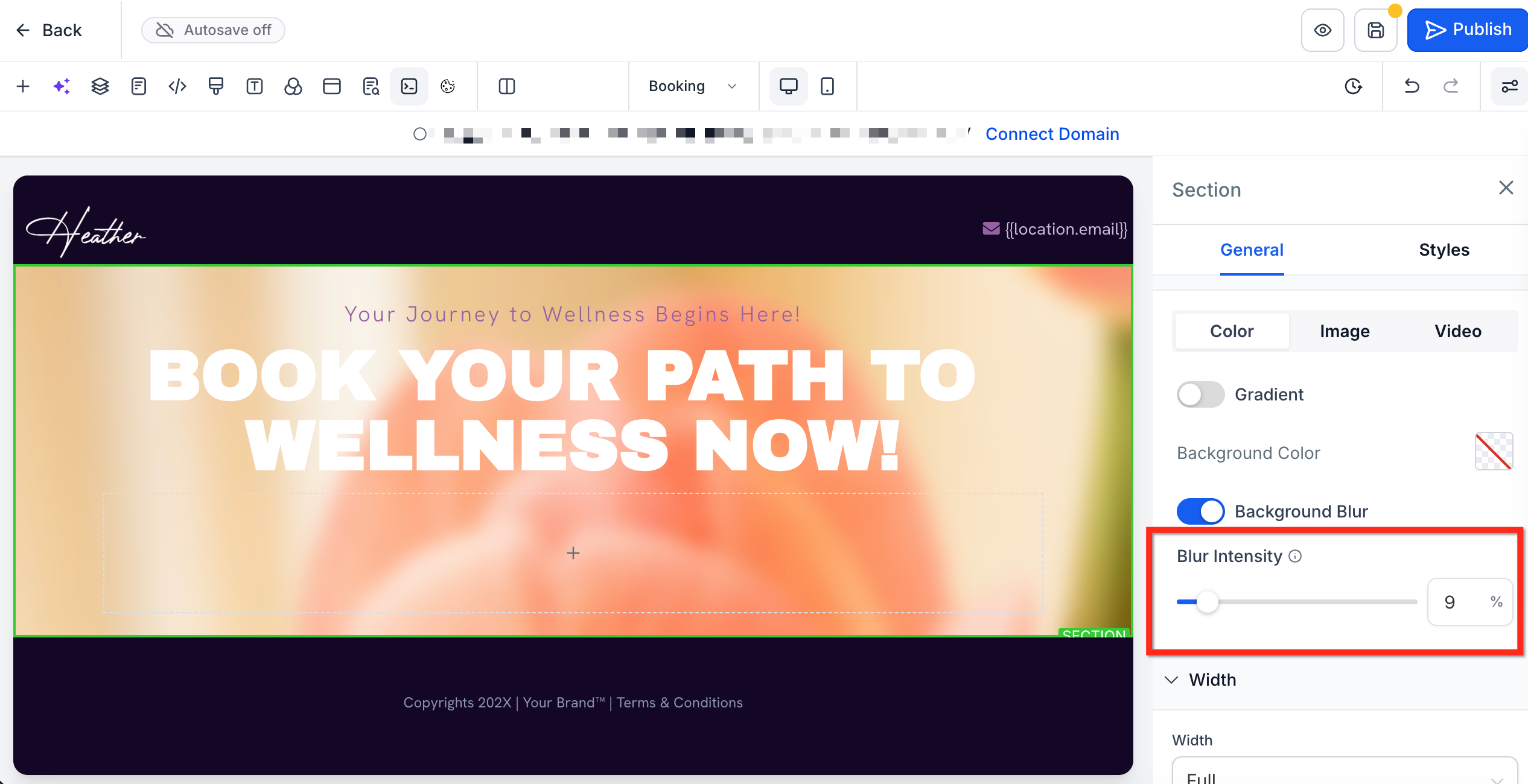
Follow these steps to soften your background using a blur. This works great with semi-transparent colors.
Step 1: Navigate to the Page Builder
Go to Marketing → Landing Page Builder / Websites**.
Open the funnel or website, then select the page that you would like to edit.

Step 2: Enable background blur
Click on the section, row, or column, then scroll to Background in the right-hand sidebar.
Under Background, select the Color tab to open color settings.
Under Color, turn on the Background Blur toggle.
Step 3: Choose the blur level
Use the Blur Intensity slider to set the desired level of blur.
Add depth and dimension to your elements with customizable box shadows and text shadows.
Box and text shadows
Versatile shadow options: Apply box shadows to all elements, such as text, headings, paragraphs, images, and buttons. Text shadows can be added to text-based elements for more depth and dimension.
Advanced customization: Access shadow settings through the Advanced tab and tailor shadows to fit your design needs.
User-friendly shadow editor
Two sections: Choose between box shadow and text shadow with easy-to-use dropdowns.
Easy default settings: Click the plus button to apply a default outer shadow with preset values, then customize further with specific settings.
Multiple shadows: Add multiple shadows to any element by clicking the plus button for more complex designs.
Detailed customization: Edit each shadow by selecting whether it is outer or inner, and adjust X value, Y value, Blur, Spread, and Color.
Customization parameters
Outer vs. inner shadow: Outer shadows create a sense of elevation and depth, making elements appear raised above the background. Inner shadows add a recessed effect, giving the illusion of depth within the element.
X value: Controls horizontal shadow offset.
Y value: Controls vertical shadow offset.
Blur: Determines the sharpness or softness of the shadow.
Spread: Expands or contracts the shadow size.
Color: Chooses the shadow color to match your design palette.
Access the Advanced tab: Open the Page Builder editor and navigate to the Advanced tab.
Open the Shadow dropdown: Click on the shadow heading at the top to reveal the shadow editor dropdowns.
Select a shadow type: Choose between box shadow or text shadow by clicking the plus button next to each title. (Text shadow is only applicable on text-based elements.)
Apply default shadows: A default outer shadow will be applied with preset values. Adjust as needed.
Add multiple shadows: Click the plus button to add more shadows for a single element.
Edit shadows: Click on the title of each shadow to customize settings like outer/inner, X value, Y value, Blur, Spread, and Color.
Combine shadows: Experiment with different combinations for unique visual effects.
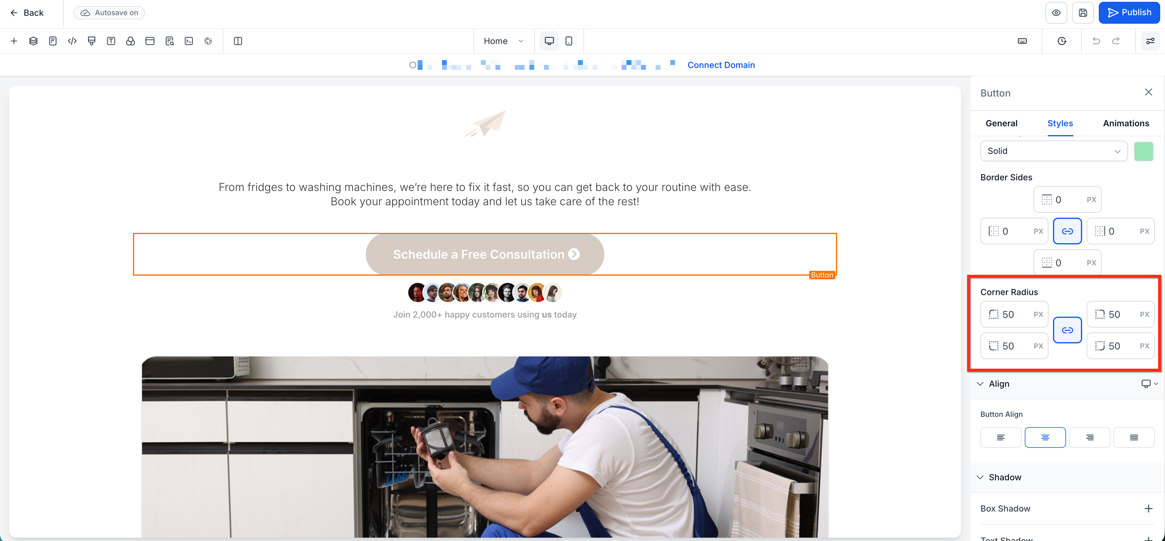
Border Control lets you customize how borders appear on supported Page Builder elements from one centralized panel. This includes commonly used elements like buttons, images, and videos. You can adjust border style, color, side-specific width, and corner radius to create anything from subtle accents to more defined visual frames, without relying on manual workarounds.
More precise customization: Adjust border settings with greater control to match the exact look you want for each element.
Independent side styling: Set different border widths on each side to create accents, dividers, or custom framing effects.
Custom corner shaping: Apply different corner radius values to create softer layouts or more distinctive shapes.
More visual variety: Use additional border styles like double, groove, ridge, inset, and outset to add depth and design variation.
The border panel brings the most important border controls into one place, so you can style supported elements faster and with fewer manual workarounds.
Border Style: Changes the visual appearance of the border.
Border Color: Sets the color used for the border.
Border Sides: Apply one width value to all sides, or unlink the values to control the top, right, bottom, and left borders separately.
Corner Radius: Adjust the roundness of corners with one shared value, or unlink the values to round each corner independently.
Note: Border Control is available for supported Page Builder elements, including Button, Image, and Video. Supported elements can vary by builder context and feature rollout.
From within a funnel or website in the Page Builder, select a supported element (for example, a Button, Image, or Video element).
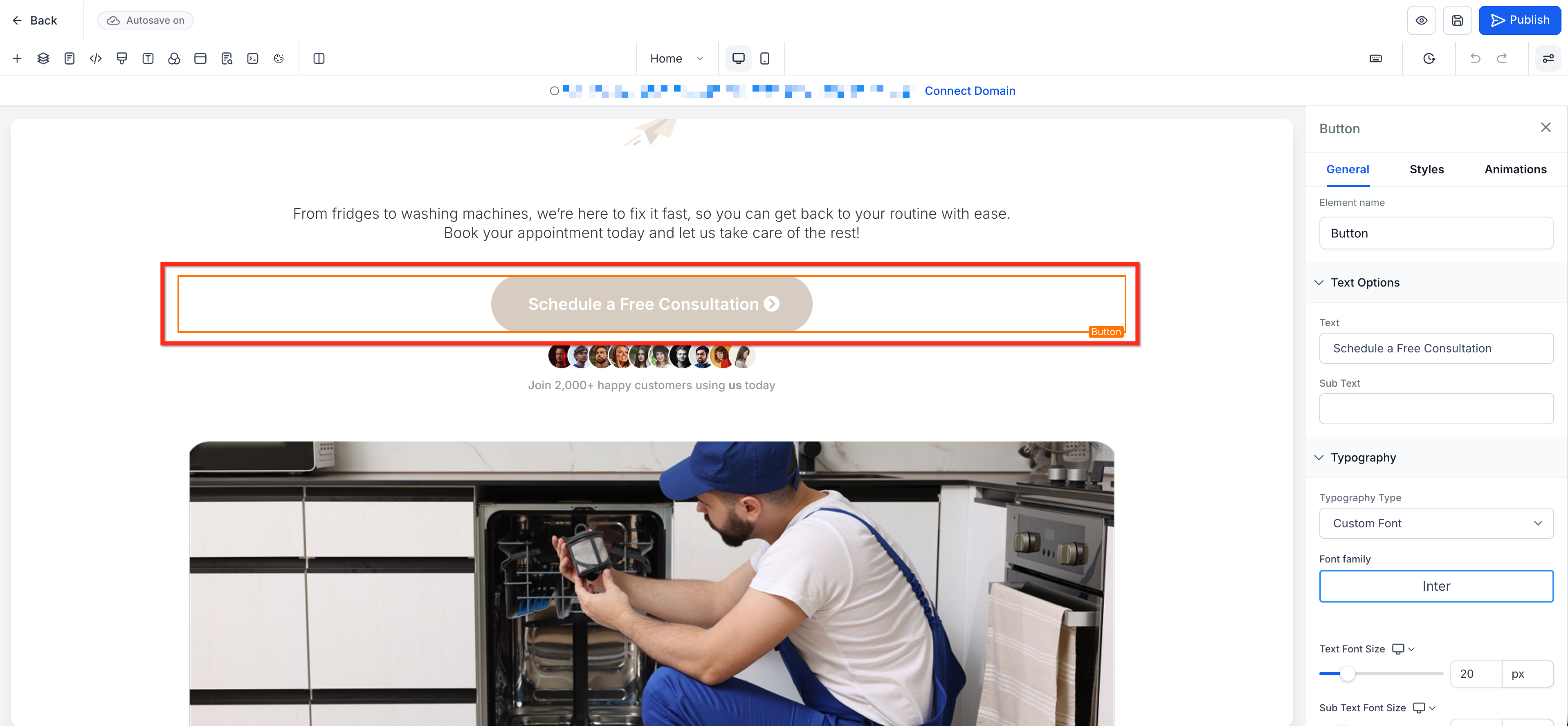
In the right-hand sidebar, open the Styles tab, then scroll to the Border panel.
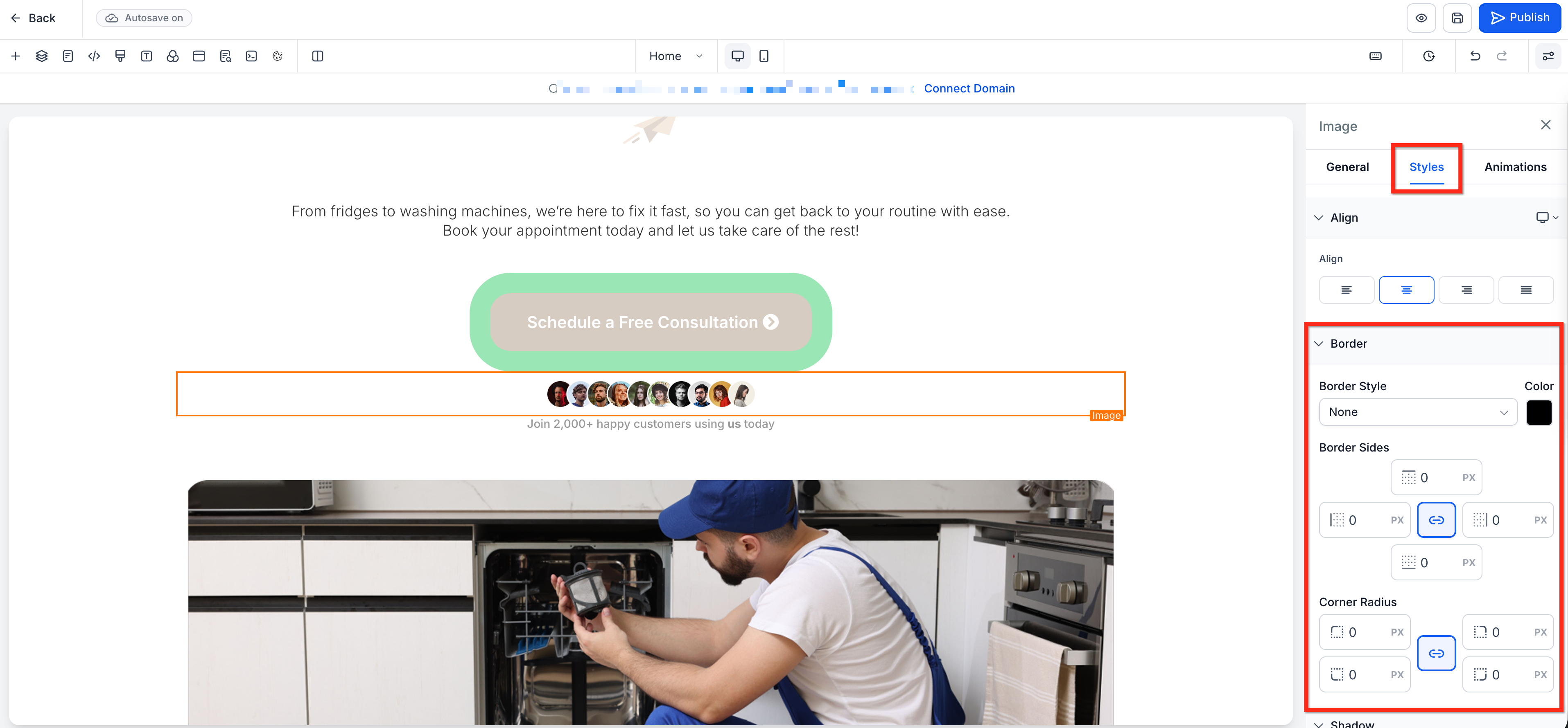
Select a Border Style and Border Color.
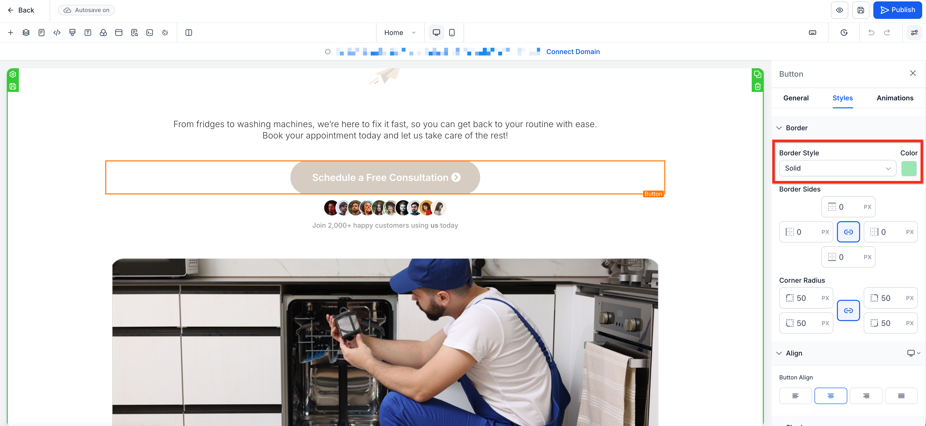
Set your Border Sides values. Leave the values linked to use the same width on all sides, or unlink them to set each side individually.
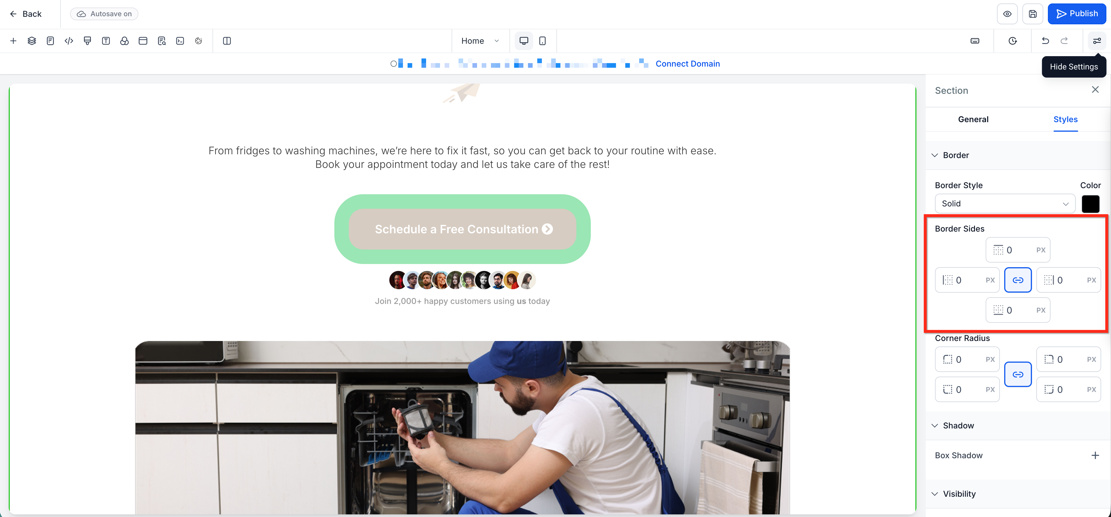
Set your Corner Radius values. Leave the values linked to round all corners equally, or unlink them to round each corner independently.
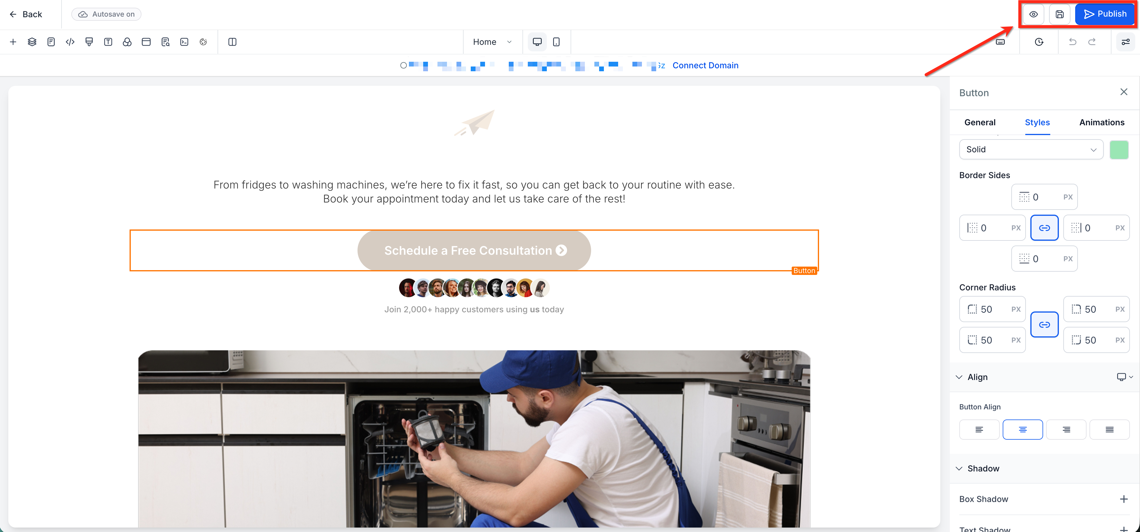
Preview the element on the canvas and fine-tune the values as needed. Save and Publish your changes when you are ready.
Will existing pages change if I edit a brand color?
No. Brand color updates apply going forward. Colors already saved on existing elements or text stay the same.
Why do I see a "duplicate color" message when I try to save?
The value you entered already exists in the palette, or a saved custom value resolves to the same value. Change the value or edit the existing swatch instead.
Can I rename or delete a custom color without breaking pages?
Yes. Renaming or deleting a swatch does not change colors that are already applied on existing pages.
Can I bulk-import brand colors?
Add them in the Brand Board; they automatically appear at the top of the palette.
Why won't my custom value color save?
The token must exist in your current custom values, and the final value cannot duplicate an existing swatch. Check that the custom value exists in your account.
Why do new pages look different from older pages?
Page Builder defaults (fonts, placeholders, and default palette colors) can be updated for newer designs. Your Brand Board or saved templates ensure consistent styling across pages.
How many colors can I use in a gradient?
Up to 10 color stops.
Will existing background images and videos change?
No. Previous settings remain as they are; gradients and blur are additional options.
Does blur affect content inside the element?
Blur softens what's behind the element. Content inside the element (like text) remains crisp.
I'm seeing banding or stripes in my gradient. How can I fix it?
Try one or more of these: add an extra intermediate stop near the harsh transition, choose colors closer in lightness, and slightly adjust the Angle slider.
How do I remove a color stop or revert to a solid color?
Click the X next to a stop to delete it. To go back to a solid color, toggle Gradient off and pick a single color on the Color tab.
Can I edit each side of the border separately?
Yes. Use the link/unlink icon in Border Sides to switch from one shared value to individual values for each side.
Will Border Control affect my existing pages?
No. Existing pages that use older border settings continue to work normally.
Is Border Control available in both Funnels and Websites?
Yes. Border Control is available across Funnels and Websites.
Can I edit each corner radius separately?
Yes. Use the link/unlink icon in Corner Radius to unlink the values and customize each corner independently.