The Page Builder gives you two powerful elements for presenting your practice's offers and credibility. The Pricing Table lays out treatment packages, memberships, and service tiers in a clean, comparable format with flexible layouts, pricing models, and conversion-focused calls to action. The Number Counter turns key metrics, like "5,000+ treatments performed", into bold, animated count-up visuals that build instant trust. This guide walks you through setting up both.
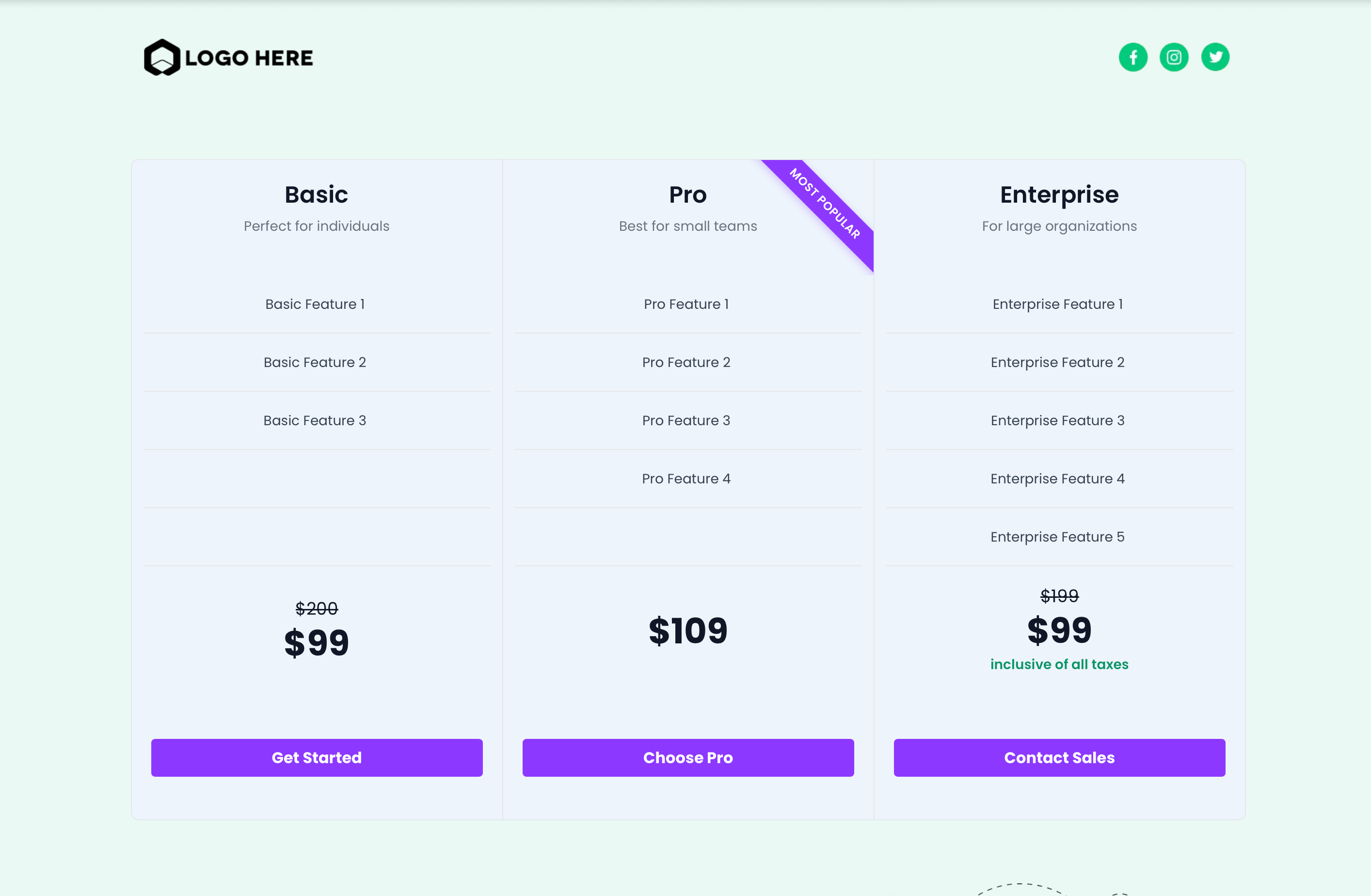
The Pricing Table element lets you present one or more plans in a clean, comparable layout. It supports multiple display modes (grid, carousel, classic table, and comparison table), several pricing models, and configurable actions, so you can tailor the experience to your offer, page design, and audience.
You can use the Pricing Table in your funnel, website, blog, and online store builders.
Layout flexibility: Choose Grid, Carousel, Classic Table, or Comparison Table to match your content and page goal.
Clear plan comparison: Use horizontal scrolling, arrows, and a sticky head column (Comparison mode) to keep features readable.
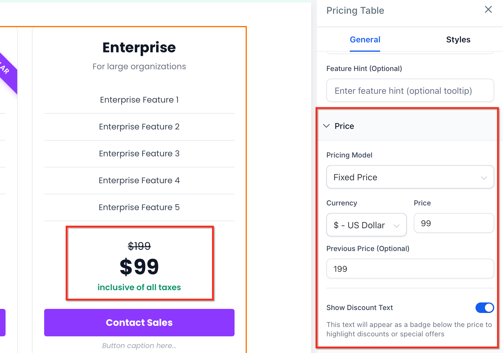
Multiple pricing models: Communicate one-time, recurring, tiered, or variable pricing without workarounds.
Conversion cues: Add a previous price (strikethrough), discount badges, and captions that highlight offers.
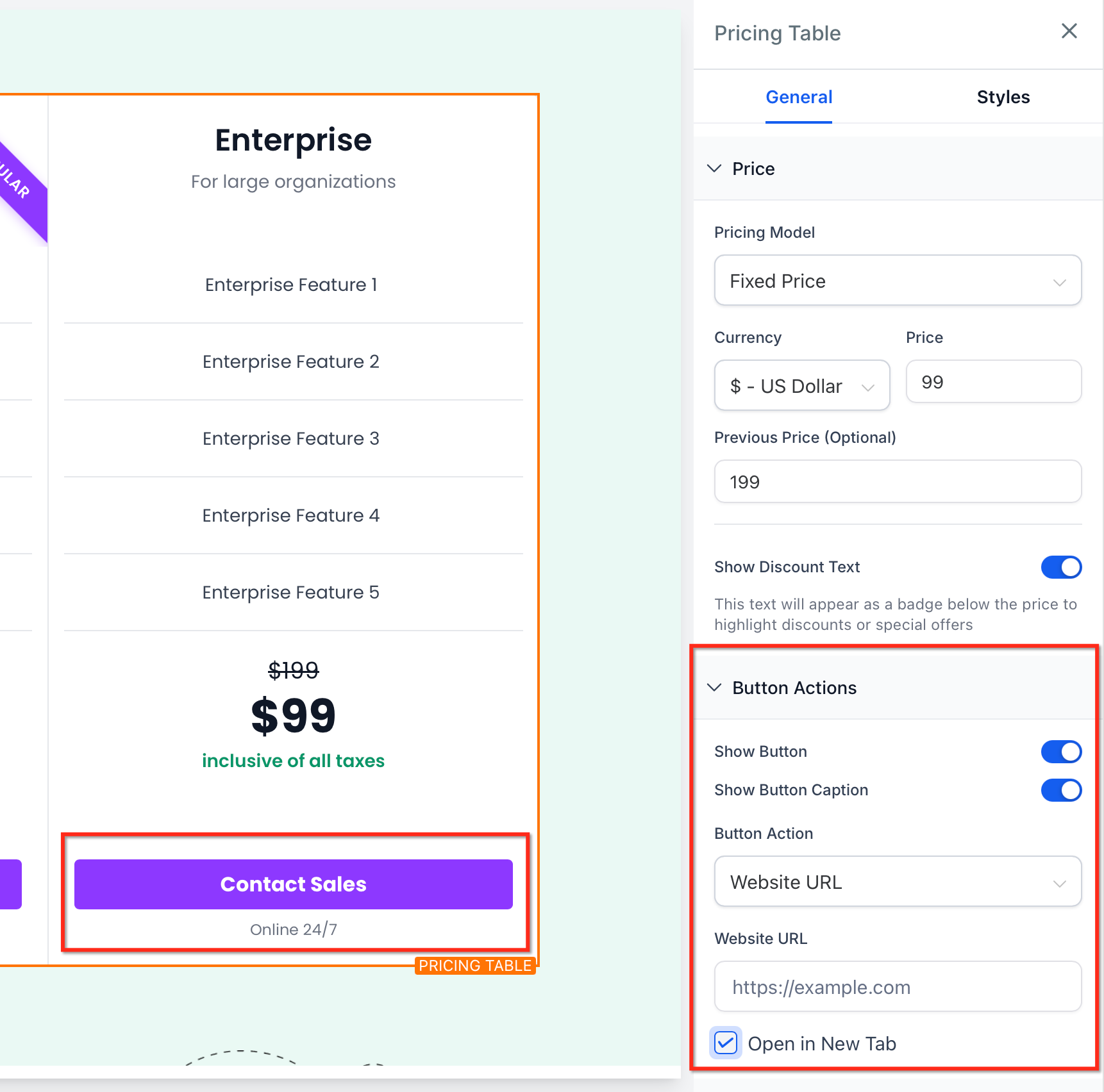
Action control: Point buttons to URLs, open popups, jump to sections, download files, or use no action.
Brand consistency: Customize colors, spacing, and column gaps to blend with your site design.
Mobile readiness: Columns adapt for smaller screens while preserving comparison clarity.
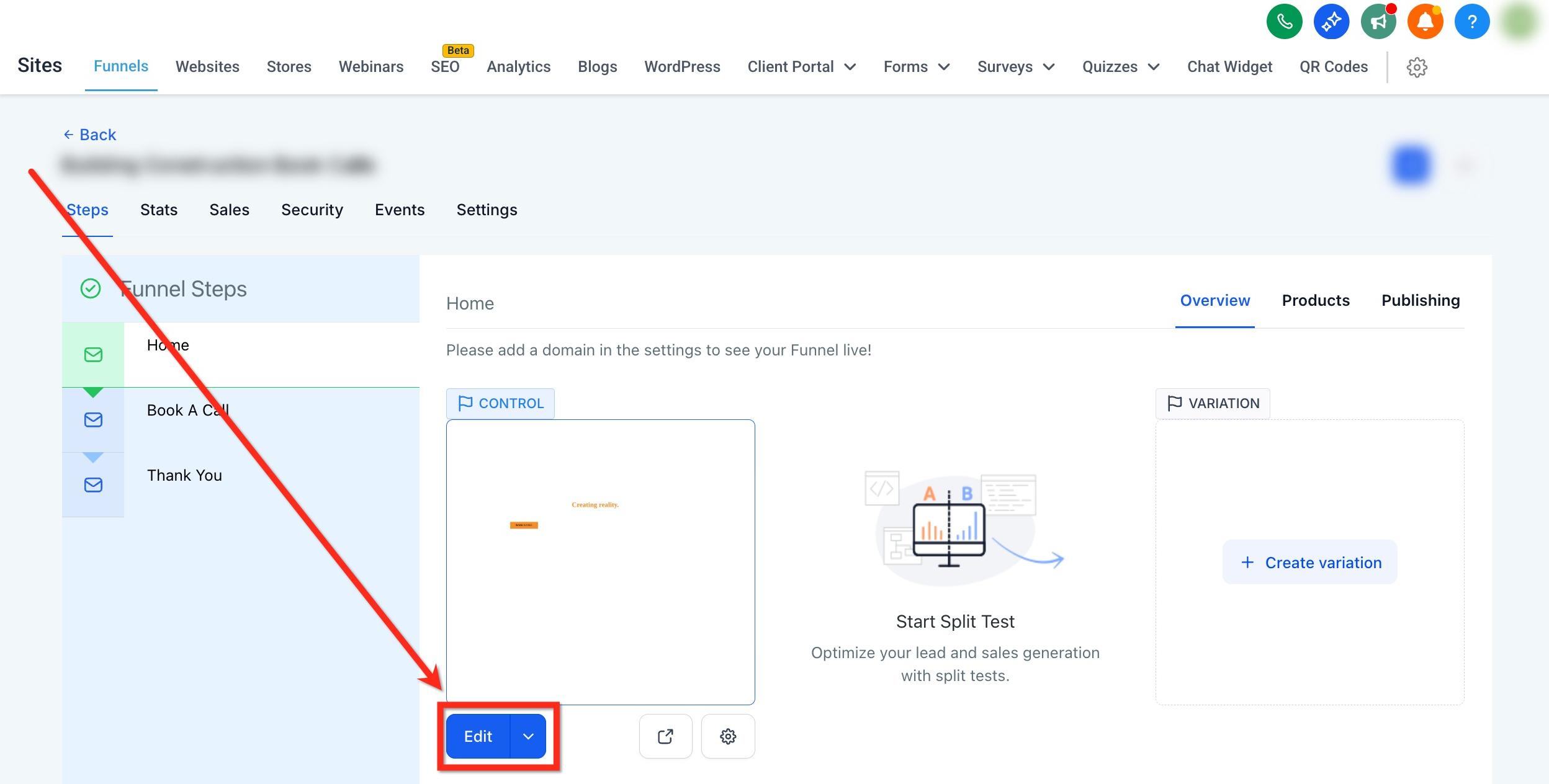
Navigate to the Page Builder: In the left-hand menu, click Web Tools and open your chosen funnel or website. Click the blue Edit button on the page to launch the page builder.
Add the element: Drag the Pricing Table from the Elements panel onto the canvas.
Choose a layout: Select Grid, Carousel, Classic, or Comparison from the right settings bar.
Configure the layout (pricing, features, buttons, and more) and styling of the pricing table.
Preview and publish: Use Desktop/Mobile preview to confirm responsiveness, then Save and Publish.
Selecting the right layout helps visitors understand the differences between plans and speeds up decision-making.
Mode | Description / Best For | Columns & Spacing | Navigation / Controls | Animation & Options |
|---|---|---|---|---|
Grid Mode | Clean, card-based layout for side-by-side comparison. | Column gap: 0–100 px; columns per row: up to 5. | , | , |
Carousel Mode | Slide-based presentation with optional auto-advance. | Columns per slide: 1–5. | Auto-advance interval; pause on hover; infinite loop. | Fade or Slide animation. |
Classic Table Mode | Traditional table for wide, detailed comparisons. | Uses horizontal width; ideal for long feature lists. | Horizontal scroll with arrow controls. | , |
Comparison Table Mode | Deep, column-heavy comparisons where context matters. | Wide tables; sticky head column remains visible. | Horizontal scroll with arrow controls; sticky head column for context. | , |
Tips:
Prefer Grid for simple tiers (e.g., 3–4 packages).
Use Carousel to feature plans one group at a time or conserve vertical space.
Choose Classic or Comparison for long feature lists that won't fit within fixed-width cards.
Choosing the right pricing model clarifies cost expectations and avoids surprises, which increases trust and conversions.
Pricing Model | Description |
|---|---|
Fixed Price | One-time payment. |
Subscription | Recurring billing with periods: daily, weekly, monthly, yearly. |
Price From | Display "Starting at" pricing for variable services. |
Price Range | Show min–max for customizable services. |
Per Unit | Price by item, hour, day, seat, person, and so on. |
Free | Highlight complimentary offerings (optionally show a previous price). |
Custom | Enter custom pricing text for niche cases. |
Clear, scannable feature lists help buyers recognize what's included and compare tiers quickly.
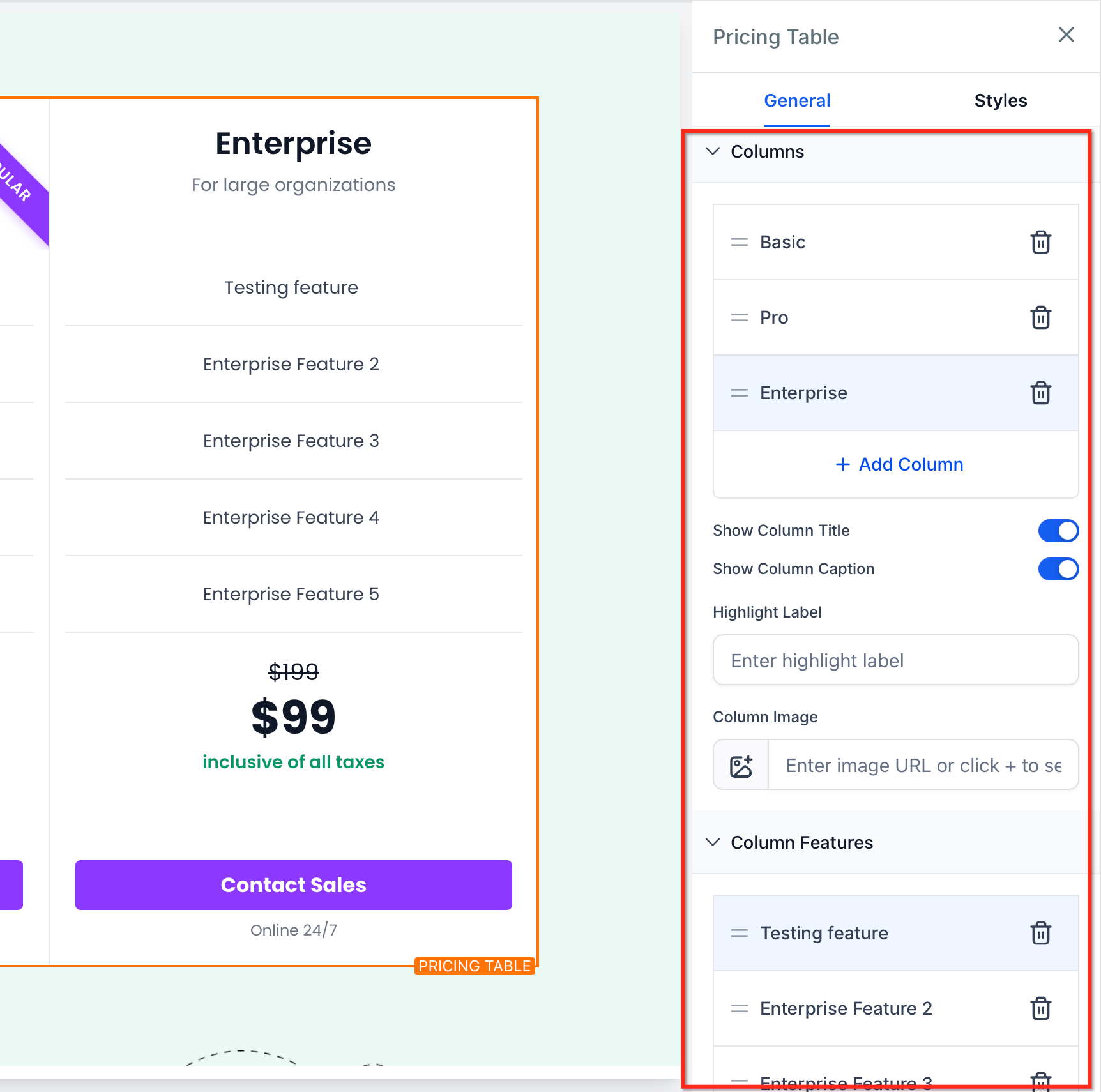
Add, reorder, or remove features for each plan (Columns).
Group related items and keep phrasing consistent across plans (Columns).
For long lists, prefer Classic or Comparison layouts to leverage horizontal navigation.
Visual pricing cues guide attention and make offers feel time-sensitive or valuable without adding confusion.
Previous Price Display (strikethrough) to highlight a discount.
Discount Text Badges to emphasize promotions.
Optional Pricing Captions for billing notes, taxes, or disclaimers.
The call to action is where comparisons turn into conversions. Configure actions that match your funnel strategy.
Action types:
Open URL (external or internal).
Open Popup (launch a specific on-page popup).
Step/Anchor Navigation (jump to a section on the page).
No action (useful for teaser plans or disabled states).
Button content:
Custom text: Clear, action-oriented labels (e.g., "Book a Consultation") for personalized call-to-action buttons.
Optional caption: Add supporting text below the button.
Show/Hide controls for button and caption visibility.
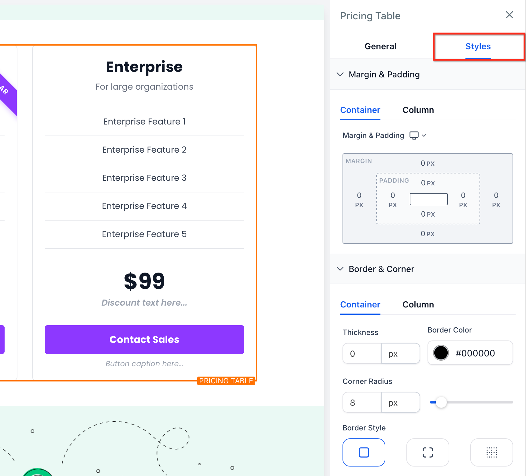
Styling ensures the Pricing Table blends with your brand while remaining readable and accessible.
Adjust colors, typography, spacing, borders, and column gaps (0–100 px).
Maintain adequate contrast for text, badges, and buttons.
Keep card padding consistent to prevent visual jumpiness between plans.
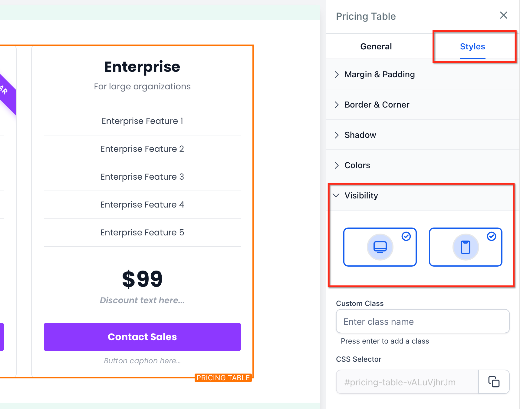
Optimizing for small screens preserves readability and ensures visitors can still compare plans and take action without friction.
Multi-column layouts may collapse to fewer columns on mobile for legibility.
Classic and Comparison layouts retain horizontal scroll with arrows when content exceeds the viewport width.
The sticky head column remains visible in Comparison mode to keep plan names in context.
Preview both Desktop and Mobile views and adjust spacing and typography as needed.
Where can I use the Pricing Table?
In the funnel, website, blog, and online store builders.
How many columns can I show at once?
Grid supports up to 5 columns per row; Carousel supports 1–5 columns per slide.
Can I show old vs. new pricing?
Yes. Enable the previous price (strikethrough) and optionally add a discount badge.
Can a plan button open a popup checkout or form?
Yes. Set the action to Open Popup and choose the popup you created for that page.
What happens on mobile?
Columns may collapse, and table layouts allow horizontal scroll with arrows. In Comparison mode, the sticky head column remains visible.
Which pricing models are included?
Fixed, Subscription (daily, weekly, monthly, yearly), Price From, Price Range, Per Unit, Free, and Custom.
Can I hide buttons or captions?
Yes. Use the Show/Hide controls in the Button settings.
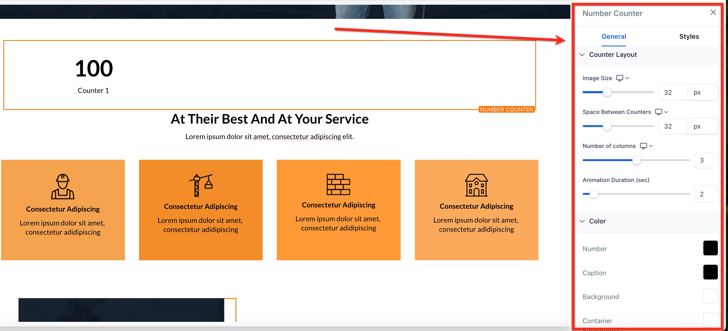
The Number Counter is a native element in the Page Builder that transforms numerical values into lively count-up animations. By combining smart formatting, customizable layout controls, and on-scroll triggers, it lets you present key achievements, like treatments performed or happy clients, in a way that's both visually compelling and brand-consistent.
Multiple Counters: Display many counters in a single element to highlight your most important metrics.
Smart Number Formatting: Automatically abbreviates large figures with K, M, B, or T for instant clarity.
Prefix & Suffix Fields: Add $, €, %, + or any custom text before or after values.
Counter-Specific Images: Pair each number with an icon, badge, or logo to reinforce meaning.
Layout Precision: Control the number of columns and fine-tune gaps for pixel-perfect alignment on every device.
Complete Styling Controls: Customize colors, borders, shadows, and typography to match your brand.
Navigate to Marketing → Landing Page Builder or Web Tools → Websites.
Click the blue Edit button on the desired page or step.
Select + Add Element in the sidebar and locate the Number Counter element.
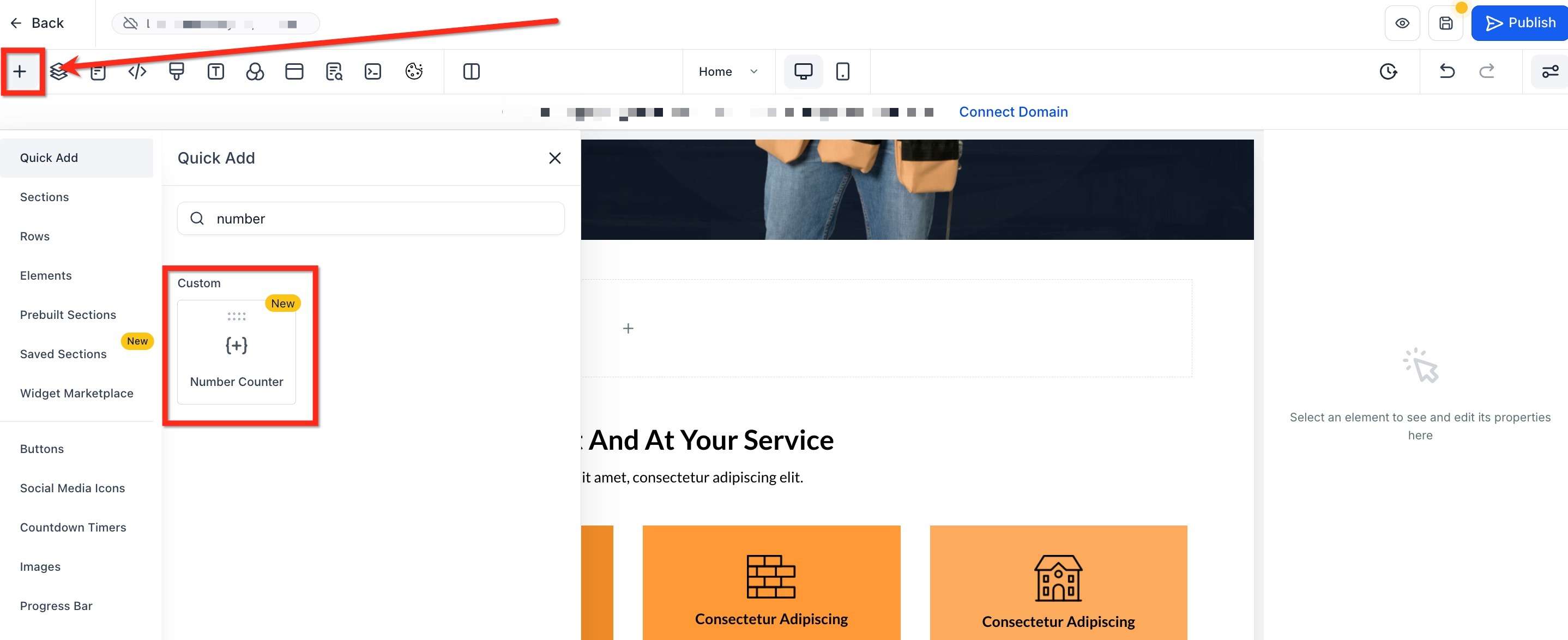
Drag Number Counter into your layout where you want the metrics to appear.
After the widget is on your canvas, you can shape each counter to fit your needs. Add new metrics, remove any you don't need, and customize every detail directly from the settings panel.
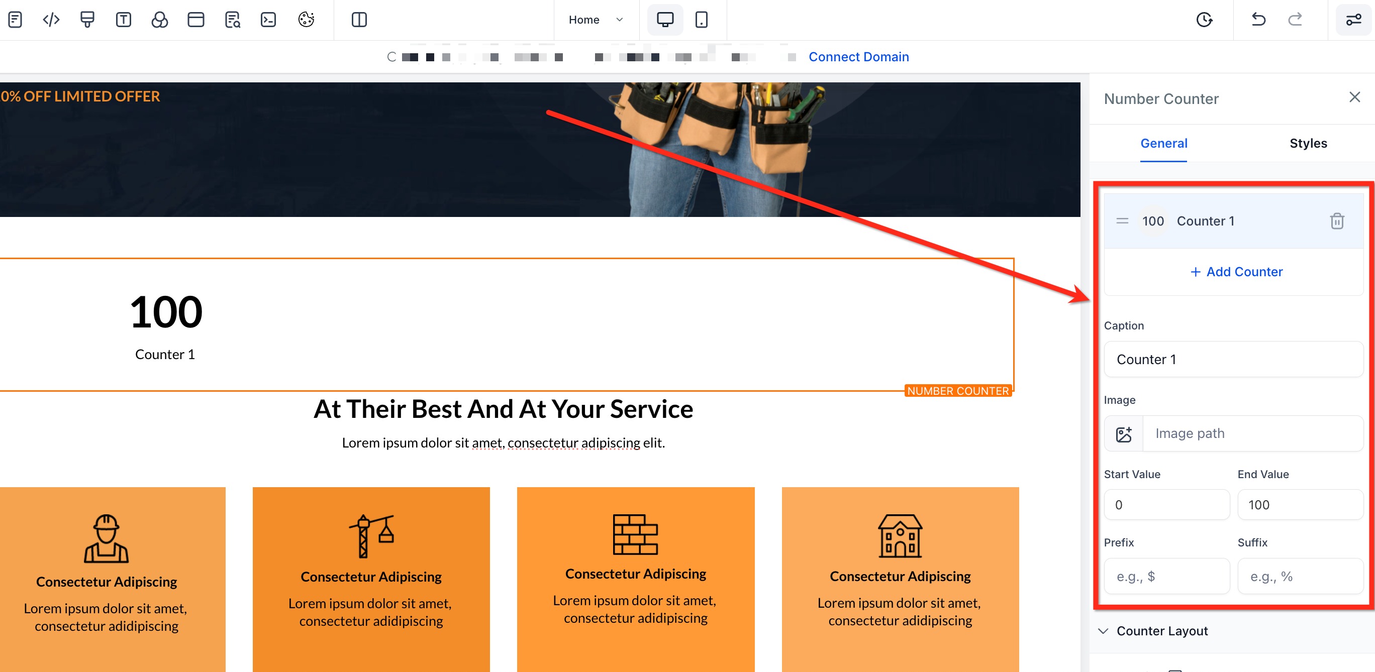
Add/Remove Counters: Click Add Counter to create more metrics, or the trash icon to delete one.
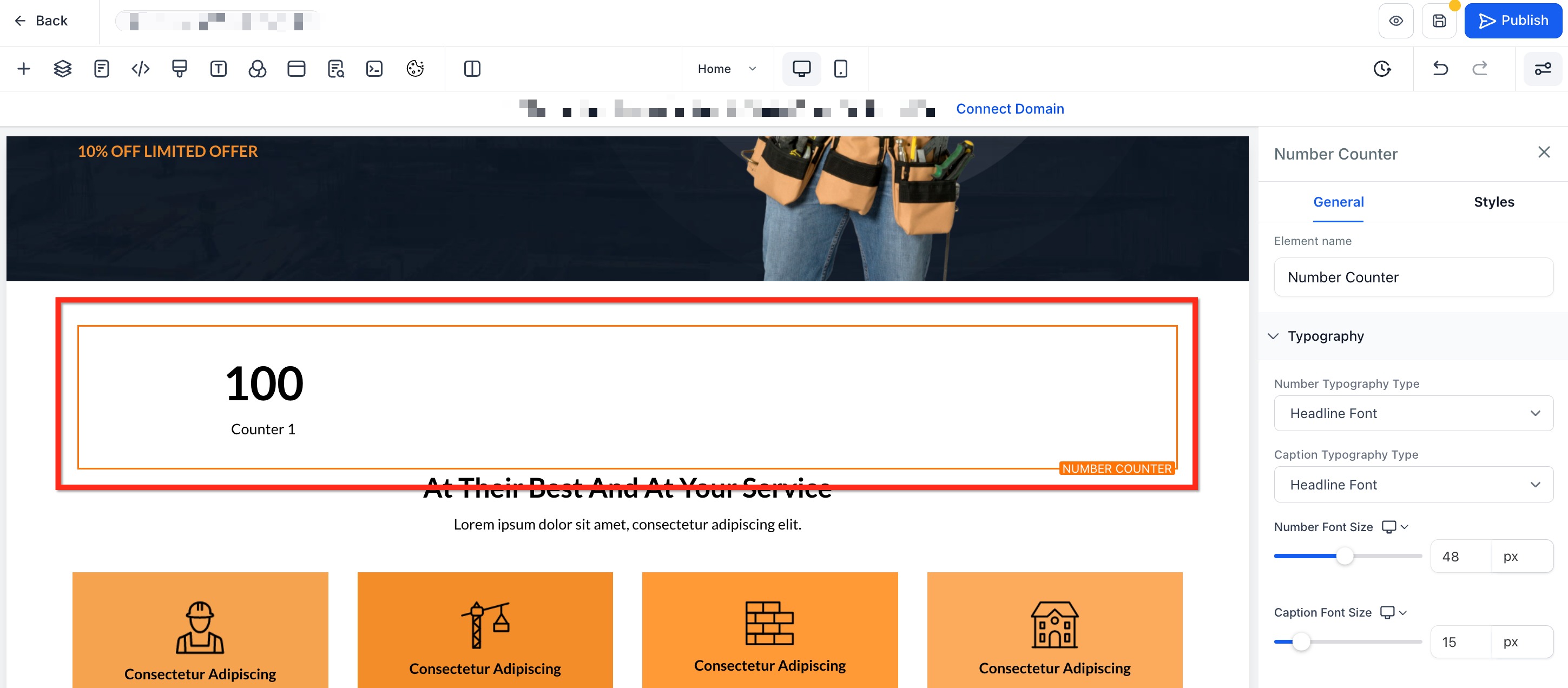
Caption: Type a label such as "Treatments Performed" so visitors know what the number represents.
Image: Upload a PNG, JPEG, or SVG icon and adjust its size with the slider.
Start & End Values: Define where the animation begins (e.g., 0) and ends (e.g., 5,000).
Prefix/Suffix: Add context with $, €, %, +, or custom text placed before or after the value.
After configuring your metrics, use the options under Counter Layout to refine spacing, colors, animation speed, and overall layout so the counters blend perfectly with your brand. Key style controls include:
Image Size: Adjust icon dimensions.
Space Between Counters: Adjust horizontal gaps to fine-tune spacing for a polished look.
Number of Columns: Choose how many counters appear per row (1–5).
Animation Options: Define the animation duration (1s–15s) to control how quickly numbers count up. Use the viewport trigger so numbers animate only when scrolled into view.
Colors: Select individual swatches for Number, Caption, Background, and Container Background. Add borders and shadows to align with your brand aesthetic.
Note: Keep counters to 20 or fewer per widget for optimal load times. While technically unlimited, animations may appear sluggish on low-powered devices beyond that point.
Image formats: Supported types are PNG, JPEG, and SVG.
Smart Formatting: Numbers are auto-formatted (e.g., "2500000" becomes "2.5 M") to keep large stats clean and easy to read.
Images: Images are optional and can be toggled on or off per counter.
Animation: The animation triggers only once per page load to maintain smooth performance.
Can I add different colors to each individual counter?
Currently, global styles apply to all counters for consistency. You can adjust the background or container color globally.
Can counters include decimals?
Yes. You can include decimal points in start and end numbers.
Will the animation restart if I scroll back up?
No. The counters animate once when they first enter the viewport.
Do I have to use images for each counter?
No. Images are completely optional and can be added only where needed.
How many counters can I add in one widget?
Technically unlimited. For best performance, keep it to 20 counters or fewer; beyond that, animations may appear sluggish on low-powered devices.
Will the counters adjust automatically on mobile?
Yes. Column settings and gap spacing respond to screen size so counters remain legible on any device.
How can I replay the animation while editing?
Within the Number Counter settings panel, click Preview Animation to watch the count-up again without leaving the editor.