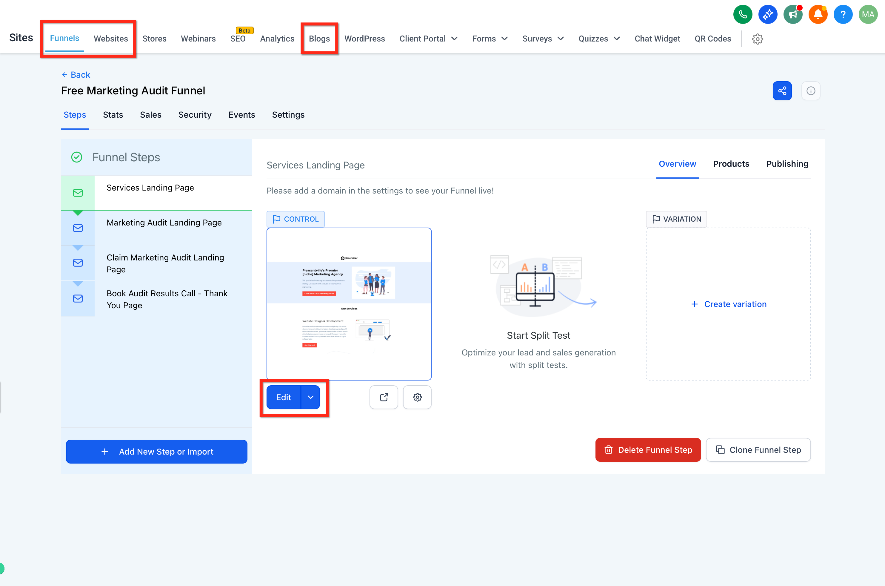
The Page Builder gives you a full toolbox of content elements you can drag onto any page across Funnels, Websites, Blogs, Webinars, and your online Store. This overview walks you through the kinds of elements available, how to reuse elements across pages so your branding stays consistent, and where to find the prebuilt libraries that speed up your builds. For step-by-step help with individual element types, see the dedicated guides in this section, such as Video Elements and Forms on Your Pages.
Every page you build in Aesthetix CRM is assembled from content elements you drop onto the canvas. Common elements include:
Text for headlines, paragraphs, and body copy
Images for photos, before-and-afters, and graphics
Video for embedded walkthroughs, treatment overviews, and testimonials
Buttons for calls to action like "Book a Consultation"
Forms for lead capture, intake, and consultation requests
Icons and menus for navigation and visual accents
Drag any element from the left design bar onto your page, then use its toolbar to adjust design and settings. Because each element type has its own options, you'll find focused guides throughout this section (for example, Video Elements and Forms on Your Pages).
The left design bar also includes a library of prebuilt elements, so you can add polished, ready-made pieces without designing from scratch. These give your funnels and websites a professional touch while keeping your creative flow. The library includes:
Prebuilt buttons: A diverse collection of attractive, predesigned buttons you can drop in and customize.
Prebuilt images: A curated library of high-quality, royalty-free images integrated right into the design bar. Use drag-and-drop to place them on your pages and save time.
Social media icons: A comprehensive set of predesigned icons for all major platforms, including Facebook, Instagram, LinkedIn, and more, to expand your reach and engagement.
Progress bars: Visually appealing progress bars to showcase milestones, loading indicators, and progression metrics.
Open the left design bar in your page builder.
Look for the sections dedicated to prebuilt buttons, images, social media icons, and progress bars, ready for you to explore and add.
Why use them
Enhanced productivity: Quickly build and customize high-quality elements without designing from scratch.
Stronger engagement: Use social media icons and progress bars to improve interaction on your pages.
Consistency: Maintain a cohesive design language across your site with easily customizable pieces.
Universal Elements let you design an element once and reuse it across Funnels, Websites, Blogs, Webinars, and Store pages, while keeping every instance consistent. A Universal Element is a single element you save to the Saved Assets library so it stays linked wherever it's used. When you update and publish a linked Universal Element, every placed instance reflects the change. This helps your team maintain brand consistency and cut down on repeated edits.
Brand consistency: Keep typography, colors, and styles aligned everywhere without manual updates.
Faster builds: Drag from the Saved Assets library instead of redesigning common elements.
Centralized updates: Edit once and publish the affected pages so all instances reflect the change.
Organized library: Thumbnails and search in Saved Assets make frequently used elements easy to find.
Team-friendly workflows: Standardize key components so collaborators build with approved patterns.
There are several ways to save and reuse content. Choosing the right option prevents confusion and avoids accidental design drift. Use this comparison to pick the best fit for each scenario.
Saved type | Scope | Syncing behavior | Typical uses | Where to find |
|---|---|---|---|---|
Universal Elements | Single element | Linked reuse; updates appear on placed instances after publishing affected pages | Buttons, logos, icons, menus | Saved Assets → Universal Elements |
Element Templates | Single element | Inserted as a starting point (copy); later edits do not sync to existing placements | One-off variants, quick starting patterns | Saved Assets → Element Templates |
Universal Sections | Section (group of elements) | Linked reuse at section level; edits can sync across placed instances after publishing | Headers, footers, announcement bars | Saved Assets → Sections (Universal) |
Note: Use Universal Elements for small, repeating items like buttons and badges. Use Universal Sections when you need a full, reusable layout block such as a header or footer.
Saving correctly the first time prevents rework and ensures the element is stored as a linked Universal Element instead of a non-syncing template.
Open a page in the Page Builder (Funnel, Website, Blog, Webinar, or Store).
Select the element you want to reuse (for example, a button, image, icon, headline, or menu) and save it as a Universal Element from either location:
The element's toolbar → Save icon
Layers panel → ⋯ menu → Save as Universal Element
Give the item a clear, searchable name (for example, Button, Primary CTA).
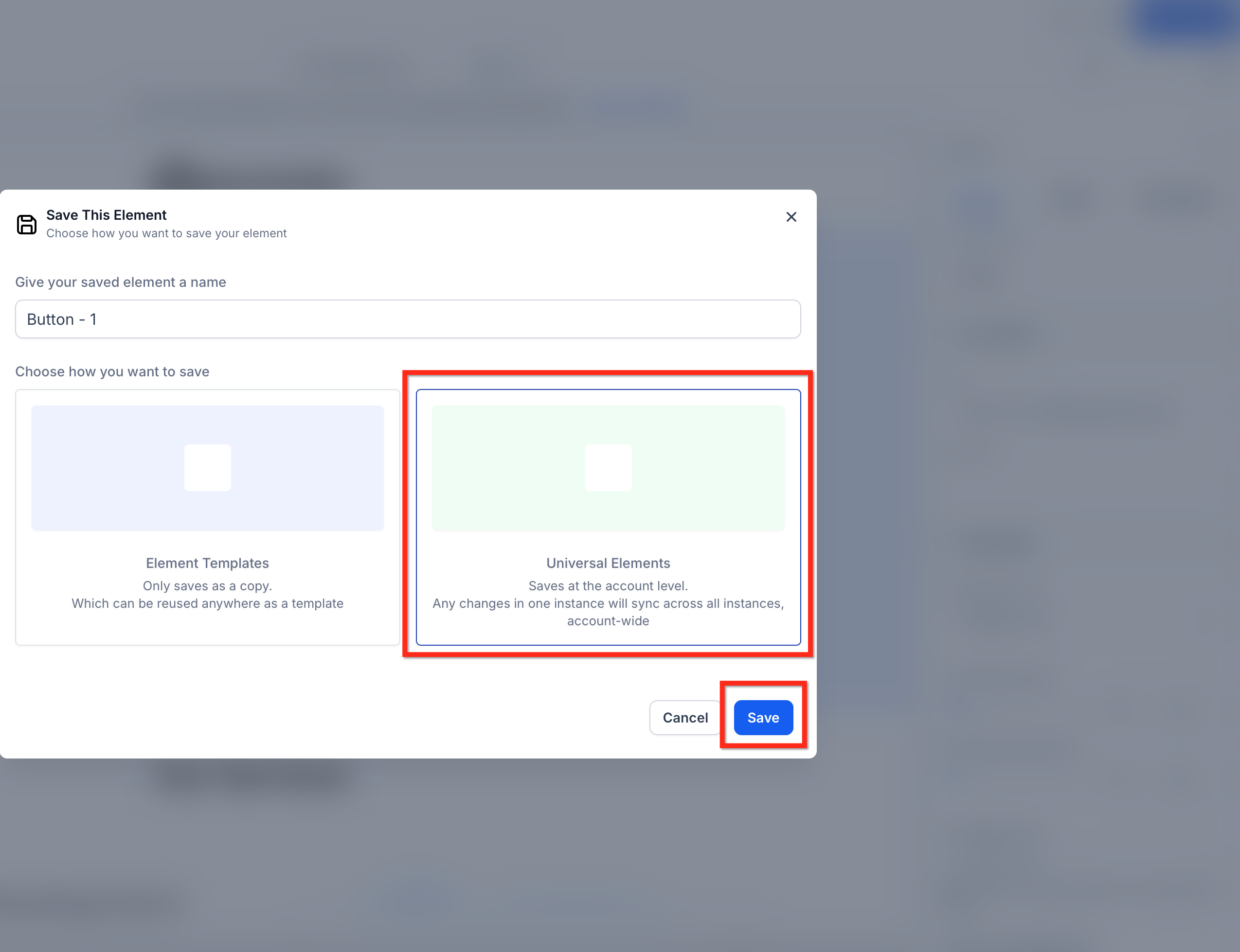
Confirm the save. The item now appears in Saved Assets → Universal Elements with a thumbnail.
Always place Universal Elements from the Saved Assets library so each instance stays linked. When you edit a Universal Element, you'll publish the change to make it live on the affected pages.
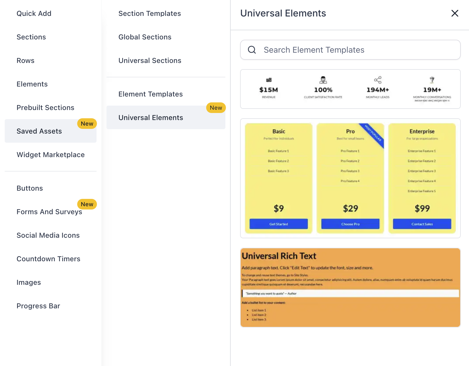
Place a Universal Element
Open Add Elements → Saved Assets → Universal Elements.
Use search or browse thumbnails, then drag the element onto the canvas.
Edit a Universal Element
Select a placed Universal Element to adjust its design or settings.
Save your page changes.
Publish the page so updates become visible to visitors.
Note: If AI-assisted page revisions are available in your account, they're designed to respect linked Universal Elements. Before running a revision, confirm whether your target area includes a linked Universal Element. If you need a page-only variant, duplicate the element locally (convert it to a non-linked copy) first. After a revision, review the change summary and publish global changes deliberately once you've validated them.
A tidy library speeds up builds and reduces mistakes. Use clear names, search effectively, and remove unused entries when appropriate.
Browse and search: Add Elements → Saved Assets → Universal Elements provides thumbnails and keyword search.
Rename for clarity: Use consistent prefixes such as Button, , Icon, , or Nav, .
Remove cautiously: Deleting a saved item detaches it from the library for future use. Review pages that currently rely on it before removing.
Do I have to publish for changes to be visible to visitors?
Yes. Saving keeps edits in the builder. Publishing the affected pages makes updates live.
Where do I find saved Universal Elements?
In the Page Builder, open Add Elements → Saved Assets → Universal Elements to browse thumbnails or search by name.
Can I rename or delete a Universal Element later?
You can rename items for clarity. Deleting removes the saved item from the library for future use, so review pages that currently rely on it before removing.
What if I need a one-off variation on a single page?
Consider placing an Element Template or creating a local copy so your changes don't affect other pages.
How can I revert a recent change if something looks wrong?
Use Version History on the affected page to restore a previous version, then republish.