Before you drop in text, images, or forms, it helps to understand how a page in the Aesthetix CRM Page Builder is structured. Every page is built from layout containers you can nest, arrange, and style, giving you precise control over multi-column designs, responsive spacing, and smooth in-page navigation. This is the foundation you'll build on.
Pages are assembled from layout containers that stack and nest inside one another:
Sections are full-width horizontal bands that run across the page. They typically hold one grouping of related content.
Rows and columns divide a section so you can place elements side by side or stacked.
Nested layouts let you place layout containers inside other layout containers for fine-grained, responsive designs, think multi-column opt-in pages or comparison tables.
Nesting layout containers removes complexity and adds flexibility to your page design:
Flexible structure: Easily place rows, columns, and other layouts within one another.
Real-time settings: Instantly change layout direction (row, column, or collage) with a live preview.
Precise spacing tools: Set margins, padding, and alignment exactly how you want, at every level.
No workarounds: Design complex pages without custom code or third-party tools.
Reusable layouts: Duplicate and modify nested containers to keep your branding consistent.
Nested layouts use the same drag-and-drop interface as the rest of the builder. To get started:
Open the page you want to edit in the builder.
Drag a Layout Container onto the canvas.
Drag a second Layout Container into the first to form the nested structure.
Open Layout Settings and choose row, column, or collage orientation.
Adjust Spacing & Alignment for margins, padding, and positioning. Repeat steps 3–5 for additional nested levels as needed.
Click Save to commit your layout, or add it to Saved Sections for reuse.
Note: Only Layout Containers can be nested, Sections and Rows stay single-level for performance. There is no hard depth limit, but stick to three or four levels for maintainability and load speed.
Two-column opt-in pages: Put your headline and form on one side, testimonials and social proof on the other.
Pricing comparison tables: Create multi-column layouts with different-sized sections for features, pricing, and call-to-action buttons.
Feature showcase grids: Combine images, text, and buttons that align perfectly across rows and columns.
You can make any button, text link, or menu item smoothly scroll to a specific section on the same page, great for "Jump to Pricing" or "Learn More" navigation on long landing pages. Scroll-to actions work across desktop and mobile, and smooth scrolling is applied automatically with no extra setup.
Every scroll-to setup starts with the selector of the section you want to scroll to. You'll paste this at the end of your link in Step 2.
Open your page in the builder.
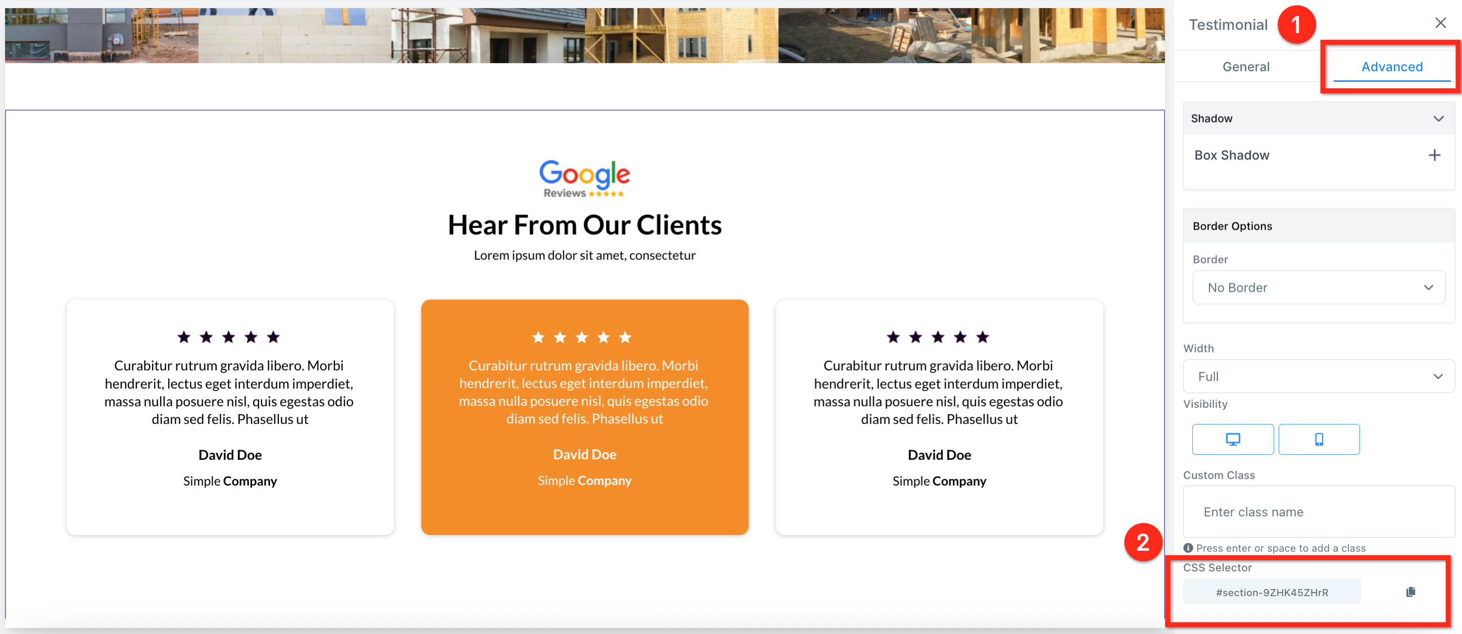
Click the section you want to scroll to.
In the right-hand panel, go to the Advanced tab.
Copy the value shown in the CSS Selector field.
With the selector copied, pick one of the following methods to trigger the scroll when a visitor clicks.
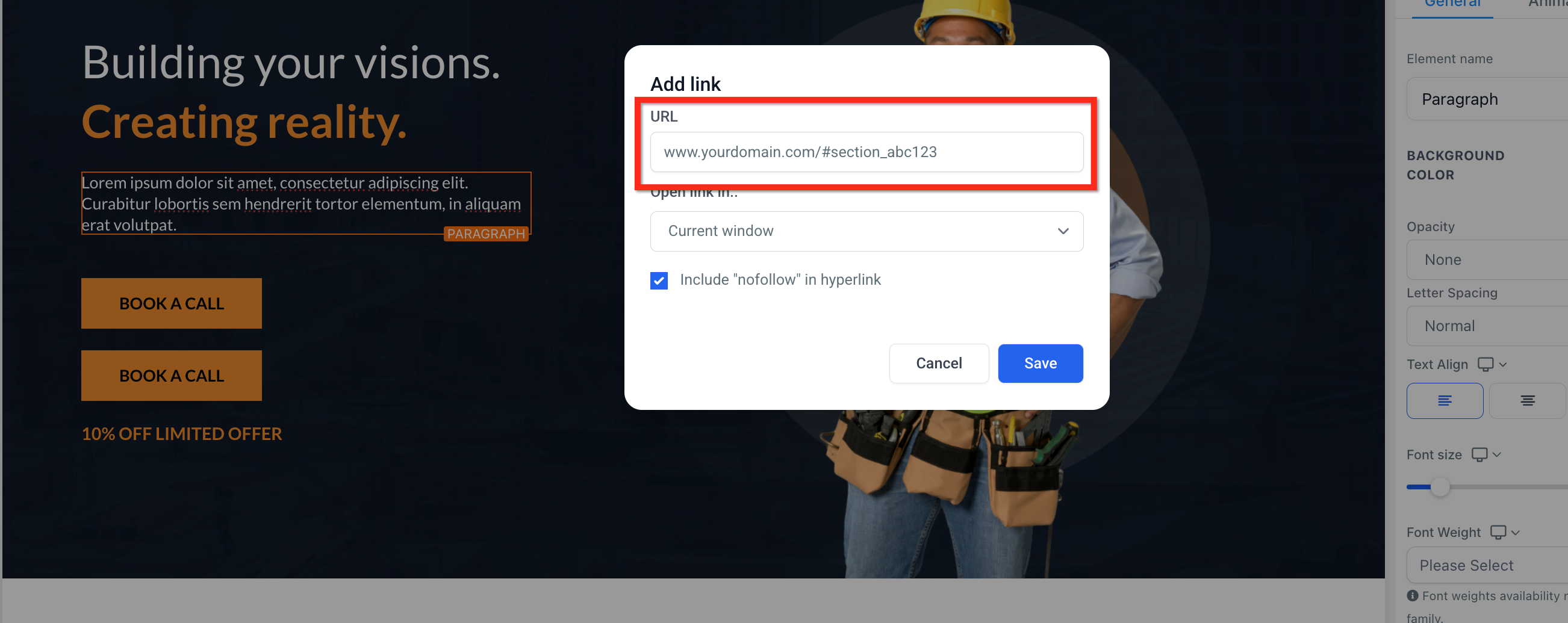
Highlight the text you want to turn into a link.
Click the Link icon in the formatting toolbar.
Enter your full page URL plus the CSS selector you copied (for example, www.yourdomain.com/#section_abc12).
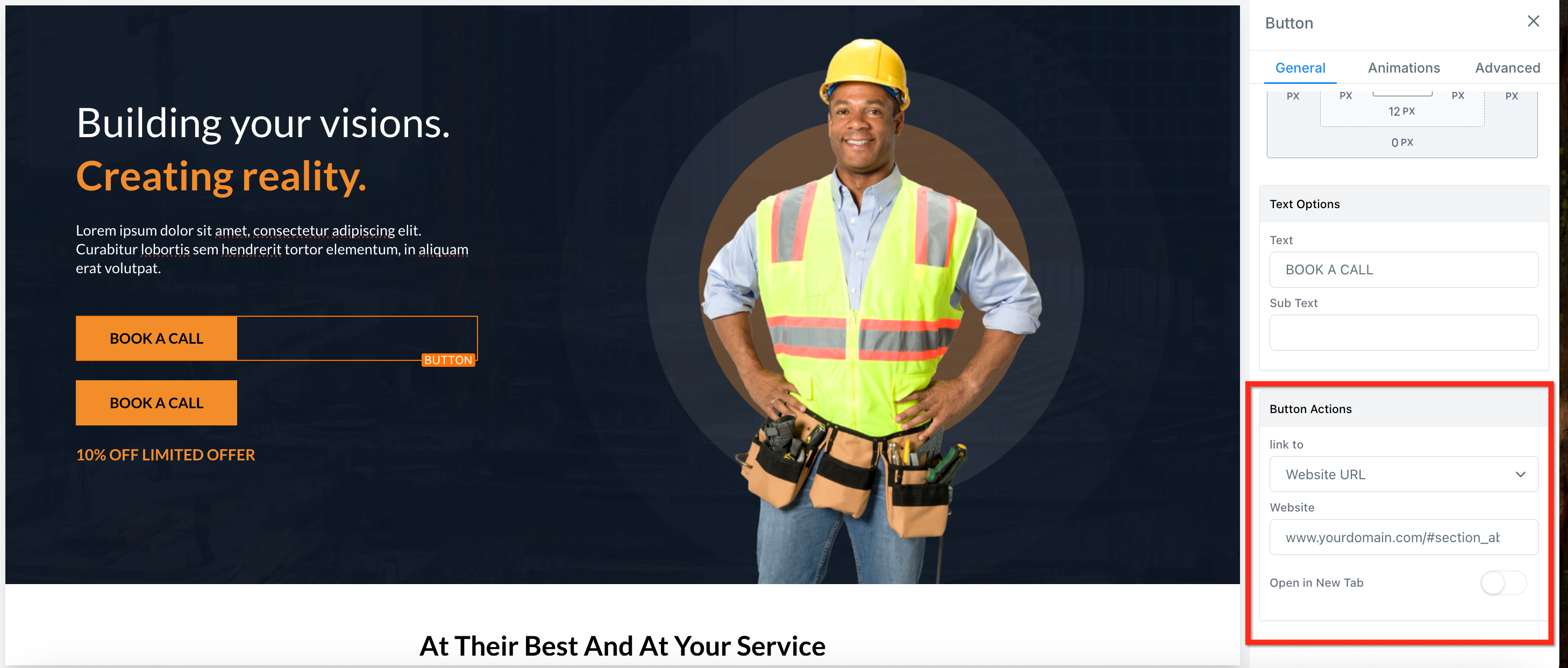
Select the button in the builder.
Under Button Actions, click the Link To dropdown and choose Website URL.
Enter your full page URL plus the CSS selector you copied (for example, www.yourdomain.com/#section_abc12).
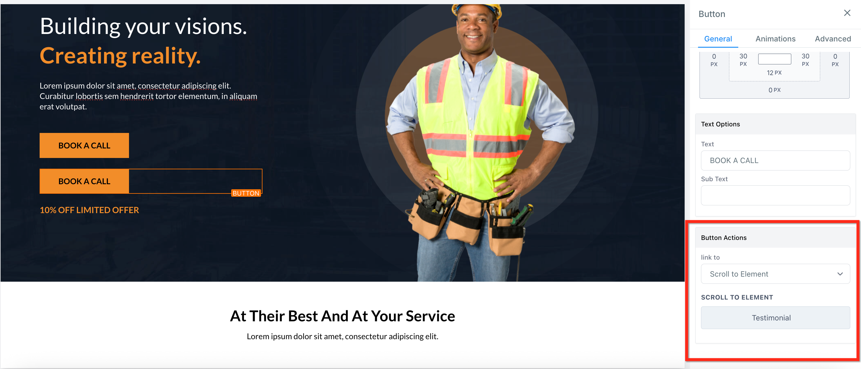
Select the button in the builder.
Under Button Actions, click the Link To dropdown and choose Scroll to Element.
Use the dropdown to select the section you want the button to scroll to.
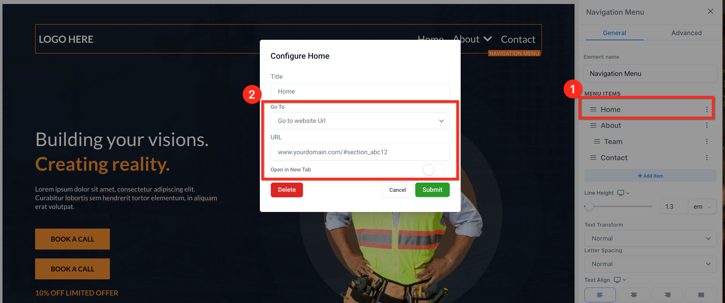
Select the Navigation Menu.
Click the three dots next to a menu item.
Change the Go to field to Go to website URL.
Enter your full page URL plus the CSS selector you copied (for example, www.yourdomain.com/#section_abc12).
Click Submit.
Note: Scroll-to only works within the same page, it can't jump between separate pages or funnel steps. Make sure each selector starts with
#and is unique; if two sections share a selector, only the first match is used.
A Navigation Menu lets visitors move between pages or sections of your site. Menus are commonly placed in headers and footers, and they support:
Direct page links
External URLs
Dropdown menus
Nested submenus
Anchor-based scrolling (see above)
Responsive behavior for mobile
Open your page in the builder.
Click Add Element.
Select Navigation Menu.
Drag the element into your desired section.
Click the element to configure its settings.
In the Navigation Menu settings panel, you can add new items, rename labels, link to internal pages or external URLs, add dropdown (child) items, and reorder items.
To create a dropdown:
Add a parent menu item.
Click Add Sub Item under that item.
Configure the child link.
Repeat for additional nested items.
Enable the Wrap option so menu items automatically move to the next line when there isn't enough horizontal space. This keeps your header clean and responsive by preventing menu overflow. It's especially useful for menus with many items, long labels, or tablet and mid-sized screens.
Use the Style tab in the element settings panel to customize:
Font style and size
Menu alignment (left, center, right)
Spacing between items
Background color
Hover effects
Dropdown appearance
Submenus render cleanly with stable dropdowns, consistent hover behavior, and even spacing across devices.
Navigation Menus adapt automatically to mobile view and may collapse into a hamburger-style layout depending on your configuration, with responsive touch behavior and smooth dropdown interaction.
Keep menu labels concise.
Use dropdowns to organize complex navigation.
Enable Wrap when using multiple menu items.
Avoid excessive nested submenu levels.
Test mobile view before publishing.
How do I add a nested container?
Drag a Layout Container into an existing Layout Container, the blue highlight shows a valid drop zone.
Can I nest Sections or Rows?
No. Only Layout Containers can be nested. Sections and Rows remain single-level for performance reasons.
Is there a depth limit for nesting?
Practically no, but we recommend three to four levels for maintainability and load speed.
Do nested layouts work in Saved Sections?
Yes. Saved Sections keep their nested structure and sync globally when updated.
Can I scroll between different pages?
No. Scroll-to only works on the same page.
My scroll isn't working. What should I do?
Check that your selector is correct and starts with #. Refresh the page and test again.
What does the Wrap option do?
It allows navigation items to move onto a new line when they exceed the available width, preventing layout overflow.
Is smooth scrolling enabled by default?
Yes. Scroll-to-element actions use smooth scrolling automatically, with no configuration required.