Aesthetix CRM uses one shared drag-and-drop page builder across your entire site presence. Whether you're creating a funnel, building a full website, or spinning up a single landing page, you're working in the exact same editor with the same canvas, sidebars, and settings. Learn it once and you can build anything.
This guide walks you through the editor layout, the drag-and-drop workflow, the left and right sidebars, and the page-level settings, SEO, tracking, custom code, and auto-save, that turn a blank page into a polished, published page for your practice.
Note: For the full workflows of creating and managing sites, see the Funnels and Websites guides. This article focuses on the builder itself, which is identical no matter which of those you're editing.
You reach the same builder from either a funnel, a website, or a landing page. Once you open any page for editing, the interface below is what you'll see everywhere.
From Web Tools, choose the site or funnel you want to work on, then open a page to launch the builder.
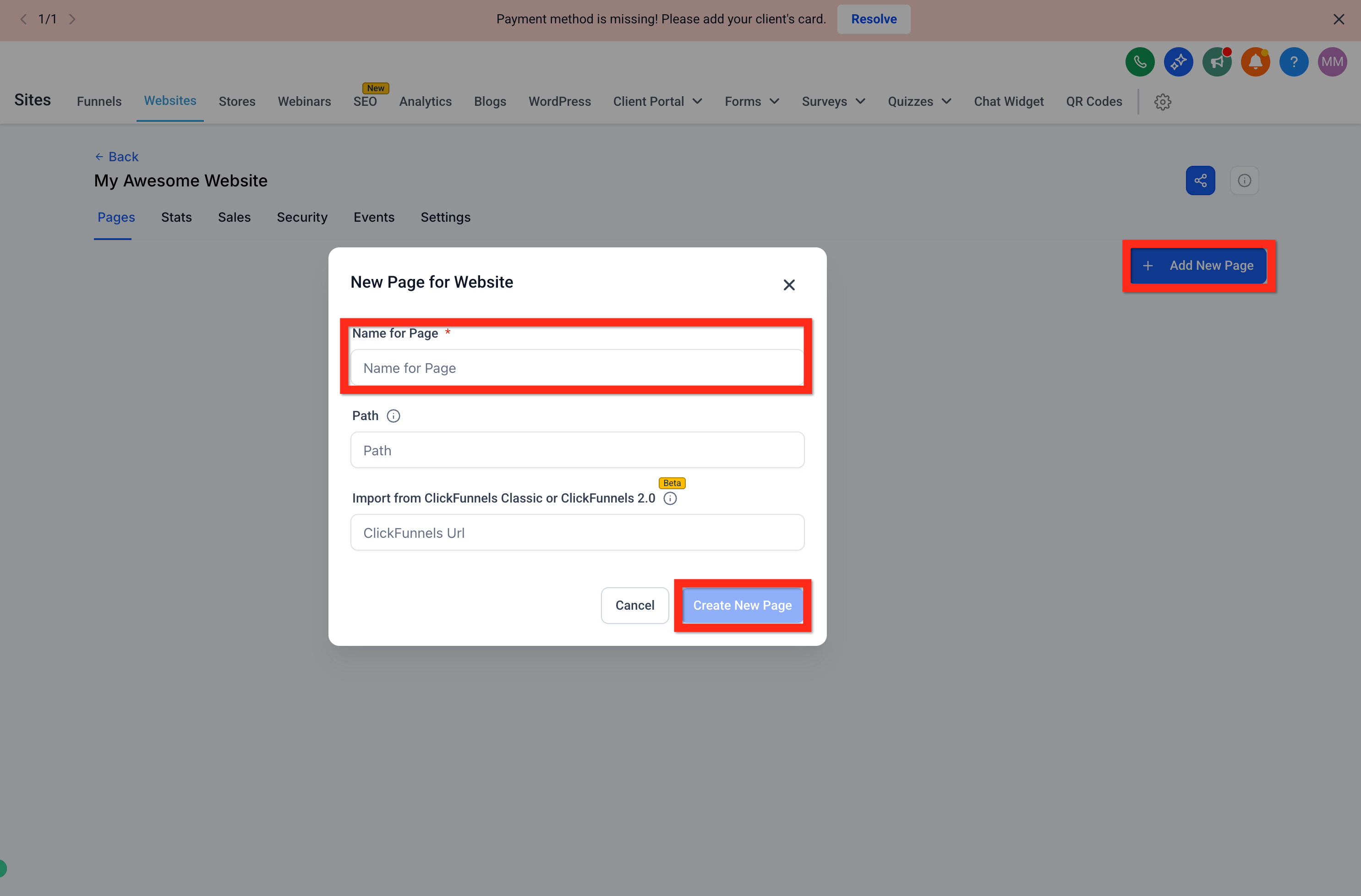
If you're starting a new page, click Add New Page, give it a name (for example, "Home"), and click Create New Page.
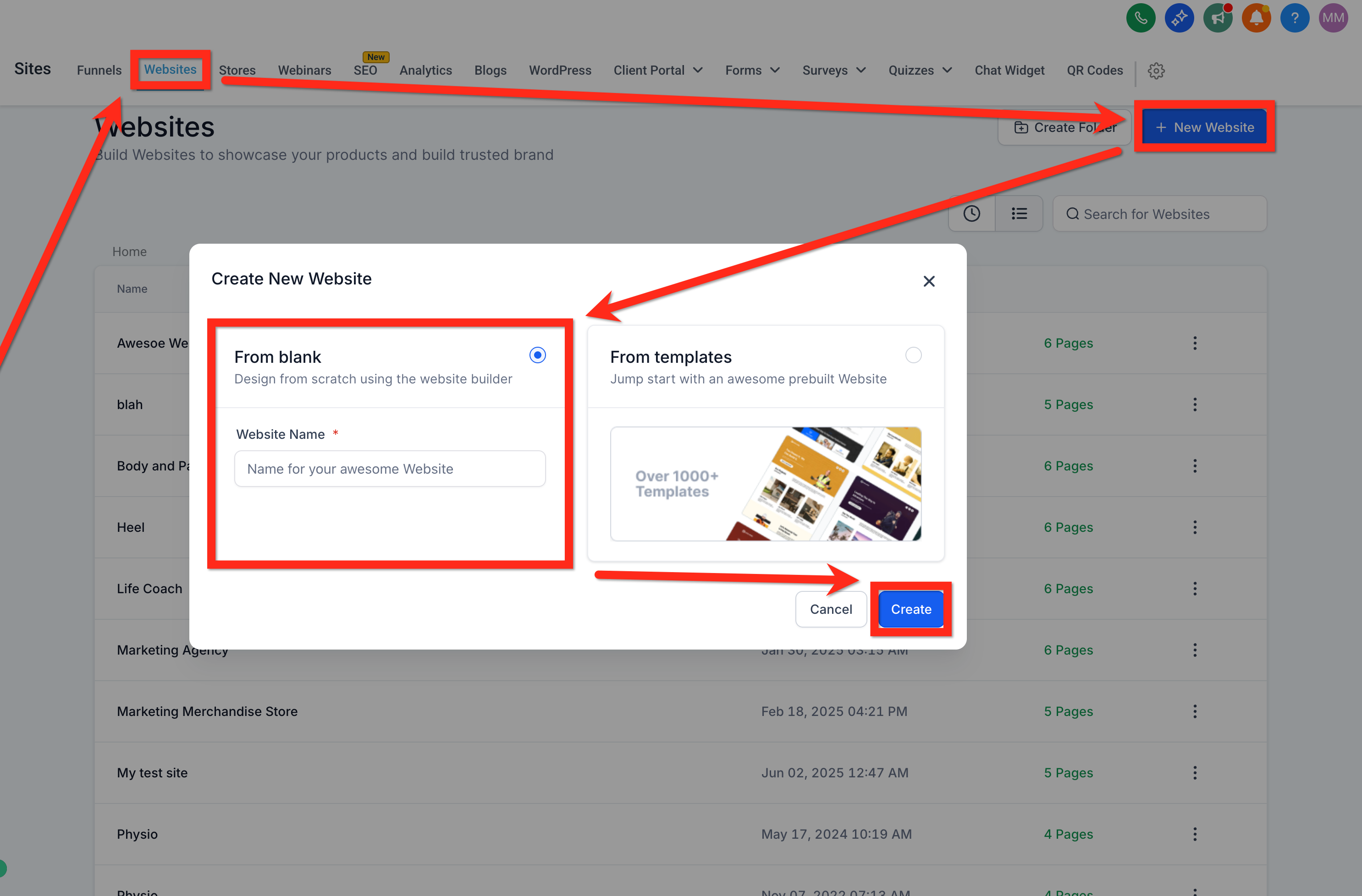
Choose Create From Blank to start with an empty canvas.
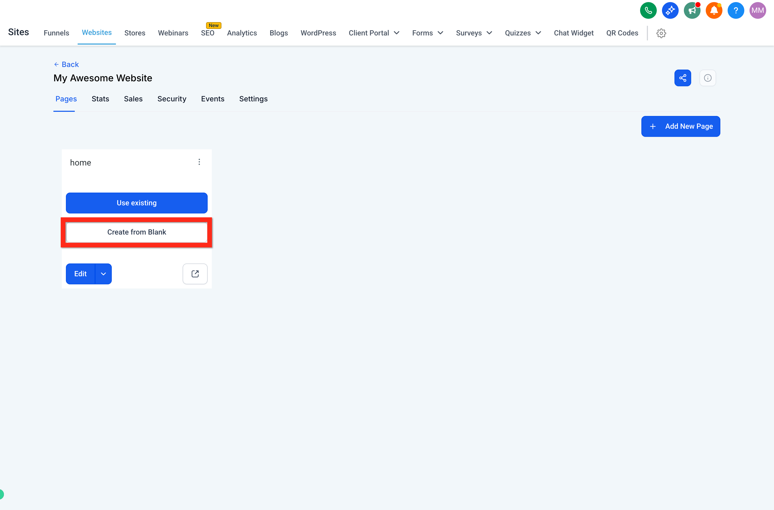
Open the builder to begin editing your page.
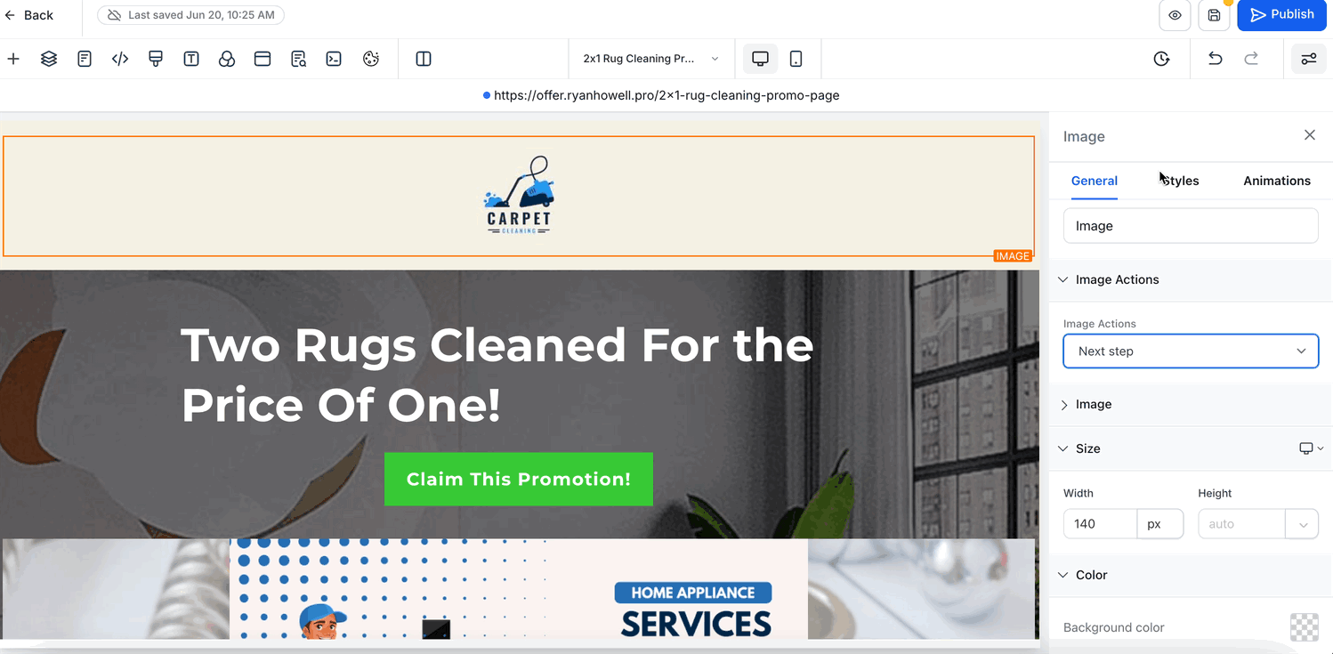
The builder is organized into a few consistent areas. Getting familiar with each one makes every later step faster.
Control Panel: Controls what appears in the left panel, elements, pages, and page metadata.
Device Switcher: Toggles between desktop and mobile views so you can test how your page responds on different screens.
Meta Controls: History, undo/redo, preview, save, and publish.
Left Panel: Elements and settings you add to the page.
Center Panel (Canvas): A live, editable preview of your page.
Right Panel: Settings and styling options for whichever Section, Row, or Element you've selected.
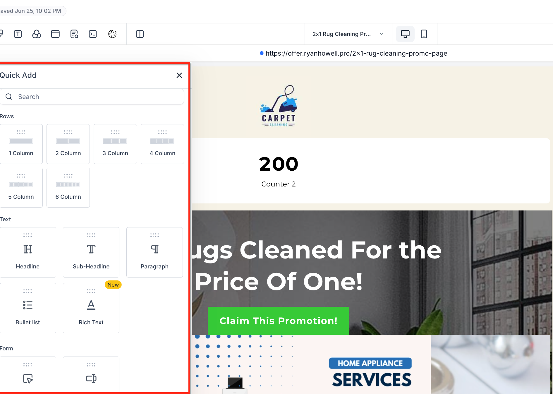
Pages are built from a simple hierarchy: Sections contain Rows, Rows contain Columns, and your content Elements live inside those columns. You can build this structure manually, or let the builder create it for you automatically (see Drag and Drop below).
Add a Section: In the center of an empty canvas, or by clicking the + (Add Element/Section) icon in the left sidebar, choose Sections, then pick a section width (for example, Full Width).
Add a Row: Inside the new section, drag in a Row and select a column layout such as 1 Column.
Add Elements: Inside the row, click Add Element to place content.
Headline: Drag a "Headline" element into the row. Click the text to edit it (for example, "Radiant Skin Starts Here"). Use the right panel to change the font, size, and color.
Sub-Headline: Click + Add Element again and drag a "Sub-Headline" below the main headline. Edit its text and style (for example, "Book your complimentary consultation today").
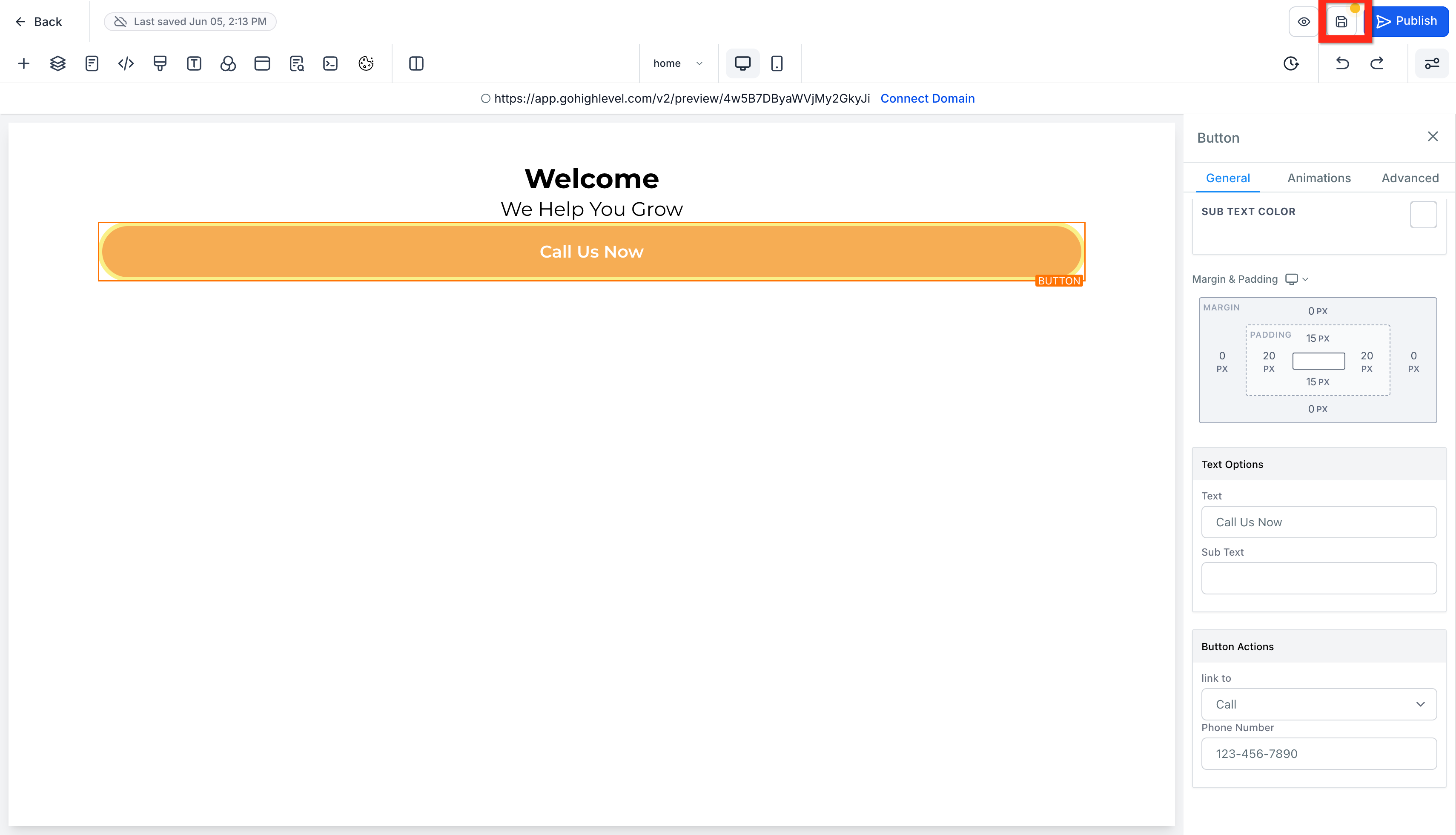
Add a Button: Below the sub-headline, add a Button element, then edit its text (for example, "Call Us Now").
Assign a Button Action: With the button selected, open its settings in the right panel, scroll to Button Actions, select Call, and enter your practice's phone number.
Repeat: Continue adding sections, rows, and elements to build out the rest of your page.
You don't have to set up Sections, Rows, and Columns by hand. The builder can create the correct layout structure for you the moment you drop an element on the canvas, fewer clicks, less guesswork, and faster page building.
When you drop an element, the builder automatically wraps it in the appropriate containers (Section, Row, and Column), keeping your page structure clean and consistent. Visual drop cues guide you as you place items.
True drag-and-drop freedom: Place any element directly on the canvas, no need to prep the layout first.
Auto-wrap logic: The builder generates the correct structure (Section > Row > Column) behind the scenes.
Smart placement detection: Valid drop targets are detected automatically so elements land where they fit.
Inline column controls: Add new columns to existing rows right from the canvas.
Improved visual feedback: Ghost outlines and highlighted drop zones preview exactly where items will land.
Open any funnel, website, or landing page in the builder.
Drag an element (for example, Text, Button, or Image) from the sidebar onto an empty area of the canvas.
Watch the builder automatically wrap the element in the correct layout containers.
Grab anywhere on an element and drag it to a new location, no separate move handle needed.
Add columns by hovering over a Row and clicking + Add Column.
Use visual cues like ghost outlines to align elements precisely.
You can rearrange columns inside the same row to adjust your layout without rebuilding the section.
Hover over the row to reveal column boundaries and drop zones.
Grab a column and drag it left or right within the same row.
Use the drop indicator to position it, then release to drop.
Note: Column reordering is scoped to the same row. Because reordering can change how columns stack on smaller screens, re-check your tablet and mobile views afterward.
Use zoom to make small placement adjustments easier.
Use rulers and guides (when available) to align elements consistently.
Use Undo/Redo to experiment safely and back out of any misdrops quickly.
Drag a Text element onto a blank canvas: The builder creates Section > Row > Column > Text.
Drag a Row onto a blank canvas: The builder creates Section > Row (with default columns).
Add columns to an existing row: Click the inline + Add Column button on the canvas to expand the layout.
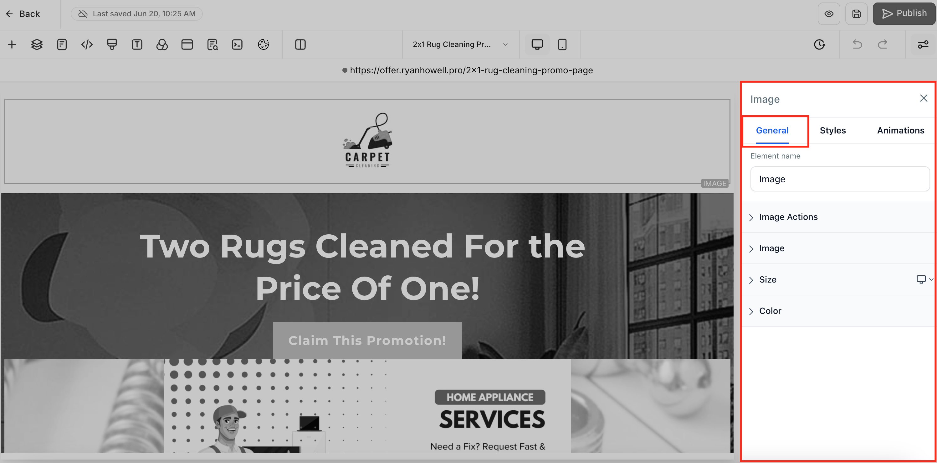
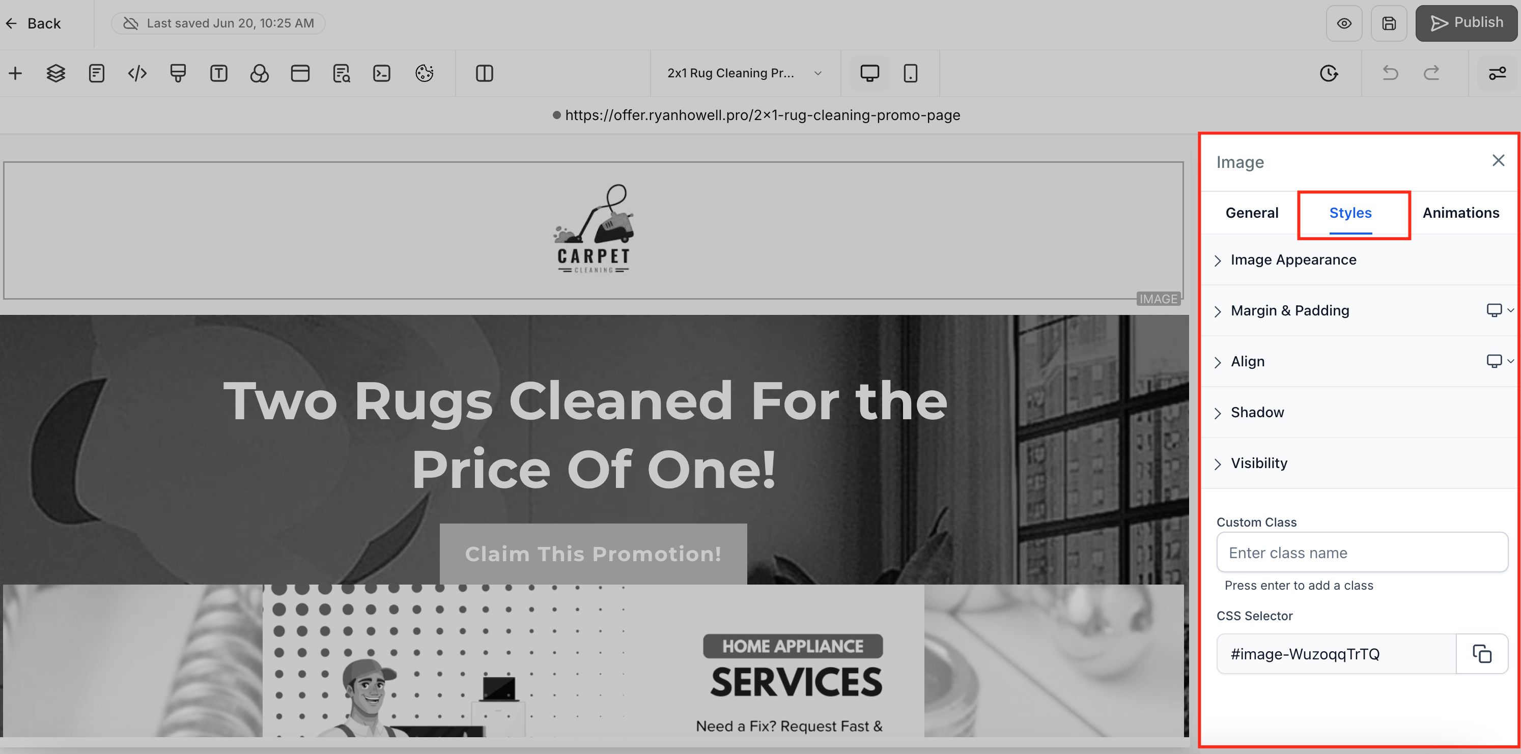
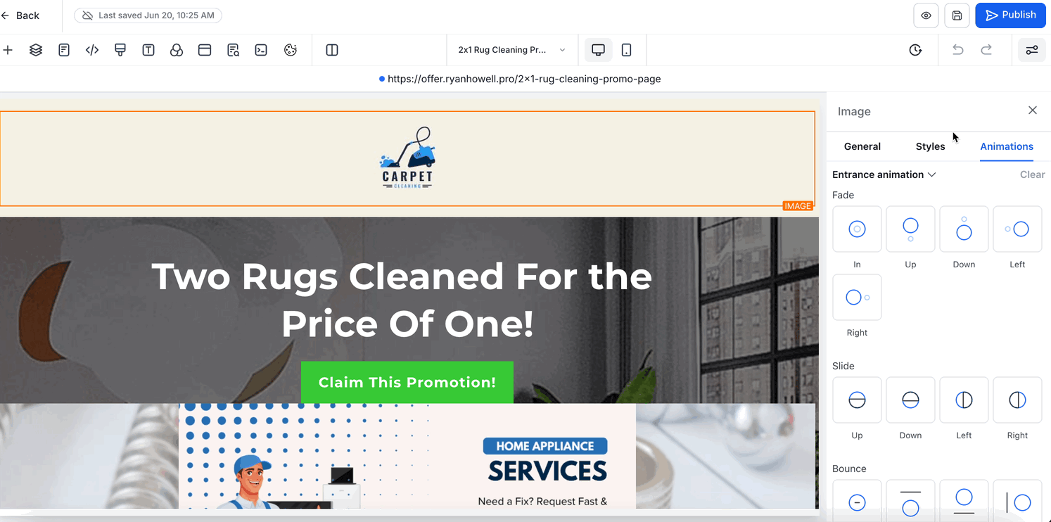
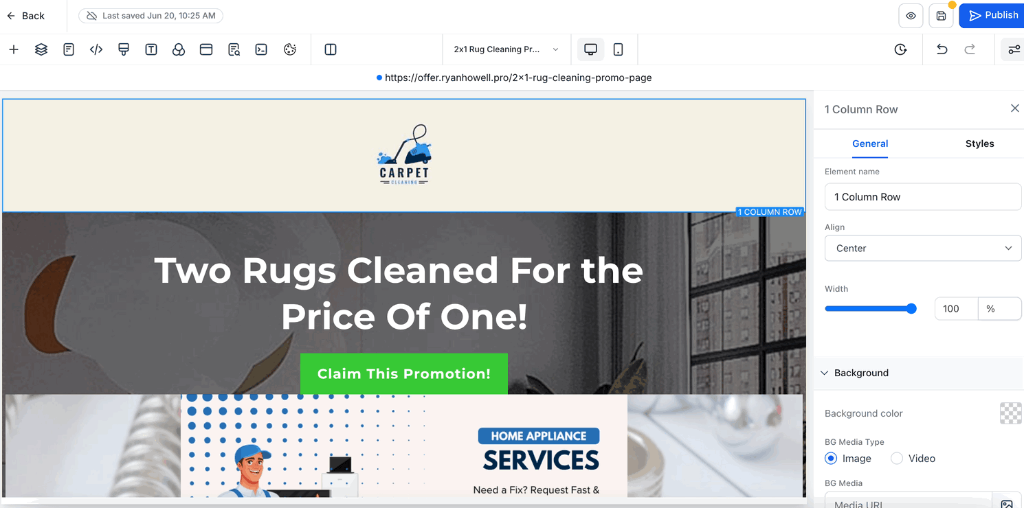
Whenever you select a Section, Row, or Element, its controls appear in the right sidebar, organized into three clear, context-aware tabs: General, Styles, and Animations. Switching tabs lets you jump straight to content settings, layout and styling options, or motion controls without wading through unrelated panels.
The General tab holds an element's core content and behavior. At the top is the Element Name field, which you can use to rename layers (for example, changing "Headline" to "Hero Title" for clearer organization). Below that are Element Options, which vary by element type, text fields for headlines, URL inputs for buttons and links, alt-text for images, and labels for form fields. Element Actions let you assign interactions such as On click, Navigate to URL, Submit form, or Open lightbox. Further down, Typography settings let you choose a font family, adjust size and weight, and set opacity, along with controls for line height, letter spacing, text transforms (uppercase/lowercase), and rotation or skew. Finally, Color Controls let you set background, text, link, and icon colors using either a color picker or a custom hex value.
The Styles tab is where you fine-tune an element's layout and appearance across every device size. You can adjust Margin (outer spacing) and Padding (inner spacing) to control how the element sits relative to its neighbors, and configure a Border by setting width, style (solid/dashed/dotted), corner radius, and color. Align options let you set text alignment (left/center/right/justify) or object alignment for images and other blocks. The Visibility panel lets you independently show or hide the element on desktop, tablet, or mobile. For text elements, the Text Shadow panel adds a drop shadow via horizontal/vertical offsets, blur radius, and shadow color. At the bottom, the Custom Class field and CSS Selector let you tag the element for any custom styling or scripting you add later.
When you're ready to bring elements to life, switch to the Animations tab. The Entrance Animation picker offers effects such as Fade, Slide (Up/Down/Left/Right), Bounce, and Zoom to animate elements as they scroll into view. Beneath each effect are controls for Direction (for example, slide from left) and Speed presets (light, medium, heavy). For ongoing motion, the Infinite Loop section applies subtle or attention-grabbing effects like Glow, Rocking, or continuous Bounce. At any time, the Clear button resets all animations back to "None" for a fresh start.
Note: These overviews cover the most common controls, but not every parameter is shown. Each element type brings its own panels and settings, images get crop and ratio options, buttons get hover-state controls, forms show validation rules, and so on, so the exact options you see depend on the element you've selected.
To keep your workspace focused, settings within each tab are grouped into collapsible panels.
Open or close individual panels as needed.
Panels retain their state throughout your editing session.
Keep advanced or rarely used settings collapsed for a cleaner view.
The sidebar remembers your preferences as you work, so you don't have to keep reopening the same panels.
Tab memory: The last active tab stays selected as you switch between elements.
Panel memory: Collapsed or expanded panel states persist as you move through elements.
New element behavior: When you add a new element, all panels open by default for quick access.
The sidebar uses a minimal, modern layout with improved spacing, consistent styling between controls, cleaner typography, and simplified icons, all designed to reduce visual clutter and help you stay focused while you design.
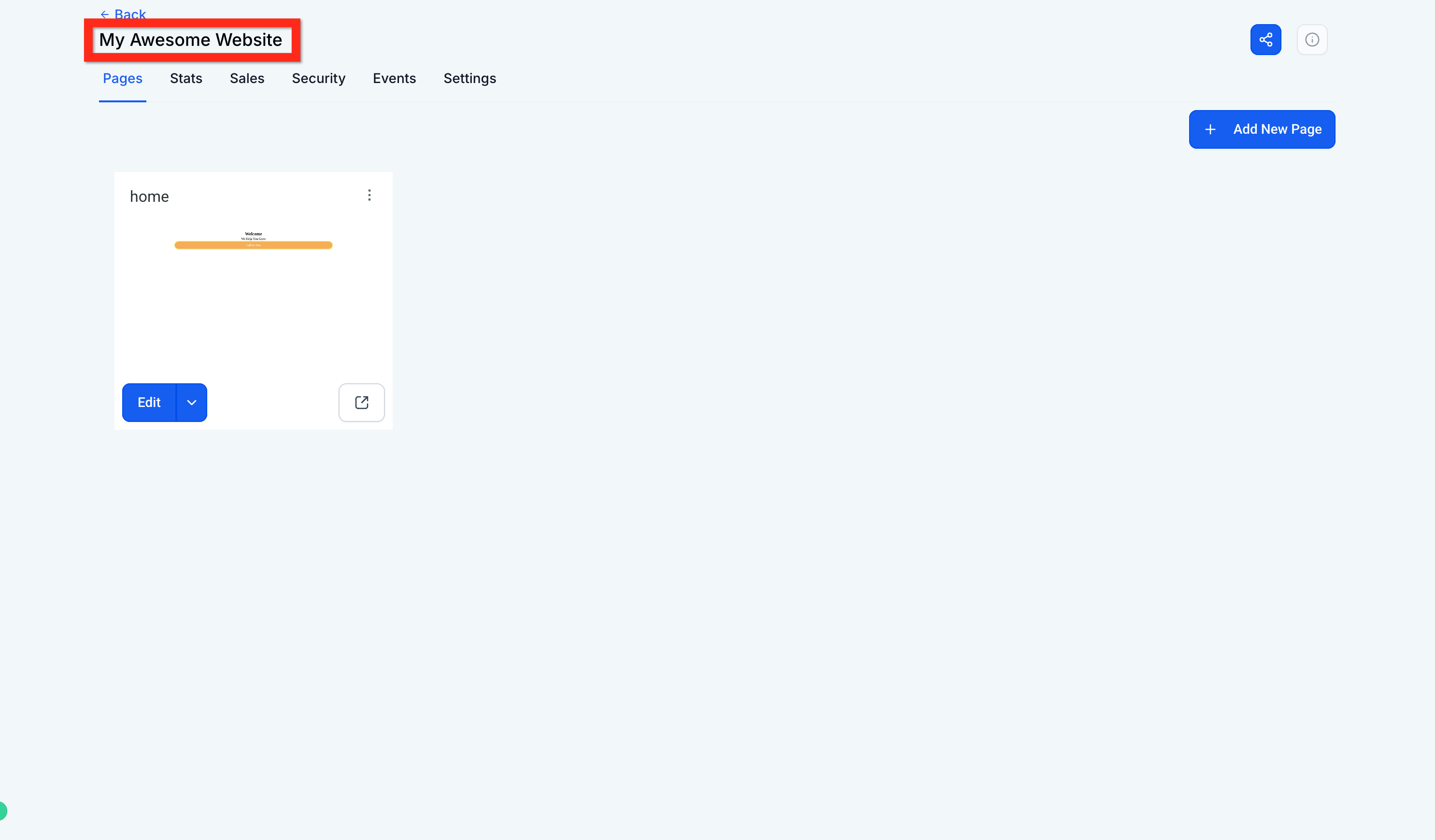
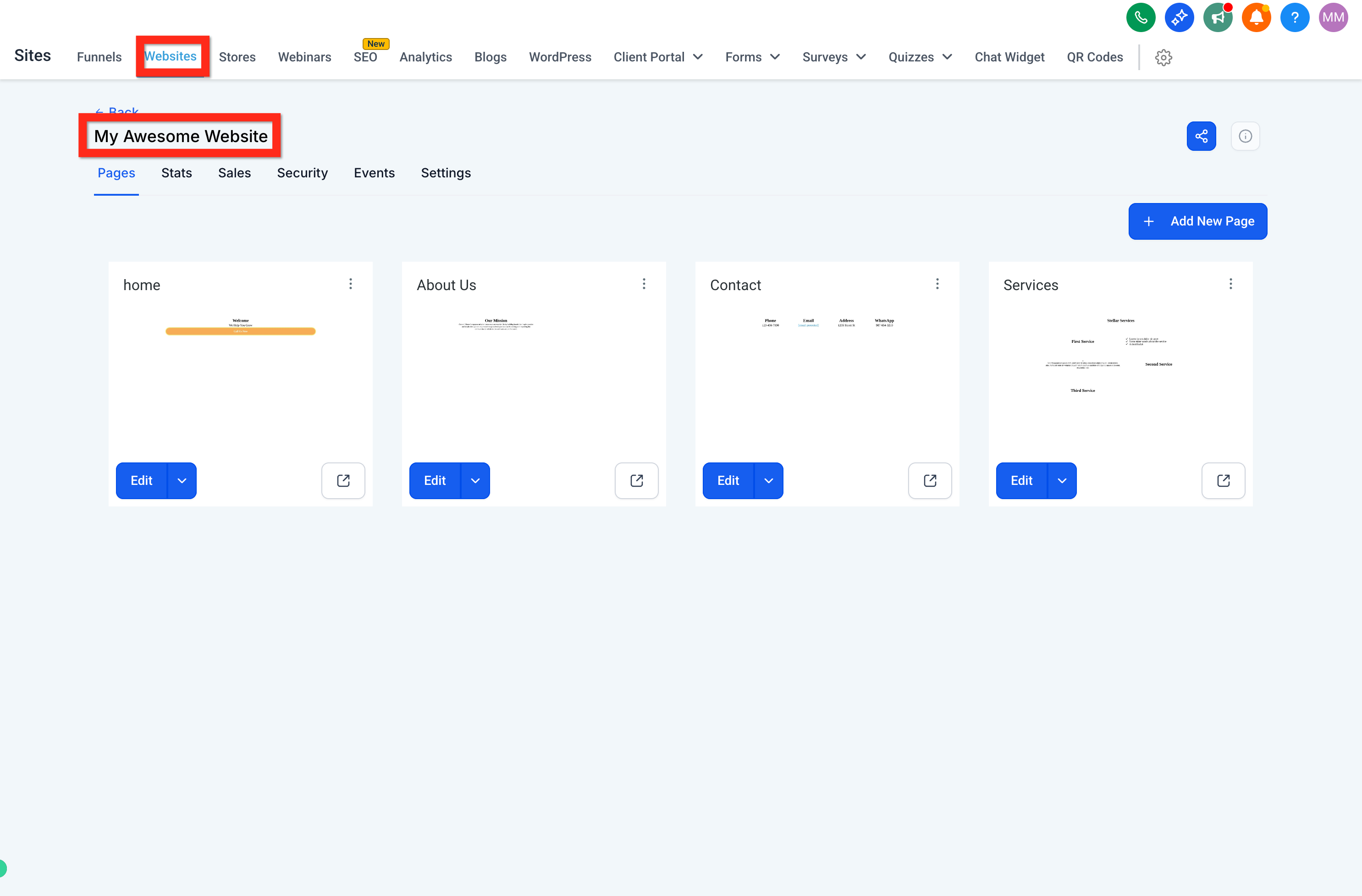
You can add as many pages as your site needs, each built in the same editor.
From Web Tools, open your site's details. (If you're still in the page editor, click the back button first.)
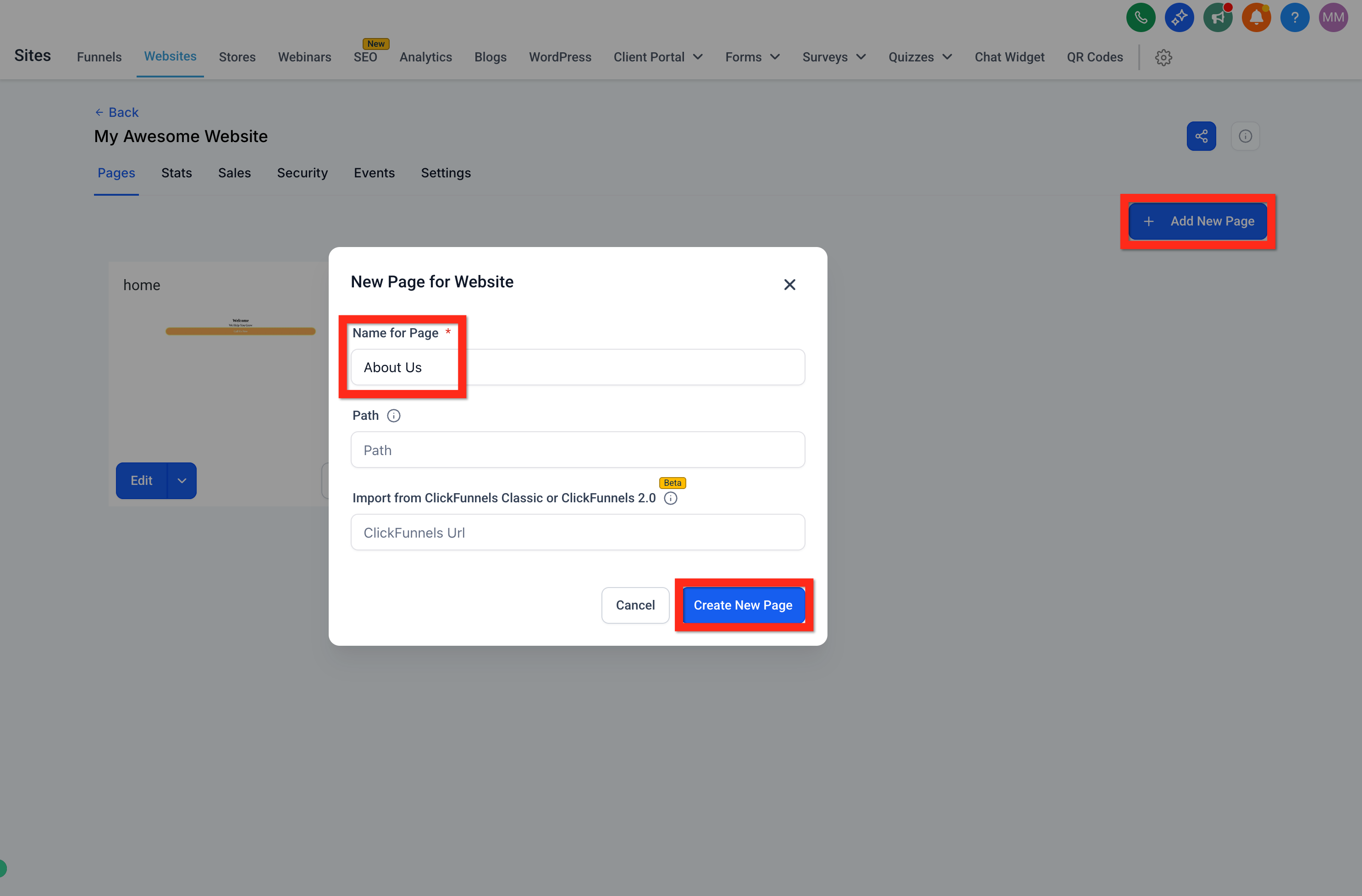
Click Add New Page, name the page (for example, "About Us"), and click Create New Page.
Choose Create From Blank to start with an empty page.
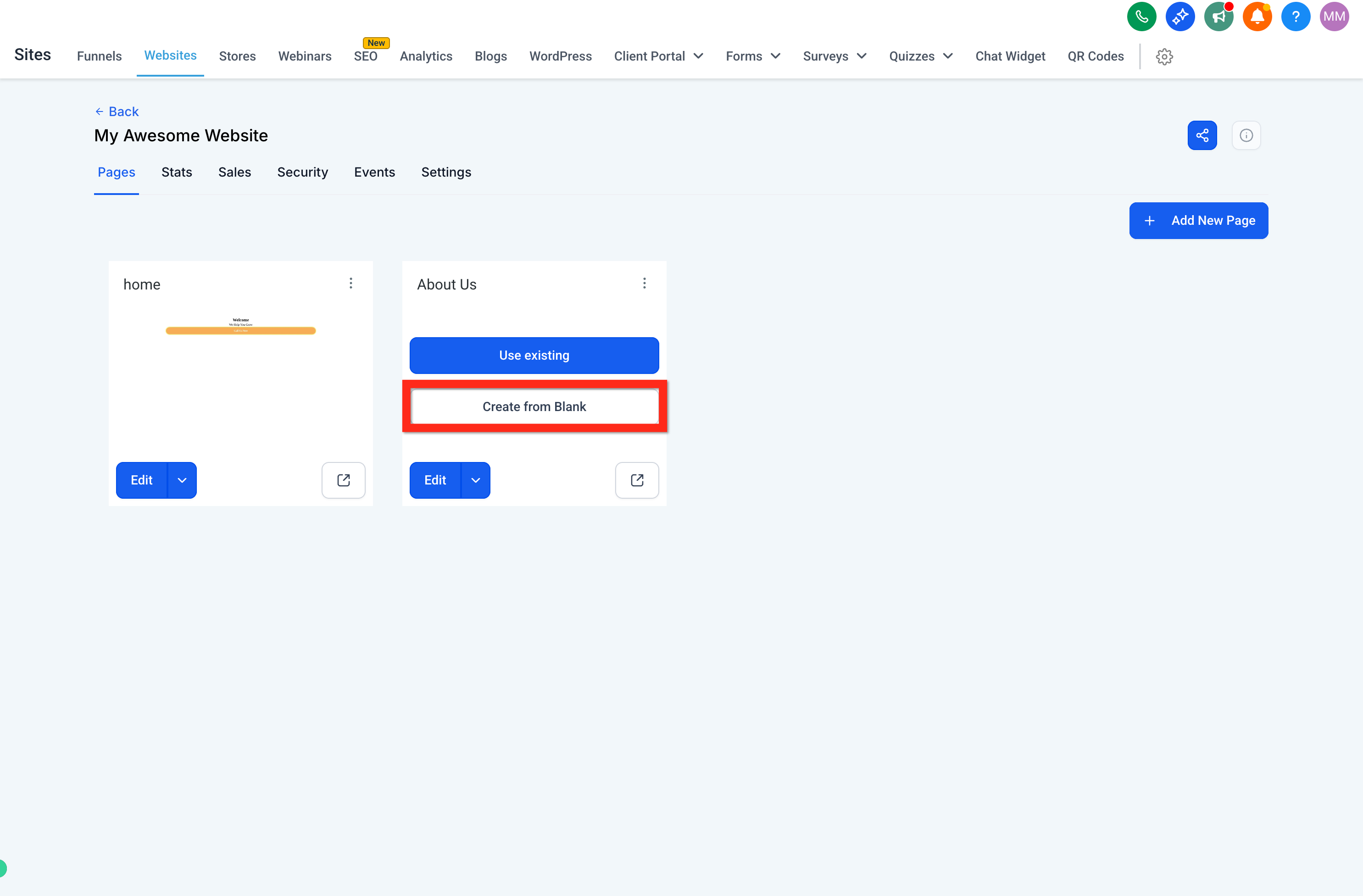
Build the page the same way, add a Text element, an Image element, and any other content. When you're done, click Save, then Back.
A navigation menu and footer help visitors move around your site. You build both from within the same editor.
From Web Tools, open your site's details. (If you're still in the page editor, click the back button first.)
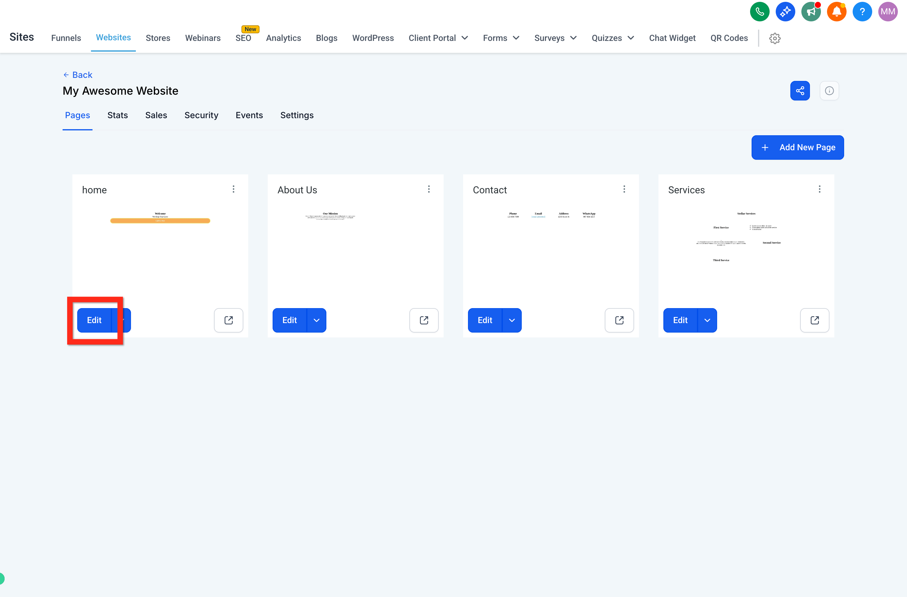
Under the "Home" page card, click Edit.
At the very top of the page, above all other sections, add a new full-width section.
Inside that top section, add a 1 Column Row, then add the Navigation Menu element.
Select the navigation menu and use the right panel to make sure each link points to the correct page, add your logo, and adjust styling.
At the bottom of the page, below all other sections, add another full-width section.
Open Elements > Prebuilt Elements > Footer and drag a footer into the bottom section.
Select each element to edit its settings in the right panel or remove parts you don't need. When you're done, click Save, then Back.
Before publishing, preview your page and confirm it looks great on every screen size.
Preview the page: From your site's details, click the preview page button (a box-with-arrow icon). Or, inside the builder, click the preview button (eyeball icon).
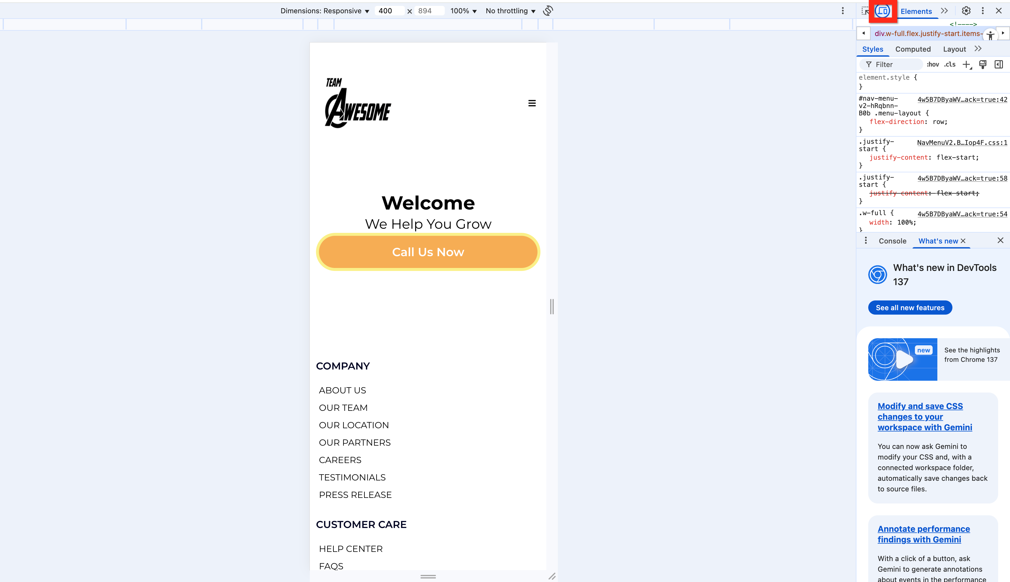
Preview mobile: In the builder, click the mobile phone icon to switch between desktop and mobile views. In a live preview, you can also right-click, choose Inspect, and toggle the desktop/mobile icon in your browser's inspector.
Adjust for responsiveness: In the editor, refine elements and settings until everything looks right on both desktop and mobile. If a single element won't cooperate on both, duplicate it and, using advanced settings, make one copy visible on desktop and the other visible on mobile.
The builder saves your work automatically as you go, but it's good practice to save and publish deliberately at key milestones.
Save: Click the save icon whenever you complete a meaningful change.
Save and Publish: Save frequently while you work, and publish when your page is ready for visitors. When you finish, save and publish one final time.
Beyond the visual design, each page carries settings that control how it's found, tracked, and connected. Some of these live in the page editor; others live in the site's Settings tab.
In the builder, click the SEO icon to open the SEO Meta Data panel.
Edit your page's SEO and meta details, title, description, and more, to help it appear correctly in search results and social shares.
To connect a custom domain and manage site-wide settings, leave the page builder and open the Settings tab for your site. From here you can:
Select or connect a custom domain so your site lives at your own web address.
Add a favicon for your browser tab icon.
Add tracking code (such as analytics or pixels) and other custom code.
Add a chat widget and more.
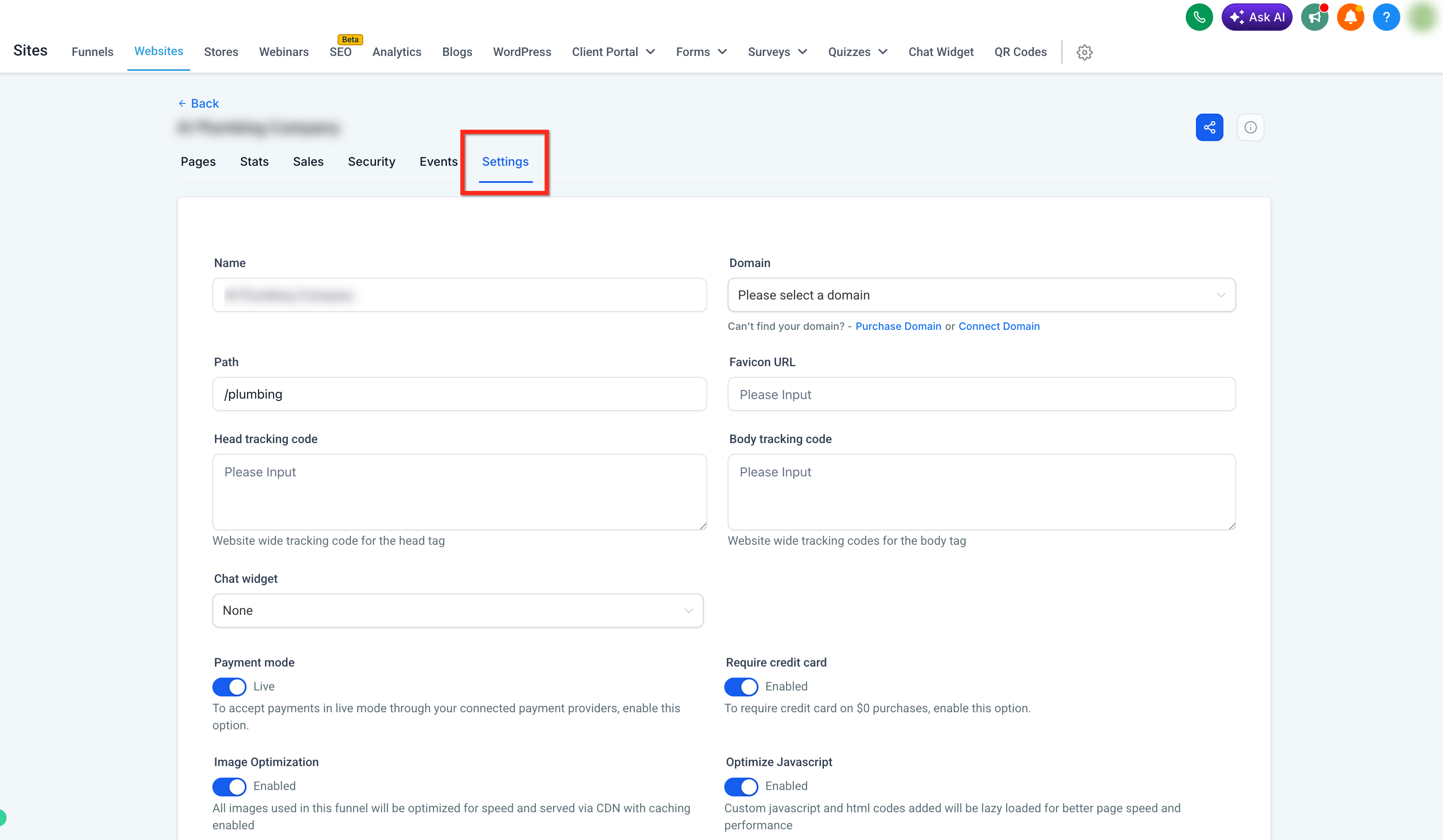
Note: Connecting a custom domain is optional. Your pages work fine on their default address, but a custom domain gives your practice a polished, branded web presence.
The builder you just learned is the same one you'll use throughout Aesthetix CRM. To put it to work on full sites and marketing flows, see the Websites guide and the Funnels guide.