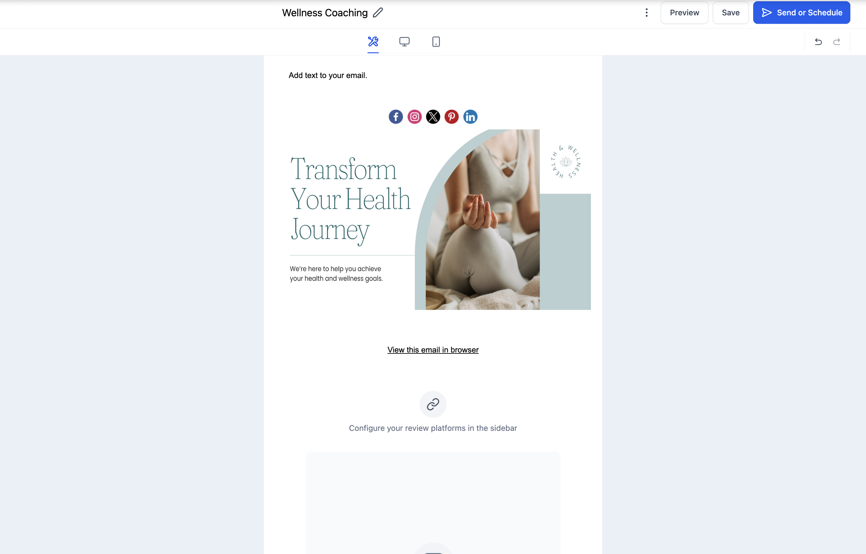
Elements are the prebuilt, drag-and-drop content blocks that make up every email in the Aesthetix CRM Email Builder. Each one serves a specific purpose, from text and images to buttons, products, and forms, so you can design polished, on-brand emails without writing code. This article is a reference for every element and its key settings.
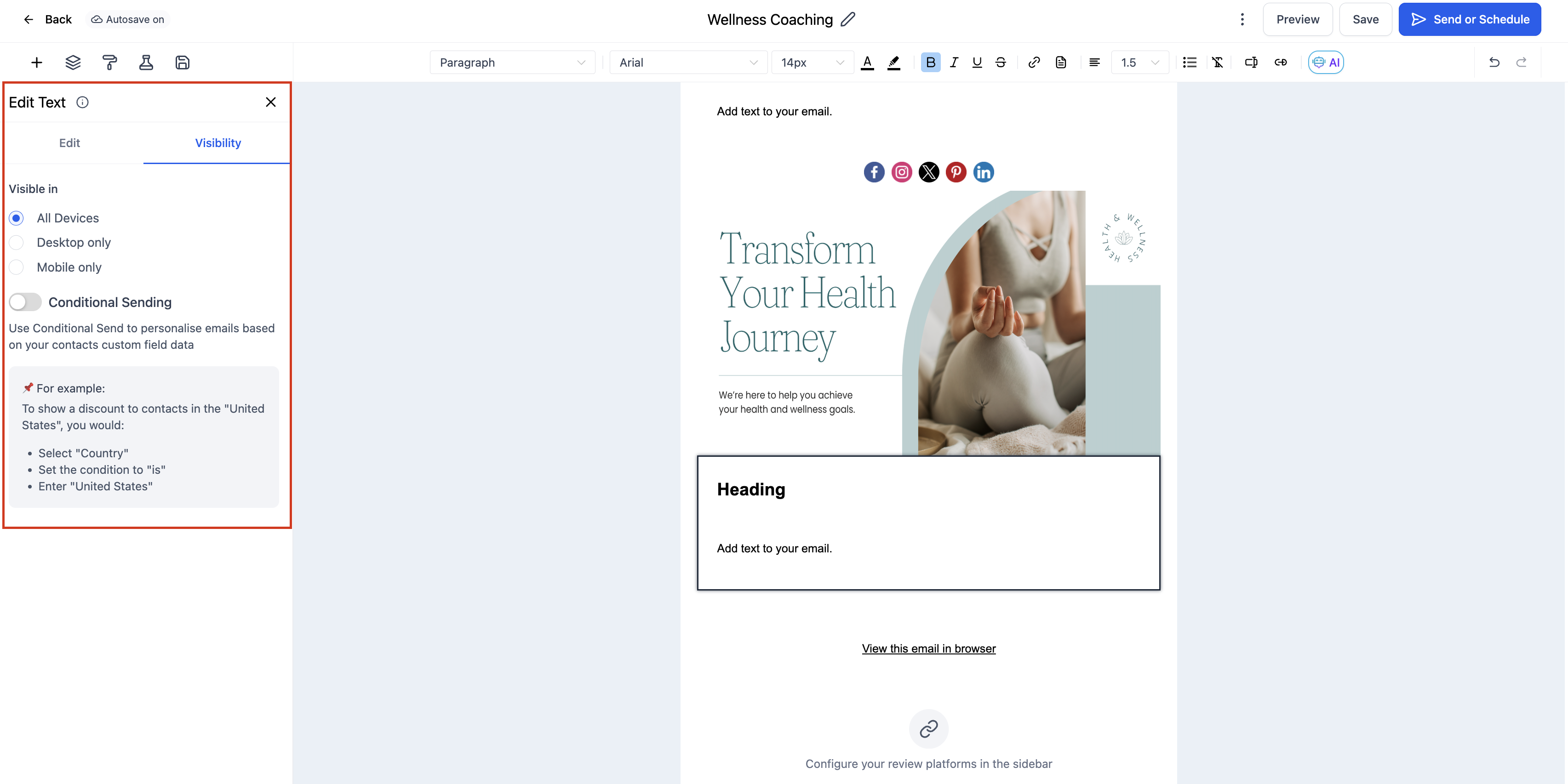
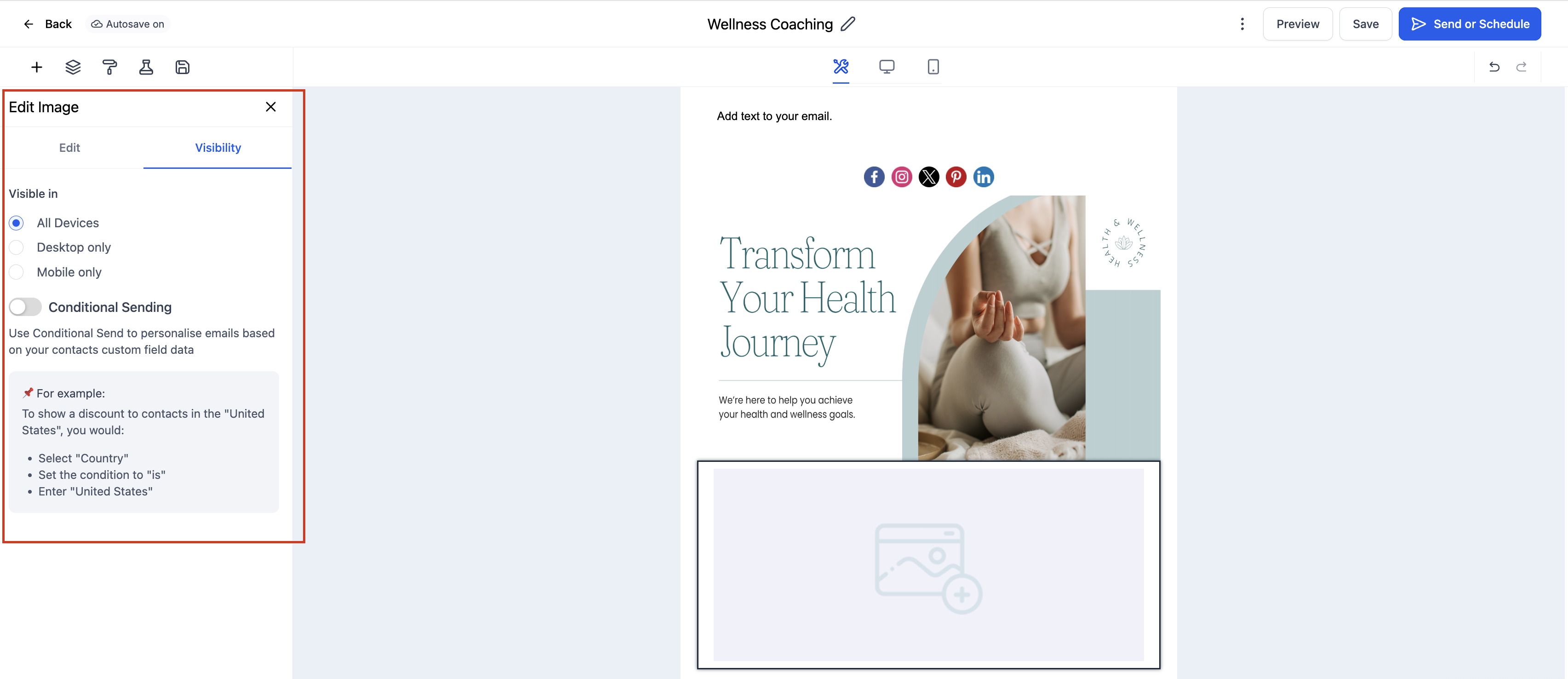
To add any element, open a template under Marketing > Emails > Templates, click the Add Elements (+) icon in the left sidebar, then drag the element you want into your layout. Click a placed element to open its Edit tab, and use the Visibility tab to set Device-Based Visibility or Conditional Sending. Always preview in both desktop and mobile before sending, since email clients render content differently.
The Text element adds and styles written content such as headings, paragraphs, and inline calls to action anywhere in your layout. It supports rich text formatting so your message matches your brand voice and stays readable on every device.
Key settings:
Content: Type or paste text directly into the text area.
Formatting toolbar: Apply bold, italic, underline, lists, and alignment.
Typography: Adjust font size, color, and spacing for readability.
Hyperlinks: Highlight a phrase and add a link for navigation or CTAs.
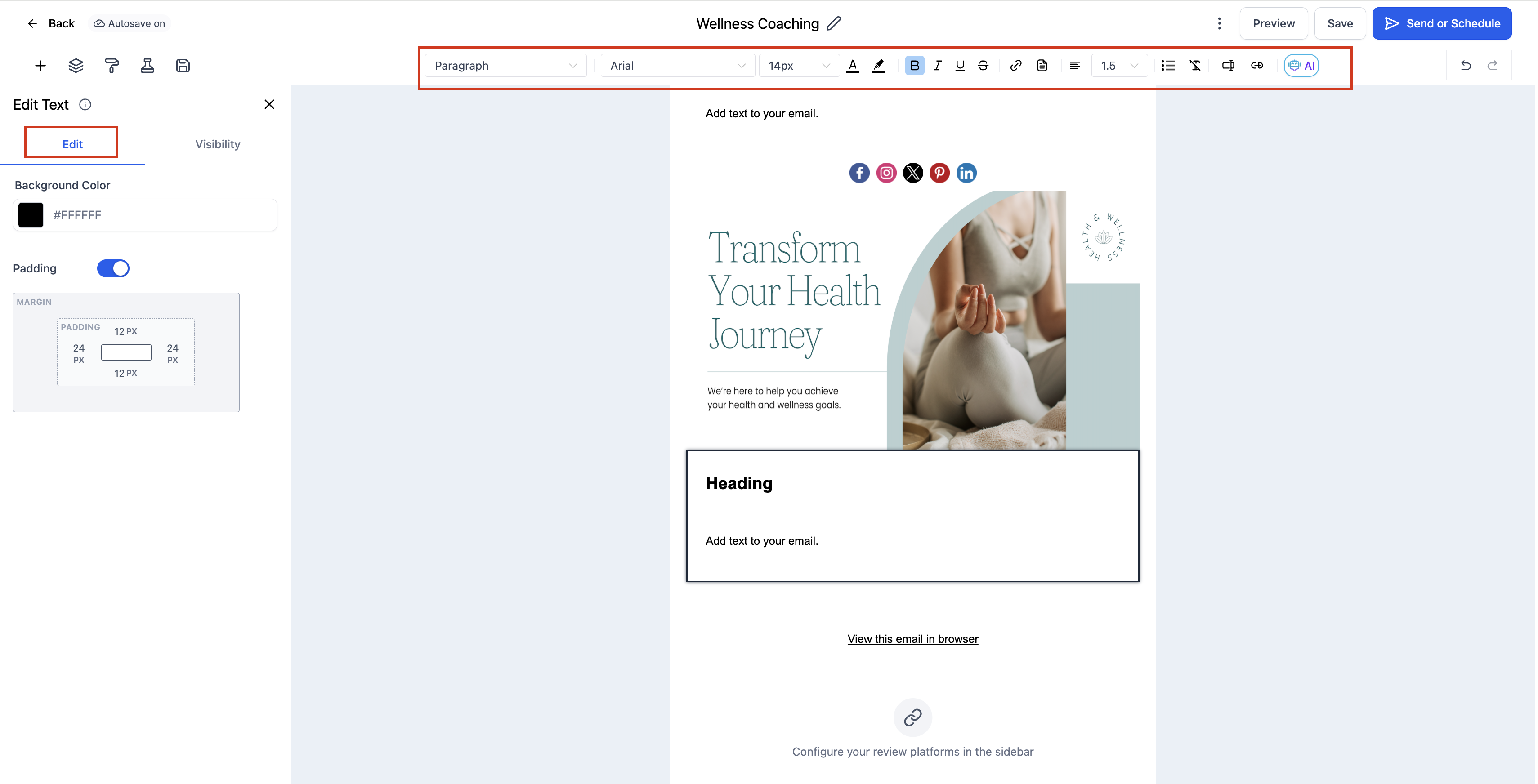
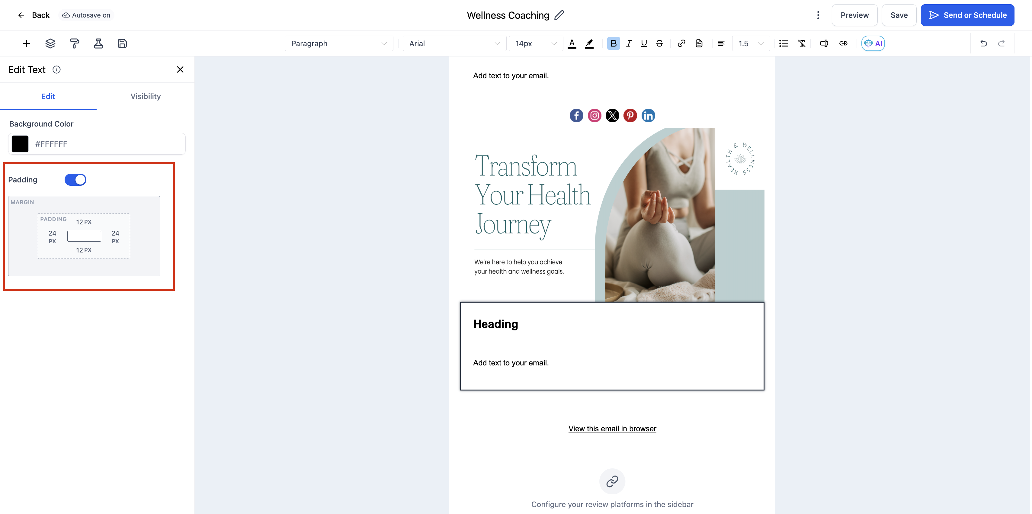
Padding: Control the spacing around the text block.
You can format individual portions of text differently by selecting them and adjusting font, size, or color with the inline toolbar. Both bulleted and numbered lists are supported.
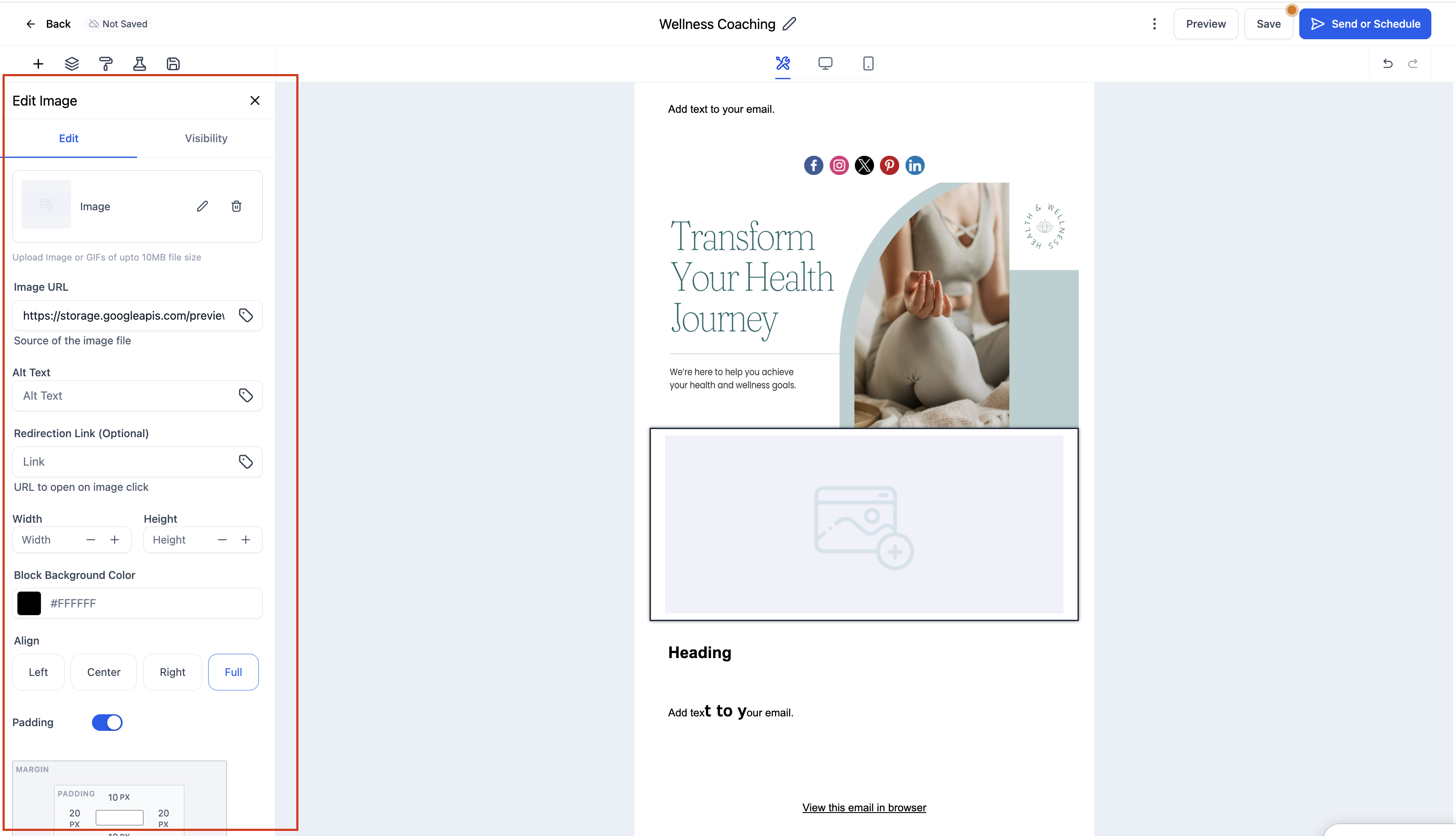
The Image element inserts images or banners directly into your email for branding, product showcases, or visual storytelling. It supports multiple image sources and renders reliably across major email clients and devices.
Key settings:
Upload an Image: Choose a file from your computer.
Use an Image URL: Paste a direct link to an externally hosted, publicly accessible image.
Adjust Width and Height: Set custom dimensions or use automatic scaling.
Add a Link: Use the Redirection Link field to make the image clickable.
Set Alignment: Align left, center, or right.
Add Padding: Control spacing around the image.
Supported formats include JPG, PNG, and GIF. To protect load times and deliverability, use compressed images under 1MB.
The Button element adds clickable, fully customizable call-to-action buttons that drive engagement and improve click-through rates. Buttons are built with HTML, render reliably in most email clients, and stay responsive across devices.
Key settings:
Button Text: Set the label to match the action, such as Shop Now, Learn More, or Book a Call.
Link: Enter the destination URL.
Styling: Adjust button color, text color, font, border radius, and background.
Size and Alignment: Control width, padding, and alignment (left, center, or right). Use the full-width toggle to set the button to 100%.
You can add as many buttons as you need, each with unique styling and links.
The Logo element adds your brand logo to an email, creating instant recognition and a professional tone. It is typically placed at the top of the layout.
Key settings:
Upload a Logo: Select an image from your device.
Use an Image URL: Paste a direct link to a hosted logo image.
Adjust Size: Set custom width and height for proper scaling.
Set Alignment: Align left, center, or right.
Add a Link: Make the logo clickable, linking to your website or a landing page.
Control Padding: Add spacing around the logo.
Supported formats include PNG, JPG, and GIF. For best results, use a transparent PNG or high-quality JPG. The logo automatically resizes for mobile.
True video playback is not supported in email clients. The Video element solves this by inserting a clickable thumbnail with a play button that links to your video content. It is available inside the Design Editor and Email Templates.
Configuration options:
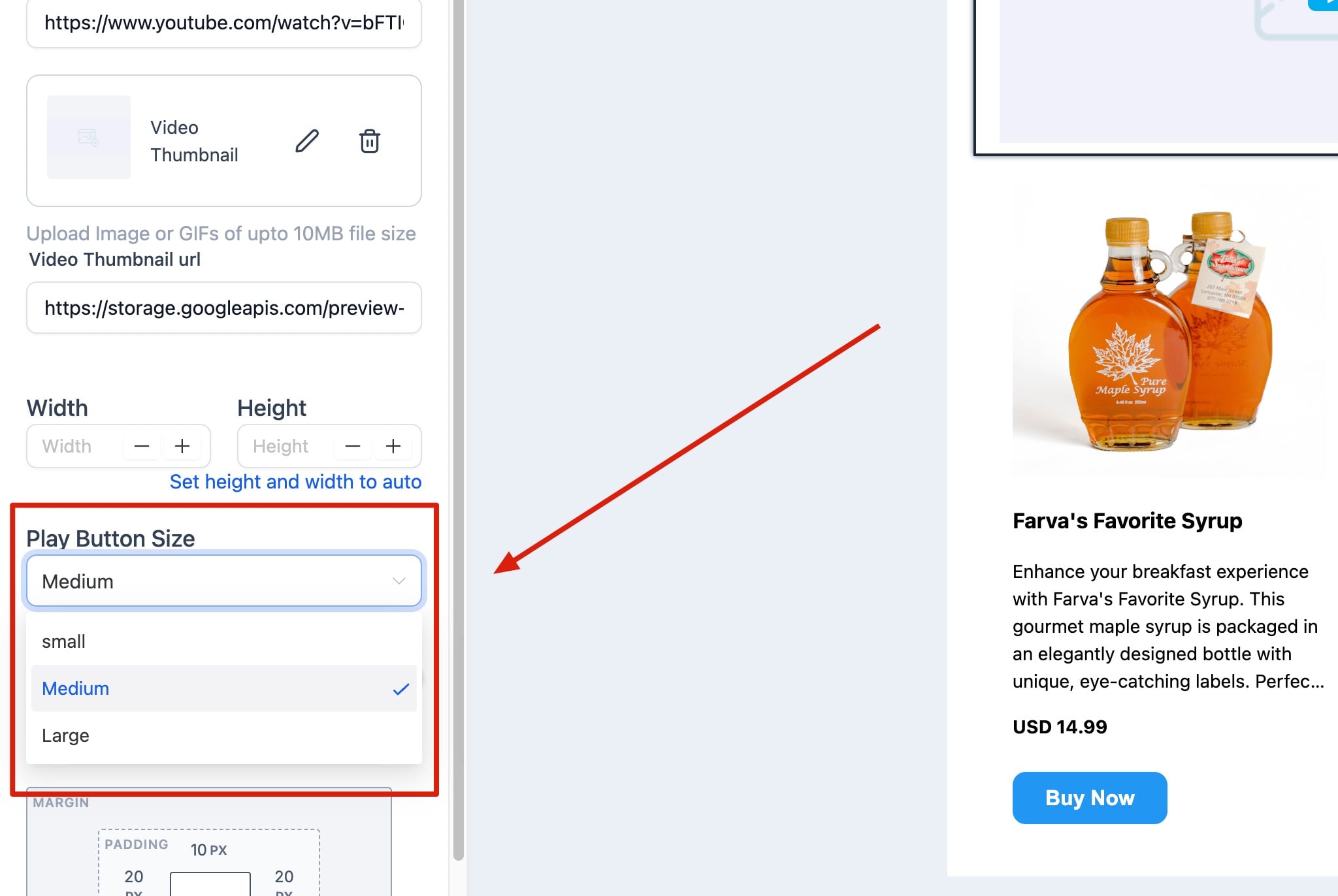
Video Type: Choose YouTube, Vimeo, Wistia, or HTML5. The system fetches the thumbnail from the video URL and styles the play button to match the provider (for example, YouTube shows a red play button).
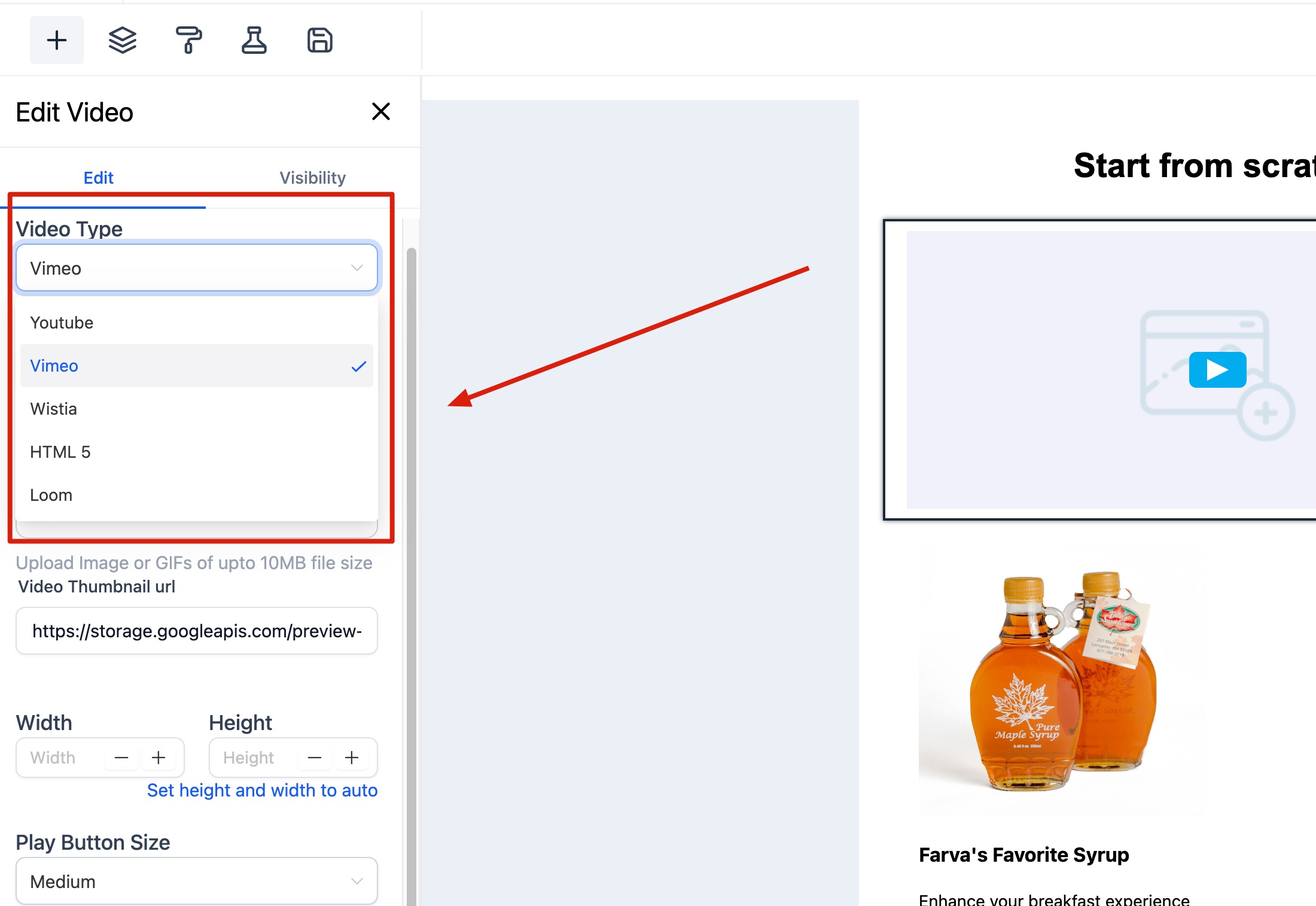
Video URL: Enter the URL of your video. If the thumbnail cannot be fetched (for example, if the video type does not match the URL), a warning appears. The editor keeps any previously fetched image rather than clearing it.
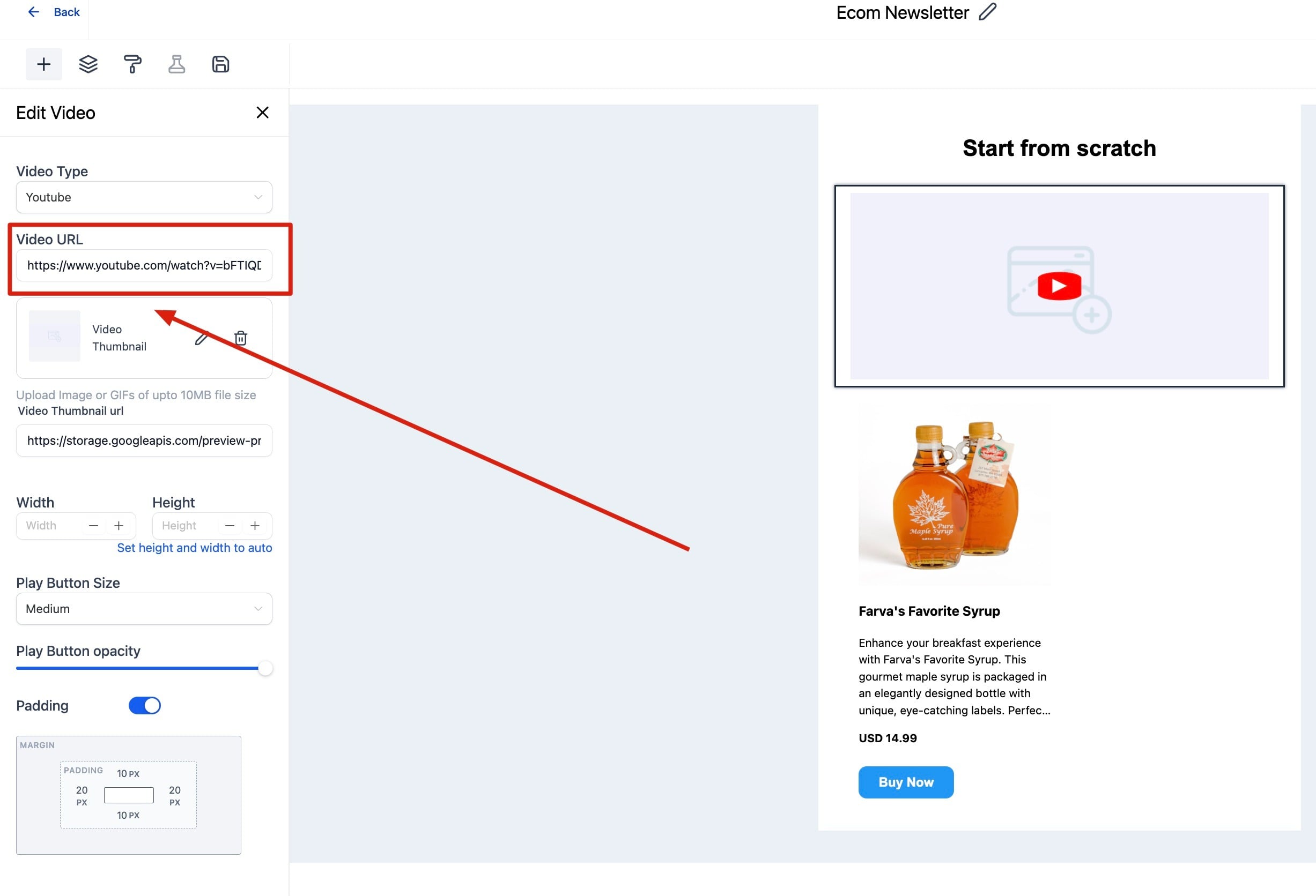
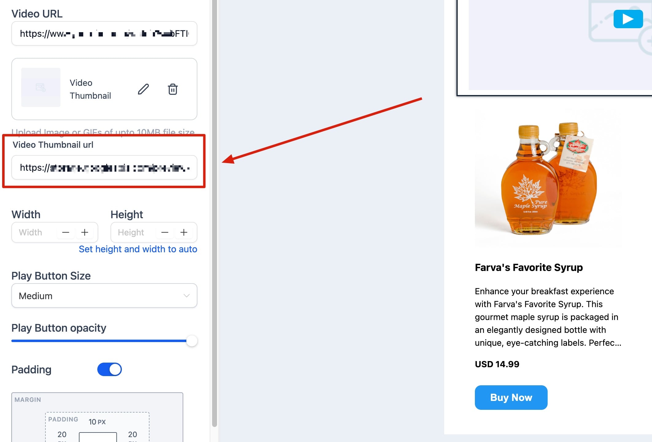
Video Thumbnail URL: Filled automatically from the video URL, or supply your own. Use Replace to upload a custom thumbnail and Remove to clear the default.
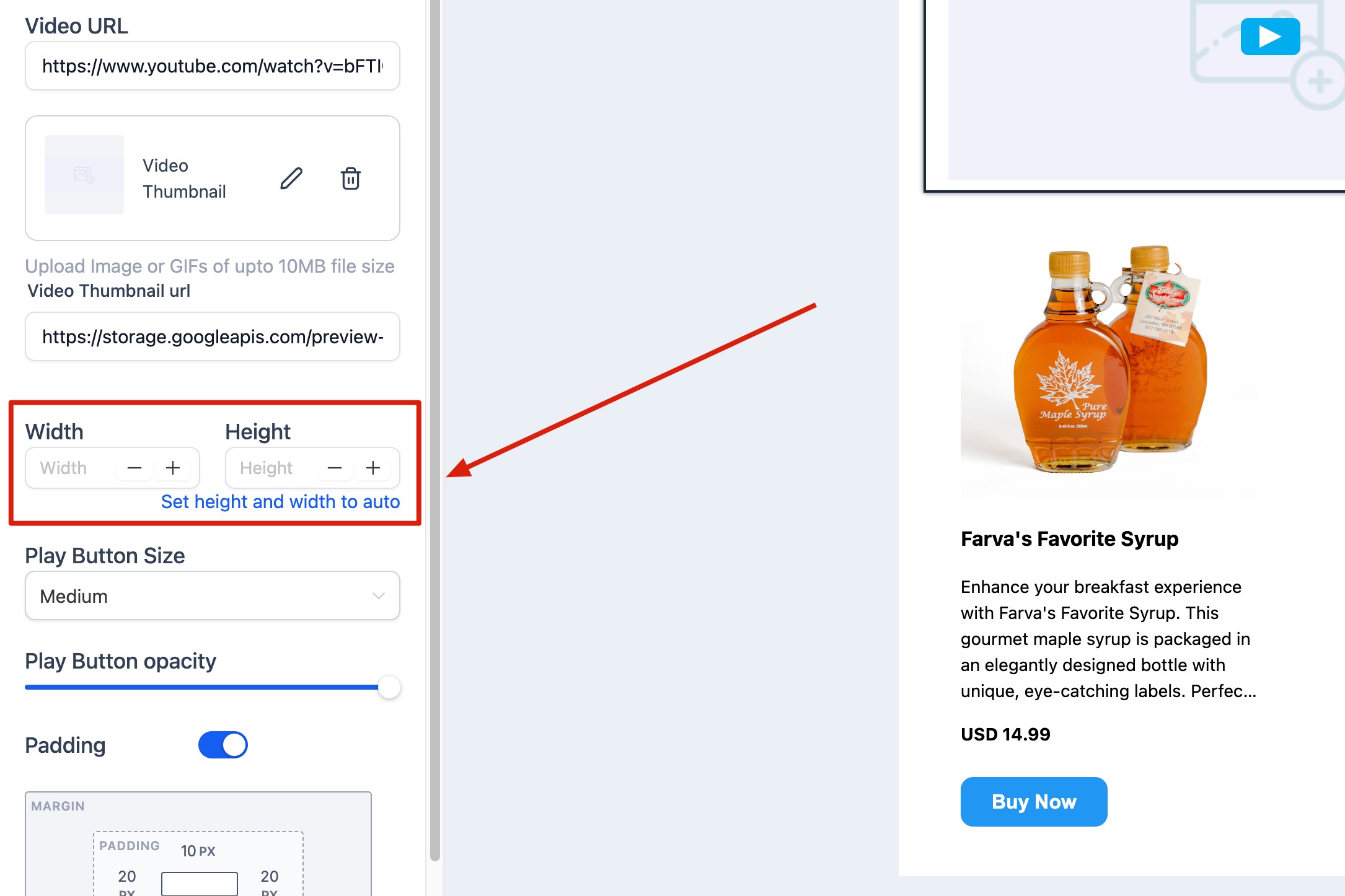
Width and Height: Control the video dimensions. With no dimensions set, the video takes full width with auto height. When you set custom dimensions, the element aligns left by default; use padding or a multi-column layout to reposition it.
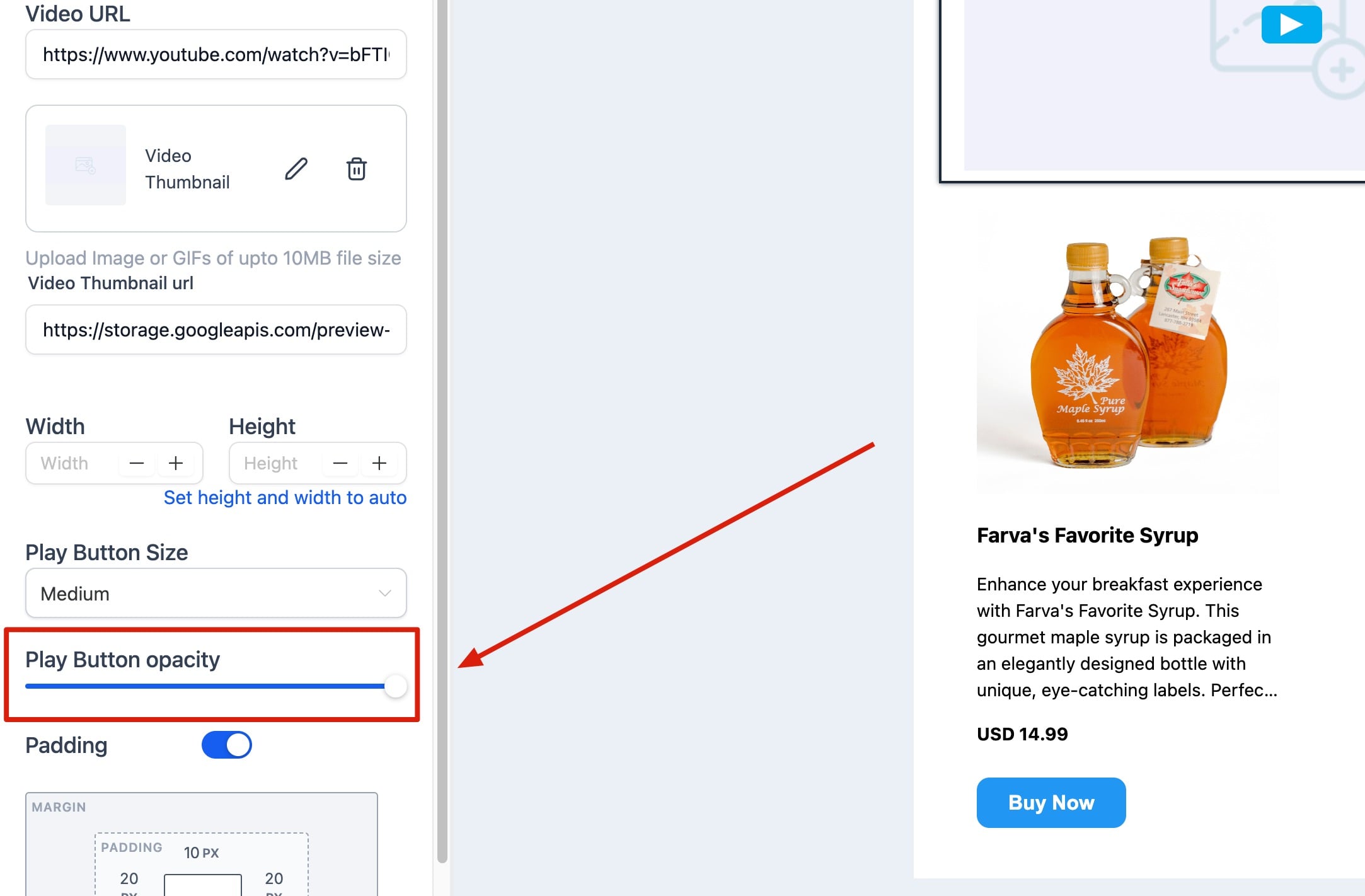
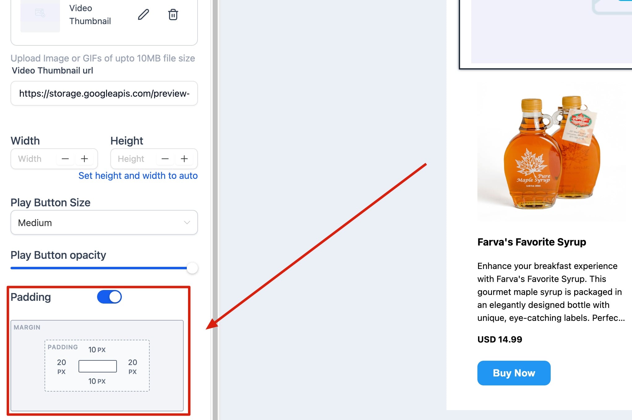
Padding: Add spacing around the video element.
The Social element adds recognizable social media icons with clickable links, helping subscribers follow and interact with your brand. Icons are optimized for email and display consistently across major clients.
Key settings:
Add or Remove Icons: Choose which platforms to display, including Facebook, Instagram, LinkedIn, X (Twitter), YouTube, TikTok, and Pinterest.
Insert Links: Paste the URL for each social profile.
Customize Appearance: Adjust icon size, shape, spacing, and color (full color or monochrome).
Align Icons: Choose left, center, or right alignment.
Add Padding: Control spacing above or below the icons.
To add a platform that is not listed, duplicate an existing icon and replace its image and URL. Icons are typically placed in the header or footer.
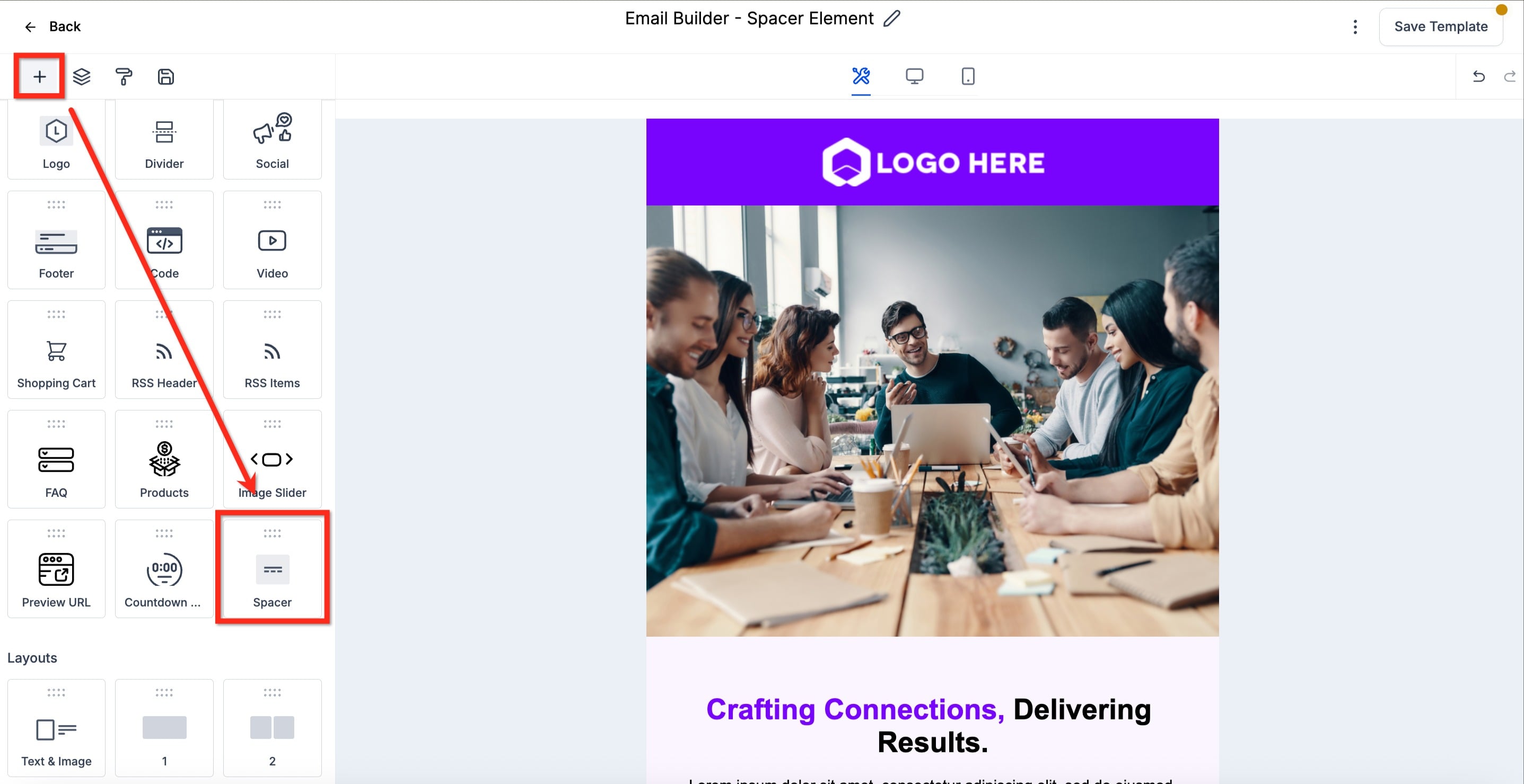
The Spacer element adds adjustable empty space between content blocks, giving you precise layout control without dividers or manual padding. The space is responsive and adapts automatically for desktop and mobile.
Key settings:
Height: Set vertical spacing.
Width: Set horizontal spacing.
Color: Adjust the spacer color if needed.
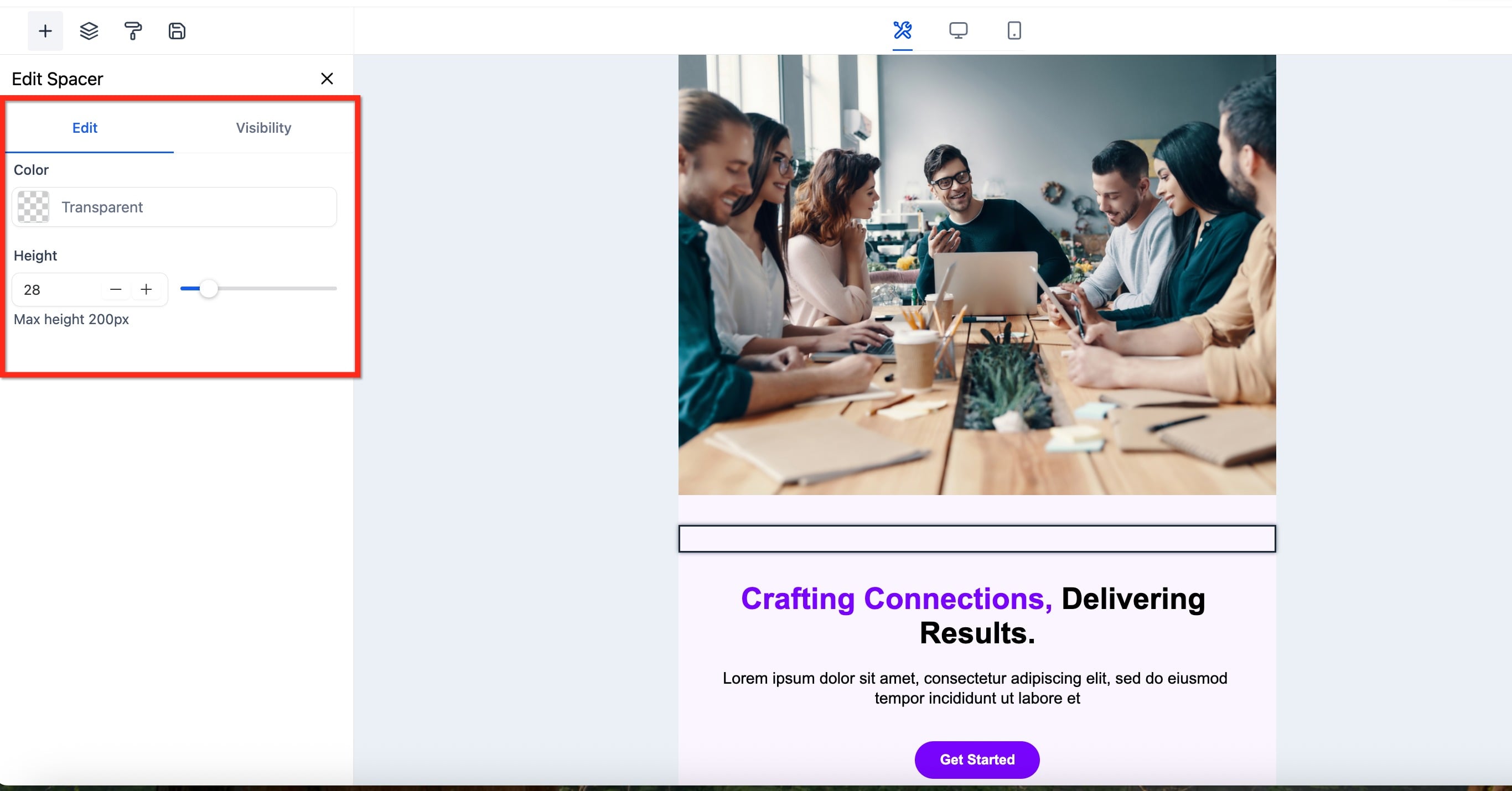
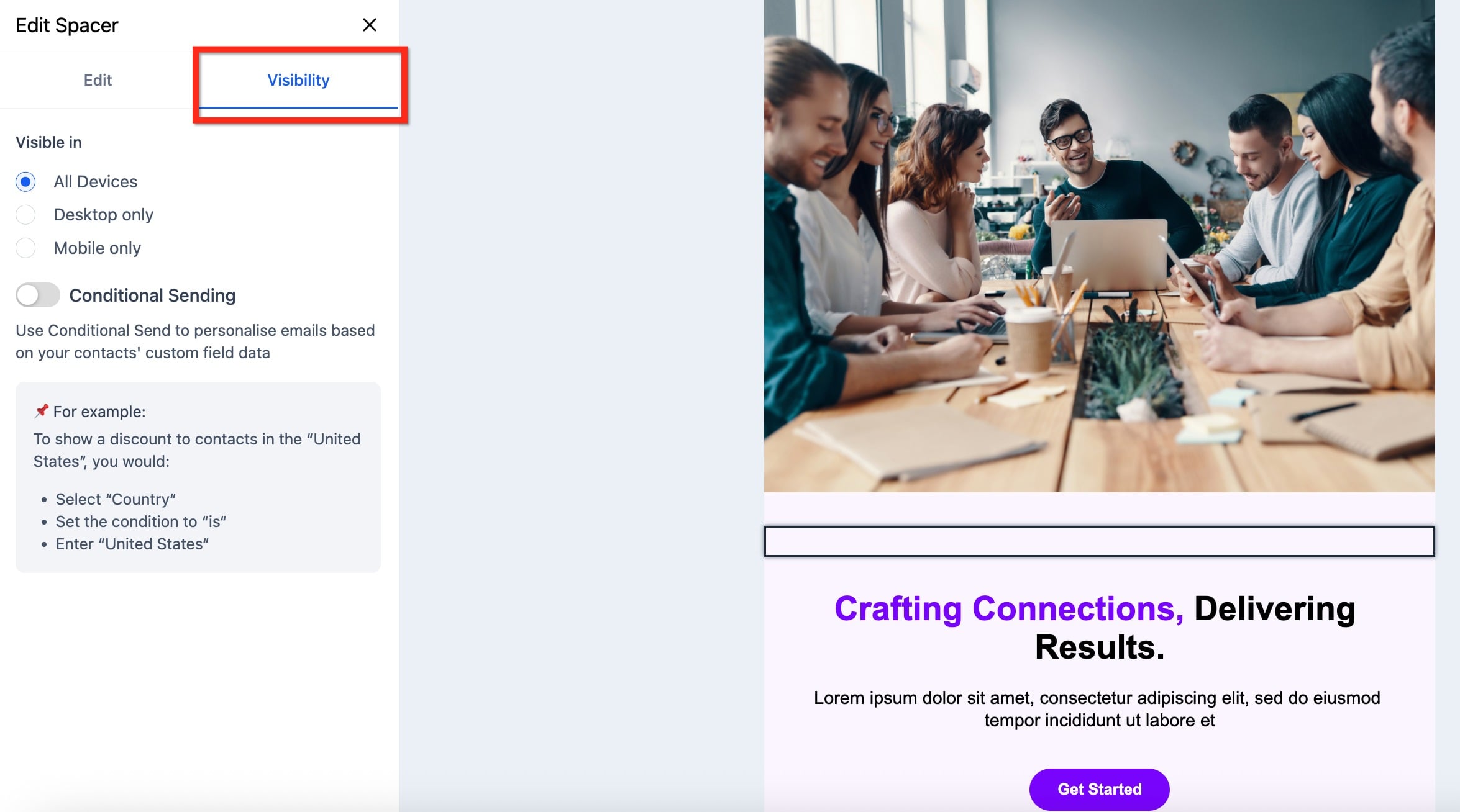
A Spacer adds empty space only and displays no visible content. It is lightweight and does not affect deliverability or loading speed. (A Divider, by contrast, adds a visible line between sections.)
The Footer element creates a consistent, professional footer at the bottom of your email for contact details, unsubscribe links, social icons, and legal disclaimers. It supports compliance and reinforces brand trust.
Key settings:
Edit Text Content: Add your business name, address, or legal text.
Add Links: Include unsubscribe or privacy policy links.
Customize Colors: Adjust background and text colors.
Adjust Spacing: Add padding or margins for a balanced layout.
Including an unsubscribe link and contact information in your footer helps you stay compliant with email marketing regulations.
The Code element inserts custom HTML or inline CSS into your layout, giving you control beyond the standard visual editor. It is ideal for embedding widgets, tracking pixels, or advanced styling.
Key settings:
Code editor: Paste or type custom HTML for structure (divs, tables, embeds) and inline CSS for styling (colors, spacing, fonts).
Preview: Check how the custom code renders in the design.
Keep code self-contained and use inline styles so it does not affect other elements. JavaScript and iframe content are generally not supported by email clients for security reasons. Always test across desktop and mobile, since clients handle HTML differently.
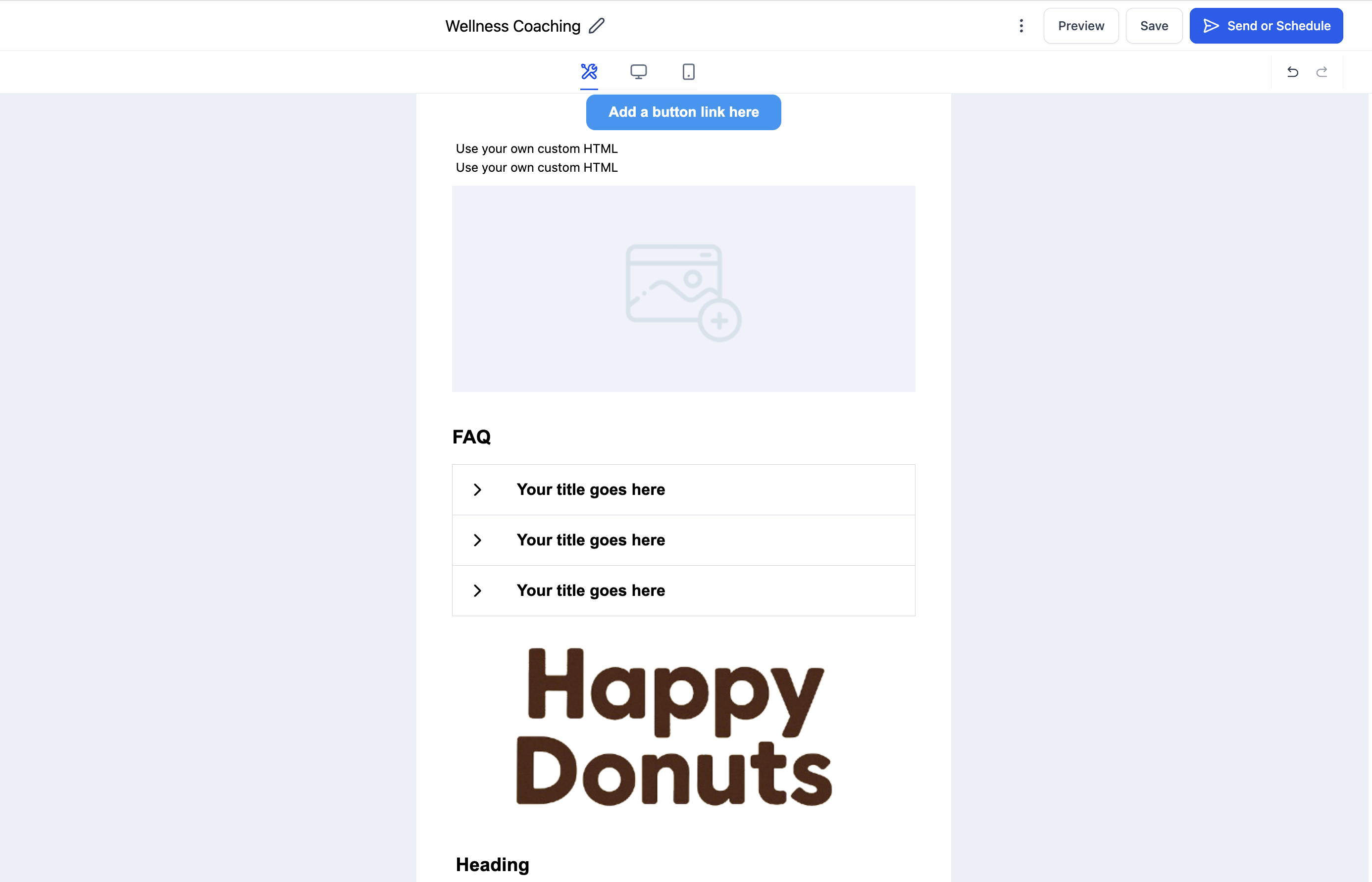
The FAQ element organizes content in a clean question-and-answer format, ideal for newsletters, onboarding sequences, product updates, or promotions where you want to answer common questions proactively.
Key settings:
Add Questions and Answers: Type or paste your Q&A content.
Edit Formatting: Use the text toolbar to style questions (bold, color, size).
Adjust Layout: Modify padding, spacing, and alignment between items.
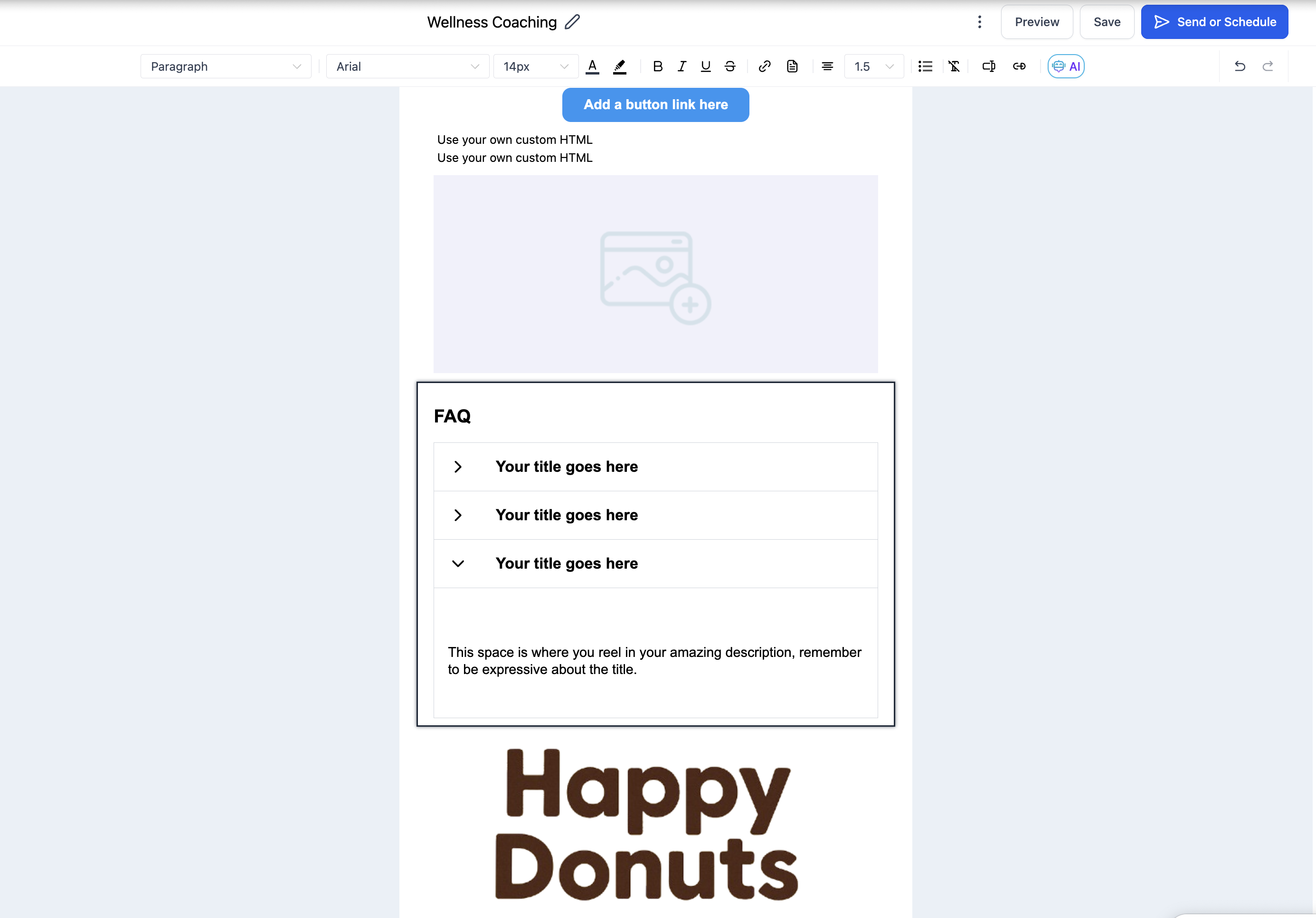
Aim for 3 to 6 questions per section for readability. Interactivity depends on the email client. Where collapsible accordions are not supported (for example, some versions of Outlook), the answers stay expanded and static so the content always displays.
The RSS element automatically pulls and displays the latest posts from an RSS feed, which is ideal for newsletters and blog updates. It comes in two parts: an RSS Header and RSS Items that show your most recent entries. Once connected to a feed, the element keeps your email content current without manual updates.
The Product element displays product listings with images, descriptions, prices, and buy buttons, letting you showcase featured items or new arrivals directly in an email.
Before using it, add your products under Payments > Products, each with a title, description, images, and a one-time or subscription price. Then in the email:
Add Items: Select the products you want to feature.
Choose a Design: Pick how products are arranged in your layout.
Show or Hide Details: Toggle the title, description, and price.
Rename the Button: Customize the call-to-action label.
Set the URL: Redirect to a funnel, website, or store page.
The Shopping Cart element displays product details, pricing, and checkout links inside your email. It is built for abandoned cart reminders, product recommendations, and limited-time promotions.
Key settings:
Item Details: Customize each item's image, name, description, price, and button link.
Buttons: Add Buy Now or Return to Cart buttons with direct checkout links.
Layout and Spacing: Control padding, margins, and alignment for a clean product grid.
The Shopping Cart element does not process payments directly. It links recipients to your website or store checkout page to complete the purchase.
The Inline Forms / Surveys element embeds prebuilt or custom feedback forms directly in your email, such as 1 to 10 scoring, like/dislike, and 5-star ratings. Use it to collect product feedback, gather service reviews, or capture simple responses.
Key settings:
Feedback Type: Choose the rating or survey format (NPS, star ratings, like/dislike, and more).
Design and Settings: Customize the form's appearance.
Title: Name the form so its responses are easy to identify in reporting.
Success Page: Optionally set a custom redirect after submission.
Responses are tracked the moment a contact clicks the element inside the email and appear under Campaign Statistics > Submissions, where you can also export respondents.
Q: Can I rearrange elements after adding them?
Yes. Drag and drop any element to move it anywhere in your layout.
Q: Are all elements responsive on mobile?
Yes. Every element is responsive by default. You can preview and fine-tune mobile spacing and alignment under the Mobile View tab.
Q: What is the difference between the Text and Code elements?
The Text element lets you add and format content visually, while the Code element lets you insert custom HTML for advanced designs or integrations.
Q: What is the difference between a Spacer and a Divider?
A Spacer adds empty vertical space, while a Divider adds a visible line between sections.
Q: How do I remove an element from my layout?
Select the element and click the trash/delete icon to remove it.